Four Pillars Summer Campaign 2020
There’s a certain endlessness to an Australian Summer. Hot days melt into one another, and the evenings linger for what feels like an eternity. And in the summer of 2020, this feeling of endlessness was exacerbated by Covid, forcing us to find joy in smaller things, and urging us to find our own summer rhythm. The Four Pillars 2020 Summer campaign needed to capture this feeling in a way that would make us want to revel in summer… over and over and over again.
Summer is Four Pillars
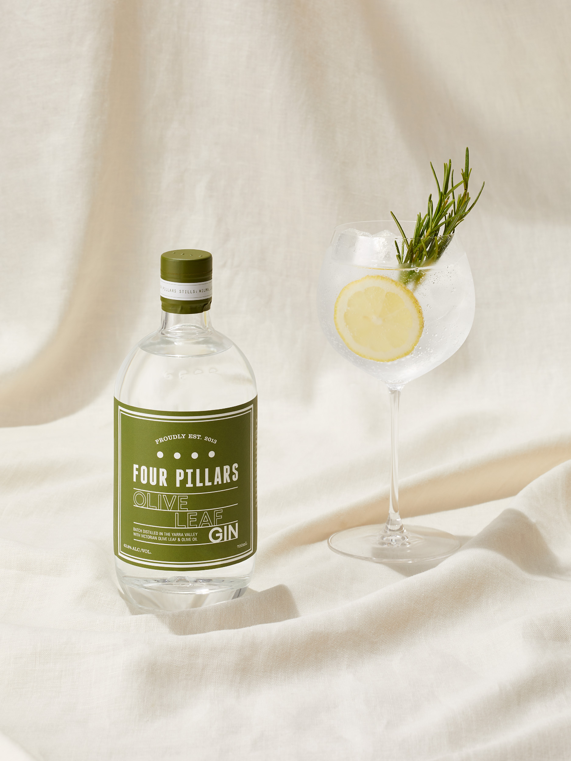
Every year, the Four Pillars summer campaign aims to make Australia thirsty by capturing something that feels new, distinctive and—of course—delicious. Coming off the back of being named the ‘World's Best Gin Producer’ for the second consecutive year, Four Pillars Gin needed to build on this momentum with yet another summer campaign that would reinvigorate existing Four Pillars fans, while making new friends of premium-gin enthusiasts.
But in a year beleaguered with Covid lockdowns and restrictions, this traditionally Out-of-home campaign needed to come to life largely through digital and social channels—to reach people where they would largely be… in their homes.
The task was clear, remain faithful to—and recognisable as—the well-known Four Pillars brand, while simultaneously celebrating the unique personalities of each of the core range of gins (five different gins in total!) through a campaign that captured the zeitgeist of a modern Australian Summer—no matter where people were enjoying it. This summer, summer would be Four Pillars.
Our summer rhythm
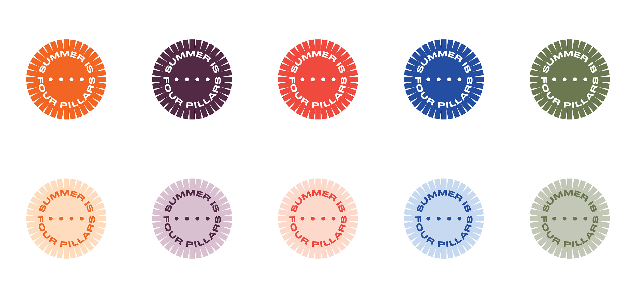
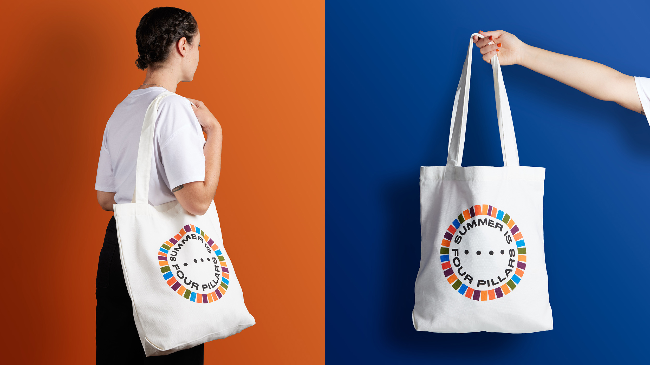
In contrast with the rest of the year’s marketing activities, the Four Pillars annual summer campaign gives the brand proverbial permission to let its hair down and revel in the moment. To signal this seasonal thematic shift, a new summer identity was created for Four Pillars, to anchor this and future campaigns to a simple positioning—Summer is Four Pillars.
This new graphic mark, that would become the central anchor for the campaign, features a playful kaleidoscope of colour that represents the reverberating energy of the summer sun. Leveraging the core gin range colour palette, the mark was used across a range of summer merch, unifying the campaign with its kinetic energy and versatility.
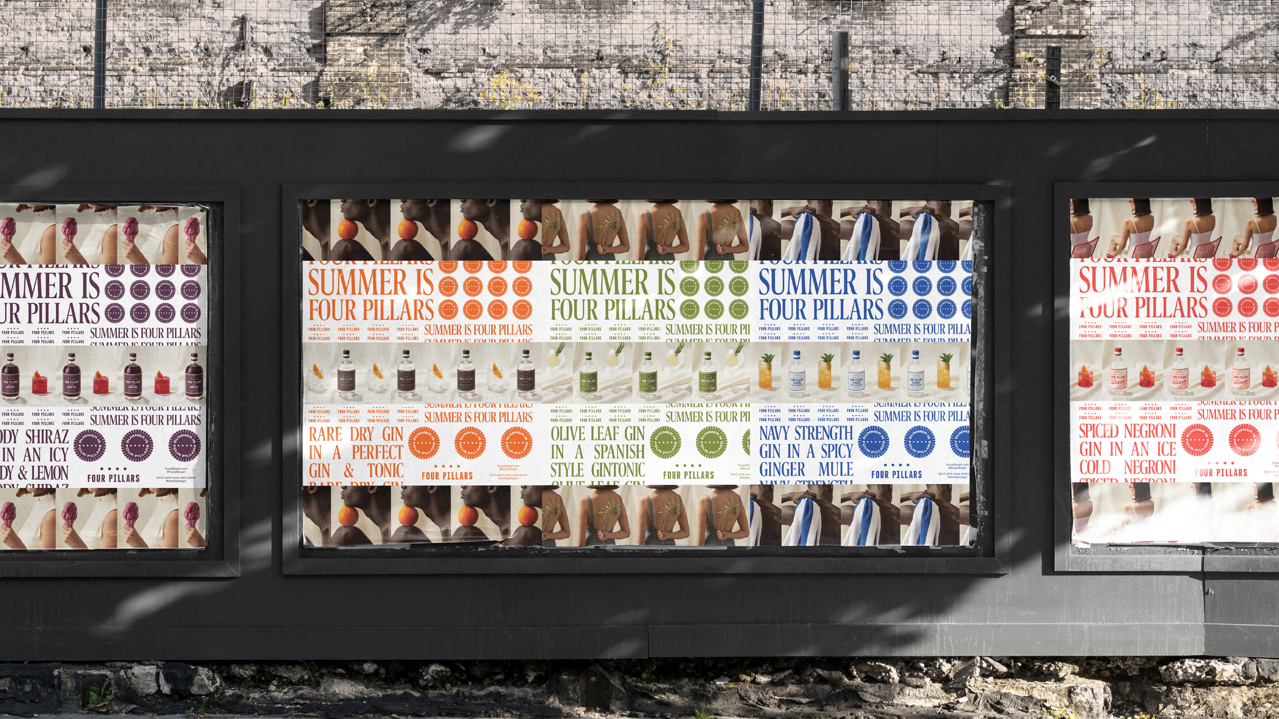
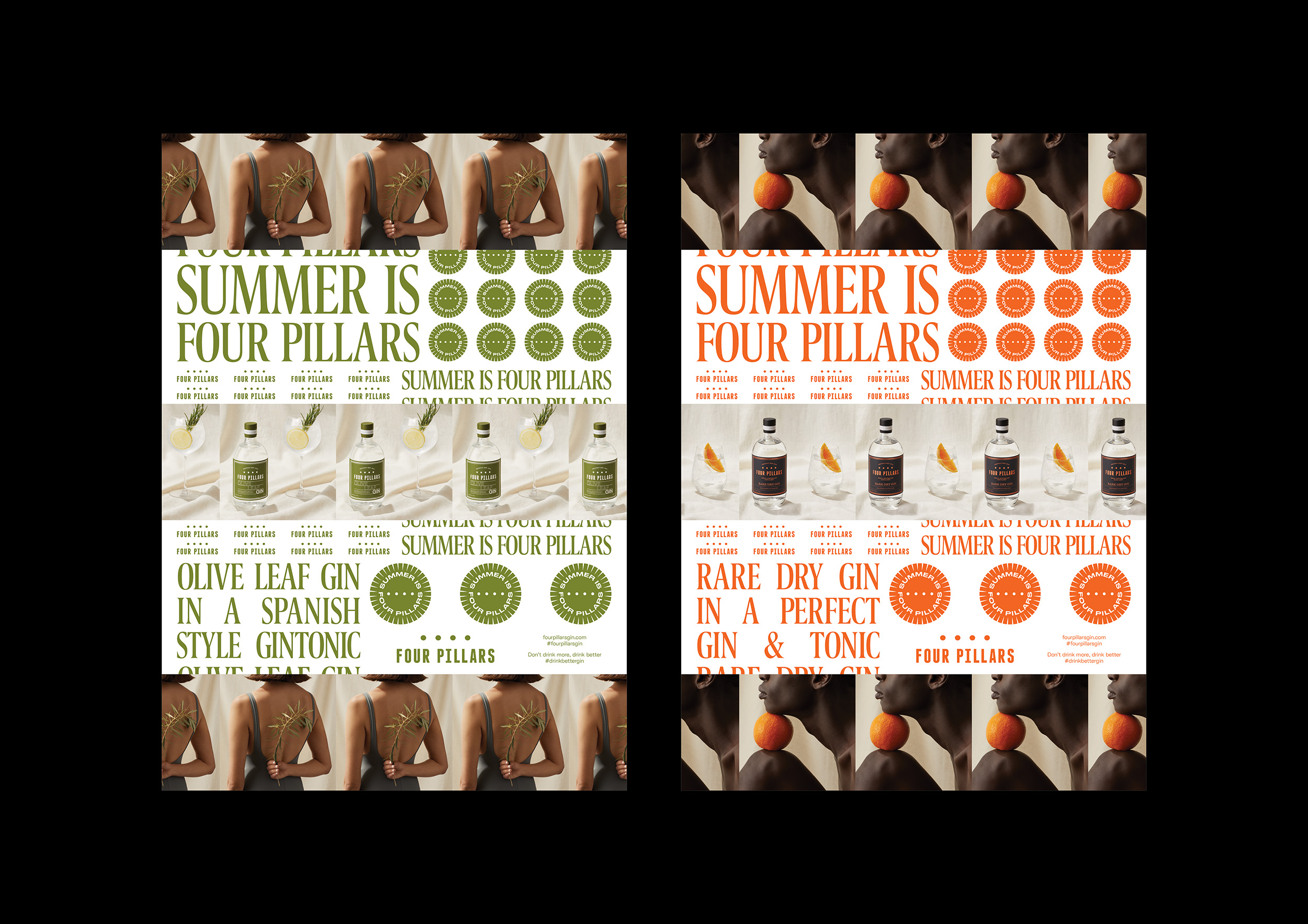
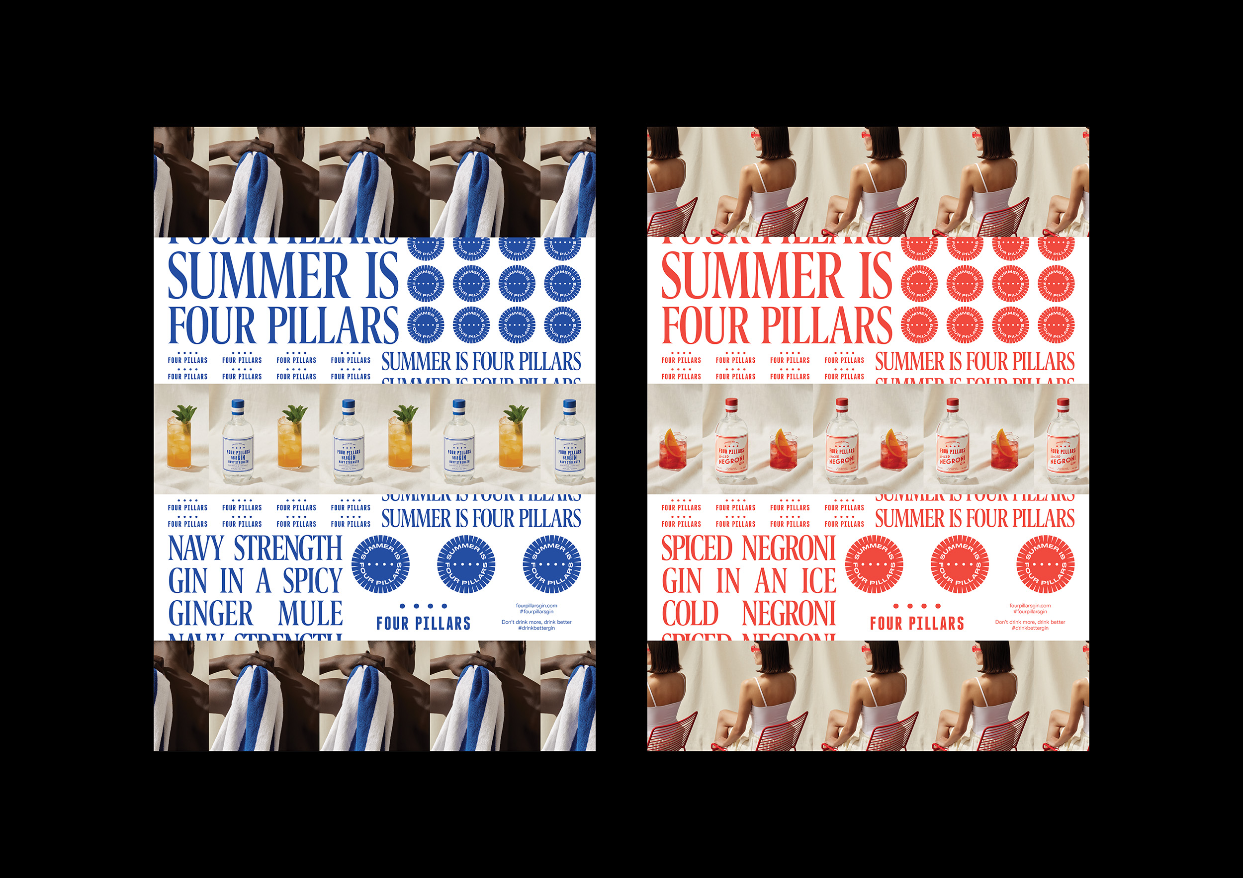
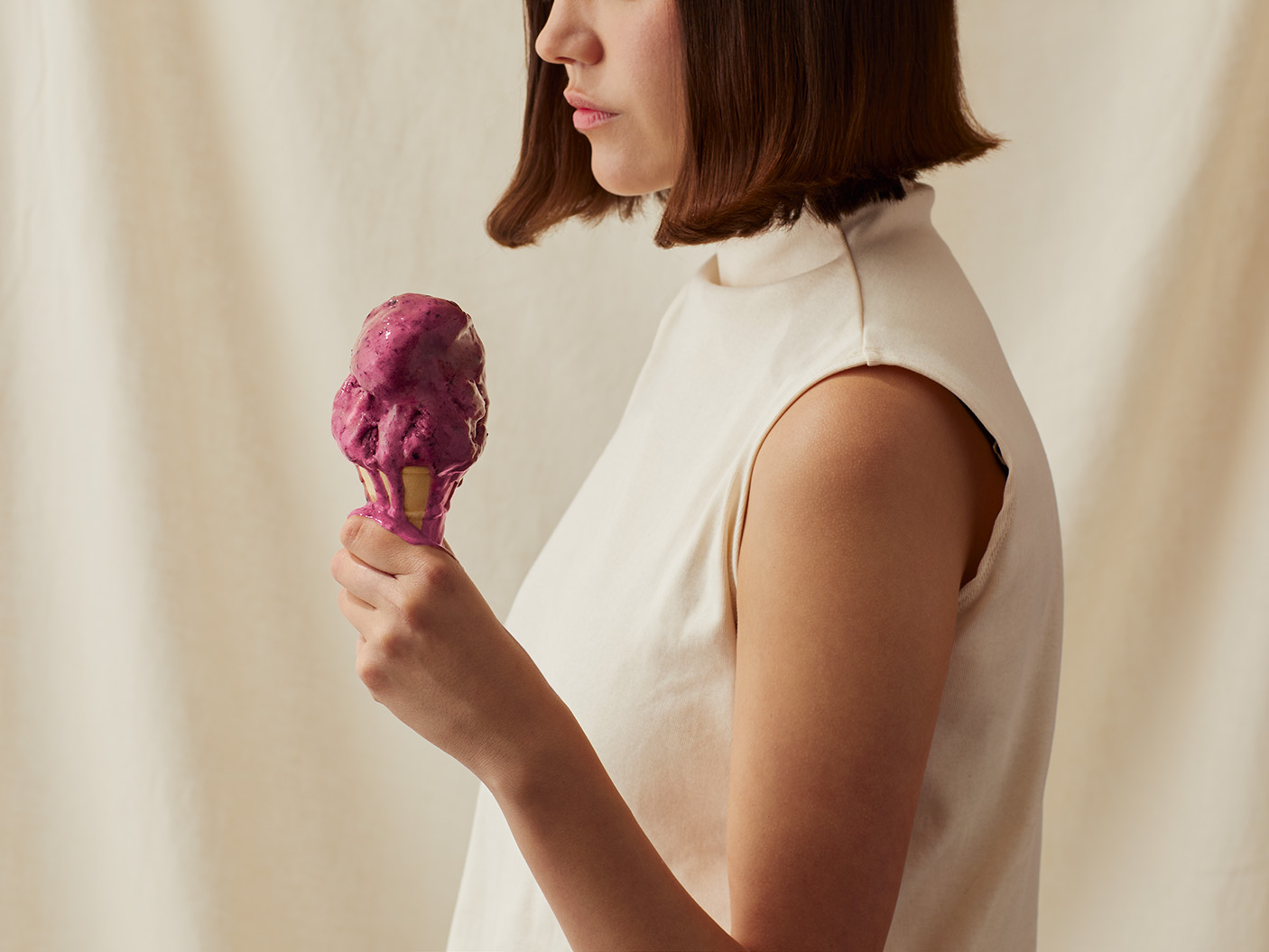
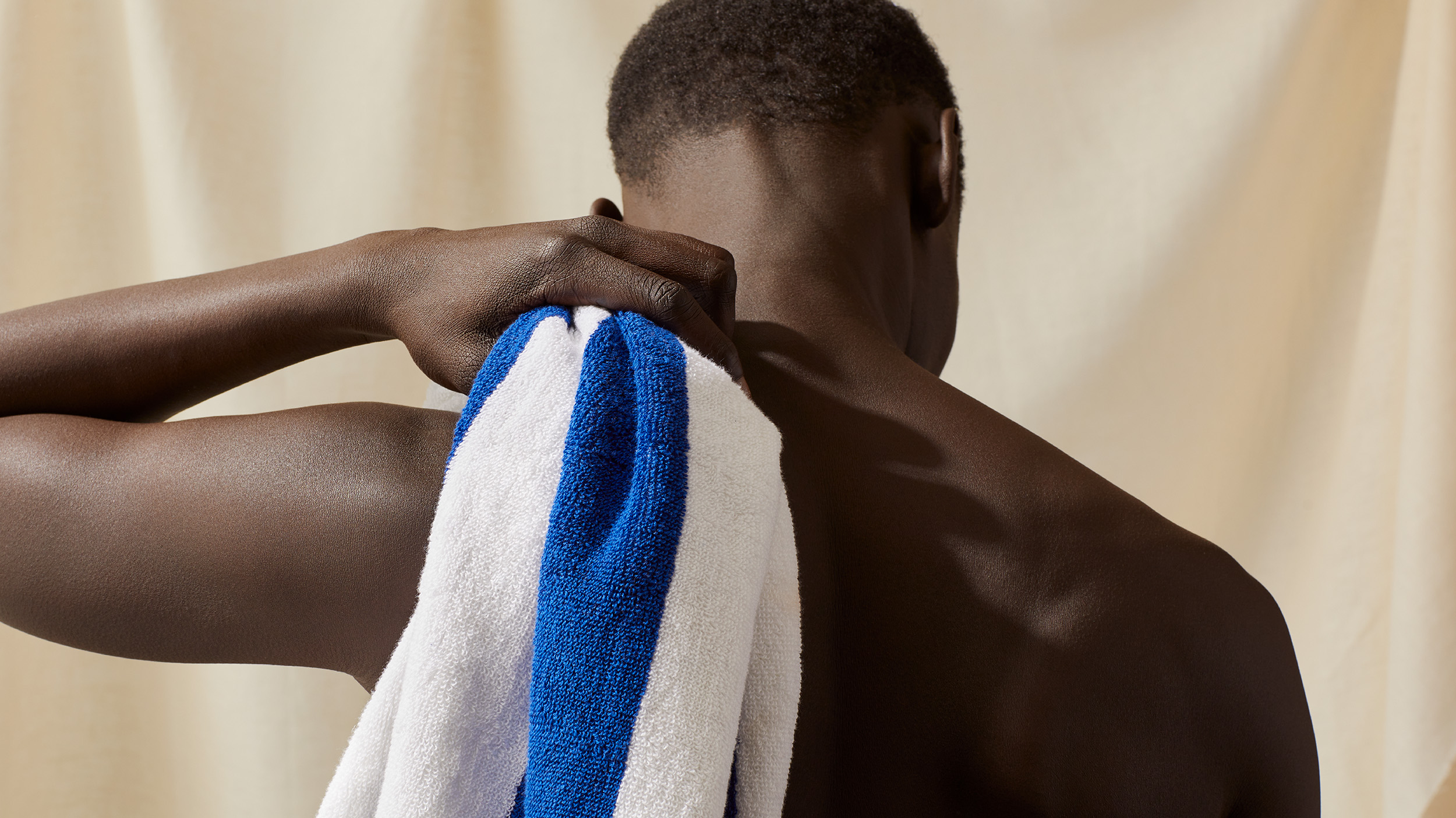
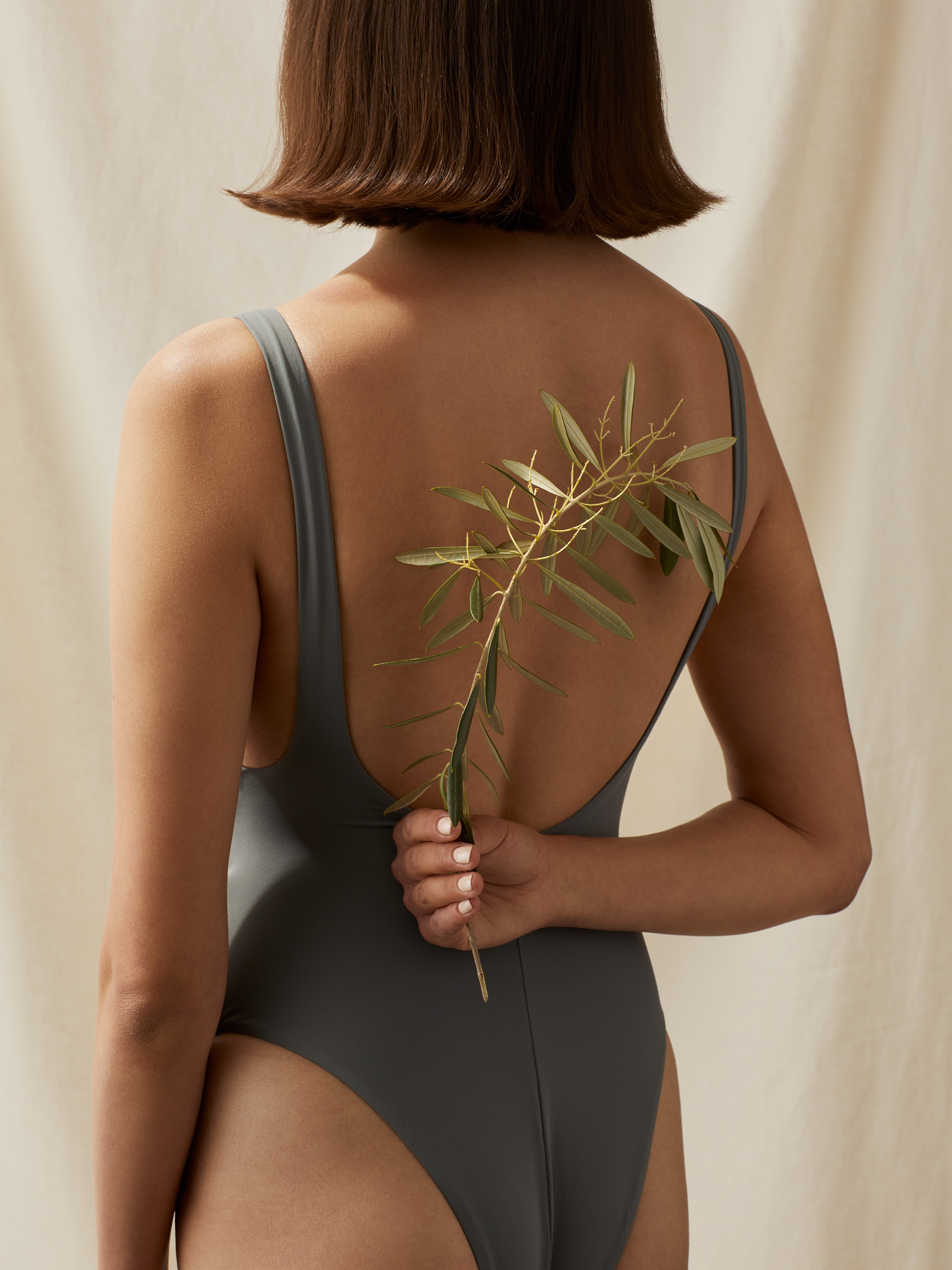
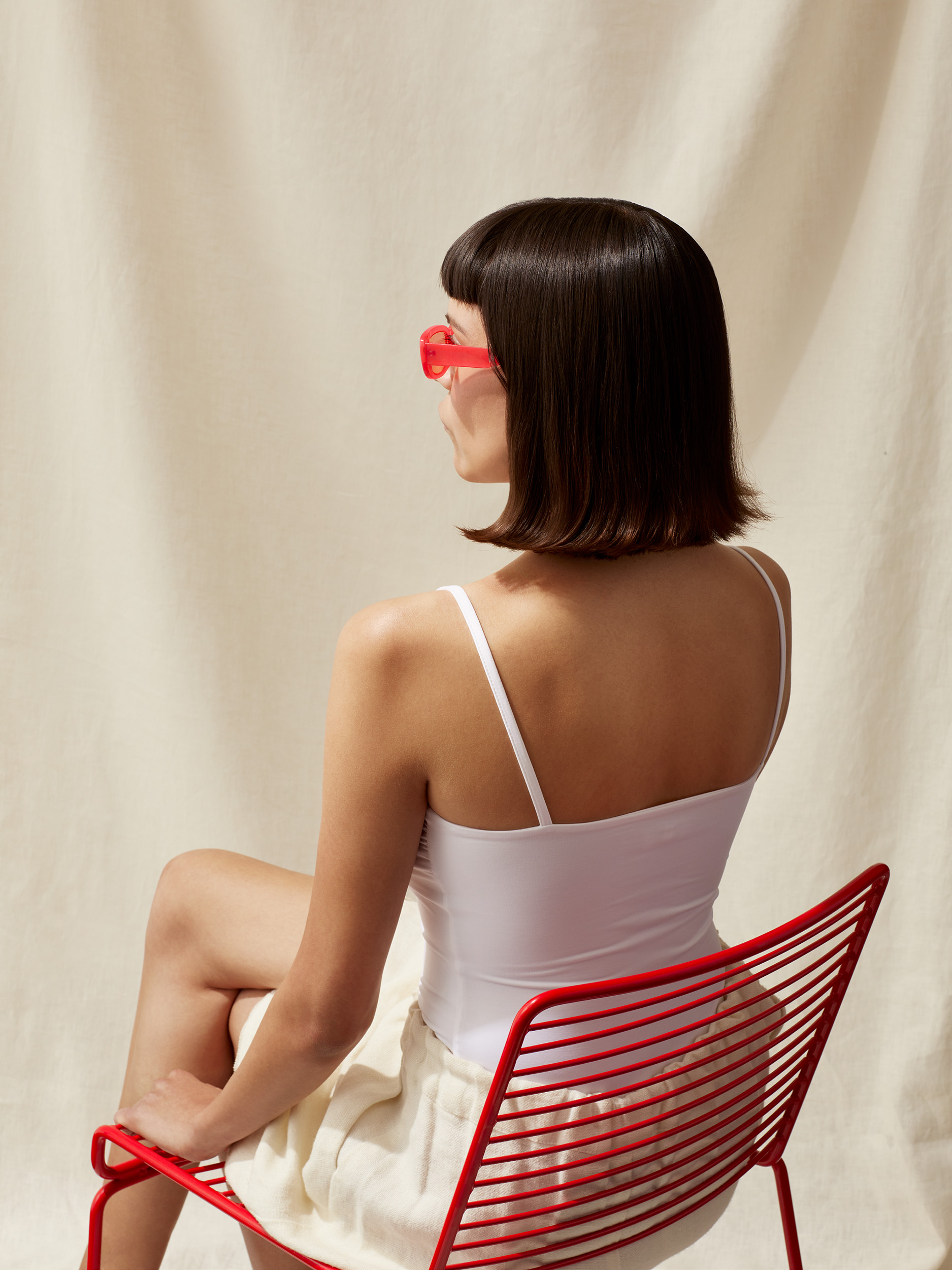
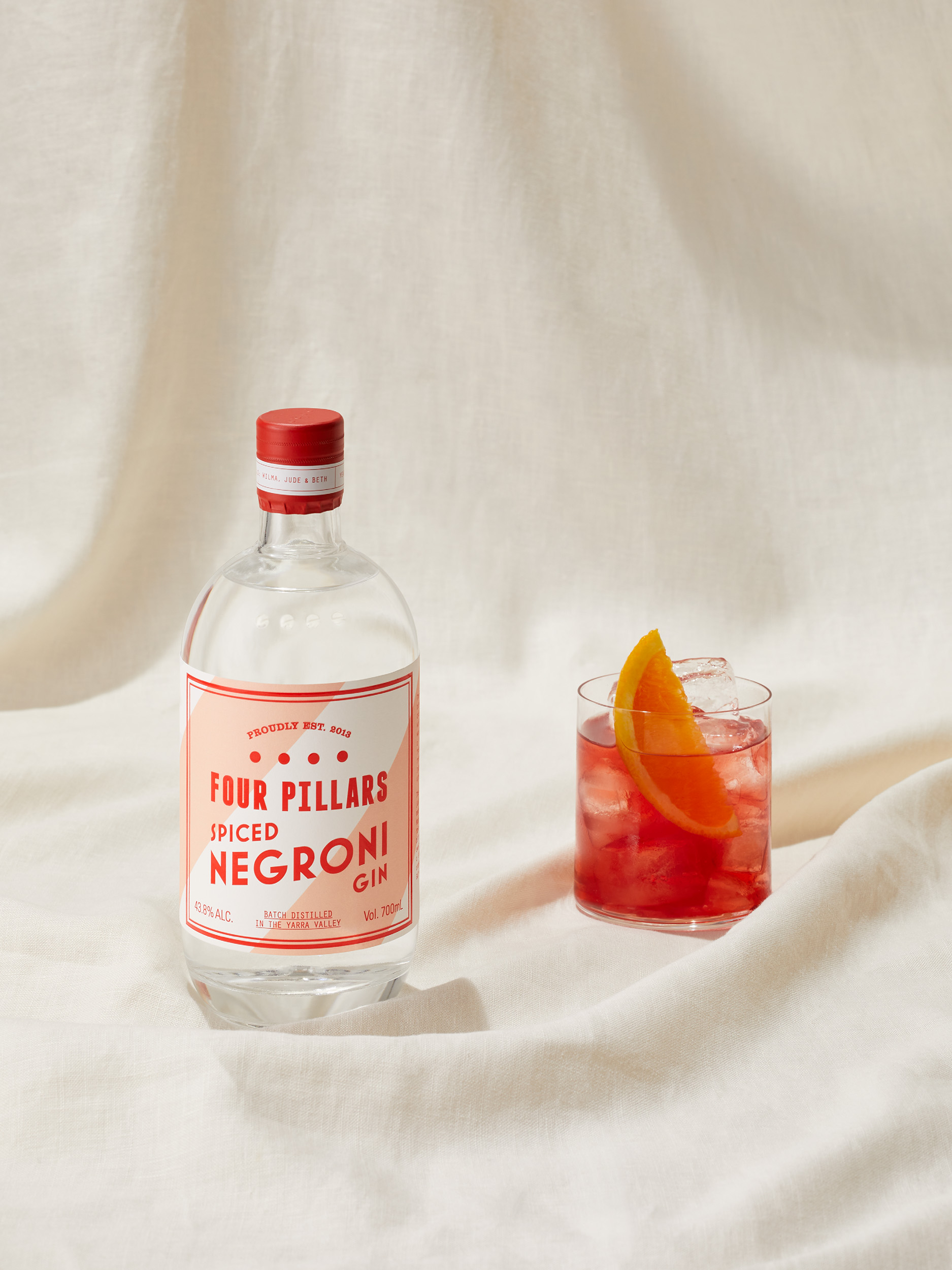
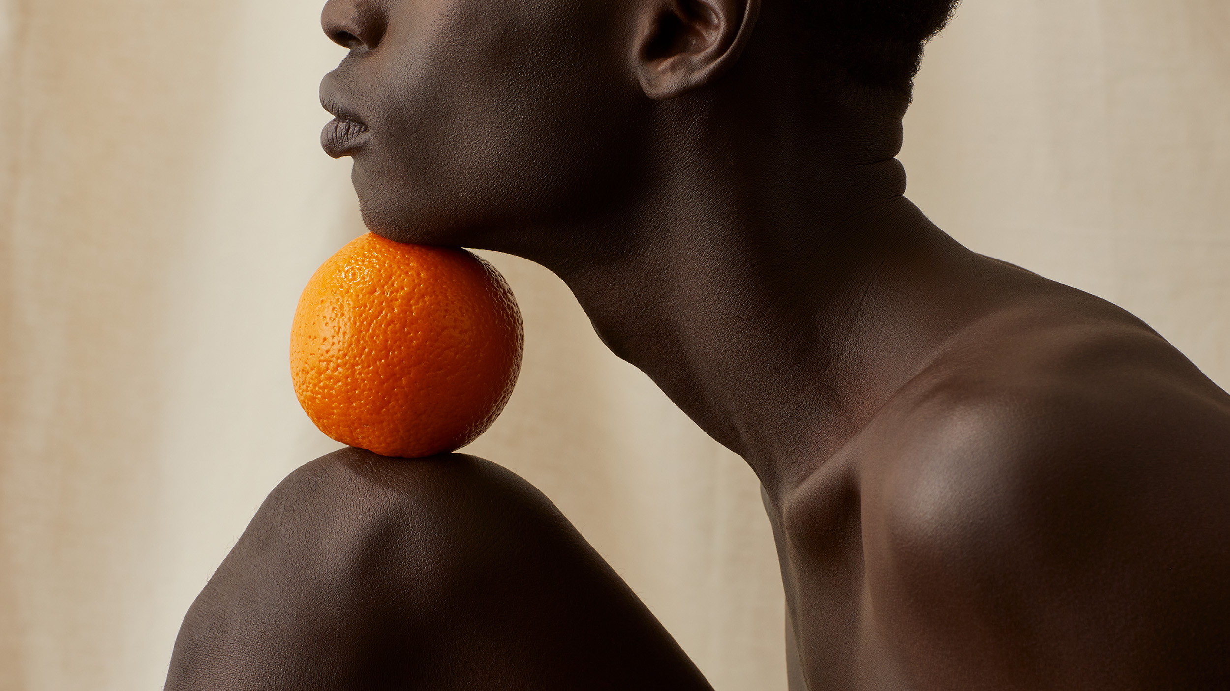
The photographic—and cinematic—component of the campaign aimed to capture the joyfully endless rhythm of our Australian Summers—a world filled with rhythmic, repetitive vignettes that showcased the core gin products in a theatrical summer world. Captured in a stylistically neutral studio environment, the stark background provided the perfect canvas for a vibrant display of contrasting colour brought to life by iconic Australian summer artifacts and moments. A rippling, blue-striped beach towel… a dripping purple ice-cream… a vibrant, juicy orange… bright, red-rimmed sunglasses… each item perfectly complemented a refreshing gin and delicious gin cocktail. The effect was a beautiful and cohesive fusion of colours and sensations, instantly transporting the viewer into a summer state of mind.
Due to the ongoing effects of the pandemic, the campaign was designed for digital consumption, with the hypnotic and mesmerizing movement of the film drawing viewers in. The typography was equally hypnotic, featuring carefully crafted serif type, rolling vertically counter to the horizontal footage, creating a never-ending mesmerising wallpaper effect.
Despite the emphasis on motion, the visual art direction and unique design composition translated seamlessly to a short-run of OOH posters. The dynamic layout captured the energy and beauty of the concept and showcased the campaign's rhythmic quality, despite this static application.
In a time of pandemic uncertainty, this campaign captured the un-dimmable joy and excitement of summer in Australia, with its endless days and moments of dazzling colour. From the rippling beach towels to the dripping ice-cream, the campaign was a celebration of all the things that make an Australian summer inimitable.
A summer like no other
The result was heady, kinetic, and—importantly—felt like no other gin brand. The resulting campaign felt less like traditional advertising and more like a kinetic art installation, celebrating the Four Pillars masterbrand and capturing both the unique vibe of an Australian Summer and the distinct personalities of each of the five core Four Pillars gin products - resulting in an overall sales uptake across VIC, NSW and QLD across all products leading with Rare Dry Gin and Bloody Shiraz Gin, those two of which had greater media spend and push behind the assets.
Scope:
- Campaign Creative
- Campaign Strategy
- Photography & Art Direction
- Graphic Design
- Photography
- Styling
- Film Production
- Animation
- Motion Design
- Sound Design
- Finished Art
- Management & Production
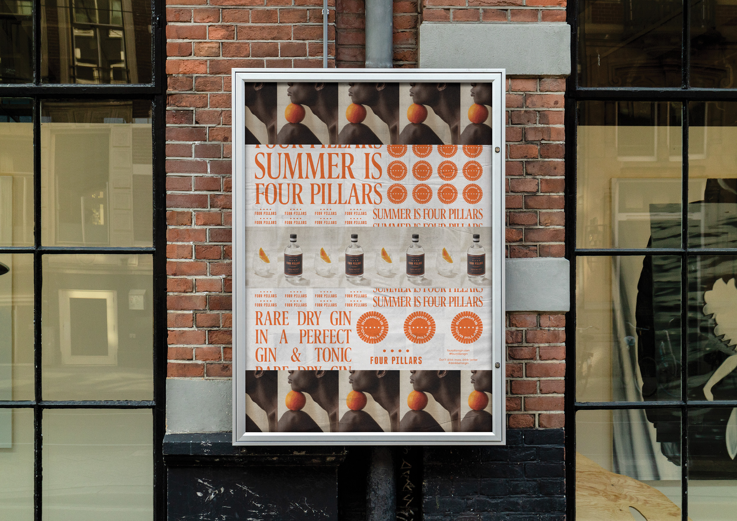
The campaign was unified through the use of a mark — a versatile and kinetic, roundel graphic, representative of the summer sun. The outer edge of the mark consists of all the various label colours of Four Pillars core range gins creating a playful kaleidoscope of colour. In addition to campaign content, this mark was used across a wide range of summer merch.