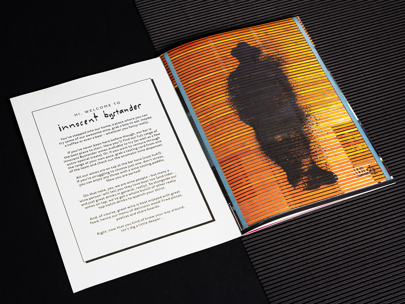
Innocent Bystander
In an industry that often takes itself far too seriously, Yarra Valley winemaker Innocent Bystander cemented a reputation for bringing the entire wine experience back down to earth, making it less complicated, less lofty, and ultimately more enjoyable. But the brand was entering a new era. With a shiny new home in an industrial warehouse space in Healesville, Innocent Bystander needed to go beyond the label to create a contemporary experience; rejecting your typical wine region clichés to instead bring a slice of urban edge to the Yarra Valley community. All whilst maintaining its important place in the hearts of locals. No pressure…
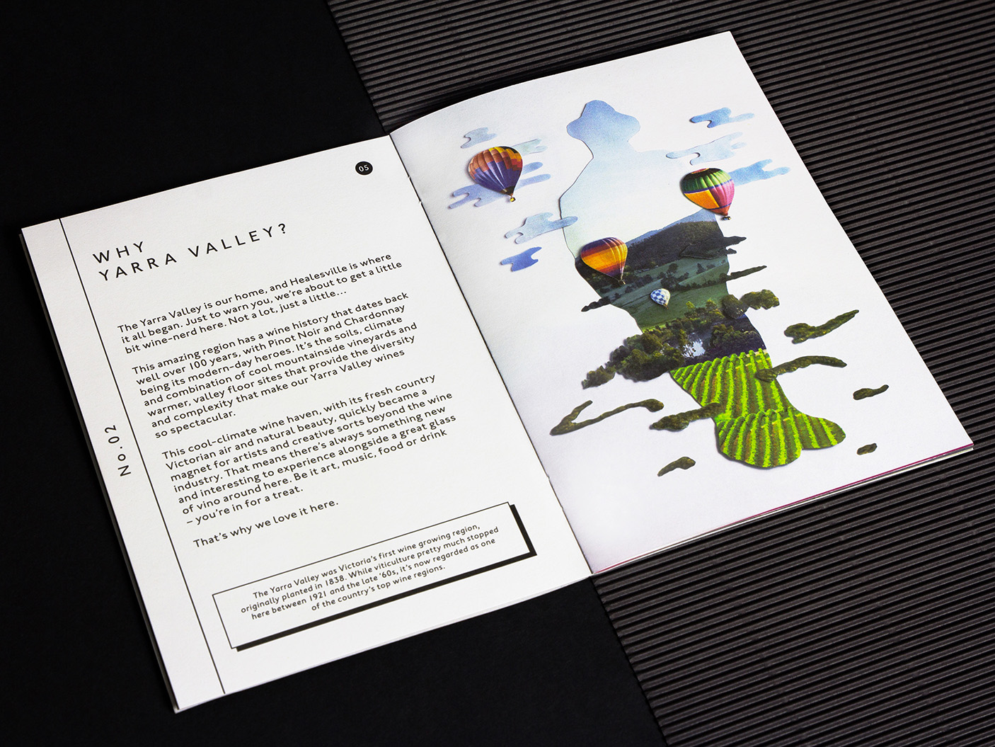
Innocent Bystander brought legacy with it. The original venue had been a small but loved local watering hole and tourist draw-card since 2006. Our challenge was to mould this meaningfully into a complete identity with a flexible brand system, and evolve it for a physical space — an industrial warehouse, formerly the home of White Rabbit Brewery.
The ‘watering hole’ concept was the seed that grew. Innocent Bystander had naturally evolved and taken shape with little-to-no story of its own to begin with. It was, at this point, a product of its community. It was a reflection of a wine making (and drinking) attitude that has for so long defined Healesville at a grass roots level.
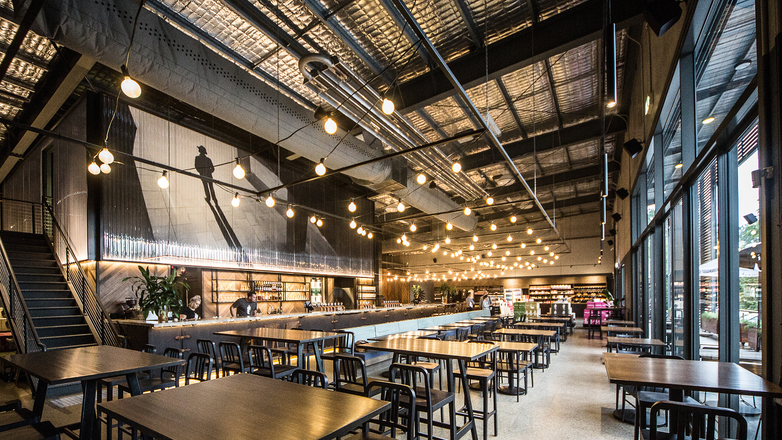
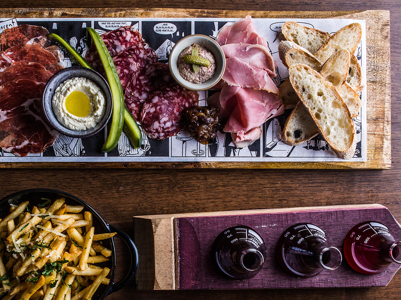
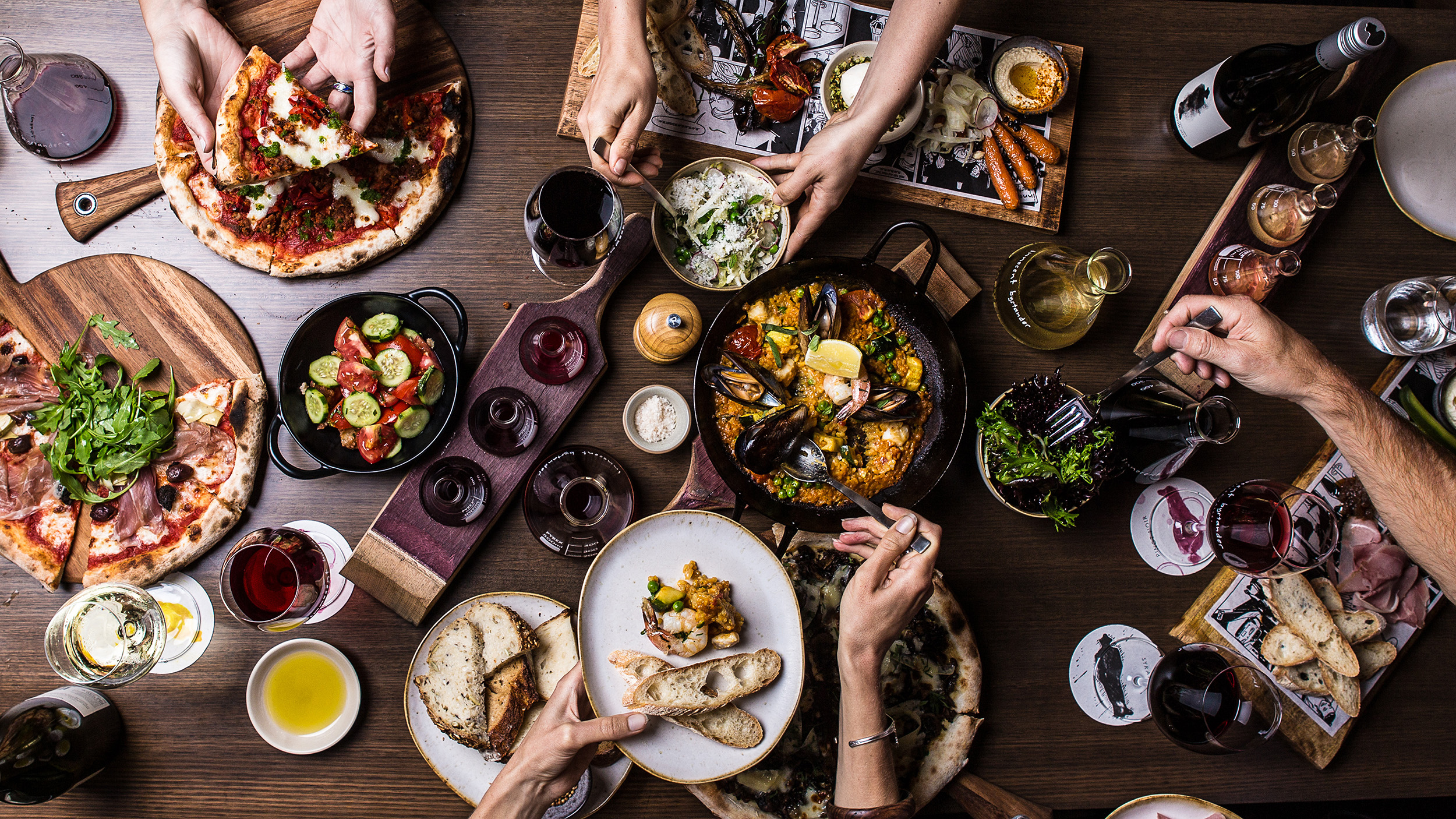
The core idea for this scope? A wine experience that felt like a craft brewery experience. One that was relaxed, casual and friendly. And, as a result, in contrast to the rest of the wine industry. This top line concept informed the entire development of the visual and verbal brand: wine poured off beer taps, large communal tables for share platters and loud conversations, industrial textures with warm lighting, and thoughtful (and sometimes, refreshingly silly) design notes for discovering.
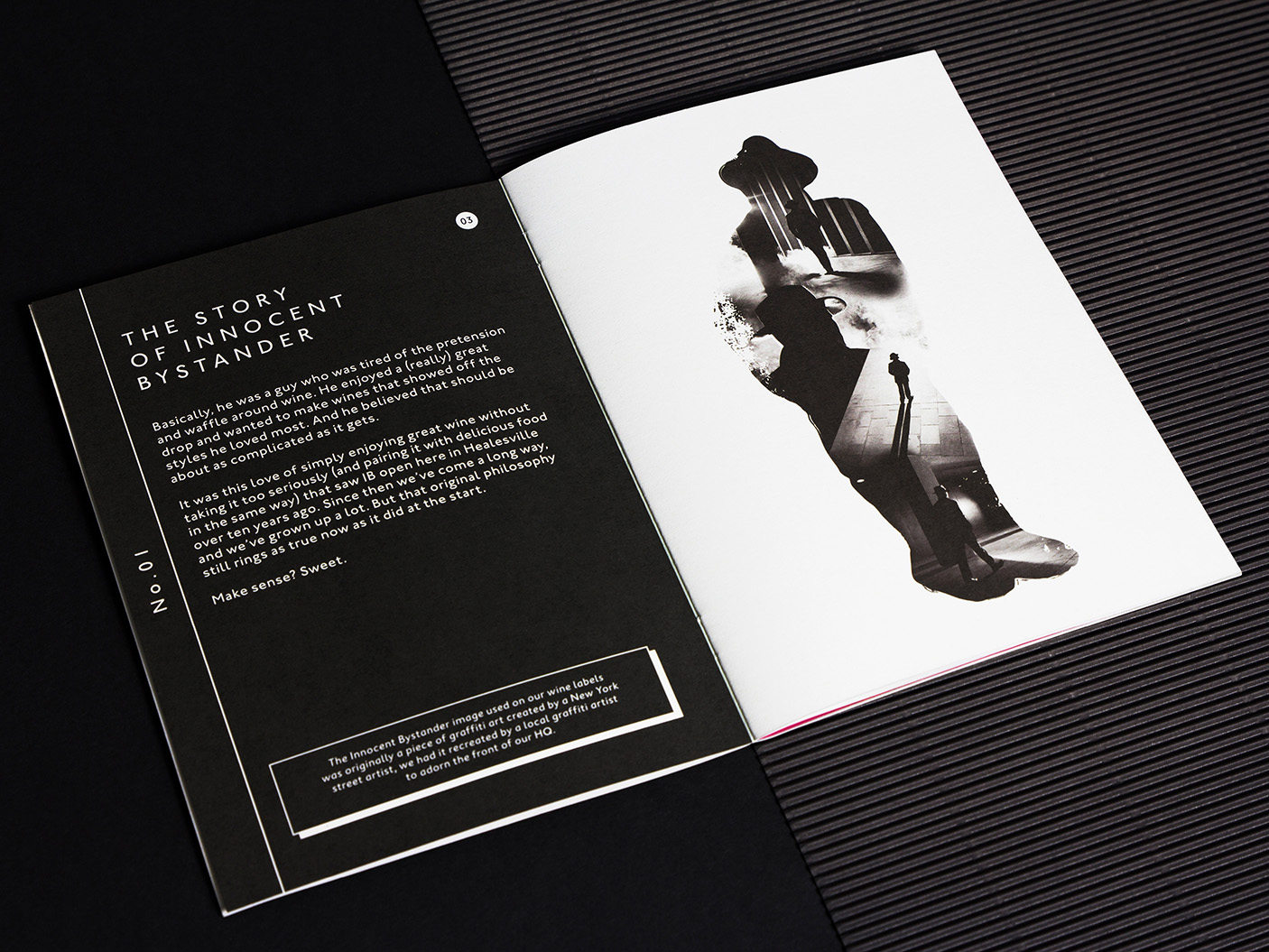
The myth behind the man
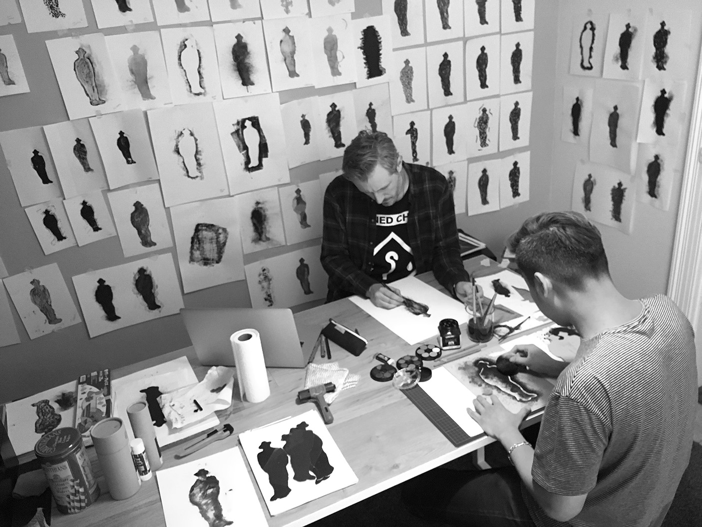
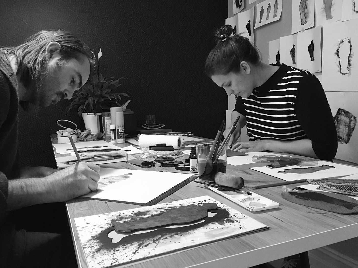
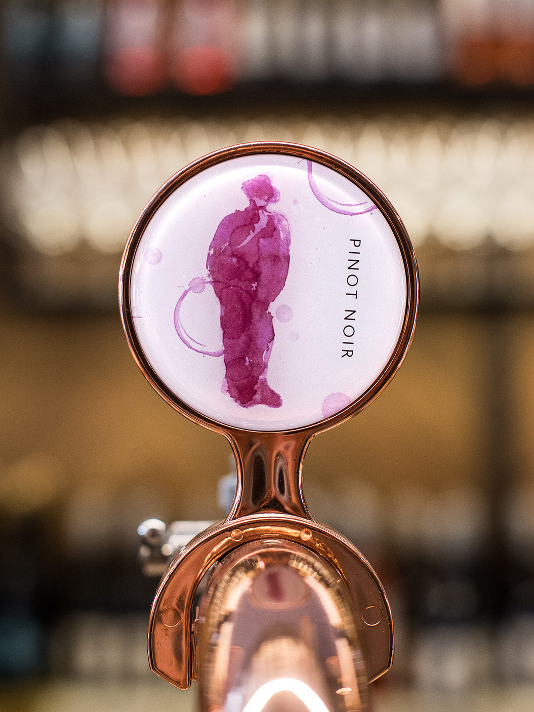
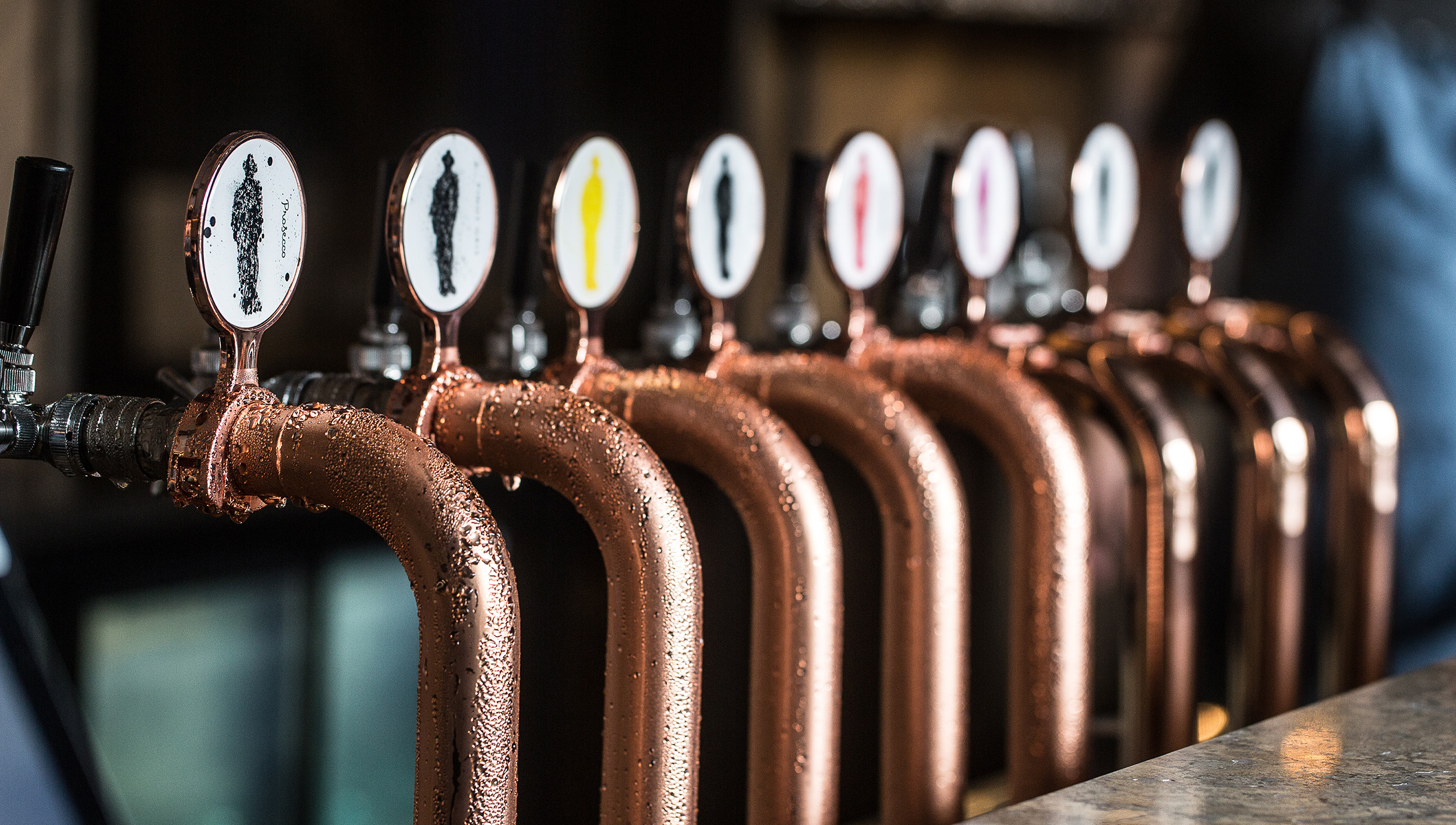
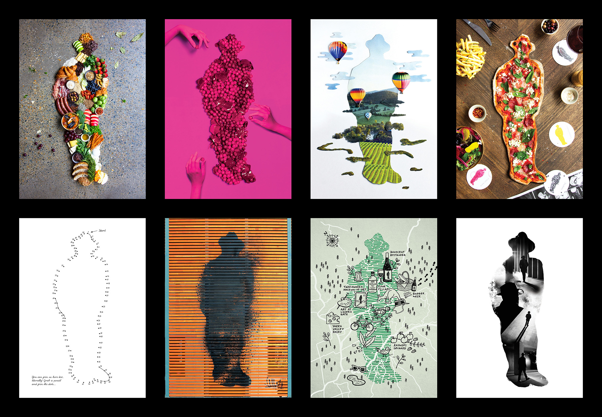
Innocent Bystander came with a single brand asset: The IB Man. This icon’s origin was largely unknown…or forgotten…or (likely) just never existed. He was a mystery, but he was also the anchor point for our entire brand story.
The IB Man became the brand’s anti-hero. Anti-jargon. Anti-pretention. Anti-BS. He enjoyed making, drinking and sharing great wine. And that, he believed, is as complicated as it should get. With undefinable features, hidden in the shadows, he remains an Innocent Bystander away from the trends and unspoken rules of a wine industry gone swirl-mad. An ode to doing what you love, but never (ever) taking it too seriously.
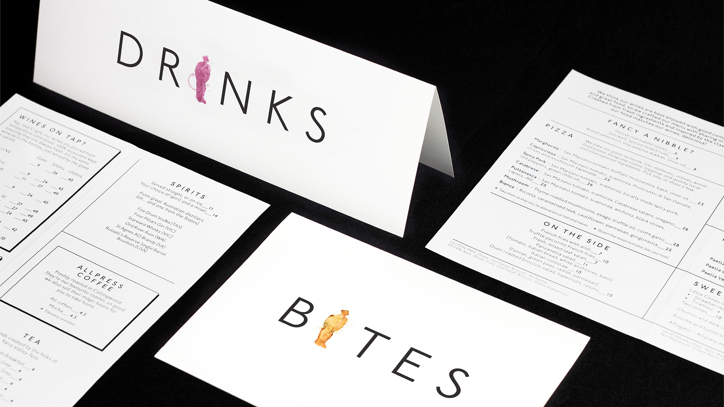
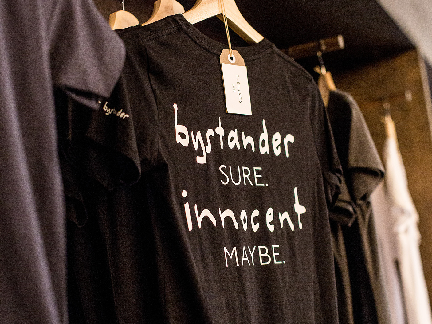
This core anti-hero narrative naturally informed the brand’s attitude and tone of voice. With language a common offender in creating barriers to the wine industry, Innocent Bystander had to be irreverent, and super straight forward. This tone of voice had to ensure that a sense of being welcome could never be lost to jargon, flowery language or excessive detail. The new brand language was implemented throughout every touch point – physical and digital. From signage, to wine tasting notes, to menus, information booklets, merchandise, website and social media.
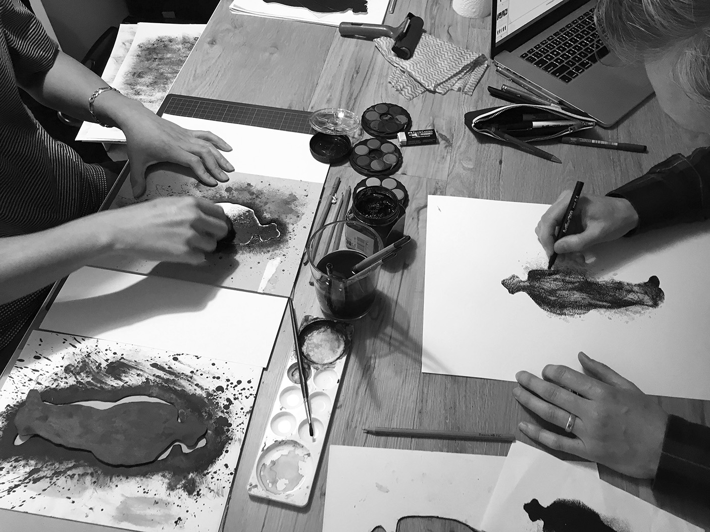
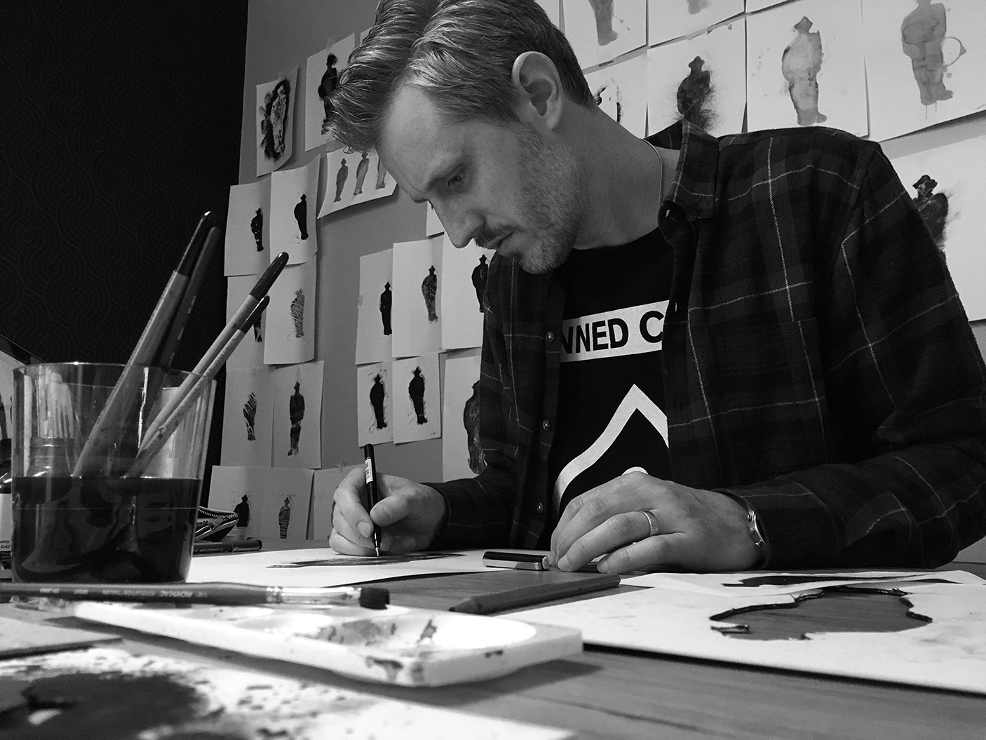
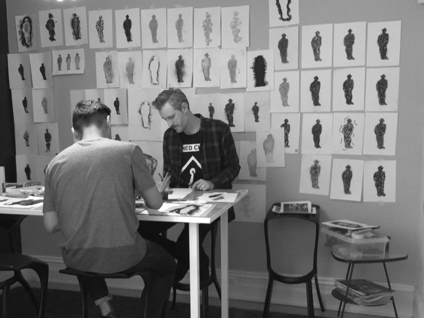
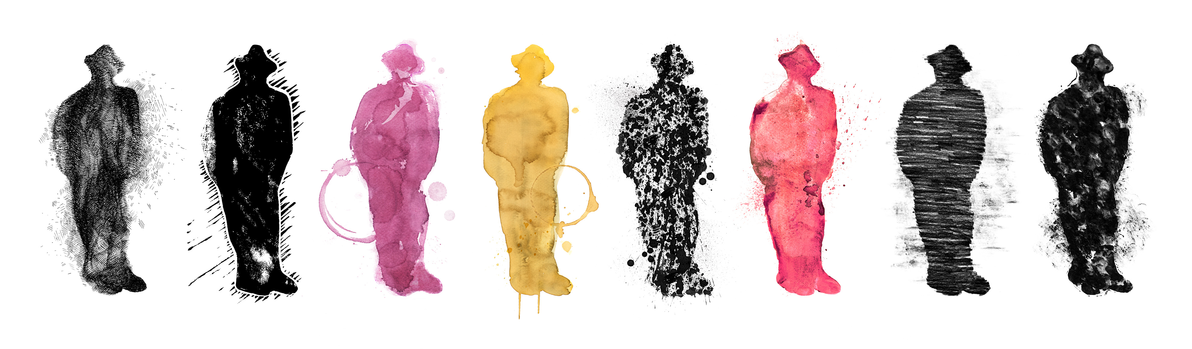
Bringing the figure to life
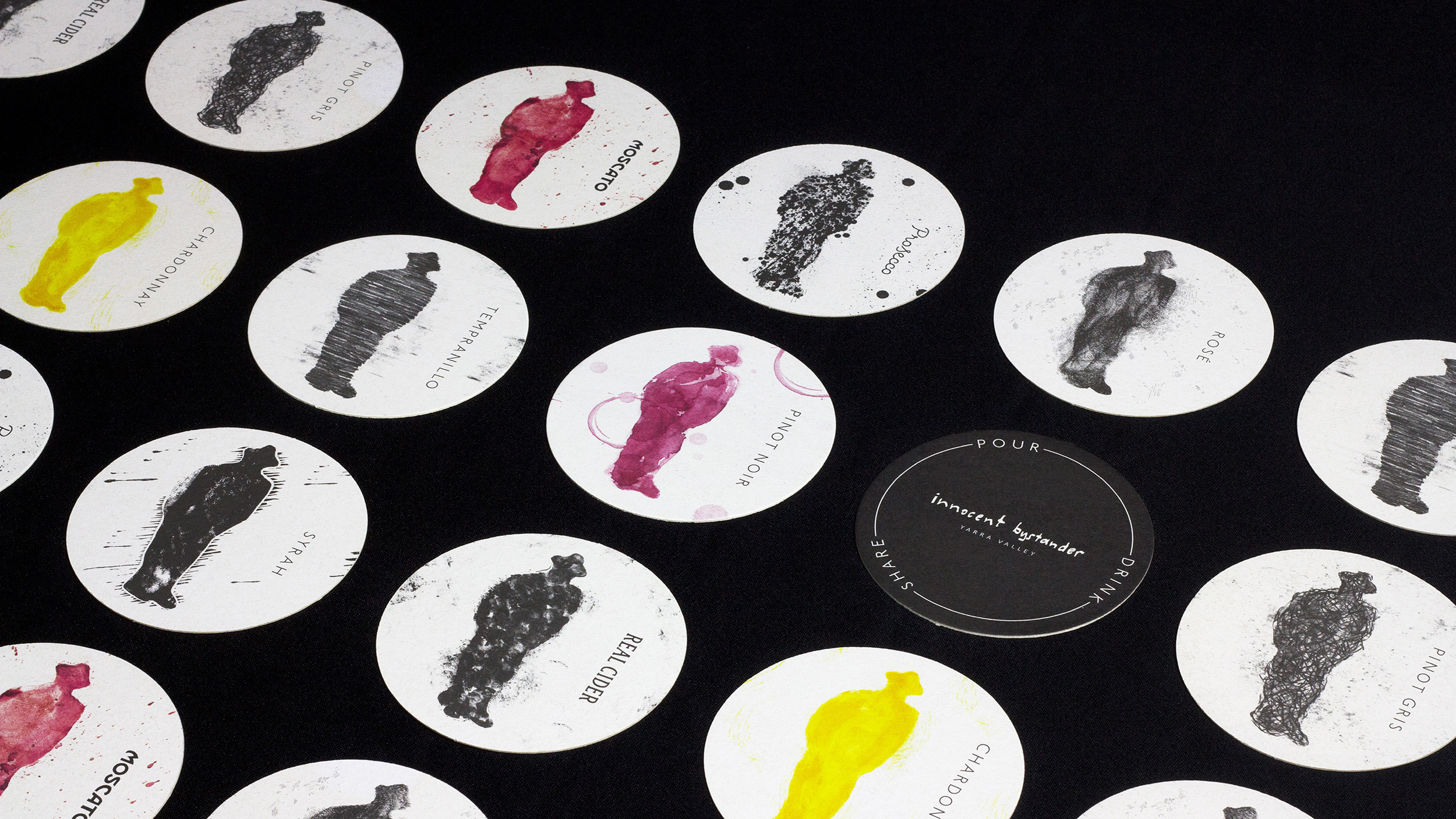
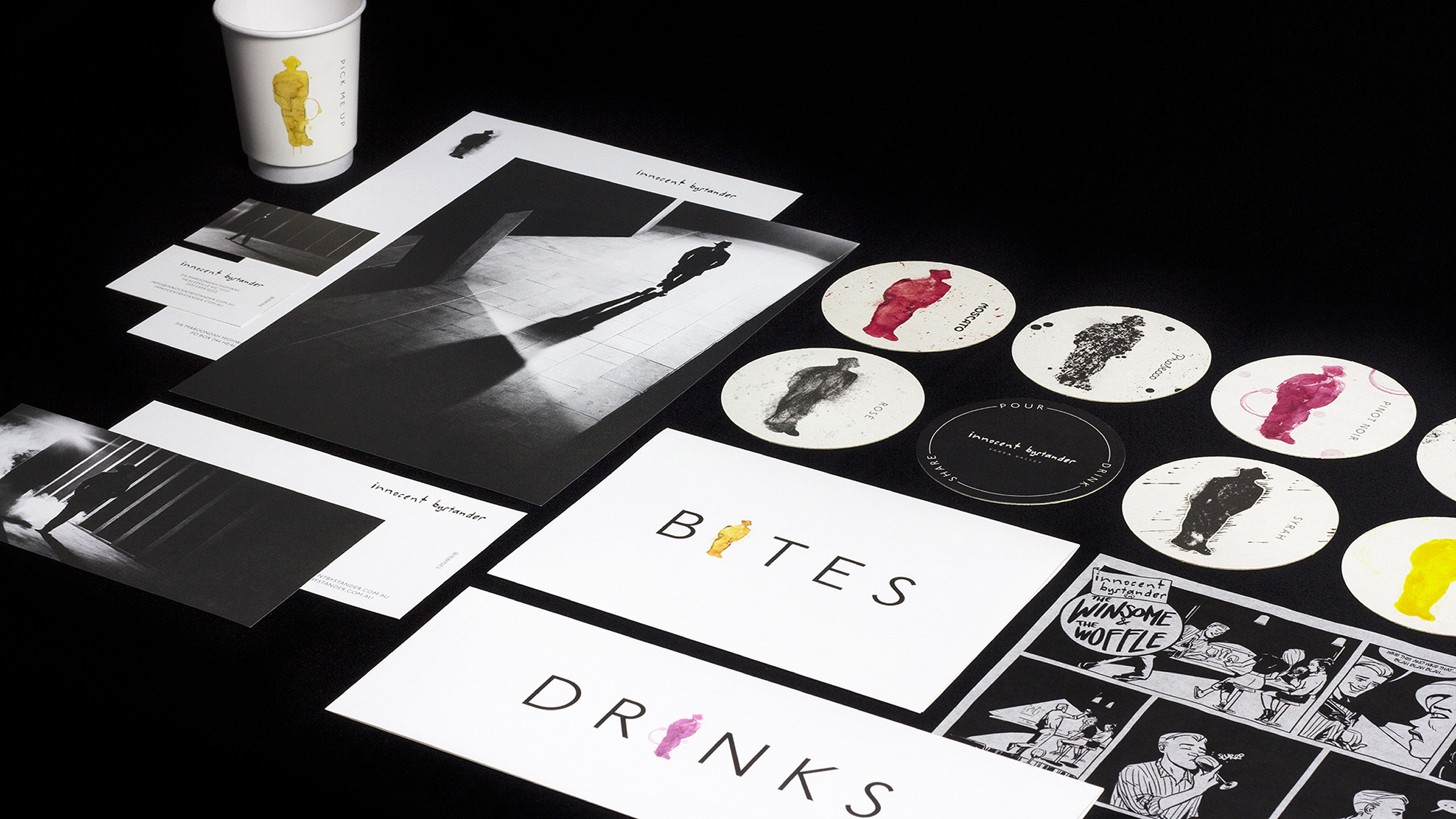
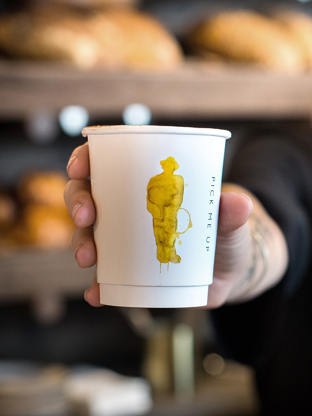
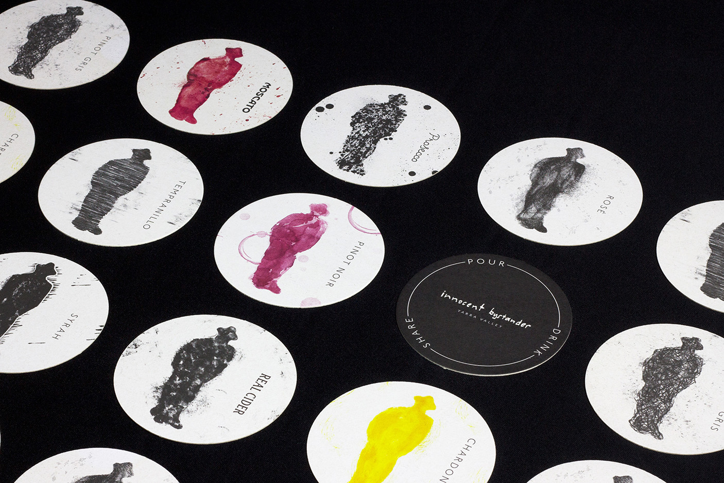
To inject a sense of energy, colour and flexibility into the brand’s visual identity, a library of IB Man artworks was created, employing gritty and organic textures. Each individually hand-crafted variation utilised a different print making technique: watercolour, linocut, graphite pencil, drafting ink – even wine and coffee stains! These variations were then used across brand touch points, from coffee cups, drinks menus, POS, merchandise, uniforms and more.
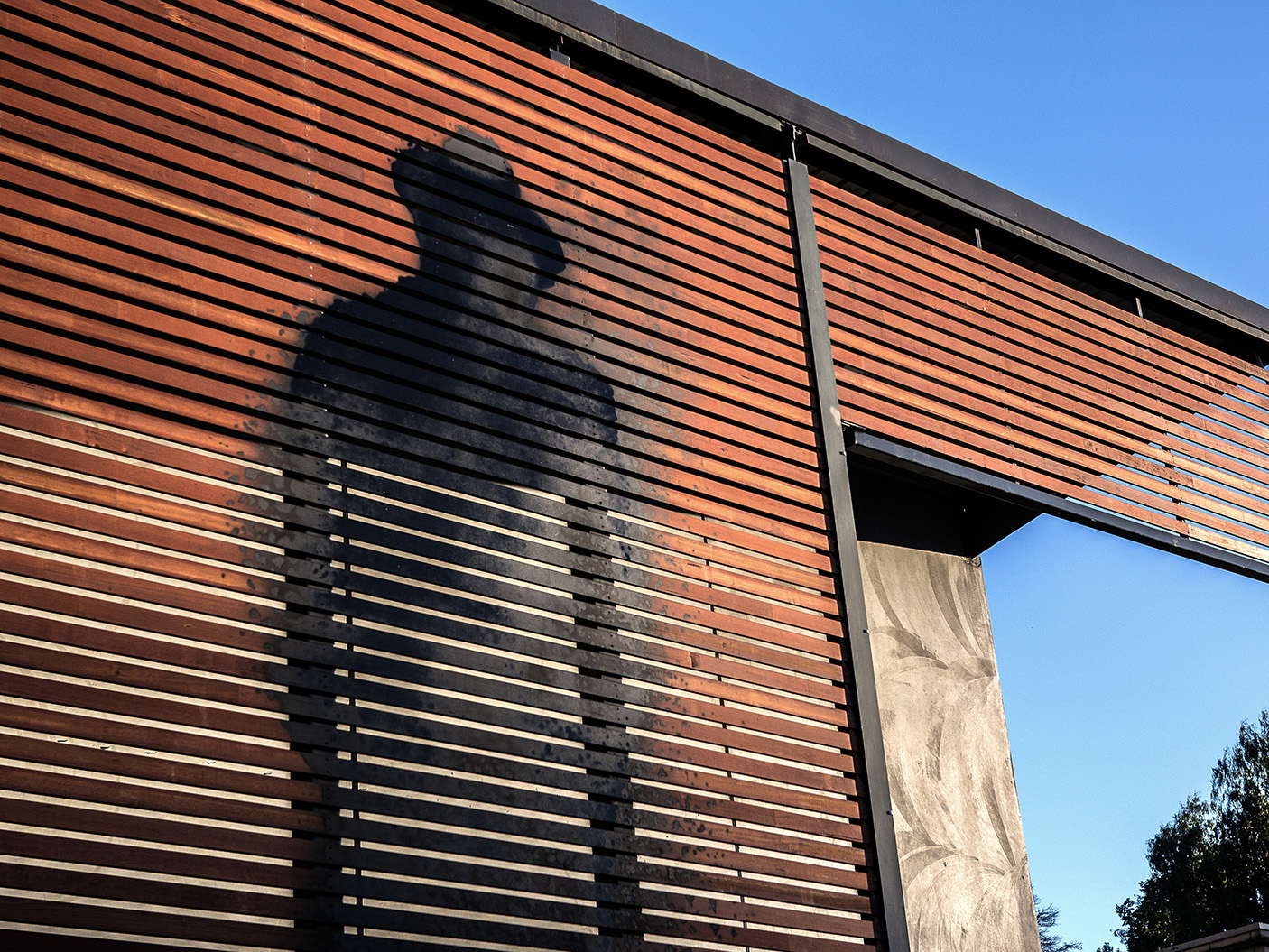
Pushing this concept even further (and much bigger) a local artist was commissioned to spray the iconic silhouette onto the front of the building. Viewable from the main street, the artwork is yet again an example of a modern wine brand, being bold and pushing against the category norms of what a winery should look like. Modern, unapologetic, unexpected and fun.
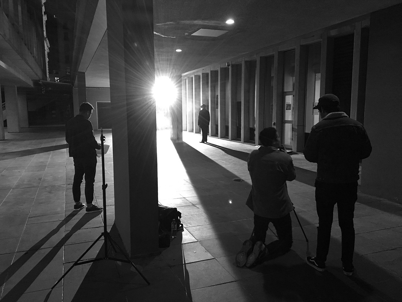
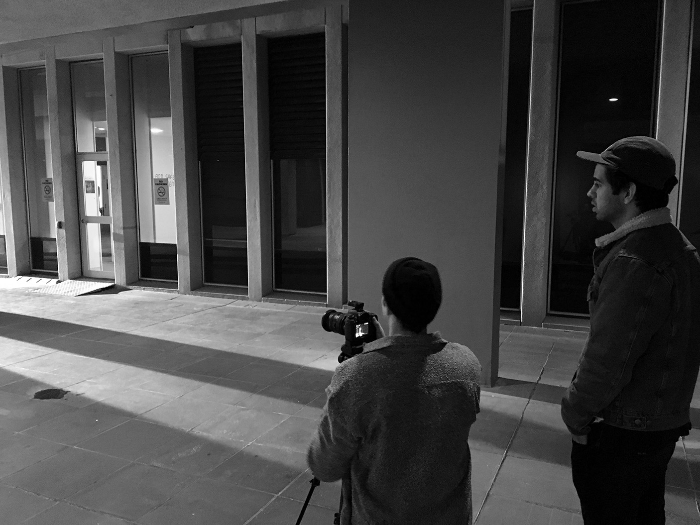
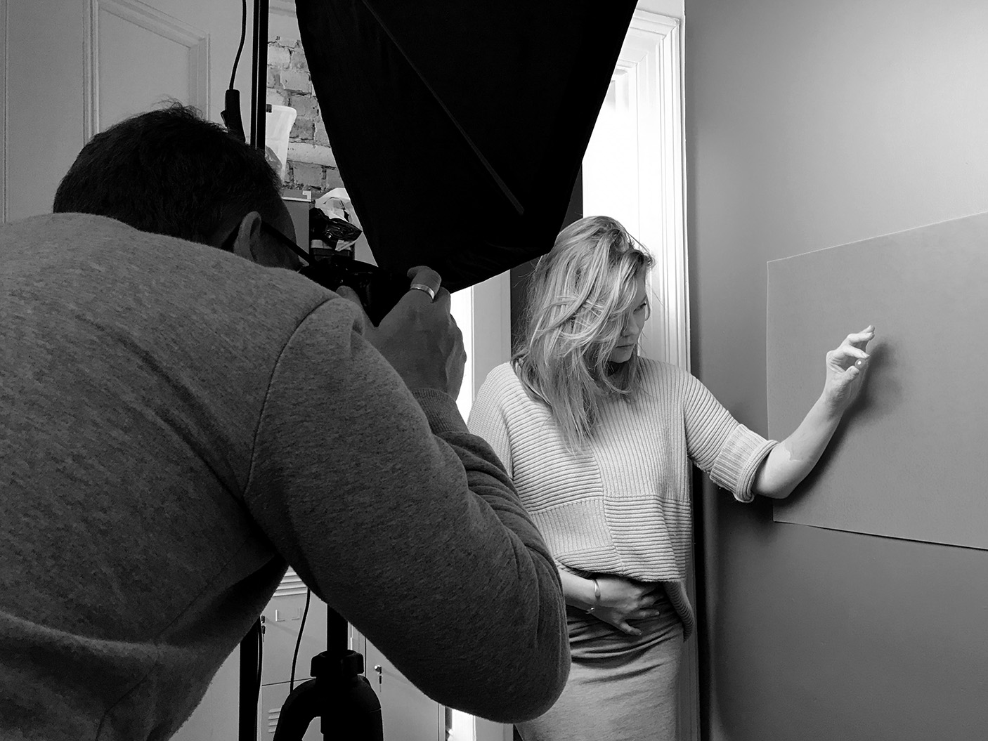
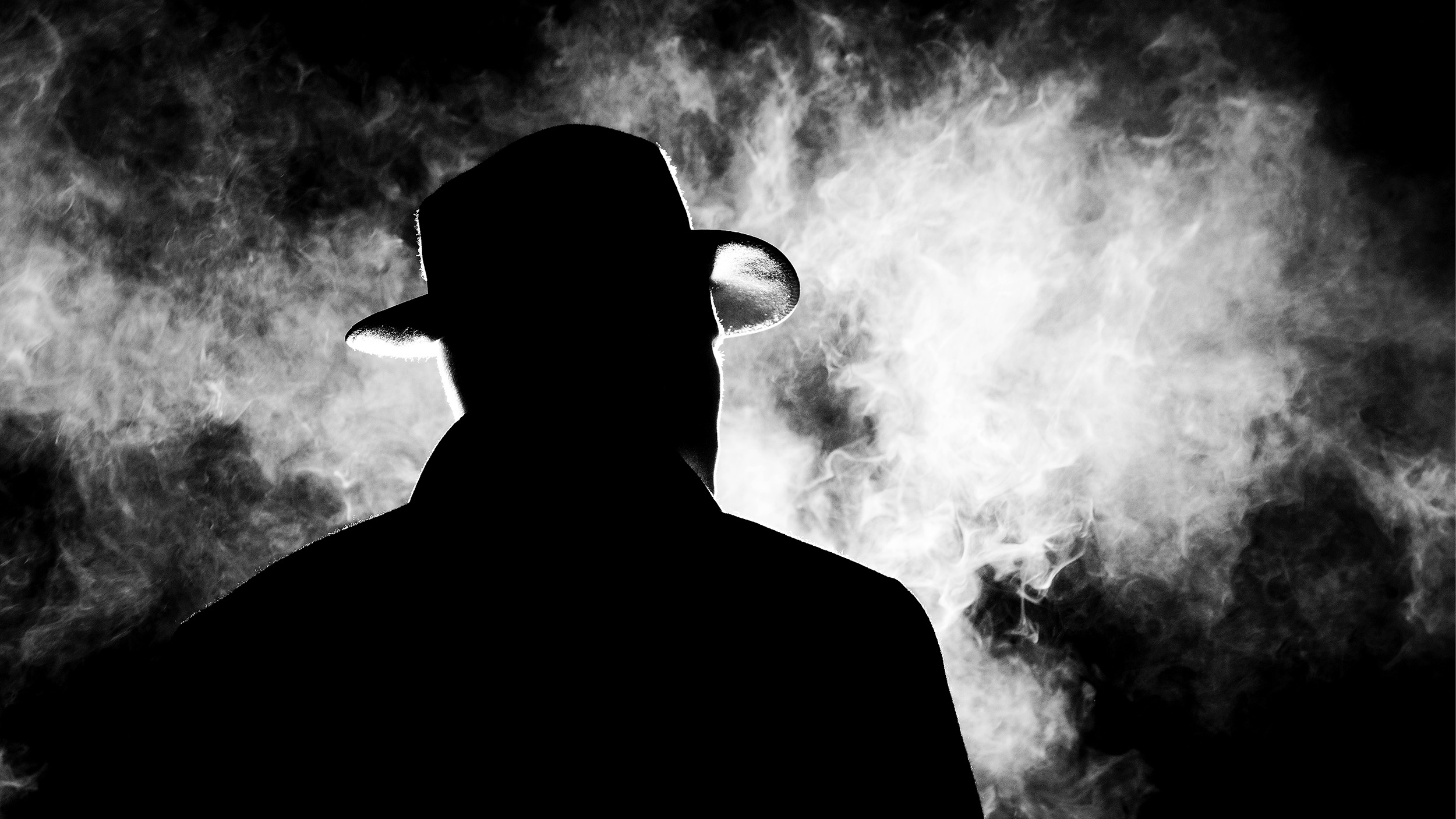
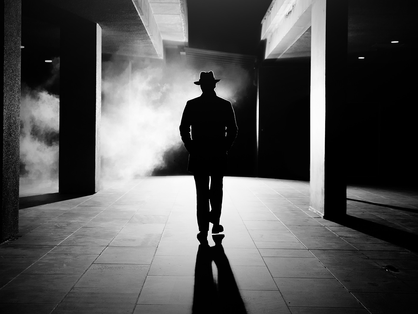
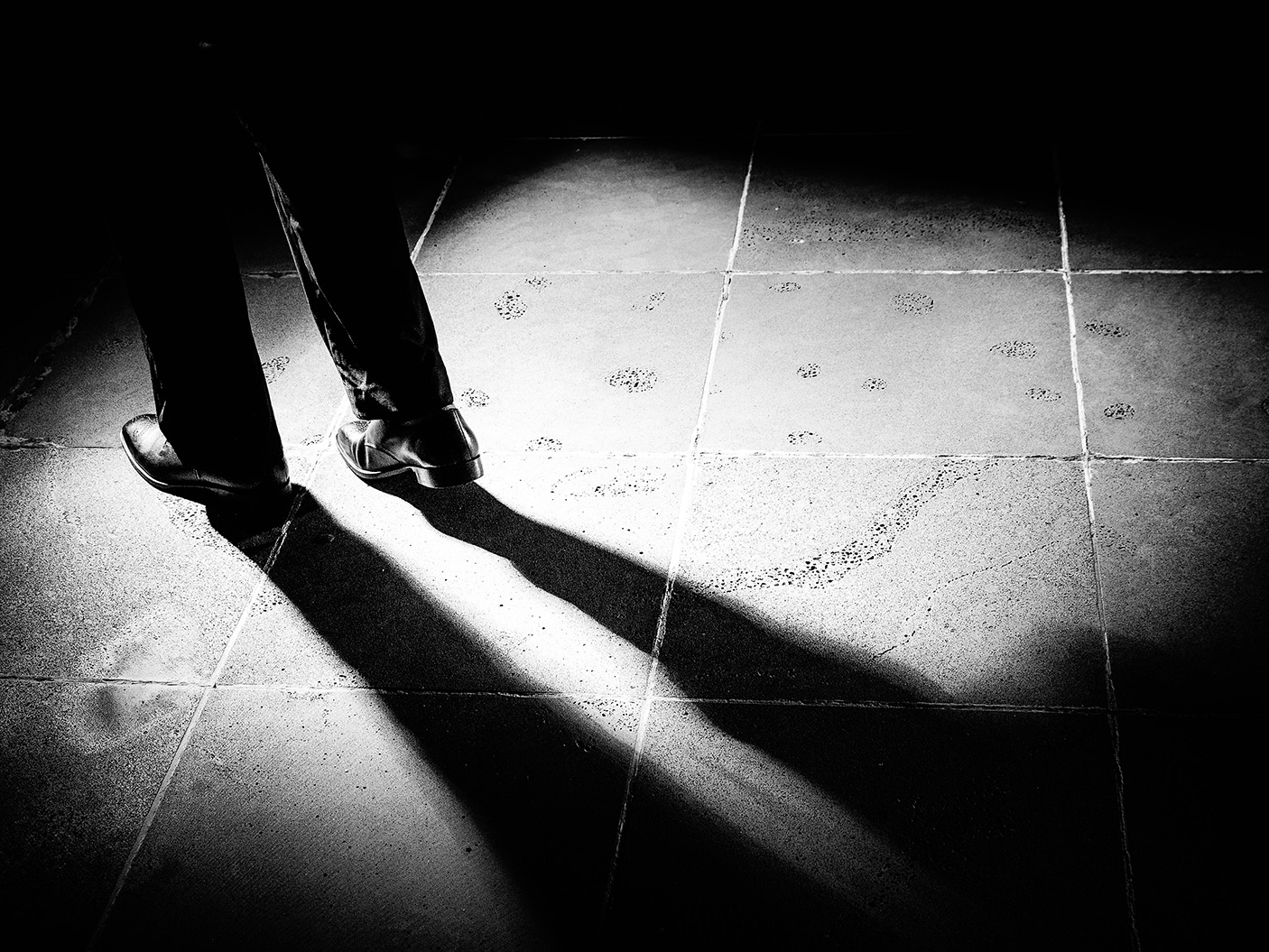
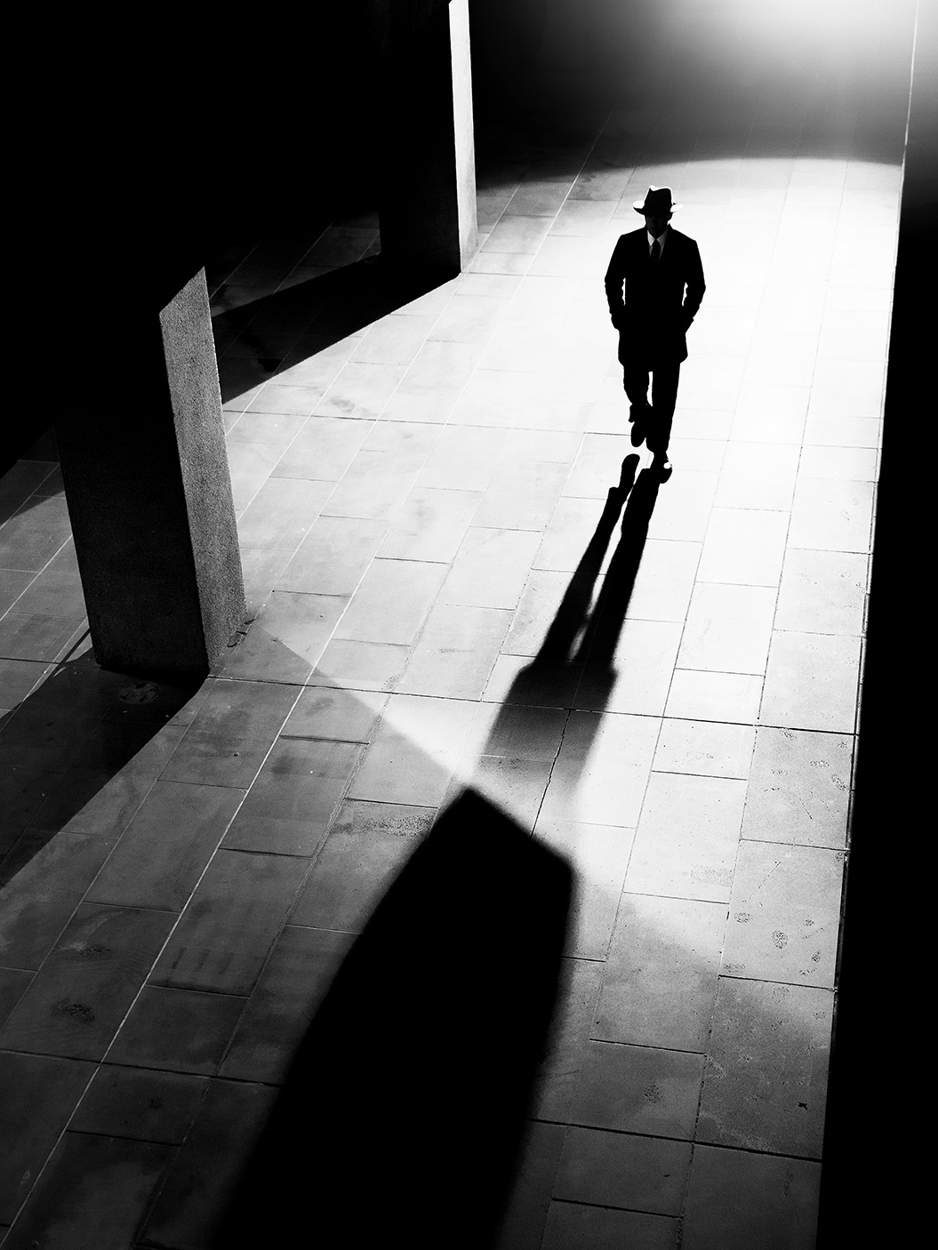
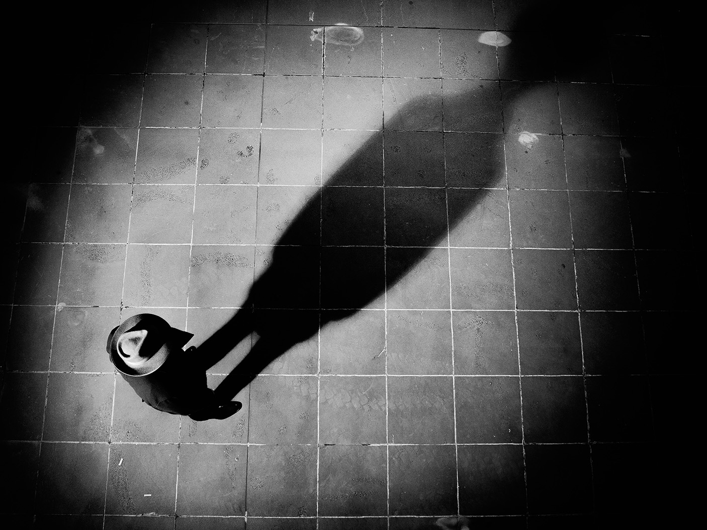
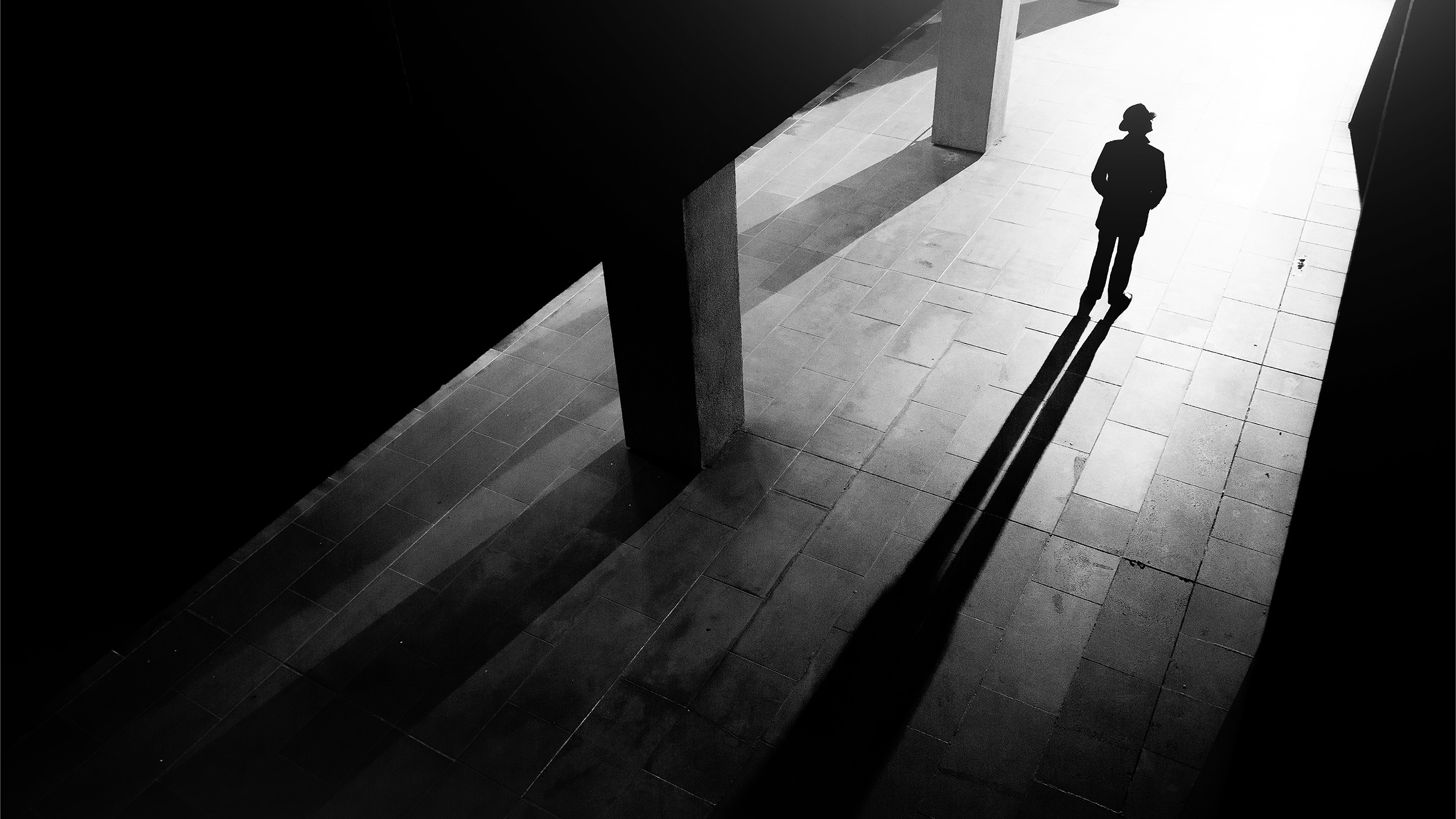
Mysterious characters (Lifestyle photography)
The simplicity of the original IB Man design meant the potential for how we could creatively reimagine him was somewhat boundless. The further we could push it, the more depth we could build into this Innocent Bystander mythology. The further we could push it, the more we could showcase the flexibility of this brand beyond the industry standard.
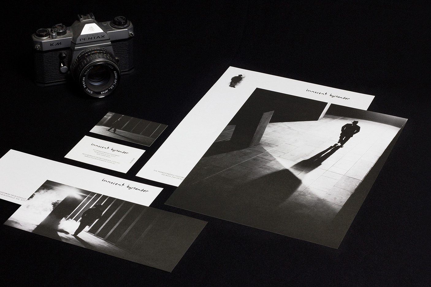
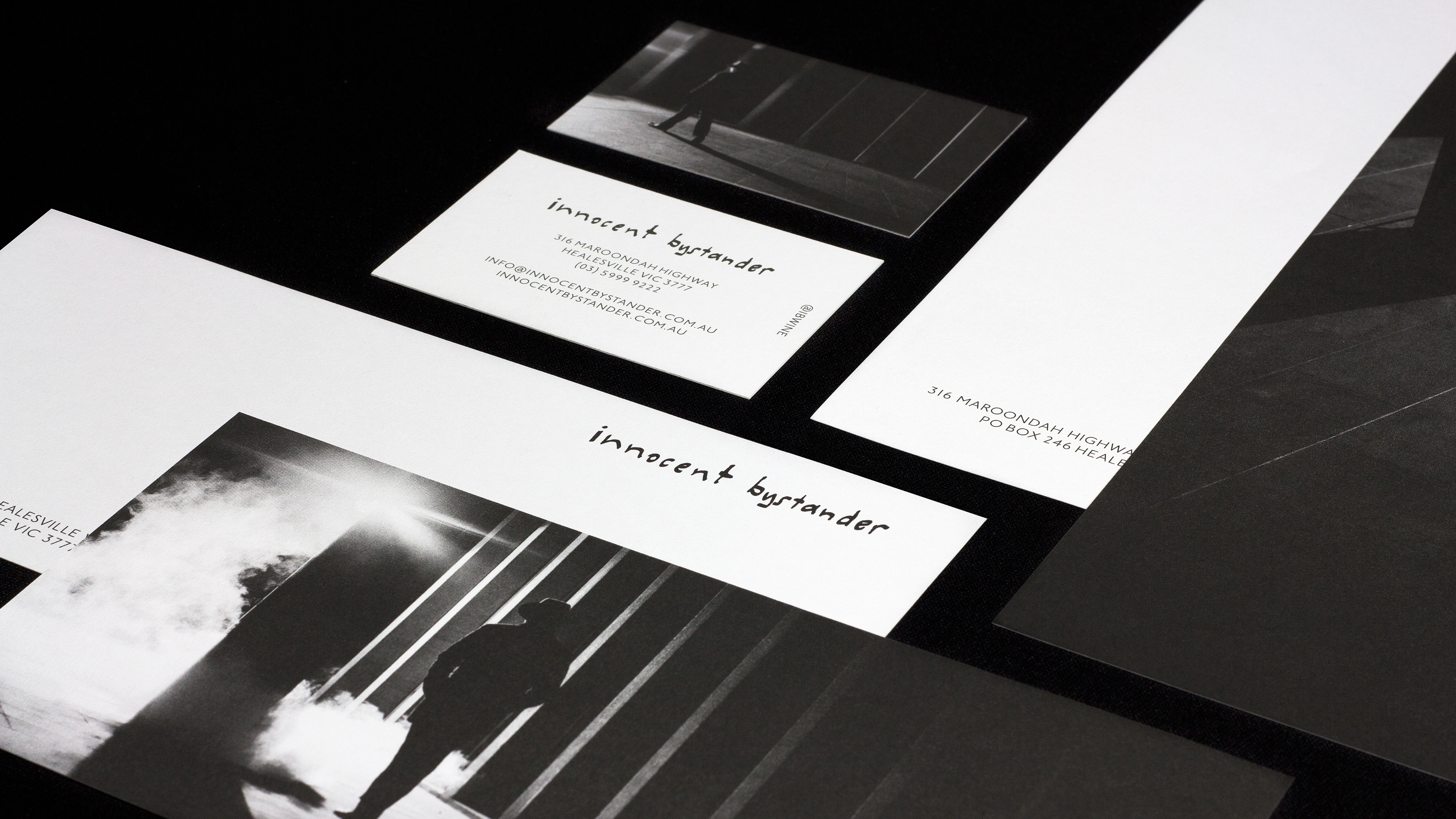
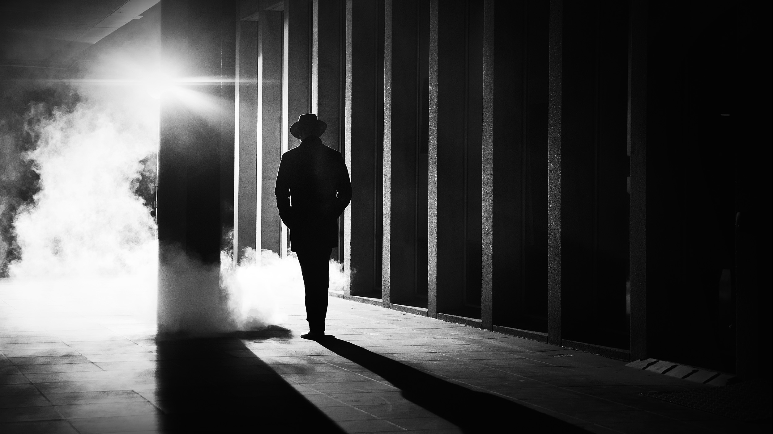
The ‘Shadow Man’ photography serves as a lateral expression of the brand’s attitude and origin story. The art direction of this shoot had to maintain a careful balance: the figure had to present as lone, confident, walking to the beat of his own drum, but never sinister or menacing.
Using hard lines, dramatic lighting and a Brutalist architecture backdrop, it forgoes any classic country wine styling elements. Instead, it establishes a rebellious contemporary territory. An intentionally unbranded piece of brand ‘artwork’, inspired by edgy film noir.
The imagery can be found across numerous Innocent Bystander assets, from stationery, to the website. The most striking statement piece to come out of this shoot lives as a prominent permanent feature in the brand home: a large-scale print above the main bar that anchors the entire room. To this day it is the most photographed and socially shared and tagged asset at Innocent Bystander HQ.
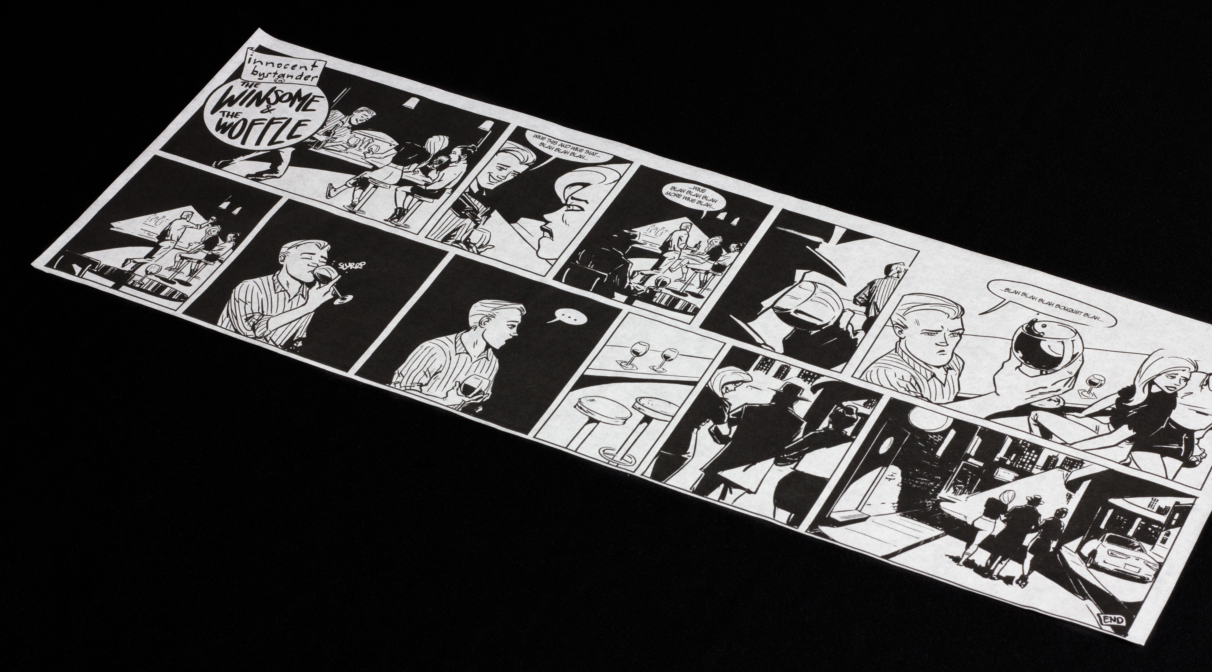
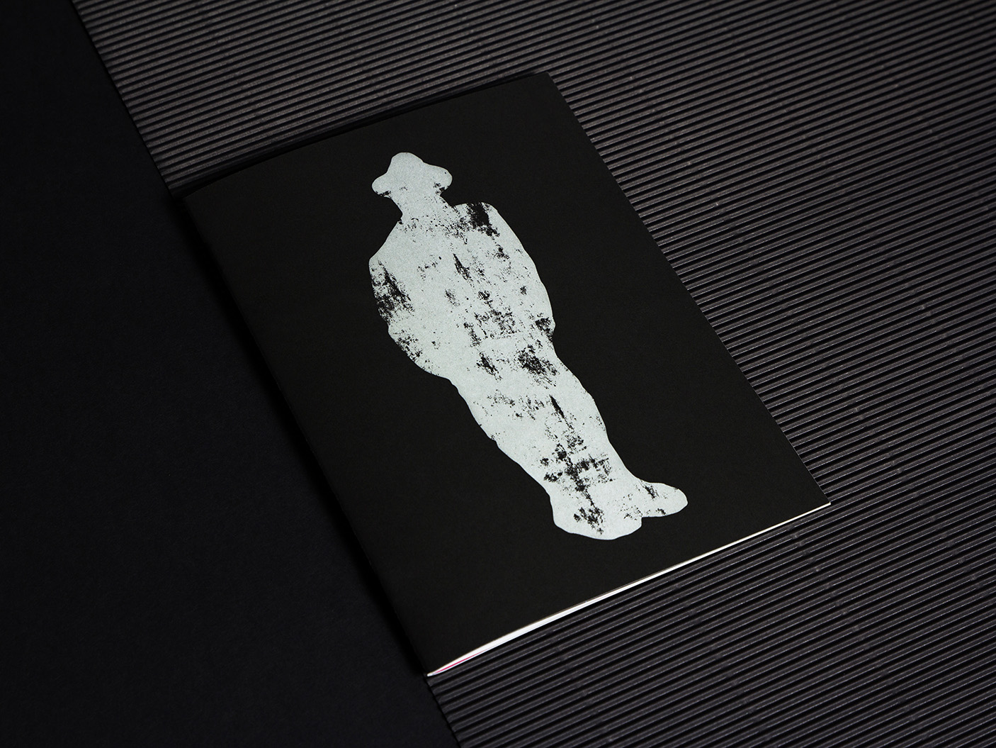
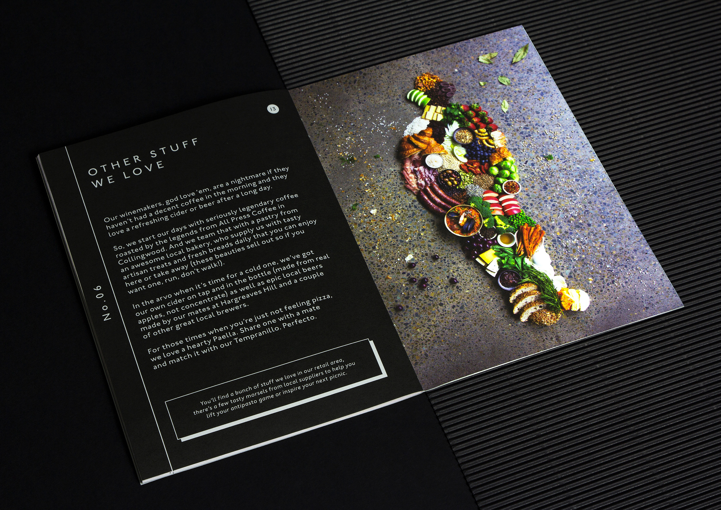
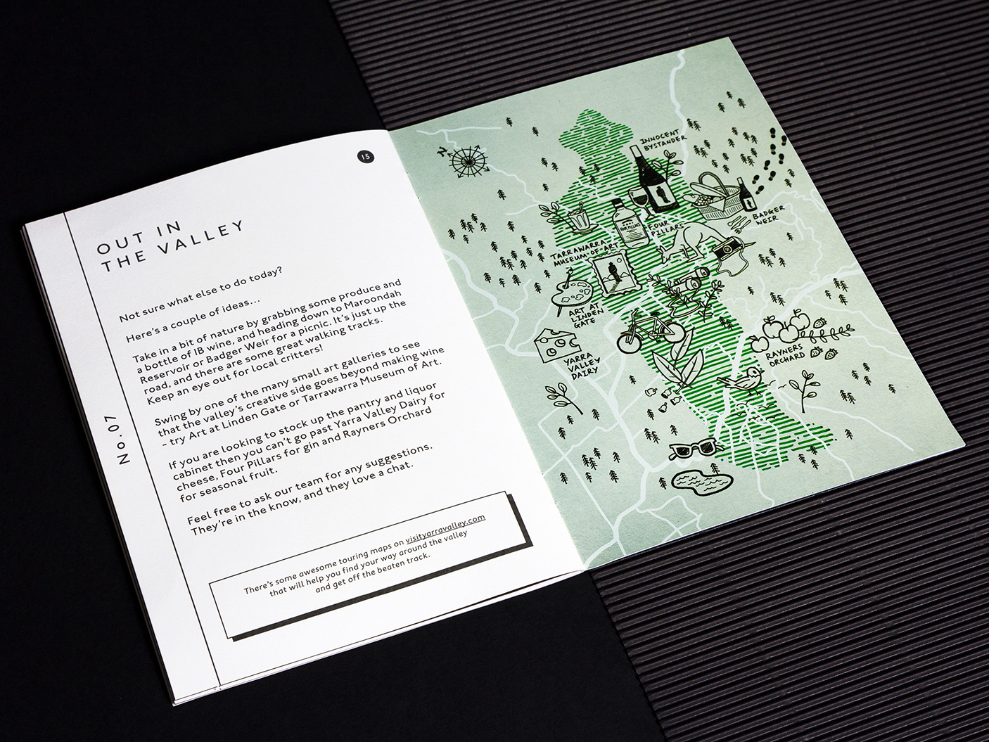
The usual suspects (The HQ booklet)
What remained at this point was gap for something smaller. A talking point. A tactile piece. Something that served you the essential details which lend to a truly great brand experience. OK, an information booklet sounds dry and dull, but, stand by…
The HQ booklet (found on every table in the venue) commits to a single-minded execution: a creative window through which we can all experience—and interact with—Innocent Bystander. The eponymous Innocent Bystander silhouette becomes a creative frame, housing photography, textures and collage art that uniquely reflects the content of each page.
Visitors can be stepped through the entirety of the brands offering in a format that consistently surprises and delights. An information guide. A keepsake. And, crucially, an additional layer to the brand experience as a whole.
By starting this extensive scope with the IB Man story, each aspect of the new Innocent Bystander brand was now intrinsically linked to a core narrative. We created a destination where every detail not only had purpose, but also adds a layer to the experience. Creating more and more depth for exploration, making it more and more memorable.
The working system that was built provided the tools the wine / hospitality business needed to change offerings and evolve when required, in a way that always felt native to the space and the brand.
Building upon the legacy the wine label had established within the community meant Innocent Bystander remained a place loved by locals, and simultaneously ‘came of age’ as a holistic and utterly unique not-to-be-missed tourist destination.
Scope:
- Brand Strategy
- Brand Identity
- Creative Direction
- Photography & Art Direction
- Graphic Design
- Illustration
- Photography
- Creative Copywriting
- Experience Design
- Way-finding
- Finished Art
- Brand Guidelines
- Management & Production
Project Collaborators:
Brand Photography – Jack Hawkins
Comic Book Illustration – Sacha Bryning
Venue Photography – Redfish Bluefish
STRATEGIC CONSULTANT – MATT JONES
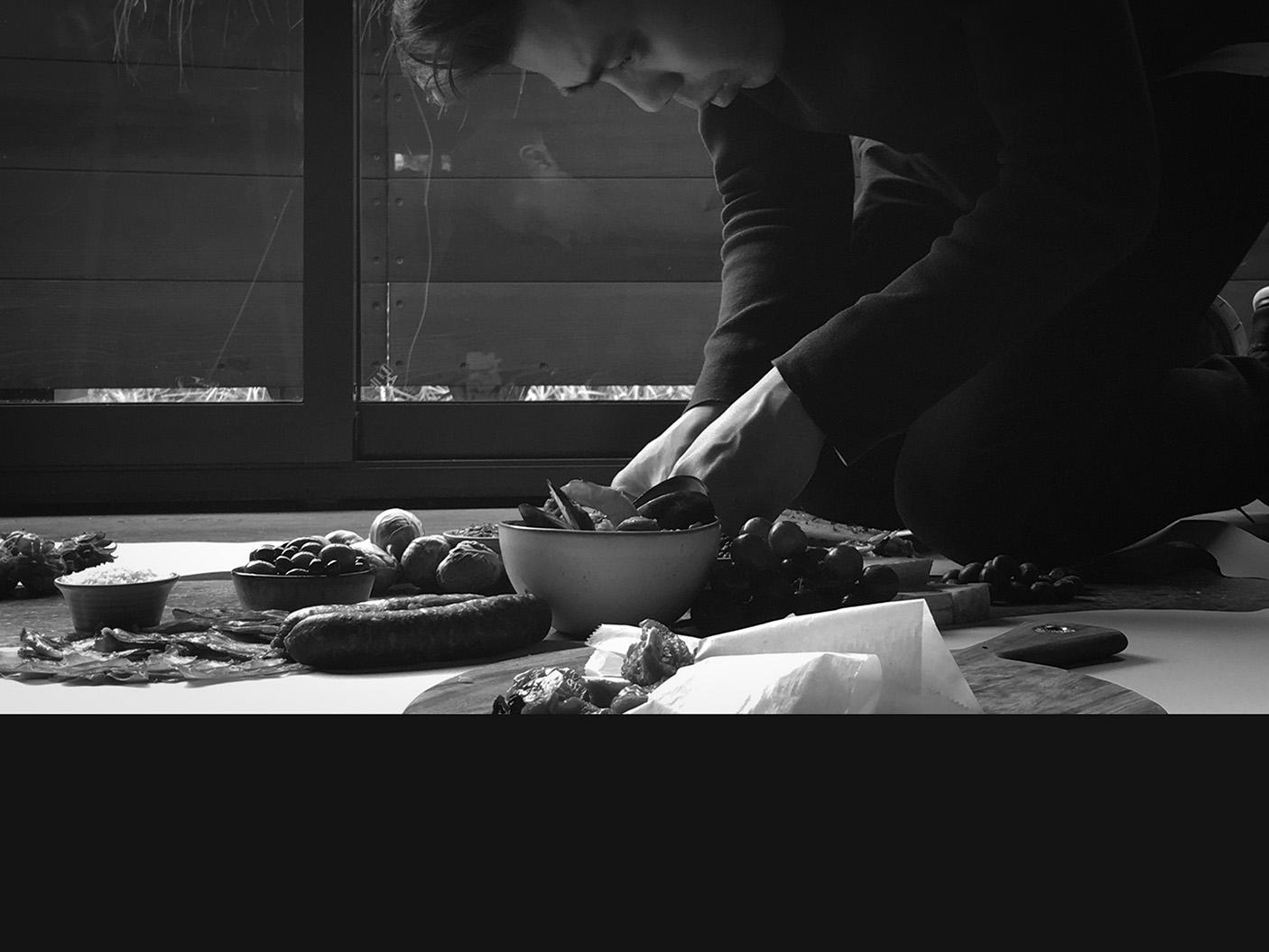
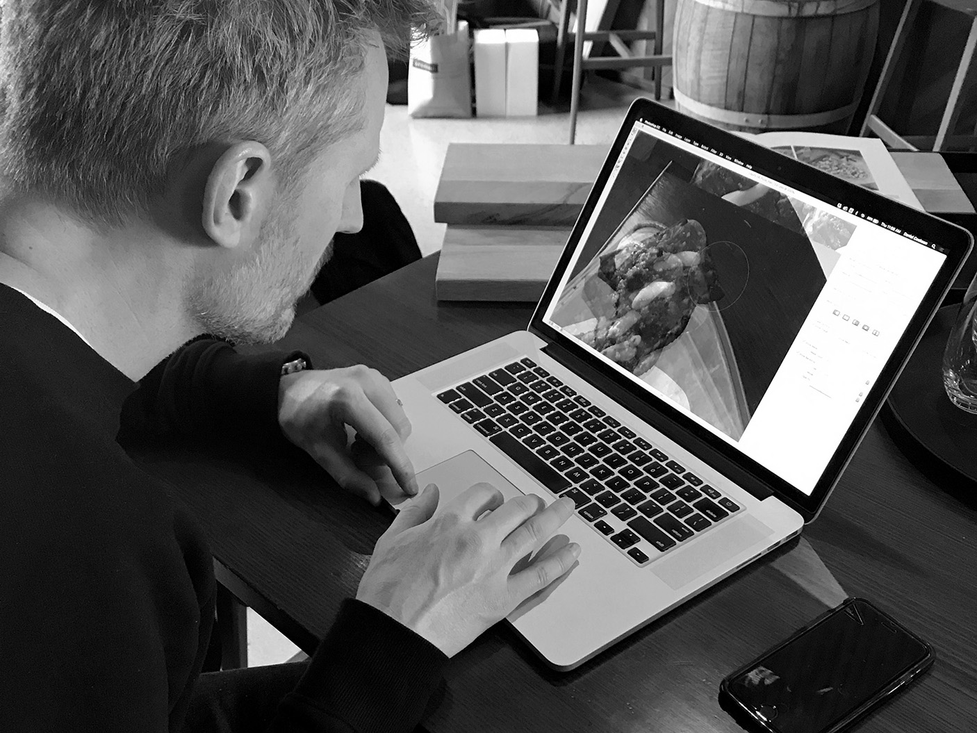
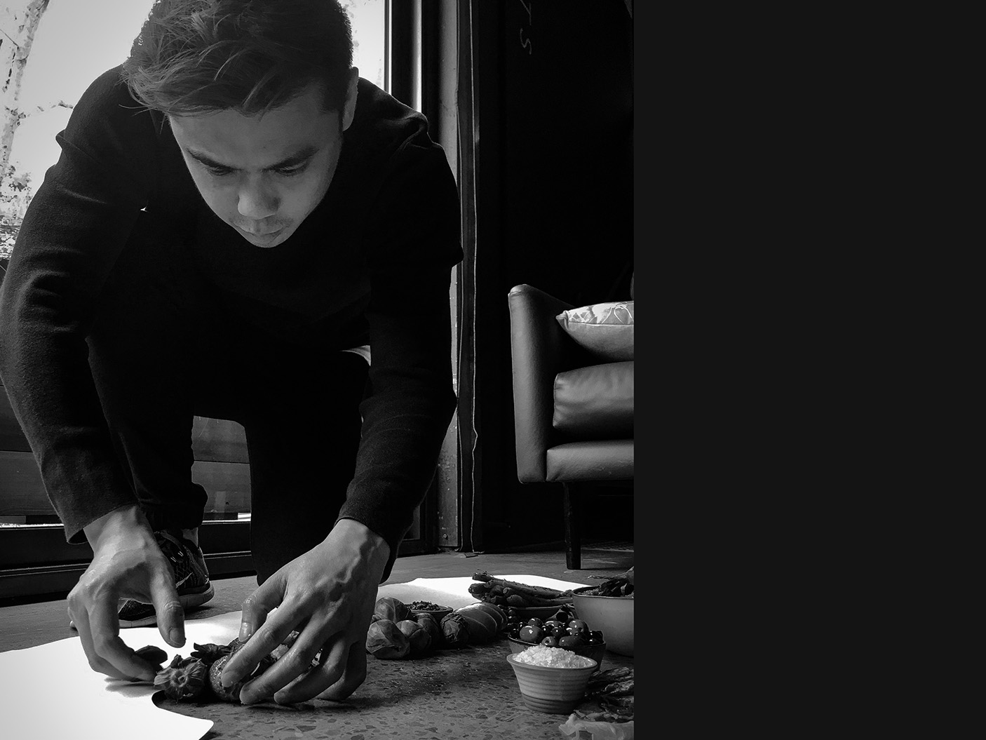
Behind the scenes