Ray Hard Seltzer Campaign
We were first introduced to ‘Ray in 2020… and a year later the Footscray born and bred brand had found its niche with an audience who were wanting a different hard seltzer experience. Something decidedly not for insta-models, influencers, or Byron Bay ‘locals’… ‘Ray is for the unfiltered, unpretentious, and unexpected—skilfully brewed, simply flavoured and seriously tasty. Heading into the spring of 2021, and emerging from lockdown, we wanted people to get to know ‘Ray a little better.
A seltzer for the rest of us
Following the seltzer wave that had already swept the US and was quickly flooding our shores, independent craft beer brewers at Hop Nation Brewing Co in Melbourne’s urban Footscray, known to locals as ‘Ray, created their first brewed hard seltzer in 2020. The seltzer craze was showing no signs of abating—with their distinctive colourways, modern flavours, and the promise of fun and refreshment—the wave of new hard seltzers was threatening to drown the ‘Ray brand in pastel noise.
The Spring of 2021 approached, and Melburnians were blearily emerging from their isolation in the city’s globally famous extended lockdown. Unsurprisingly, consumer expectations of a season of raucous crowded festivals and noisy, jam-packed gigs with a refreshing seltzer in hand were low. Socialising was set to be more informal, intimate, lo-fi, and brilliantly simple.
There was an opportunity to further embed ‘Ray into the local hard seltzer market by appealing to a more realistic sense of occasion – simple pleasures that call for simple refreshment with a select few. To distinguish ‘Ray from the rest of the players, the brand needed to lean into its quirky, modern, gritty ‘Footscray’ personality and deliver the message that coming together this Spring was worthy of celebration.
Simple pleasures, simple refreshment
The creative approach was for the brand and product to embody traits that personified laid-back good times, a sense of well-worn familiarity, and understated local vibes—hugely appropriate for a post lock-down social life. In getting to know ‘Ray a little better, we wanted people to self-identify with the campaign and how it responded to where they are in their lives… both physically, and mentally.
Because let’s face it… post-lockdown, no one had the time or energy for full blown ragers, and yet we still craved quality time with our favourite people. We wanted to position ‘Ray as the perfect catch-up companion—the perfect little hit of happiness without going OTT. This sentiment is reflected in our campaign hero line ‘That’s Ray’.
Lo-fi meets big vibes
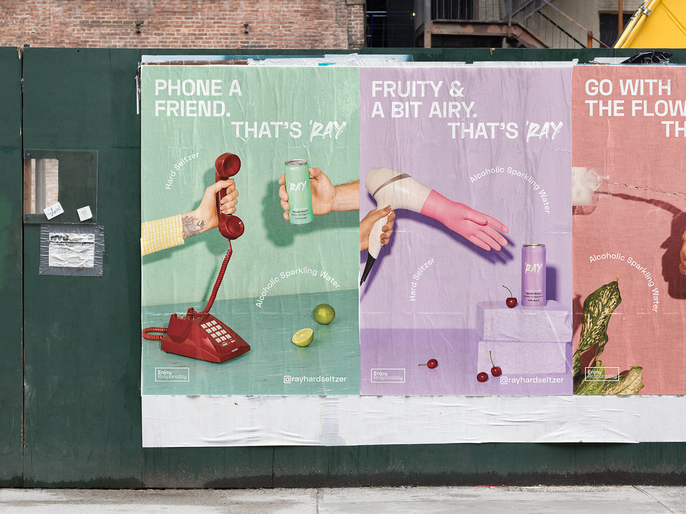
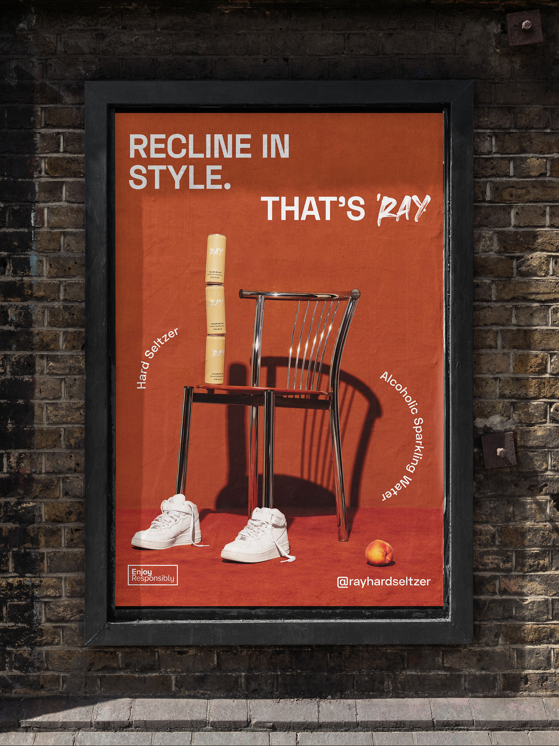
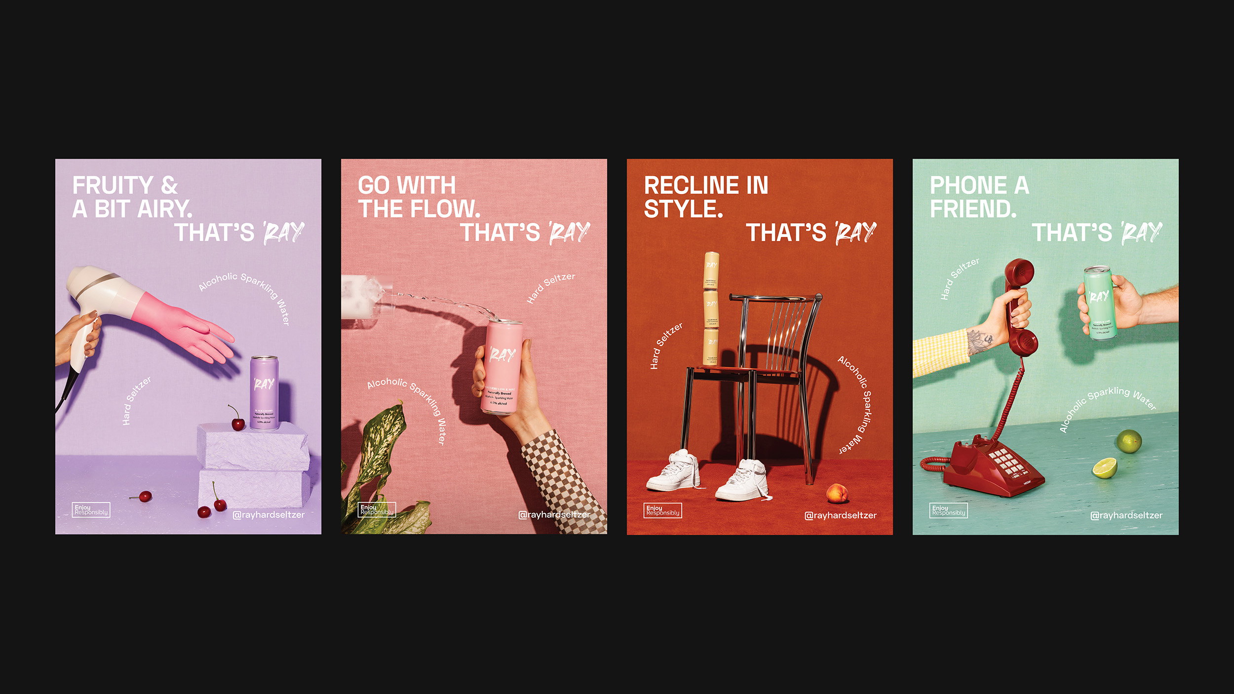
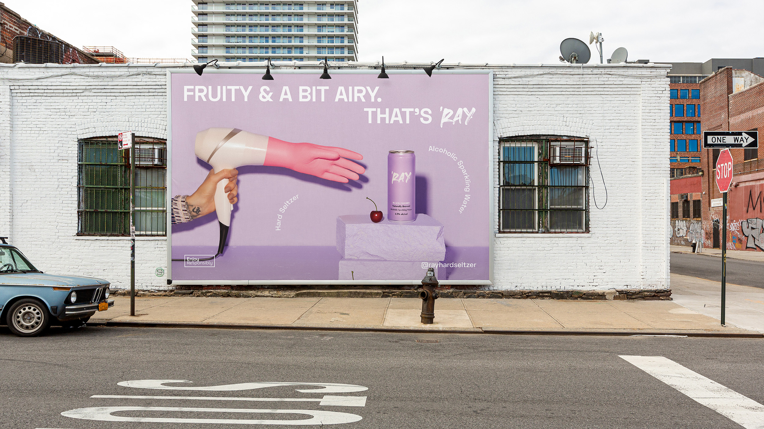
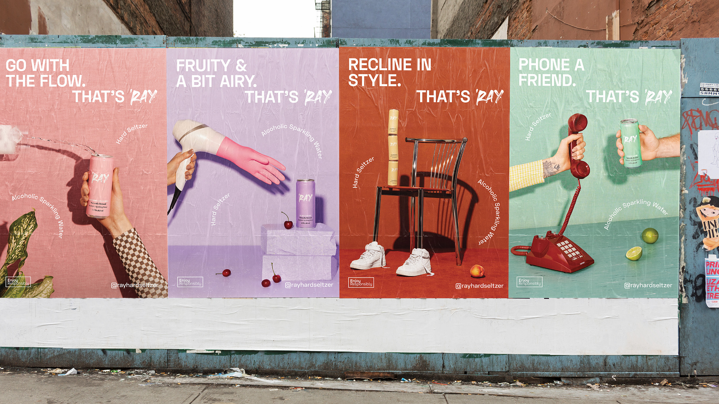
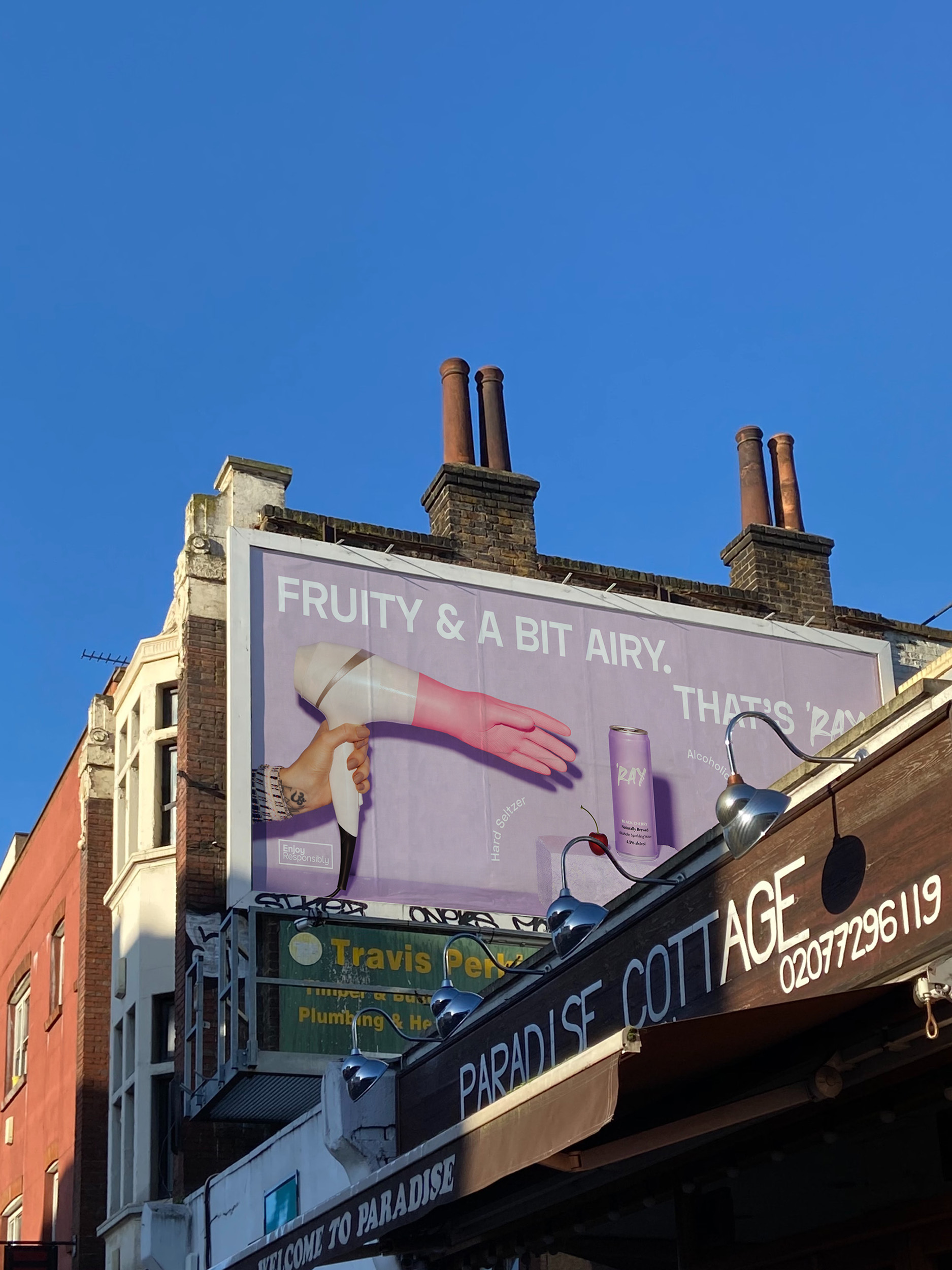
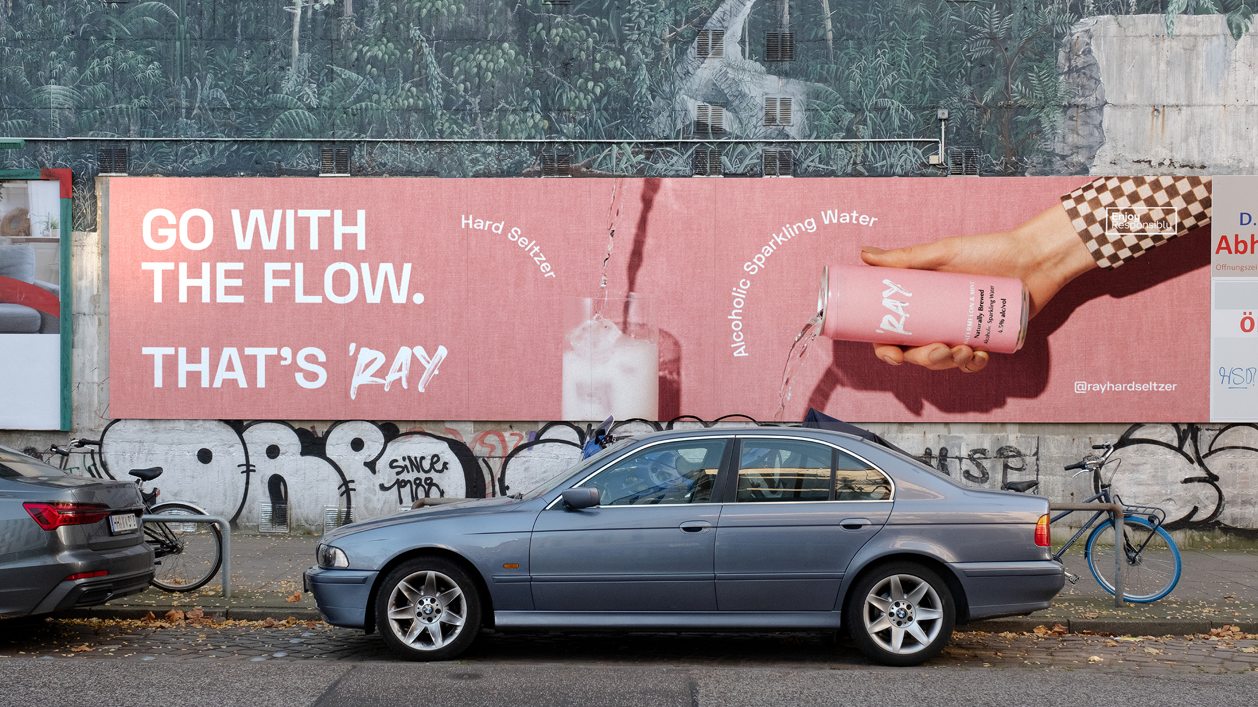
The creative approach paired a series of retro, lo-fi scenes with copy lines that reflected our current mood, and the unique characteristics of the product. The art direction brings these double meanings to life in a series of four quirky, eye-catching poster series. ‘Ray’s retro vibe subtly suggests its flavours against a stylised-yet-modern quirky, urban world. The cans feature in bizarrely styled and choreographed compositions. A tattooed hand reaching in. A pair of retro high-top sneakers. An 80s analogue telephone.
Typography is playful and tracks the copy through the composition, helping to engage the consumer. The message of ‘good times to come’ is clear and the fluidity of the text works to unify the posters and the broader message that ‘Ray Hard Seltzer is just a little bit different, but familiar and comforting, too.
Scope:
- Campaign Strategy
- Campaign Creative
- Photography & Art Direction
- Creative Copywriting
- Photography
- Graphic Design
- Finished Art
- Motion Design
- Management & Production
Following the seltzer wave that had already swept the US and was quickly flooding our shores, independent craft beer brewers at Hop Nation Brewing Co in Melbourne’s urban Footscray, known to locals as ‘Ray, created their first brewed hard seltzer in 2020. In Spring of 2021 as Melburnians were emerging from the cities lockdown, there was an opportunity to further embed ‘Ray into the local hard seltzer market by appealing to a more realistic sense of occasion – simple pleasures that call for simple refreshment with a select few. To distinguish ‘Ray from the rest of the players, the brand needed to lean into its quirky, modern, gritty ‘Footscray’ personality and deliver the message that coming together this Spring was worthy of celebration.
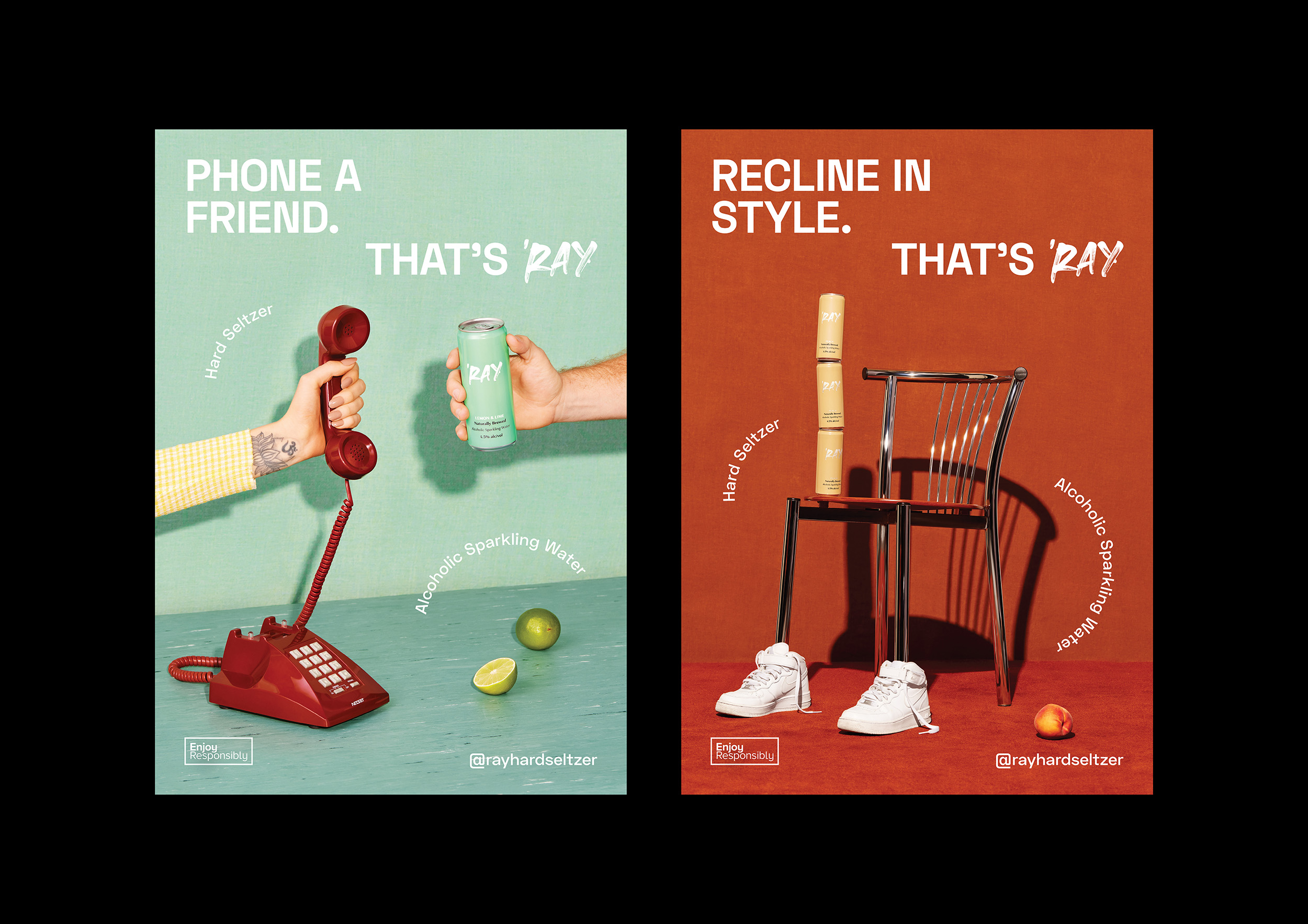
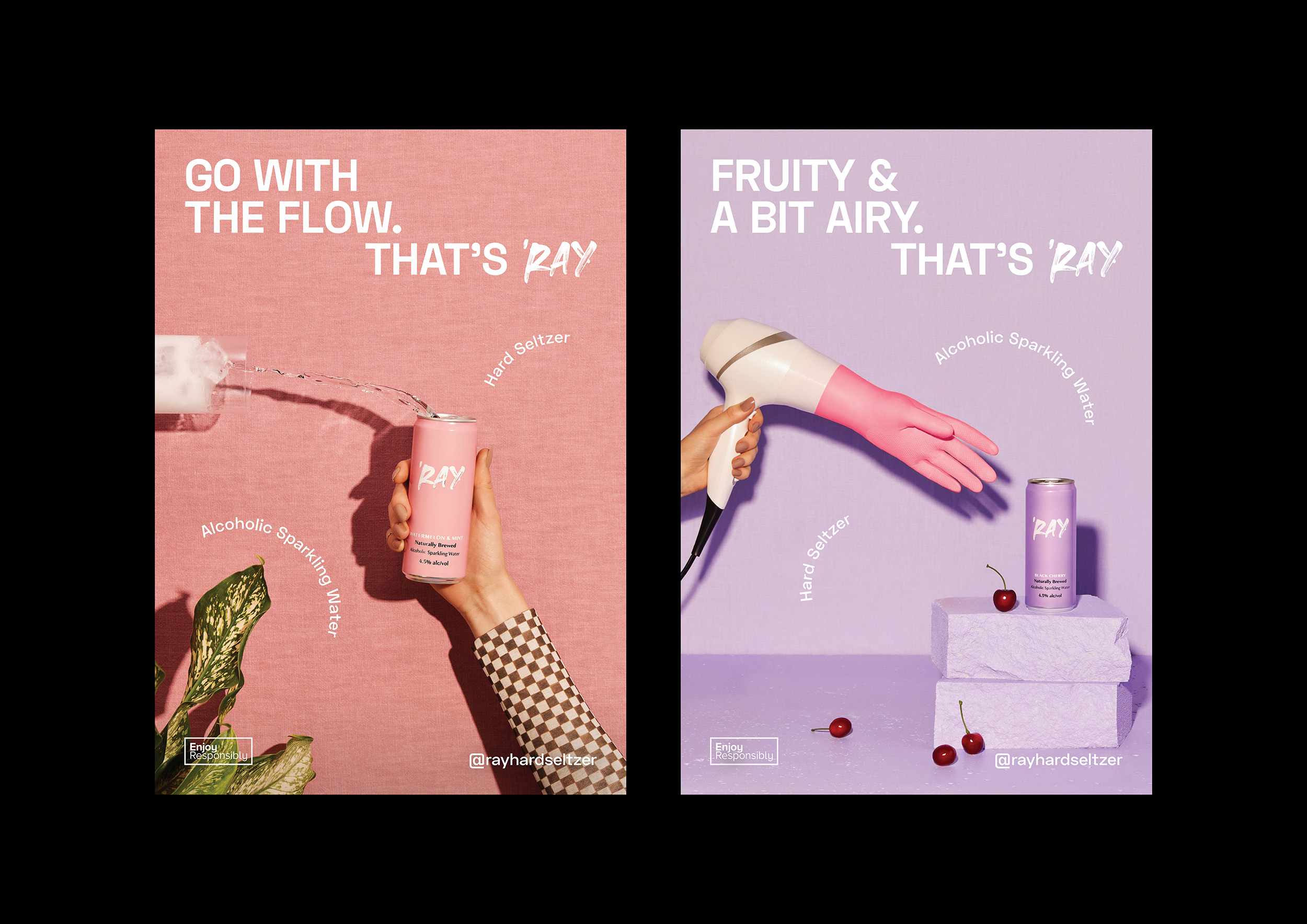
The creative approach paired a series of retro, lo-fi scenes with copy lines that reflected our current mood, and the unique characteristics of the product. The art direction brings these double meanings to life in a series of four quirky, eye-catching poster series. The cans feature in bizarrely styled and choreographed compositions. A tattooed hand reaching in. A pair of retro high-top sneakers. An 80s analogue telephone.