Sircel
A fast-moving world, with fast moving problems, needs fast moving solutions. Which is why when a business comes along that’s tackling one of the fastest growing environmental concerns of our time—the rapid proliferation of e-waste—we need to pay attention. However, in the competitive space of recycling and waste management, where cynicism and empty promises abound, communicating true innovation is no easy feat. Our challenge was to position this game-changing business as a new benchmark for this increasingly damaged industry.
Replacing scepticism with substance
For years we’ve collectively turned a blind eye to one of the biggest growing environmental concerns of our time… e-waste. The magnitude of this global problem is only starting to hit home… and with our appetite for electronic products showing no signs of abating, we’re in urgent need of a whole-of-system solution that addresses this issue.
Sircel (formerly E3Sixty) is exactly what the world needs with its world-leading proprietary system, enabling up to 100% diversion from landfill, end-to-end, right here in Australia. This groundbreaking solution stands in radical contrast to the current industry average of just 20%, revolutionising how we manage e-waste and protect our valuable resources.
However, the brand as it stood was in danger of being lost in the green-wash of the recycling and waste management landscape—and while there is certainly a wealth of innovation in the sustainability category, many players in the space are borrowing verbally and visually from the same playbook creating a world of green, arrows, leaves, and jargon.
We needed to reposition, rename, and reinvigorate the brand, so it could redefine the e-waste landscape, challenge what’s expected from the category, and address the gap between the problem and the solution… ultimately helping to create greater clarity and trust with audiences.
Turning finite into infinite
The first step was repositioning the business beyond ‘recycling’ and ‘e-waste management.’ Operating at the intersection of sustainability and technology, Sircel’s role in the circular economy became clear—harnessing innovative technology to drive positive environmental transformation.
To distance the business from competitors and create a tech-centric experience, we developed a new name—Sircel, a portmanteau of ‘circular’ and ‘electronics.’ The two-syllable name feels more distinctive and less generic, providing a stronger springboard to tell their most impactful stories.
The new positioning and name provided an anchor for a refreshed narrative for the business—one that focussed on the infinite nature of these resources, and the potential value found in things that were previously being thrown away. Because our most vital and valuable resources are no longer found beneath the soil. They’re literally in our hands, and in our homes, and in our businesses. Sircel’s new narrative focus was about bringing end of life technology back to life… because the future of e-waste, is no waste at all.
Scope:
- Brand Strategy
- Creative Direction
- Naming
- Tone of Voice
- Brand Identity
- Website Design
- UX Design
- Film Production
- Photography
- 3D Animation
- Animation
- Finished Art
- Way-finding
- Project Management
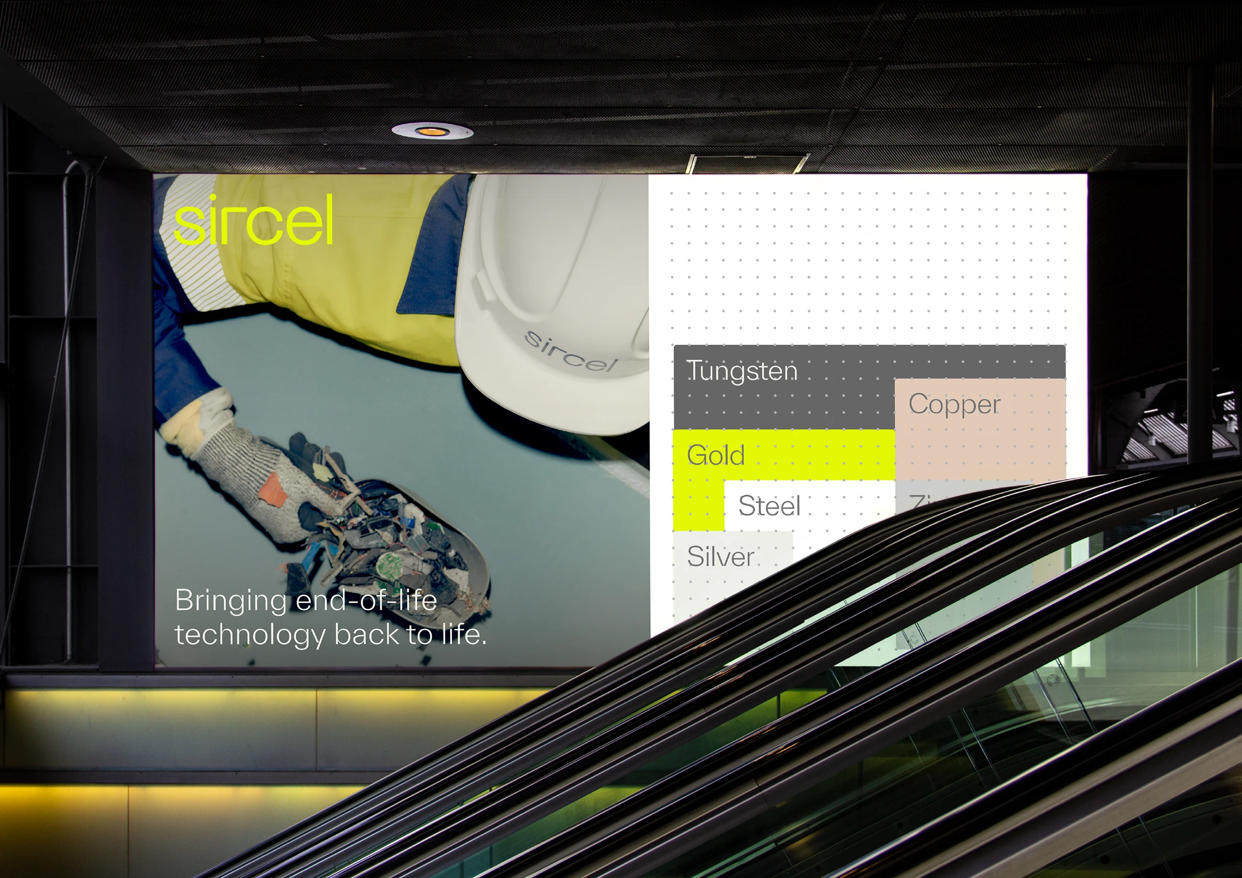
Our rebrand began with strategic repositioning. We knew we needed to break away from the conventions and clichés associated with the recycling industry. Recognising Sircel’s advanced technology and singular ambition placed them in a league of their own, we positioned them as a unique category-one tech company, setting them apart from the greenwashing trends of the industry they had conformed to.
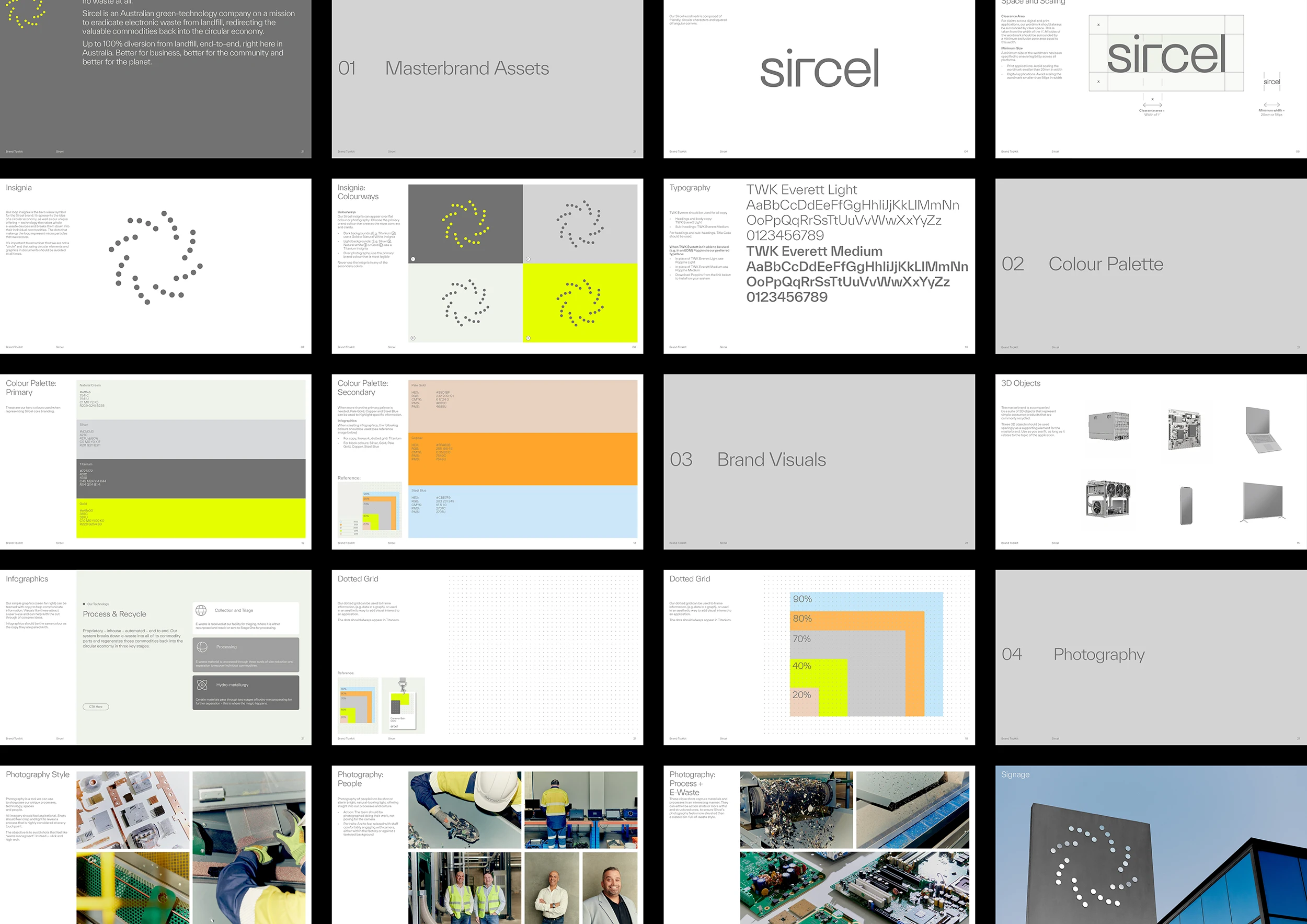
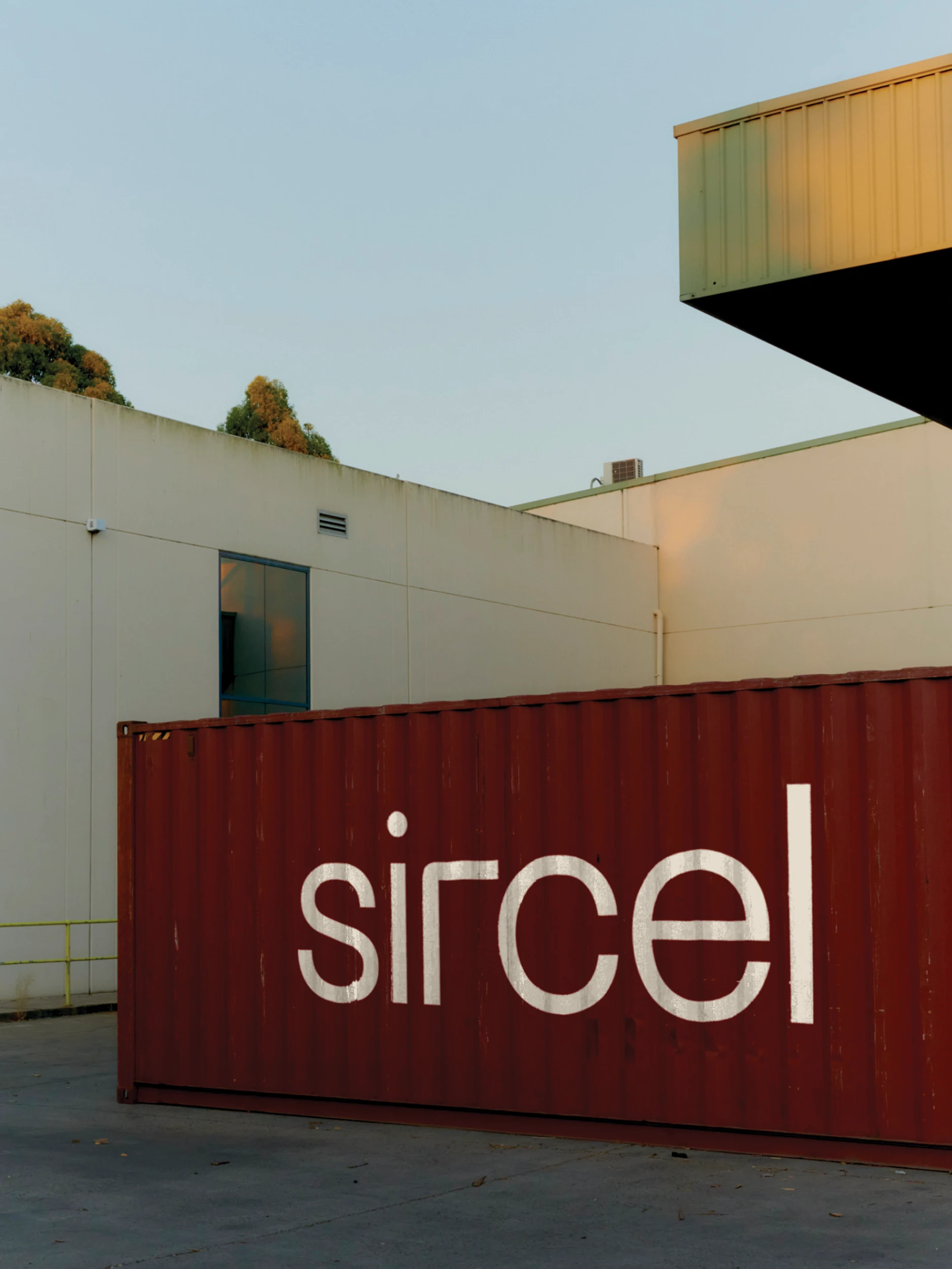
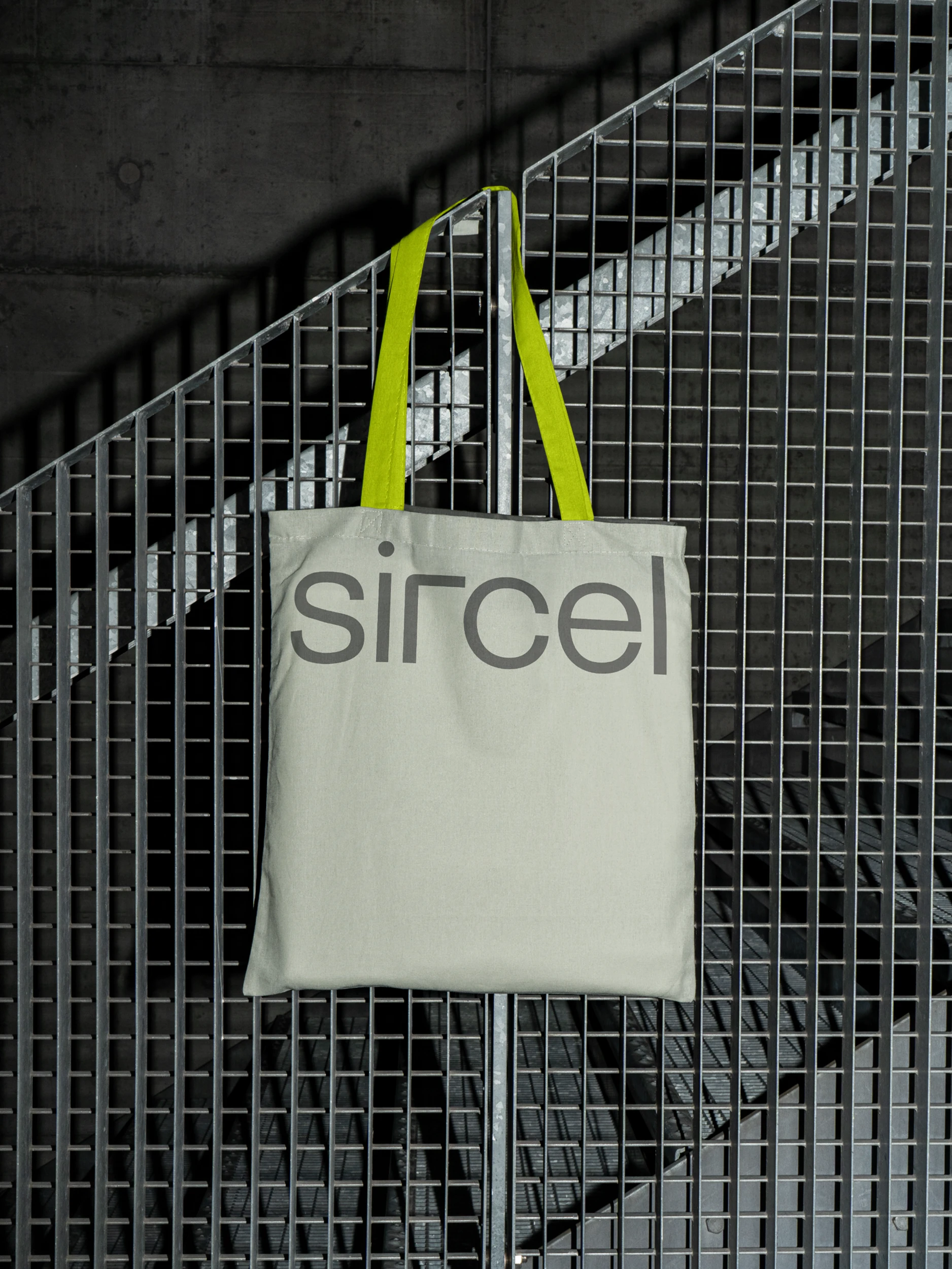
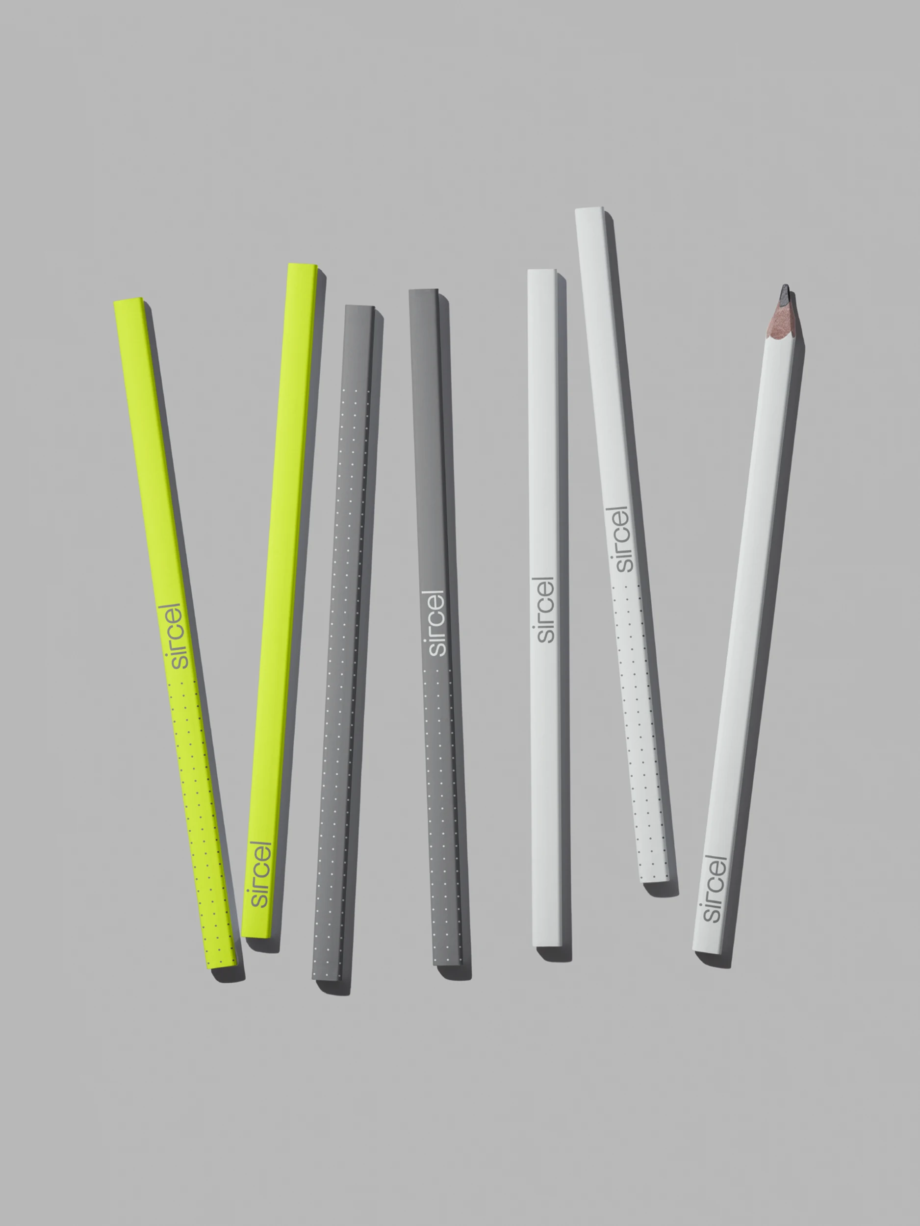
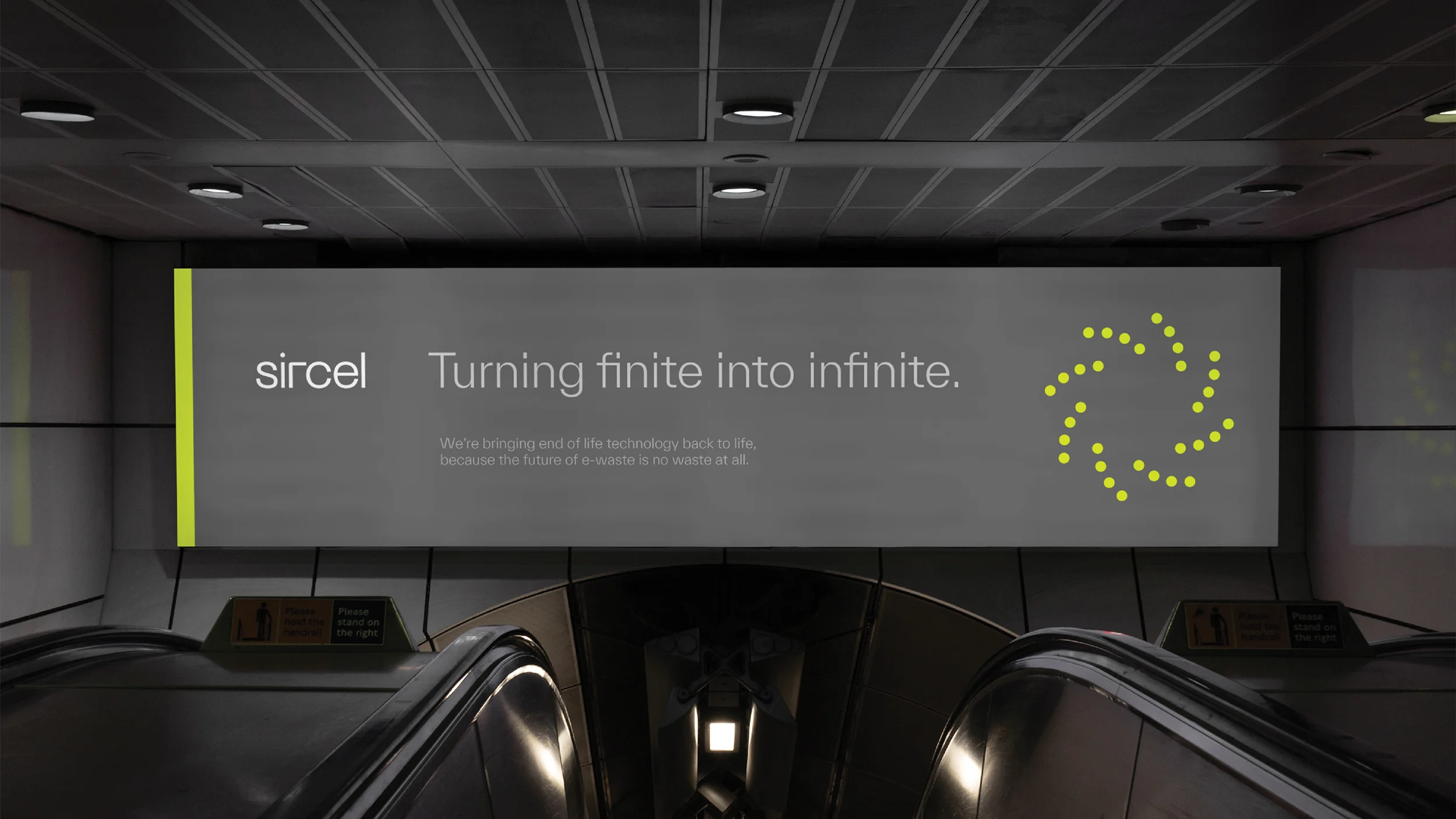
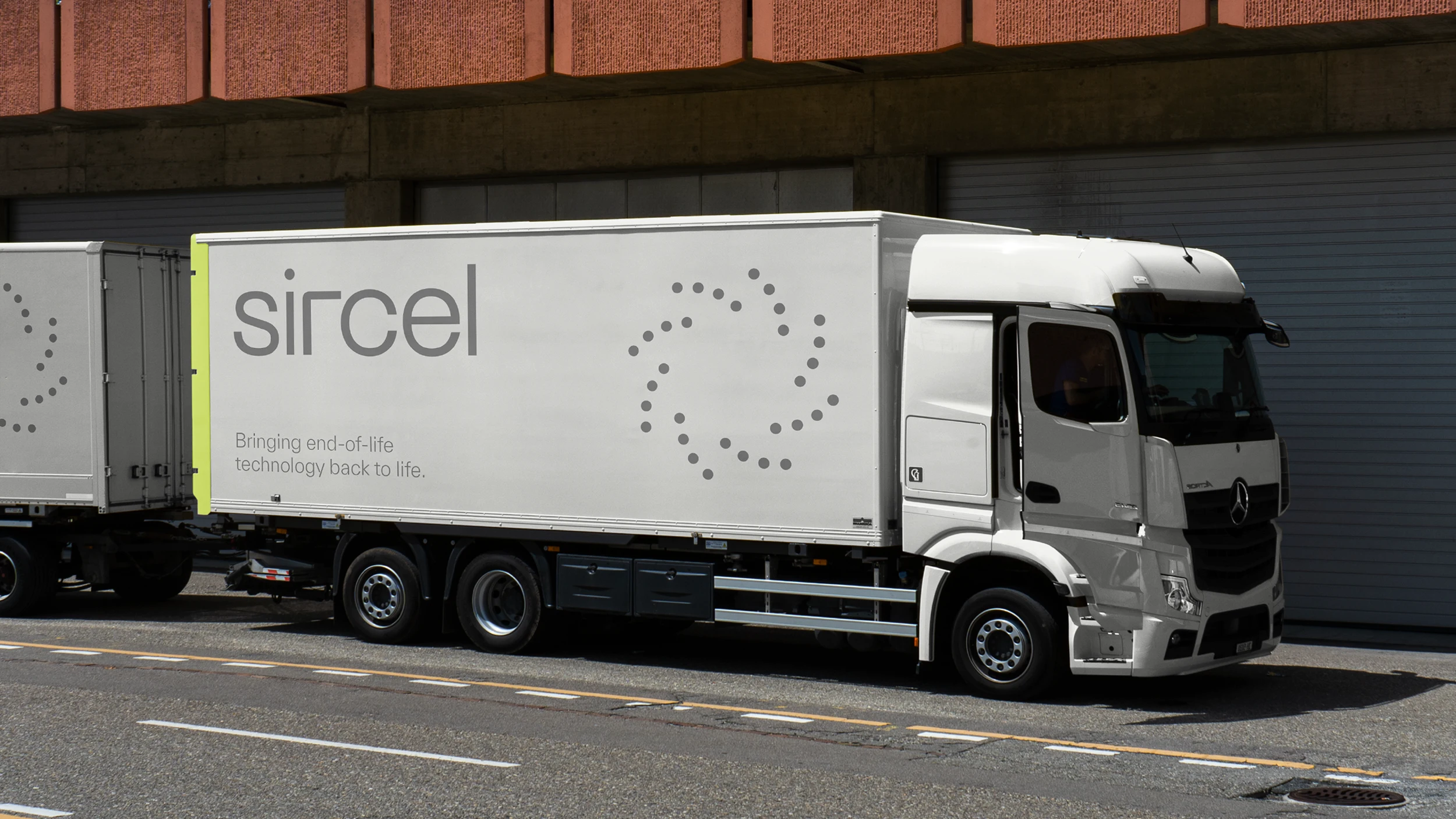
To align with the new brand positioning, we developed the name Sircel, a portmanteau of ‘circular’ and ‘electronics.’ A custom wordmark was developed reflecting the brand’s tech aspirations, with lowercase sans serif letterforms and a geometric ‘r’ character, combining hyper-modernity with softer approachable qualities.
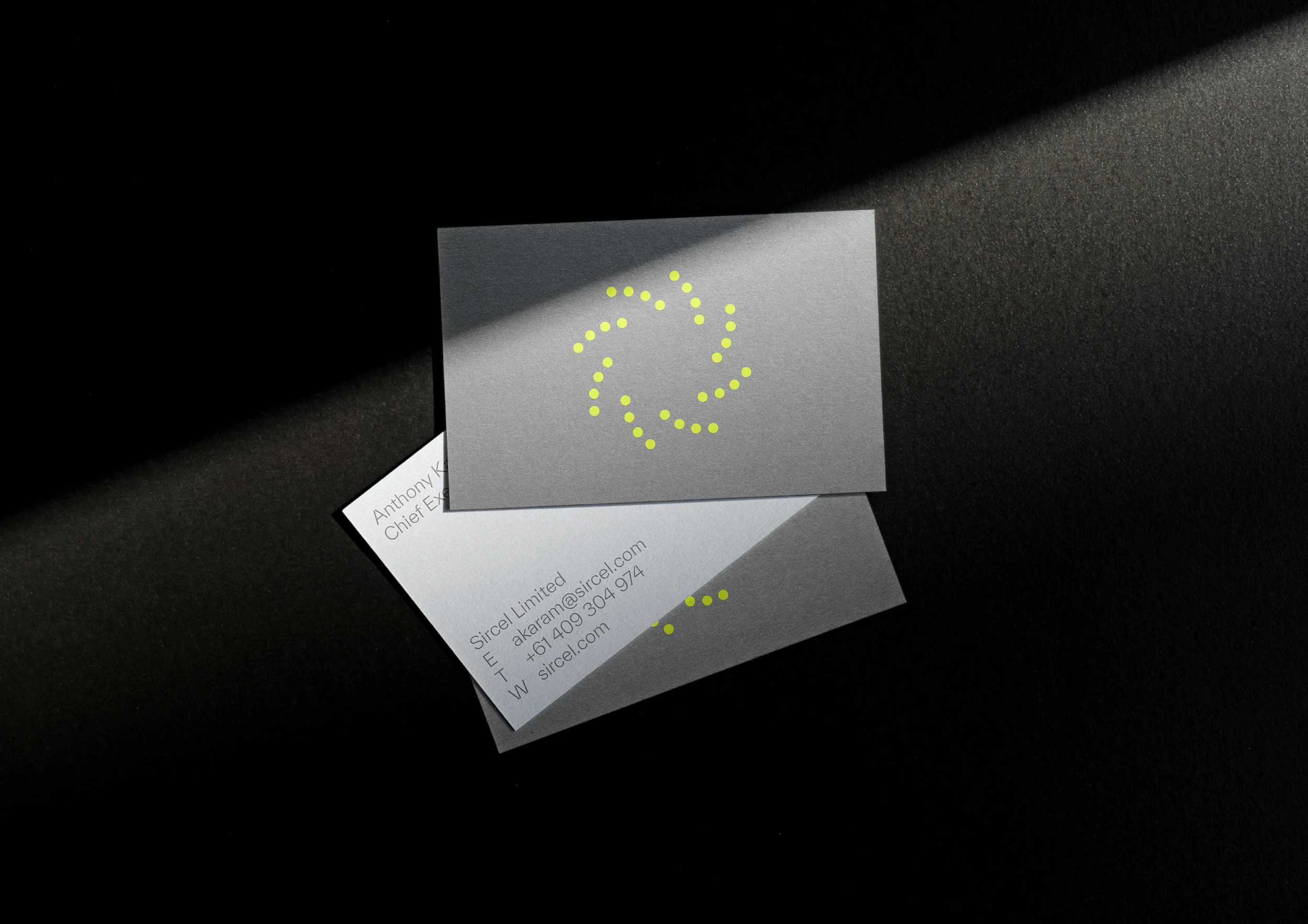
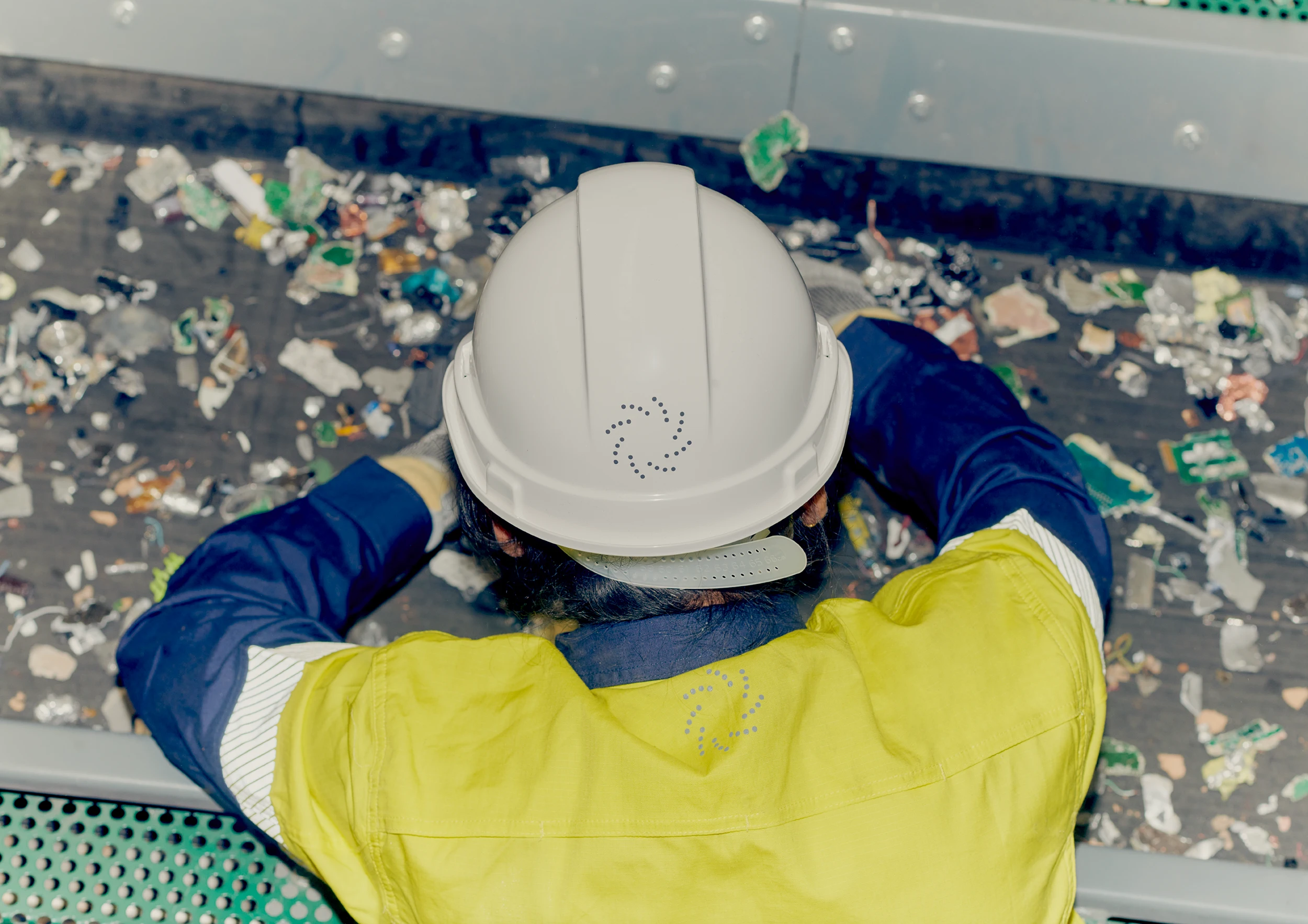
The insignia, inspired by Sircel’s groundbreaking pyrolysis mechanism, complements the wordmark and was designed for motion. This dynamic symbol represents progress, circularity, and perpetual resource regeneration, making it a powerful visual asset for the brand.
Sircel’s website serves as the primary expression of the new brand language and system. We worked alongside site developers to craft an impactful digital experience, making it straightfoward for users to navigate Sircel’s complex offerings more easily and intuitively.
Since Sircel regularly communicates complex data to stakeholders, we developed a design system that simplifies this information without compromising the brand’s aesthetic qualities, ensuring both clarity and visual appeal in all reporting.
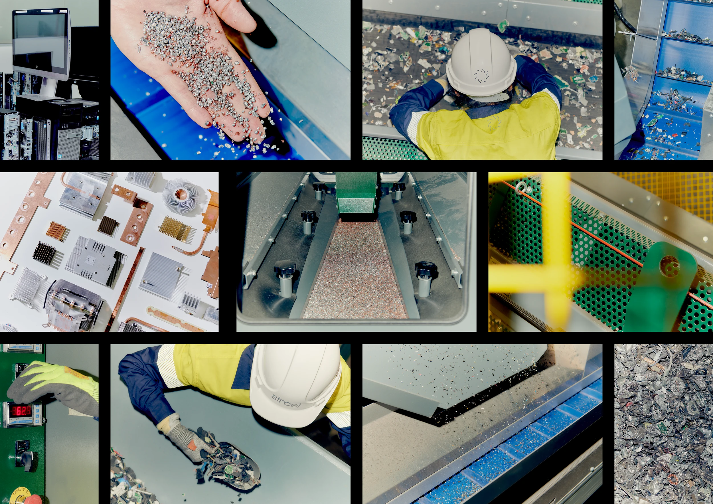
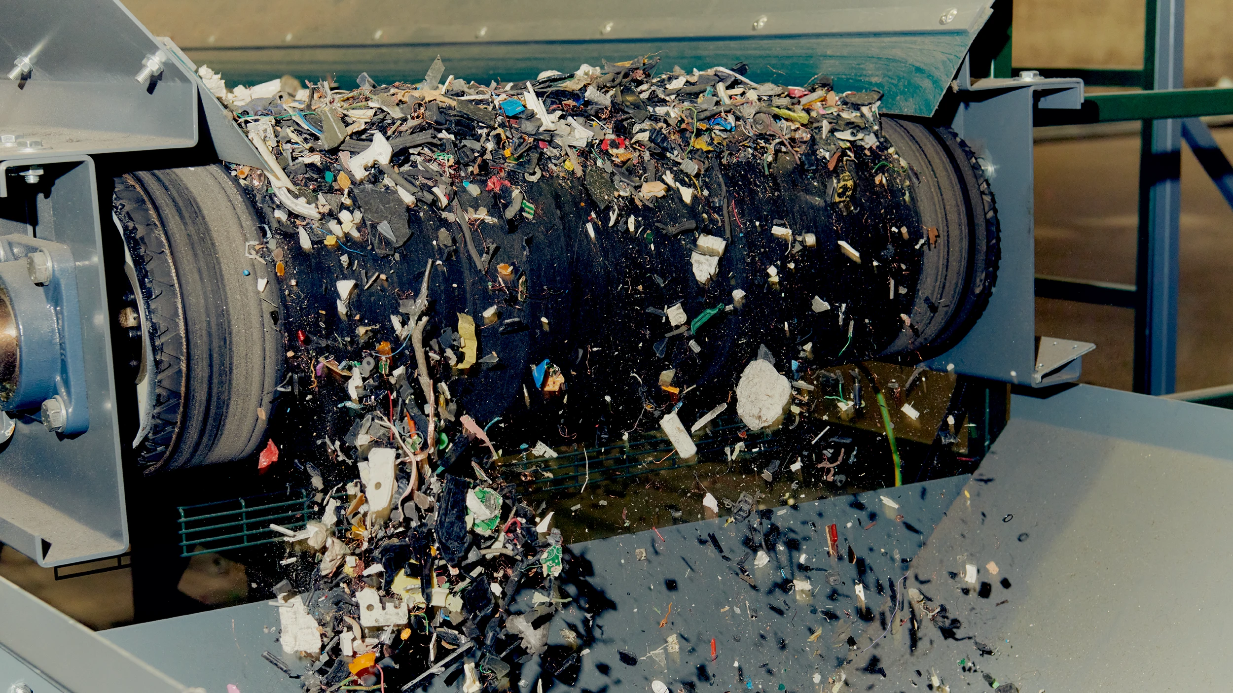
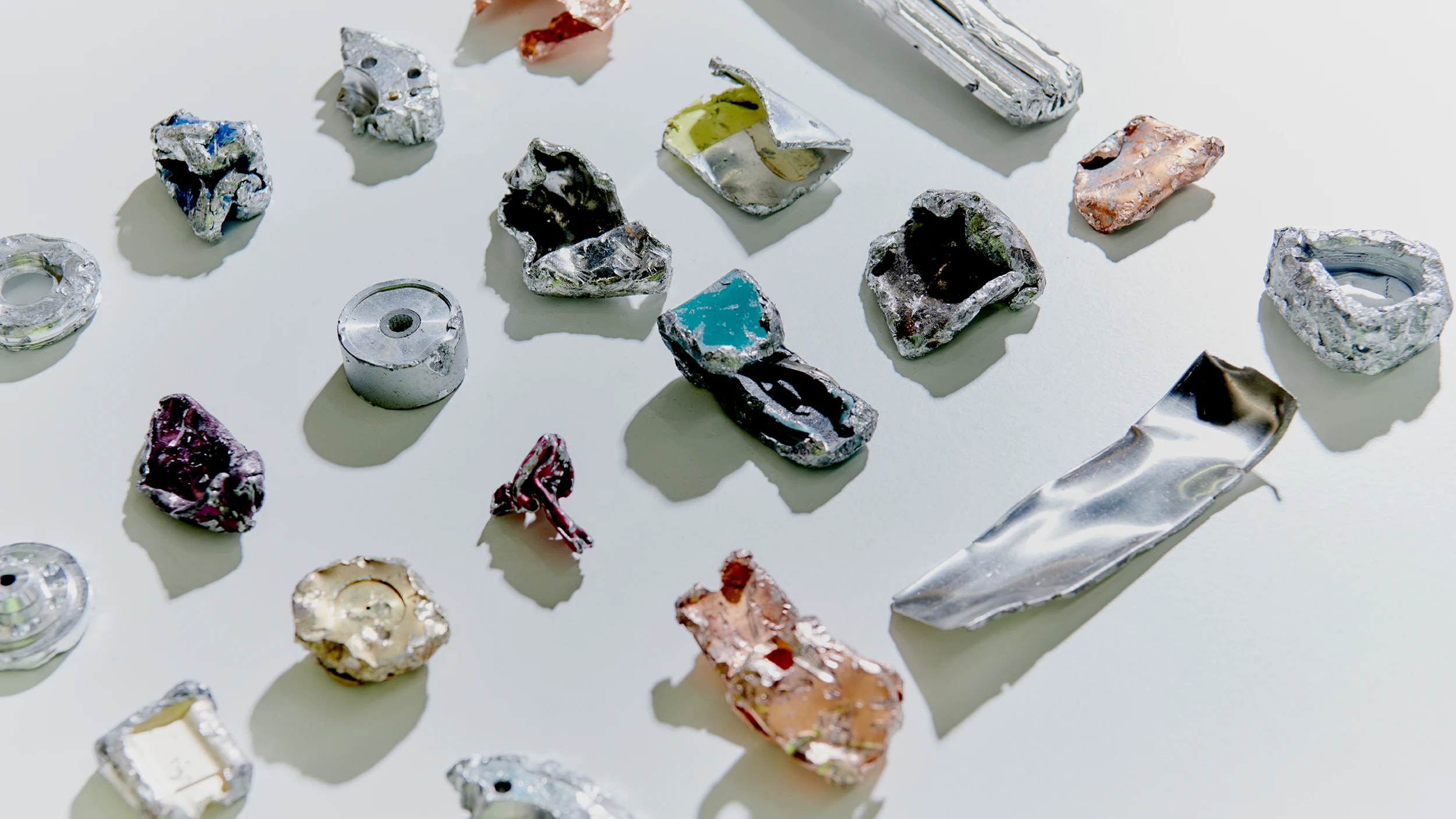
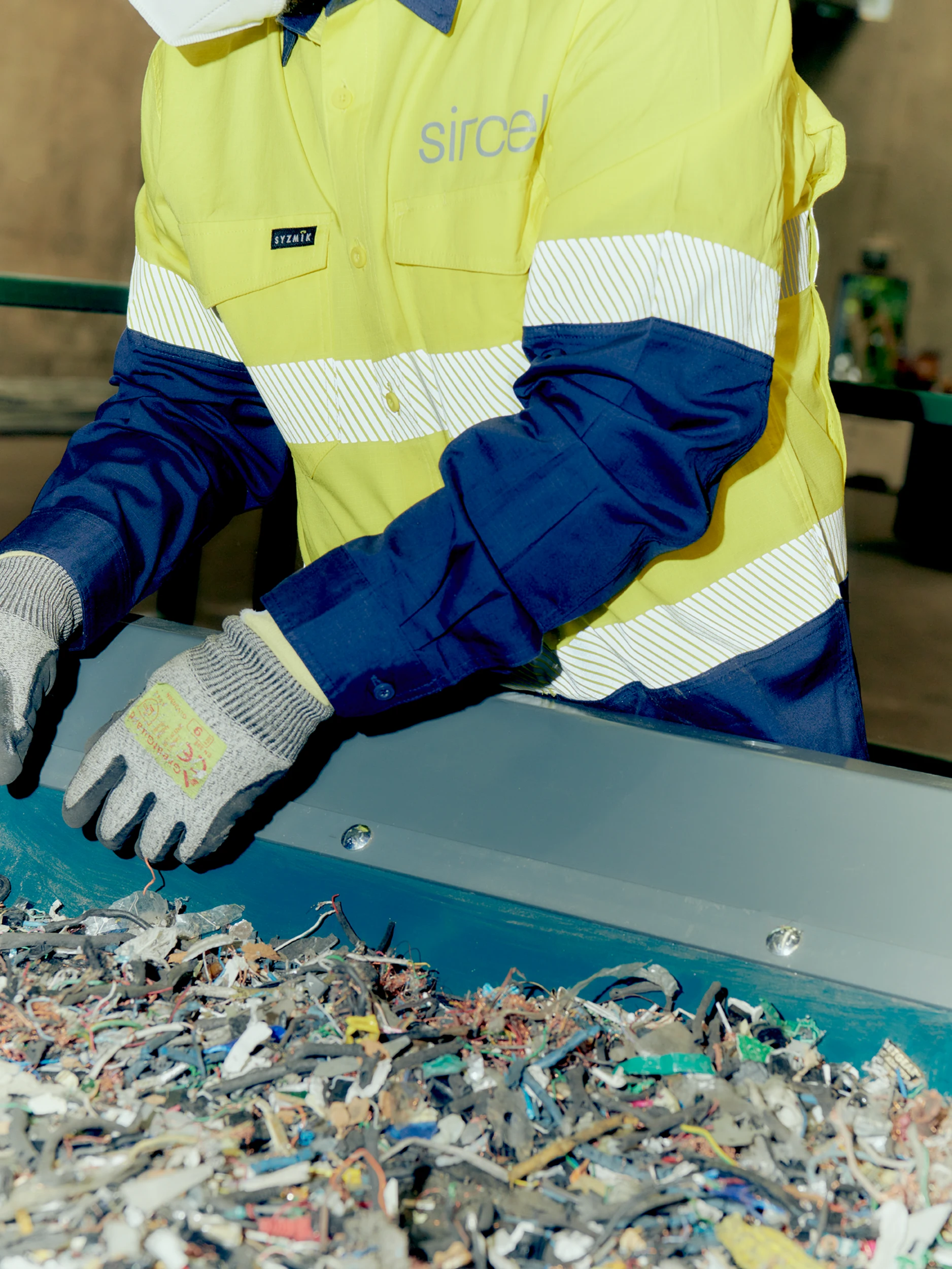
Our approach to photography was also a departure from the expected. Leveraging a fashion-inspired ‘flash photography’ style, we focussed on the surprising aesthetic appeal of e-waste and the industrial machinery used to process it. This art direction transformed something seen as garbage into something filled with infinite potential.
