Bloody Shiraz Gin Campaign
First released in 2015, Four Pillars’ Bloody Shiraz Gin has since gained a cult following for both gin-lovers and gin-newbies alike. Growing year-on-year, this brilliant liquid is the brand’s second highest selling product and has become a sensation the world over. And every year, to celebrate the gin and a new shiraz vintage, Four Pillars launches a limited-edition bottle design. The challenge for the 2021 was to ride this wave of momentum and create a bottle design and supporting campaign that would truly capture the personality and impact of the Bloody Shiraz Gin effect, making 2021 the biggest bloody year ever.
Bloody beautiful, and a bit bloody cheeky
Bloody Shiraz Gin is a gin unlike any other. What first started as an 'experiment that went right', Bloody Shiraz Gin has become a hallmark product for the Four Pillars brand. However, Bloody Shiraz Gin had ‘craft experiment’ hangover—with its personality deeply ingrained in making, wine, grape territory. This had, over the years, created a disconnect with the modern, progressive feel of the product itself. We needed to look beyond the fruit to discover what was truly special about this product and this beloved brand.
A combination of the in-built cheekiness of the brand language—courtesy of the irreverent use of the word ‘BLOODY’—and the indefinable, irreplicable purple colour of the liquid, provided us with the distinctive attributes through which to build a unified creative platform for Bloody Shiraz Gin. This innate attitude and unmatched colour, paired with a new, cohesive story provided the way in to tying the whole ecosystem—the core identity, the limited-edition bottle and the campaign—together.
All about the bloody liquid
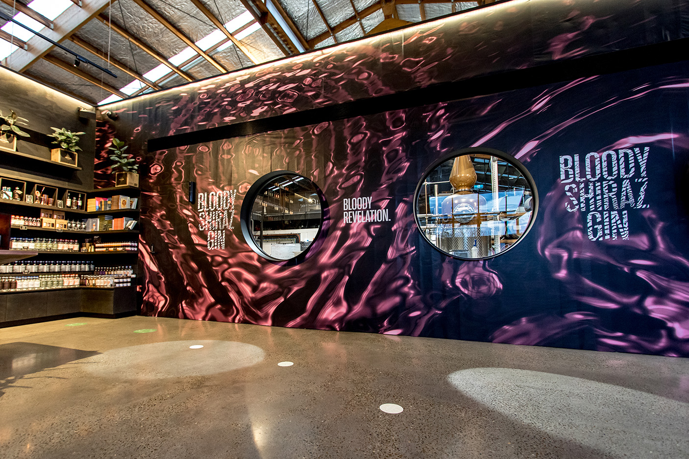
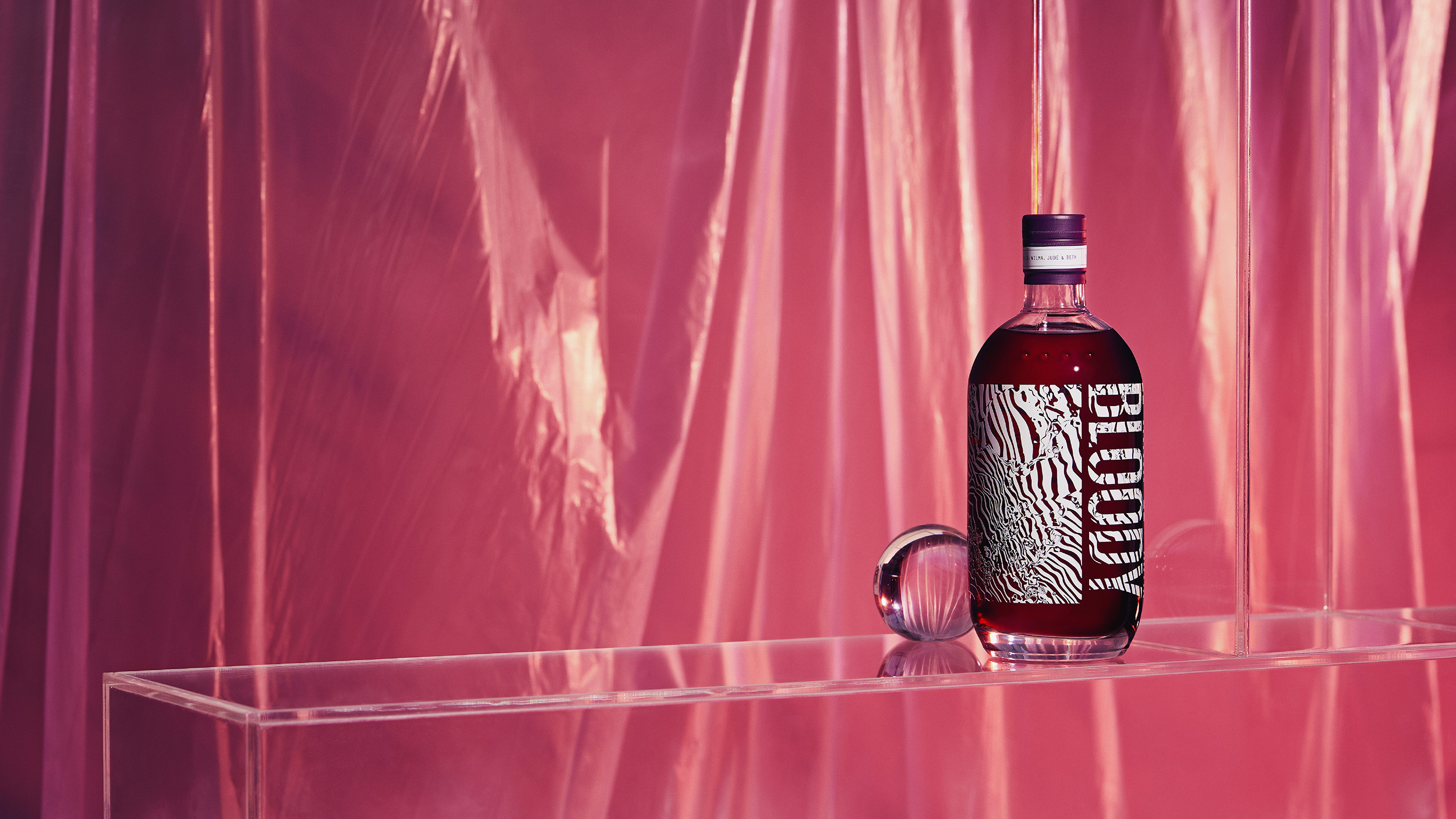
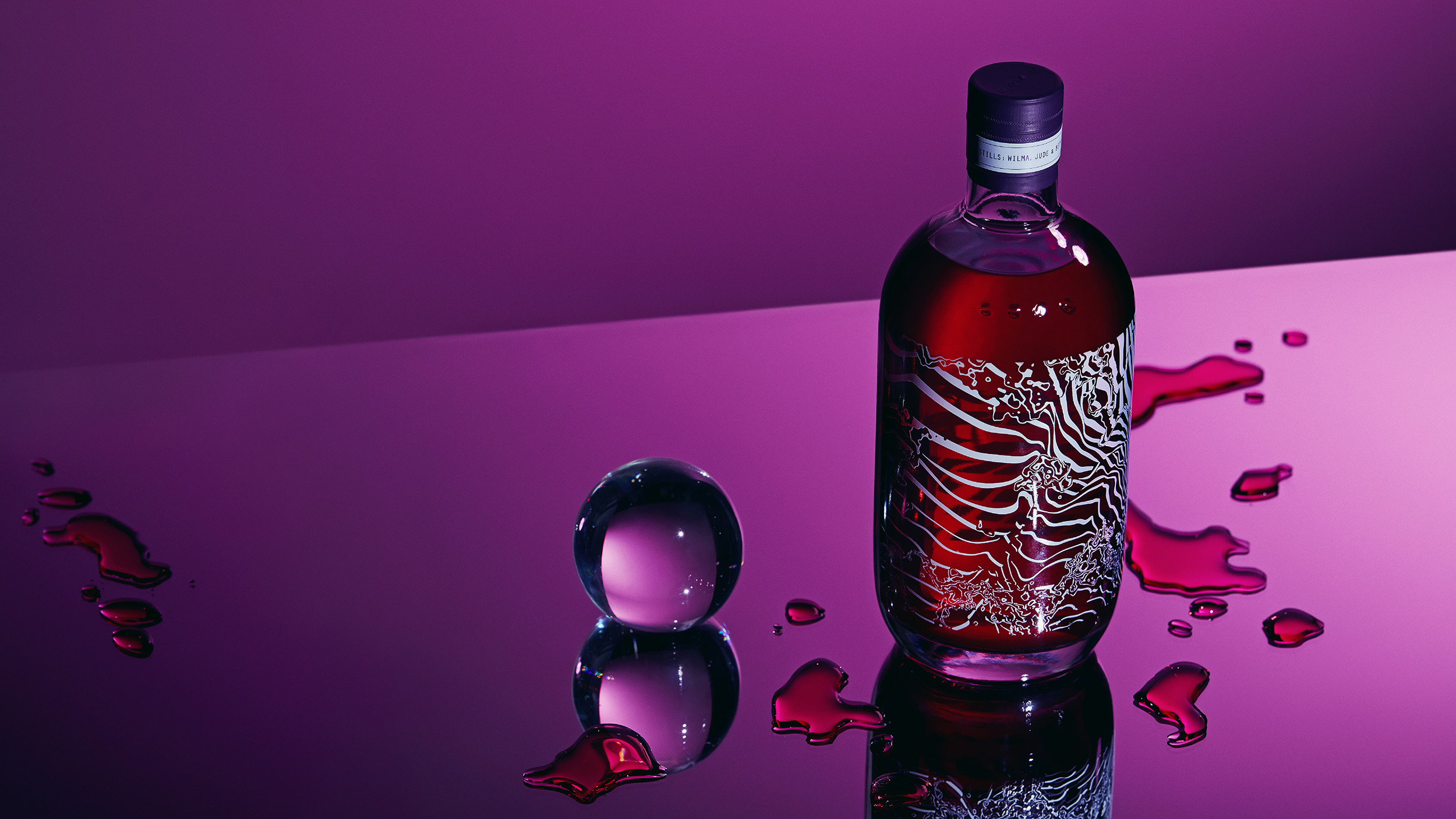
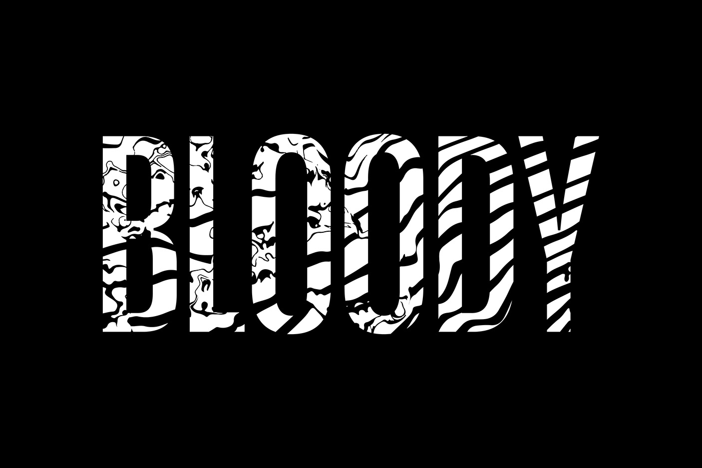
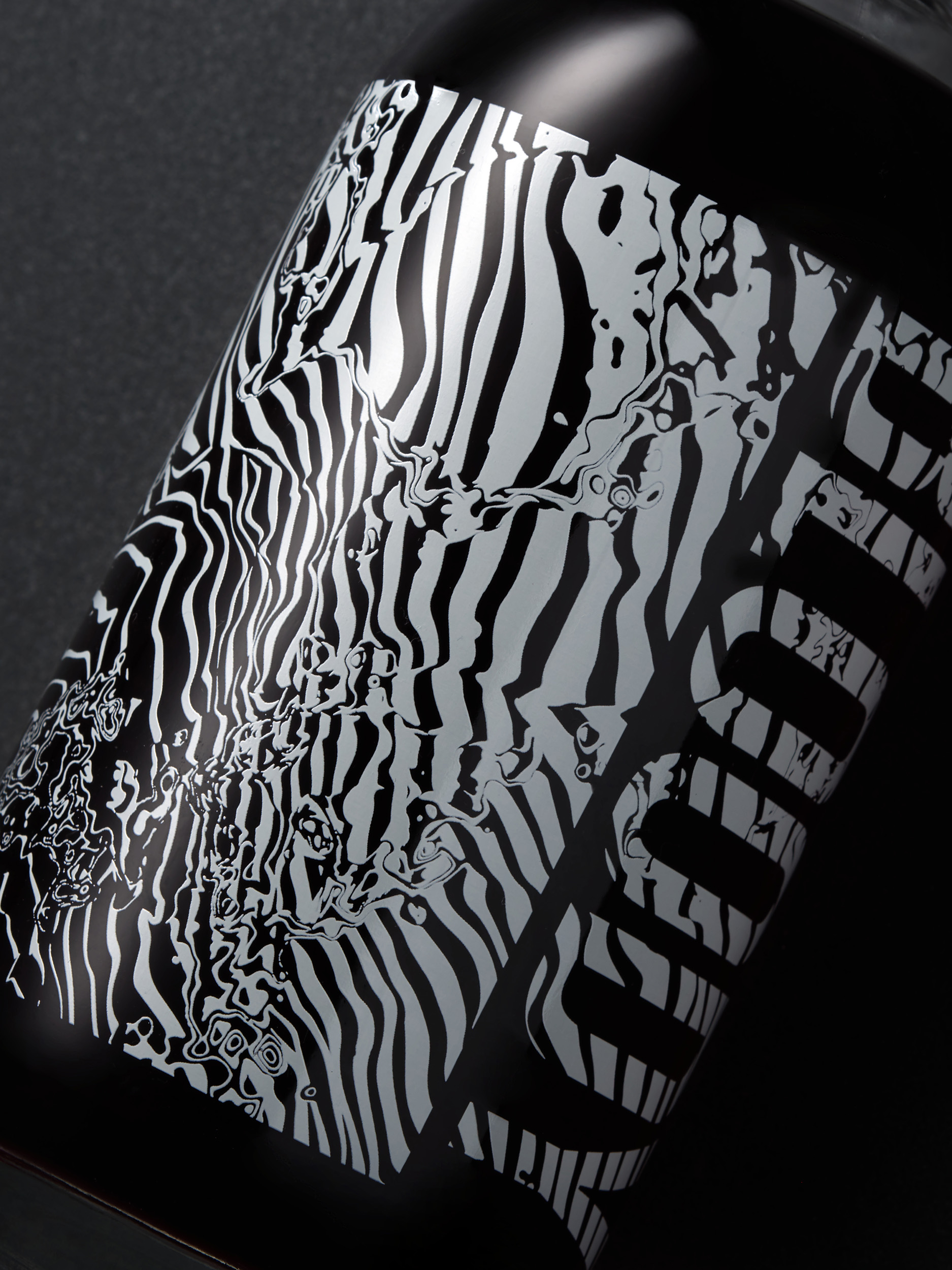
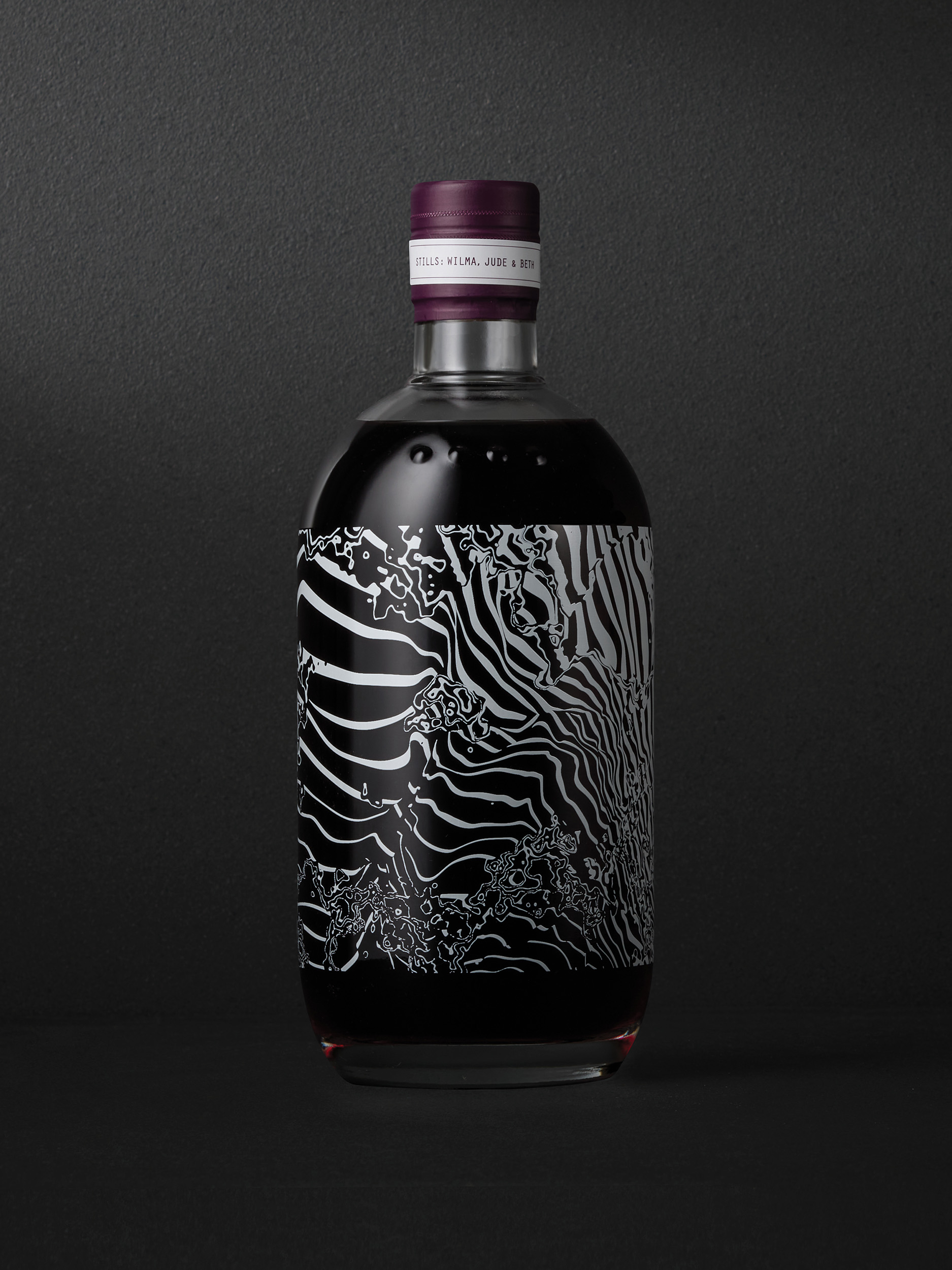
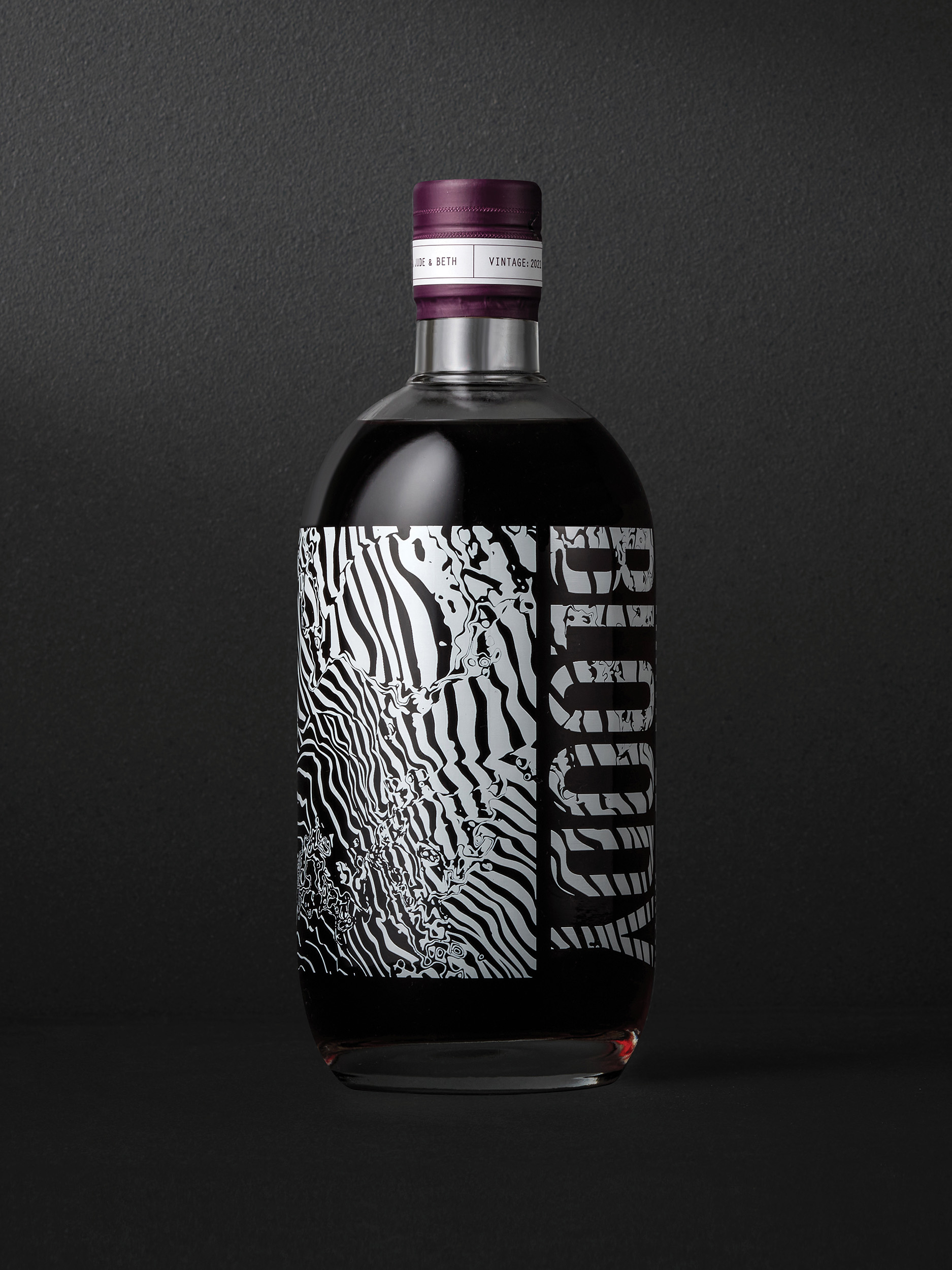
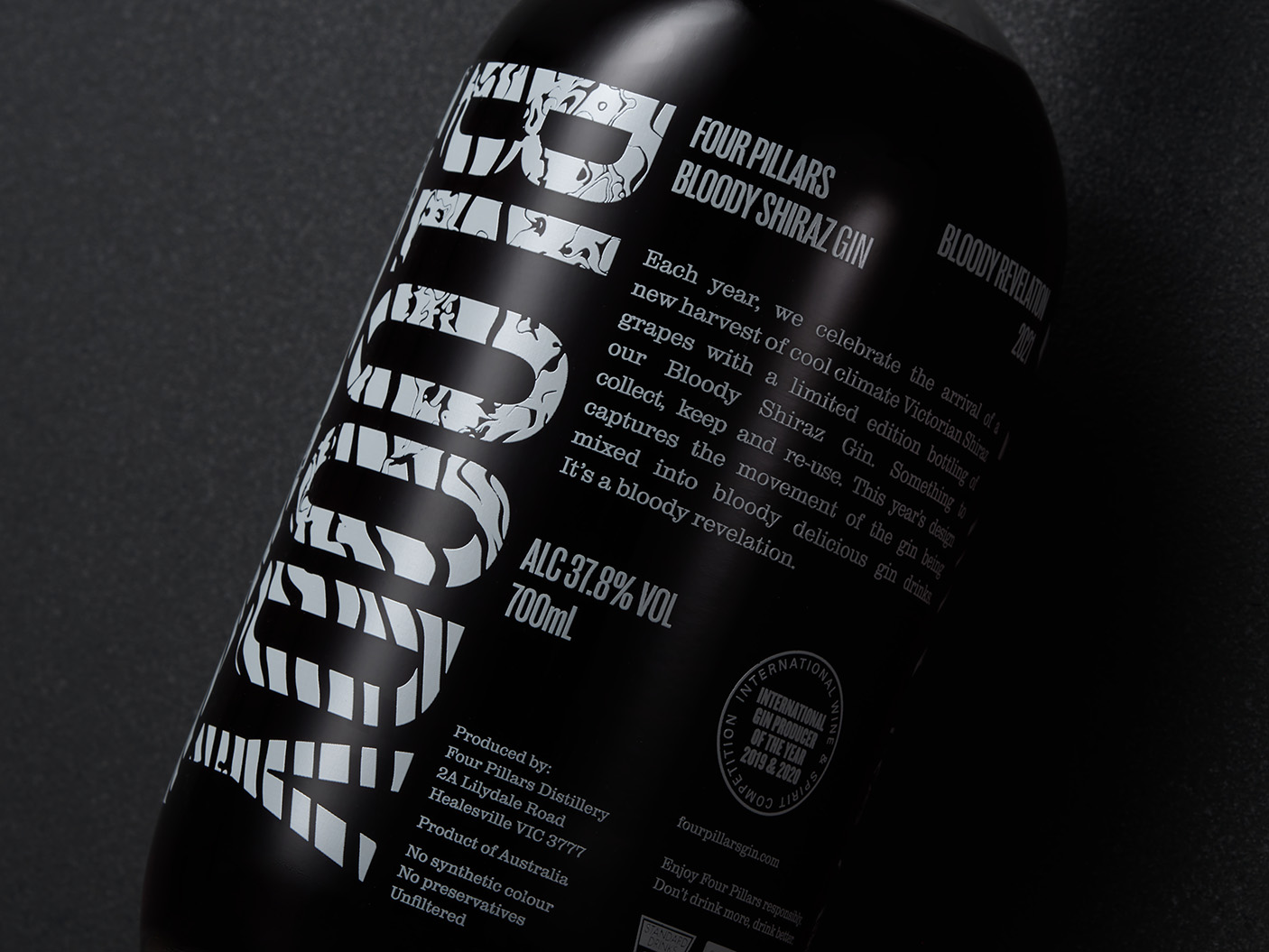
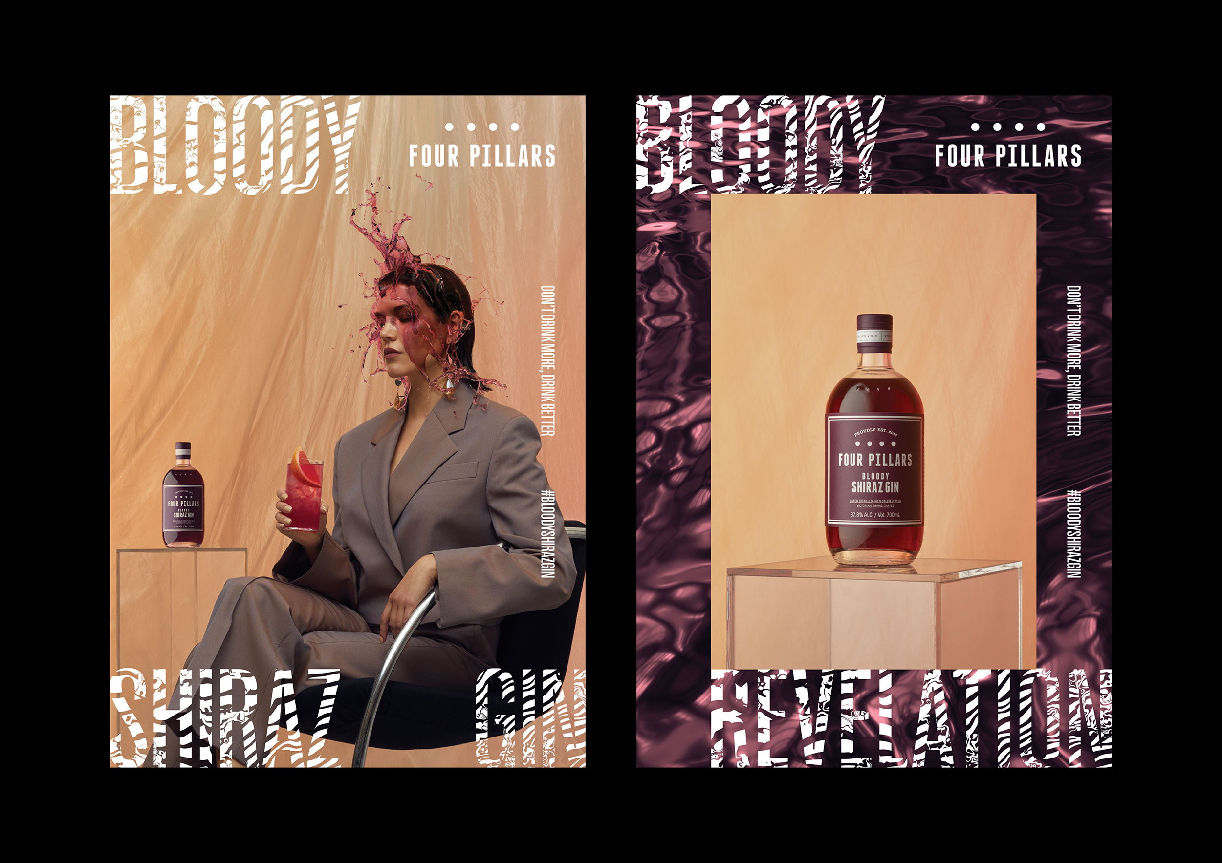
Inspired by the luscious qualities of the purple liquid, a series of mesmerising visual assets were created—rippling liquid textures and typography that mimicked the kinetic effect of the gin—becoming the centrepiece of the campaign. These striking liquid assets flowed across every touchpoint, from digital content, print, environmental and display. Most prominently, these graphics became a key feature of the 2021 limited-edition Bloody Shiraz Gin bottle, which was launched as the first phase of the campaign.
Applied to the glass bottle as an intricately screen-print, the design wrapped the entire front face of the bottle to create a truly single-minded approach, focused on hero-ing the unique purple colour of the liquid. The side label then featured the gin’s most provocative nickname: ‘BLOODY’, a name that references the process of ‘bleeding’ colour from wine grapes. This bold BLOODY wordmark and the liquid assets were then integrated into the campaign teaser phase —adding an irreverent brashness when used in the cheeky colloquial Australian context.
A bloody icon
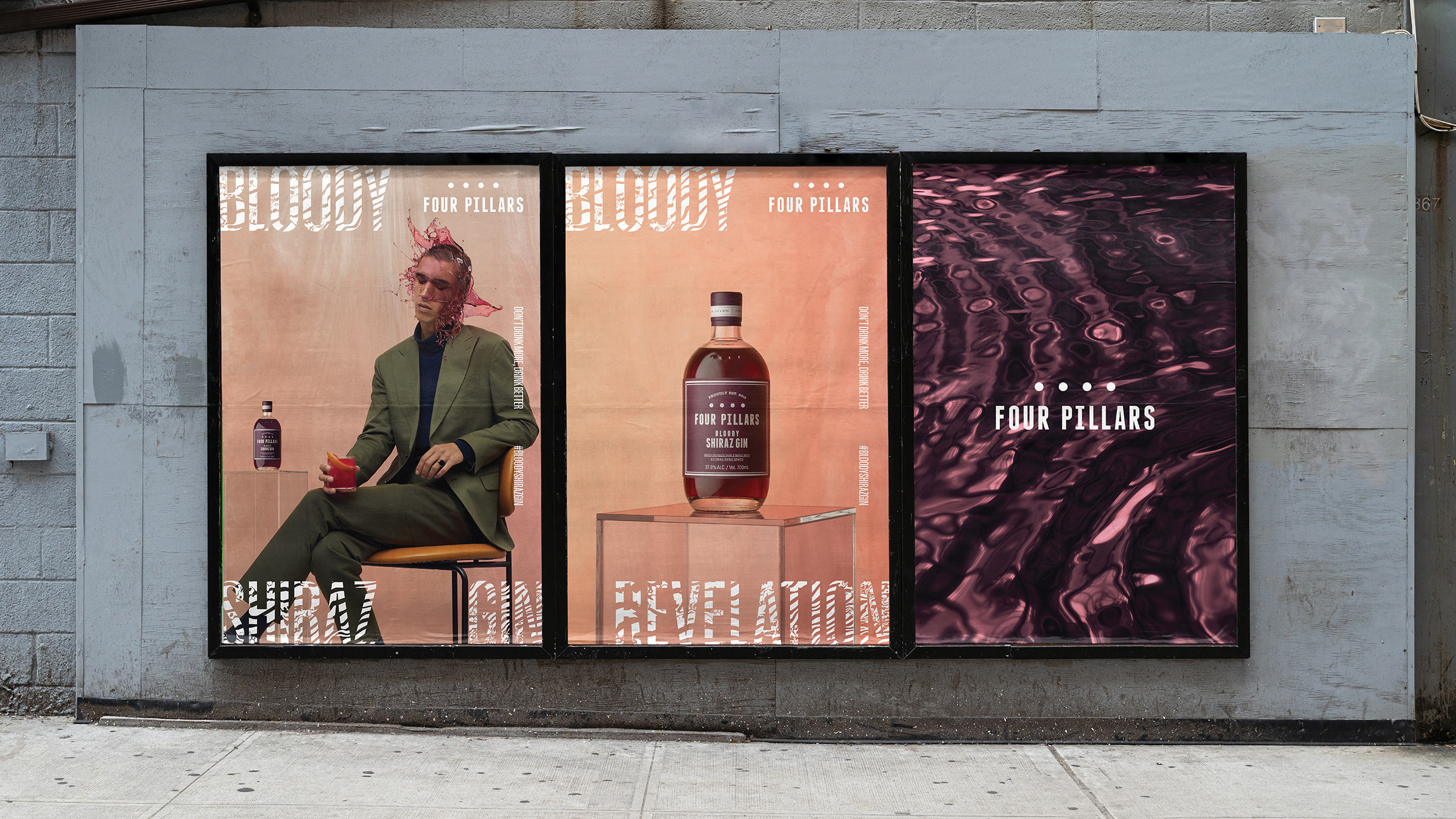
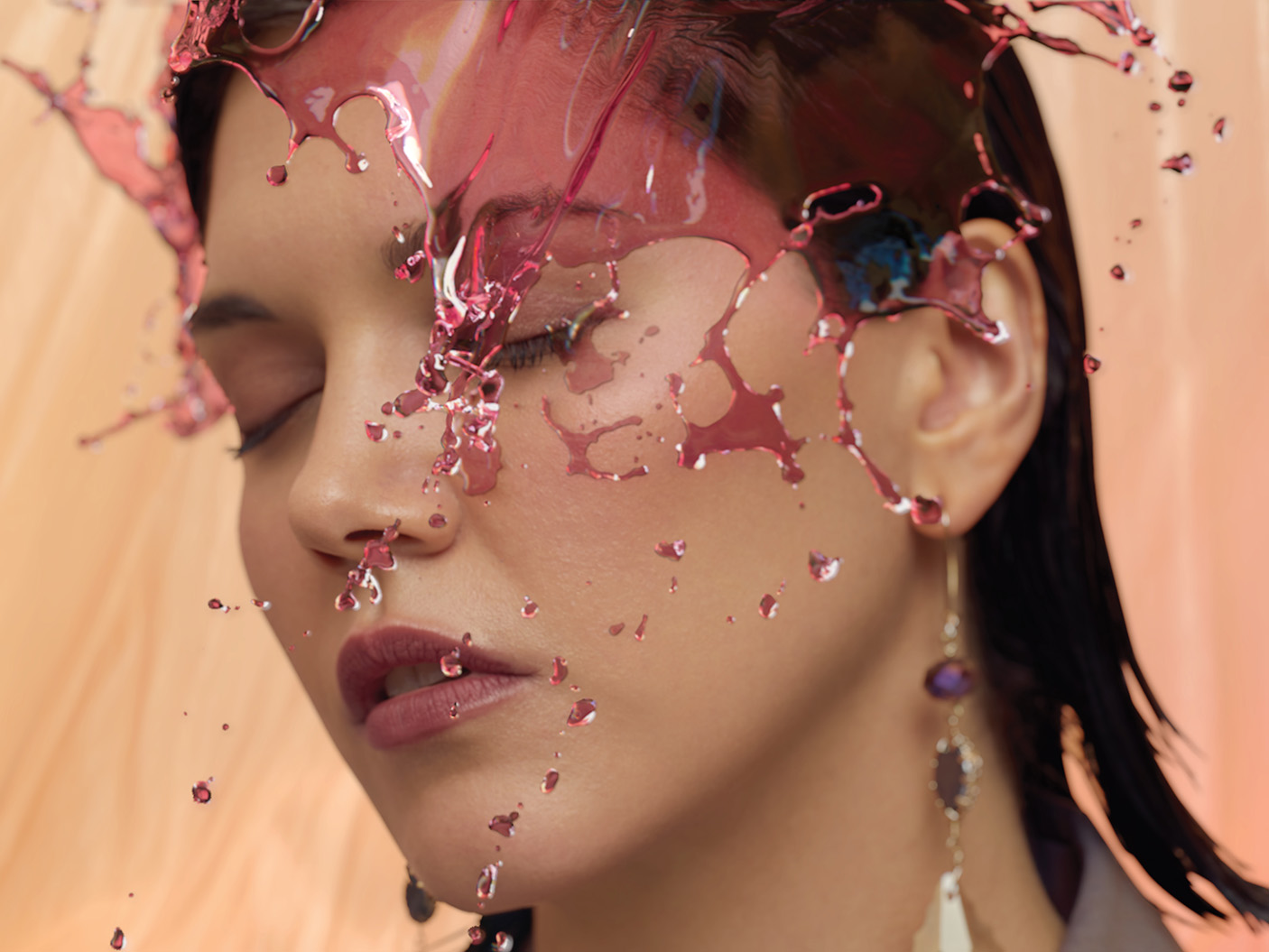
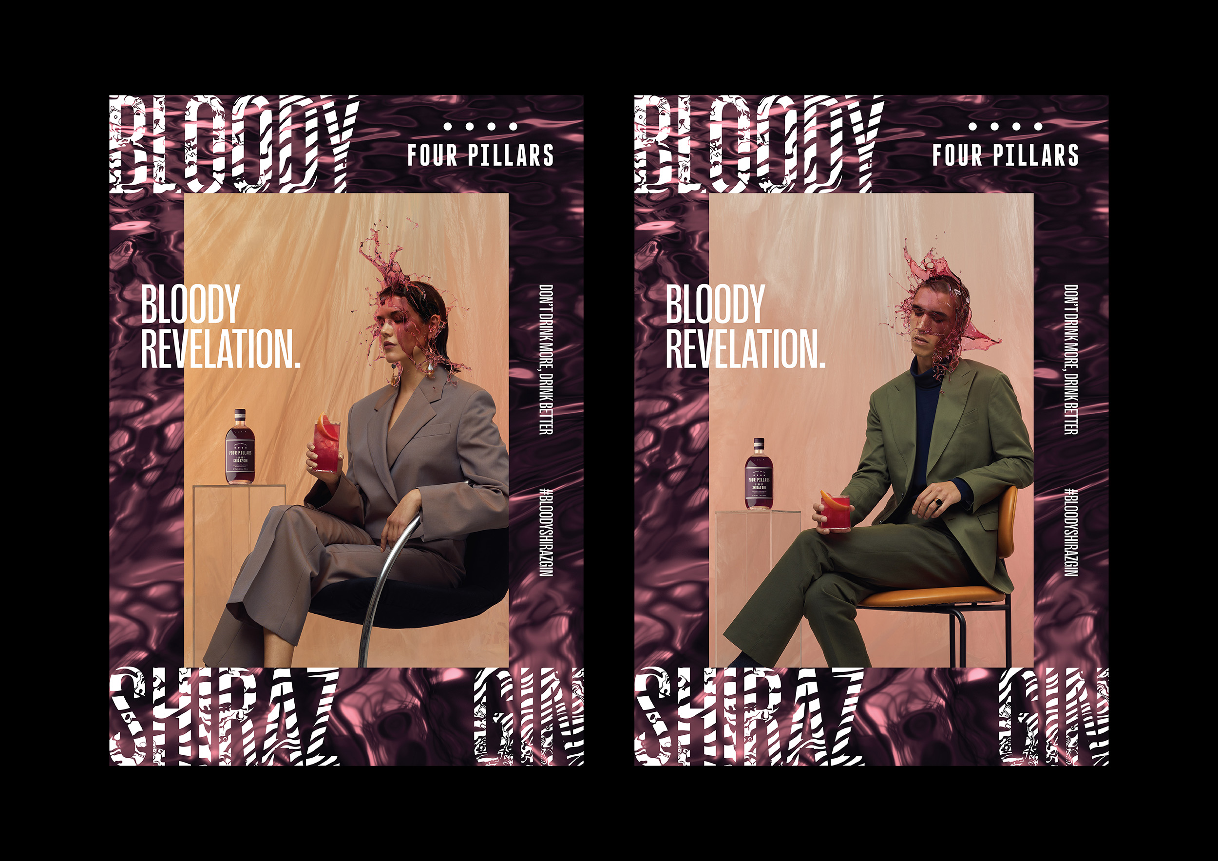
The second phase of the campaign was all about capturing the ‘moment of revelation’—that remarkable instance when someone tries the Bloody Shiraz Gin for the first time.
Brought to life through a series of hyper-staged and stylised fashion portraits, we see two models—gin drink in hand—with the glistening purple liquid flowing gracefully across their faces. In motion, the liquid moves in ultra-slow motion, as if defying gravity, bringing a surreal luxuriousness and mesmerising beauty to every droplet as it descends. A true metaphor of the all-consuming sensorial experience of Bloody Shiraz Gin. The campaign was supported by a contemporary, spacious soundtrack—bringing a calming ambience to the content.
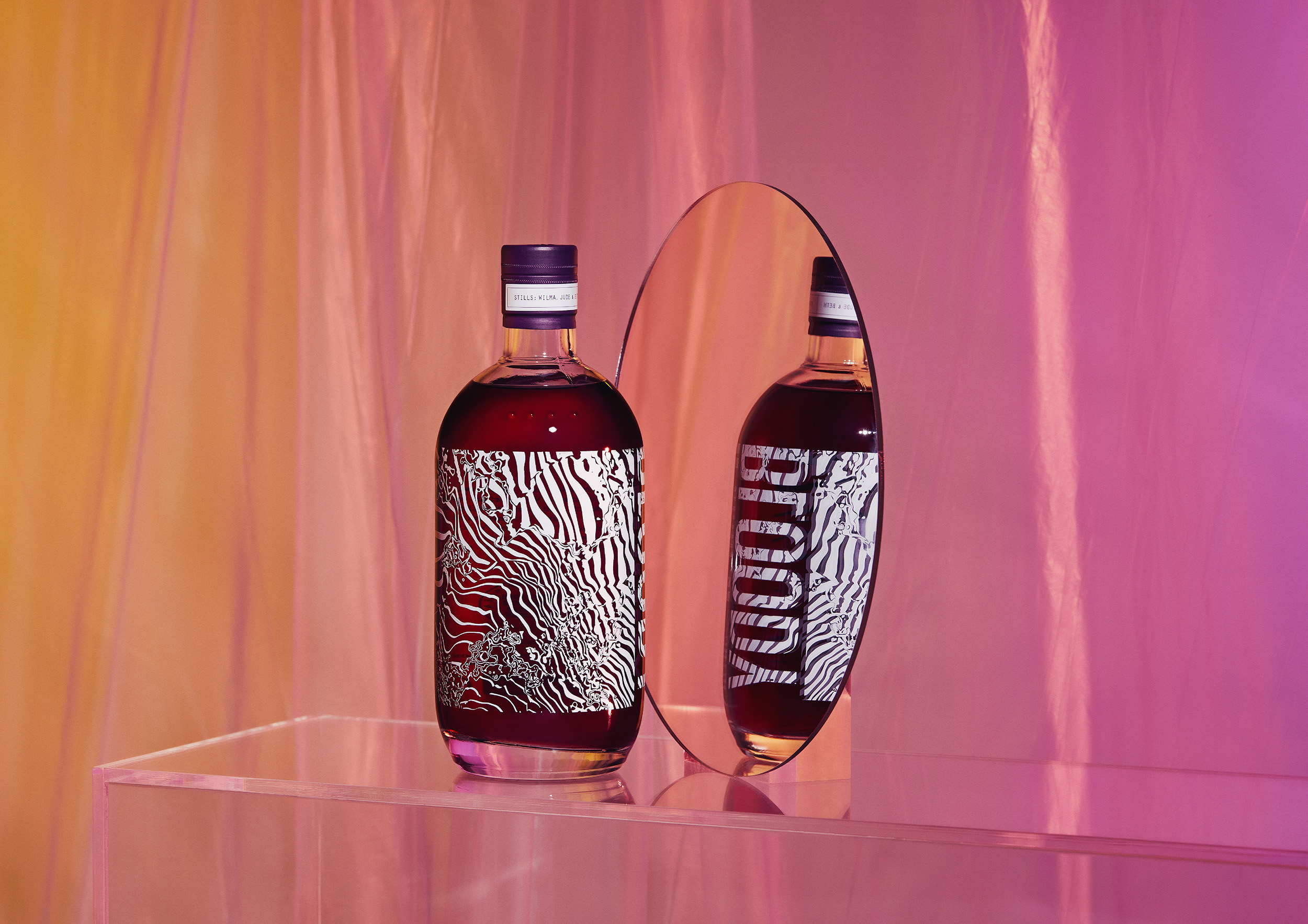
The campaign was further supported through product photography that tied the Bloody Shiraz experience together. Set in an almost surreal purple plastic world comprised of reflective glass surfaces against a translucent plastic backdrop—the ripples of which mimicked both the label design and the flowing liquid—these photographs captured the limited edition bottle’s best angles… which was all of them.
Packaging porn
The resulting limited-edition label design felt less like a product, and more like a work of art… with some describing the result as ‘packaging porn’, while others commenting that they’d ‘buy it just for the bottle’. The limited-edition label design and associated graphics were also successfully leveraged as a tool to build intrigue and momentum for the second phase of the Bloody Shiraz Gin marketing campaign. Over [XXX] of the limited-edition bottles sold—about a third of all 2021 Bloody Shiraz Gin sold. Additionally, the limited-edition pack design was awarded a Distinction and a Judges Choice at the AGDA Design Awards.
Scope:
- Campaign Strategy
- Campaign Creative
- Photography & Art Direction
- Photography
- Styling
- Motion Design
- 3D Animation
- Film Production
- Sound Design
- Graphic Design
- Illustration
- Finished Art
- Management & Production
Inspired by the luscious qualities of the purple liquid, a series of mesmerising visual assets were created—rippling liquid textures and typography that mimicked the kinetic effect of the gin—becoming the centrepiece of the campaign. These assets flowed across every touchpoint, from digital content, print, environmental and display. The graphics were also featured on the screen-printed limited-edition bottle, which was launched as the first phase of the campaign.
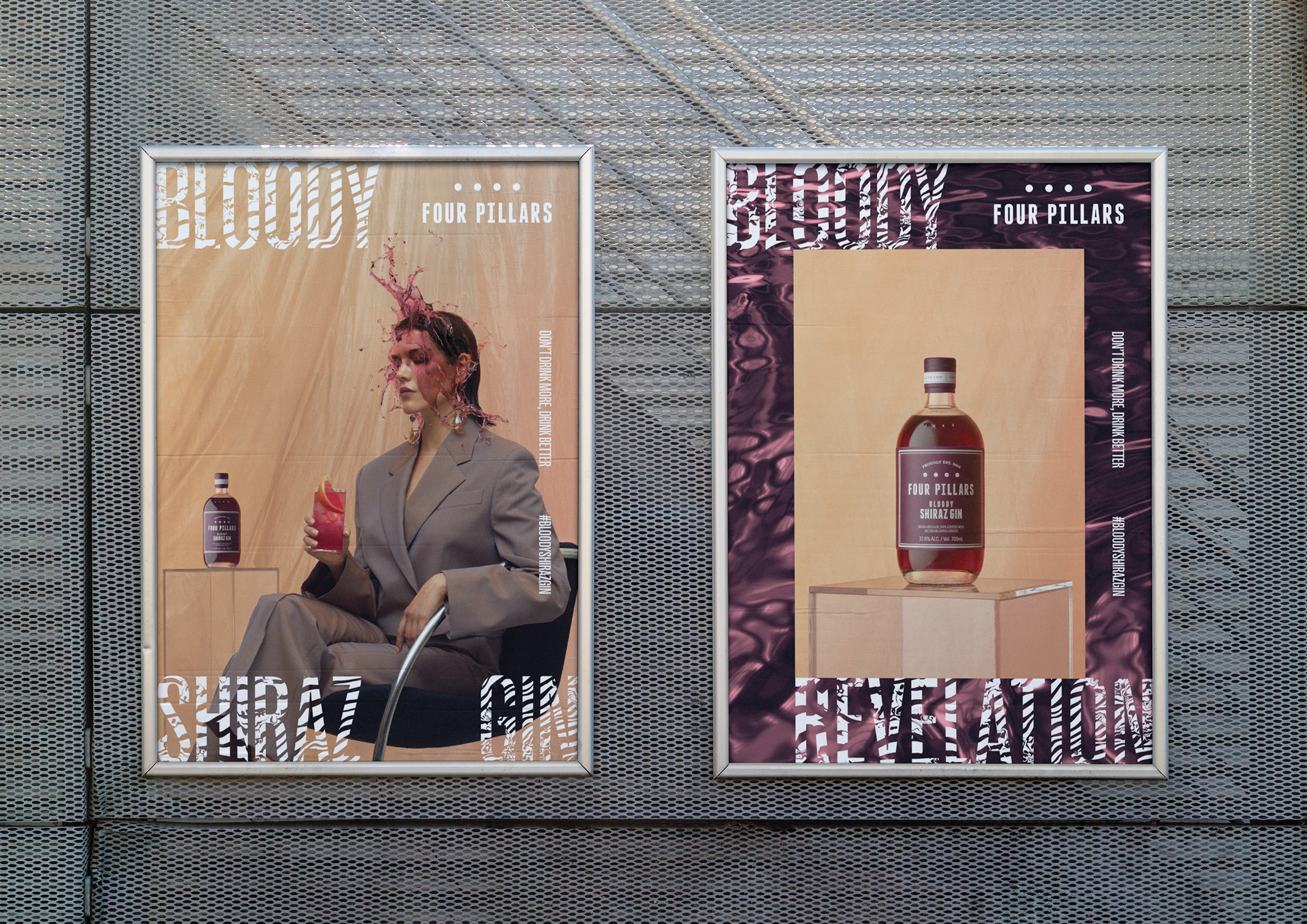
The second phase of the campaign was all about capturing the ‘moment of revelation’—that remarkable instance when someone tries the Bloody Shiraz Gin for the first time. This ‘Bloody Revelation’ is visualised through the stunning purple liquid slowly and gracefully enveloping people’s faces, as if capturing the exact moment of impact.
The purple liquid become a key motif of the campaign and allowed Four Pillars to activate their homes in Sydney Drinks Lab and Healesville Distillery