Coloursmith Lives in Colour
When it comes to talking or writing about colour, it’s common to fall into a number of traps—whether it’s focussing on colour trends or forecasts, or exploring colour theory through an overly academic lens. But what about our relationship with colour? The memories, experiences and feelings associated with the colours we choose to surround ourselves with… where are those stories? This theory is exactly what the ‘Lives in Colour’ book explores.
Bringing colour to life
Conceived as a precursor to the launch of the new Coloursmith product and brand—a new technology empowering consumers to create their own colours—the Lives In Colour book needed to act as inspiration for consumers—and to demonstrate the brands thought leadership and commitment to connecting colour to personal stories and experiences.
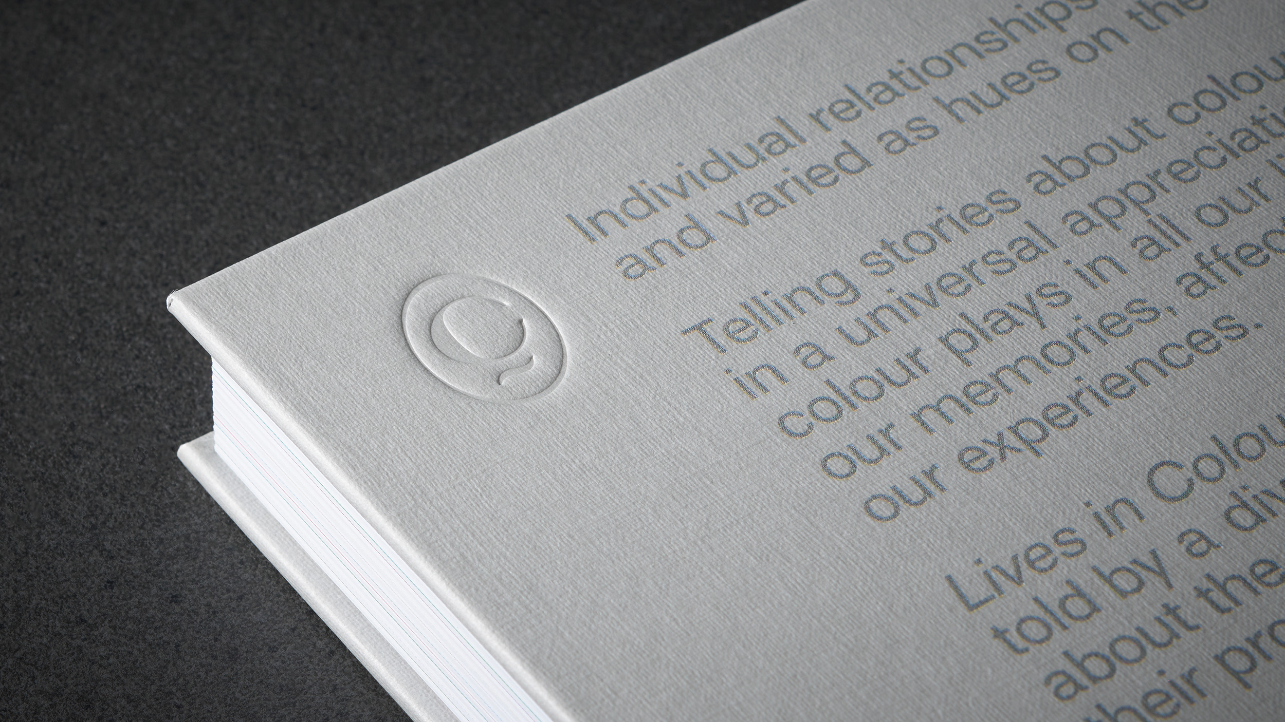
From our formative early childhood memories… to professional pursuits… to pivotal moments… colour can be a means with which to reveal the most poignant personal tales.
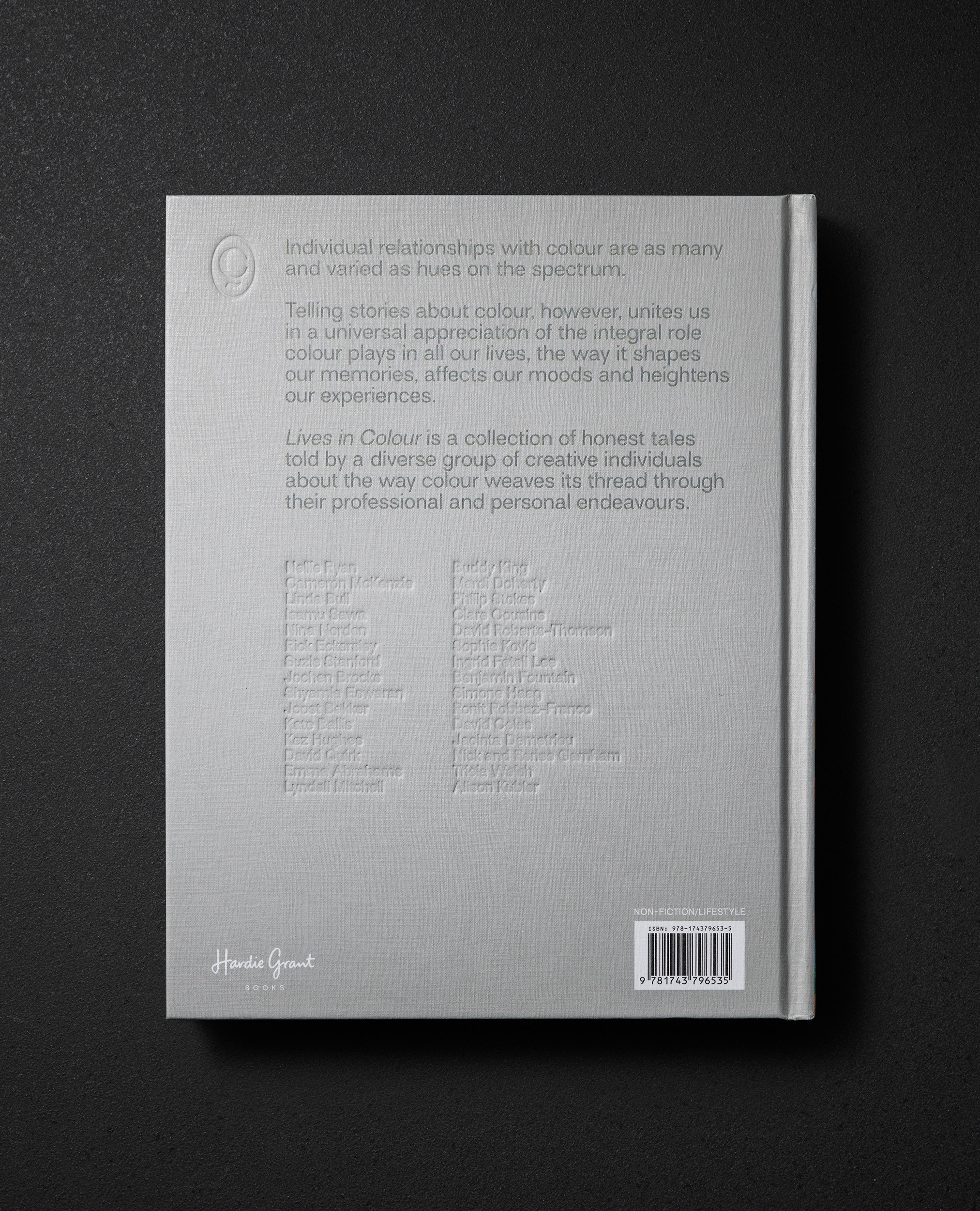
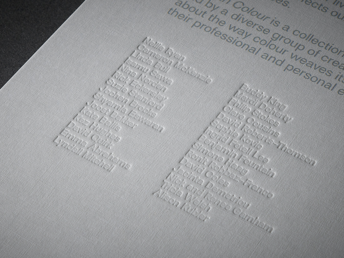
Lives in Colour is a curated compilation of such stories, shared by individuals whose
relationships with colour are as varied as the colour spectrum itself. Some work with colour — artists, designers, farmers; others live what we call ‘colourful lives’—unconventional, exotic and eventful; and, for some, colour is a more subtle, incidental but ever-present element.
Their anecdotes offer us an insight into their lives and personalities and highlights the diversity of human experience. The resulting tapestry of tales illustrates the universality and democratisation of colour — the fact that it touches all of us in vastly different ways.
Letting colour tell a story
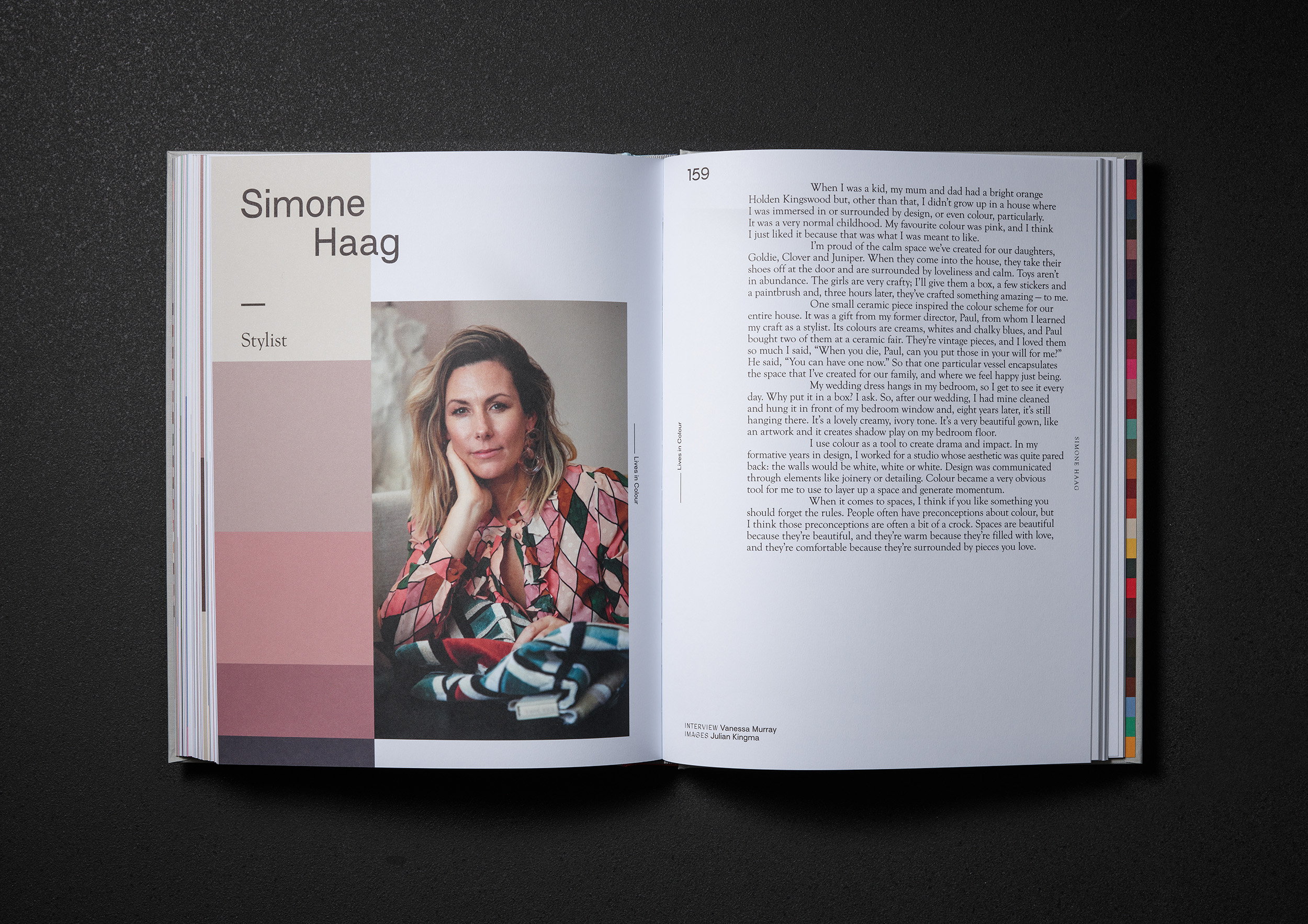
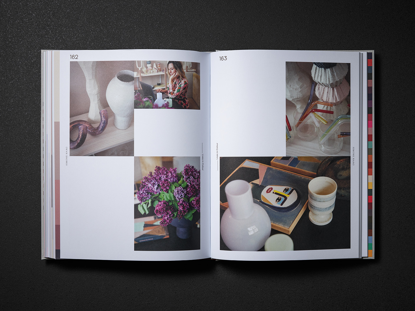
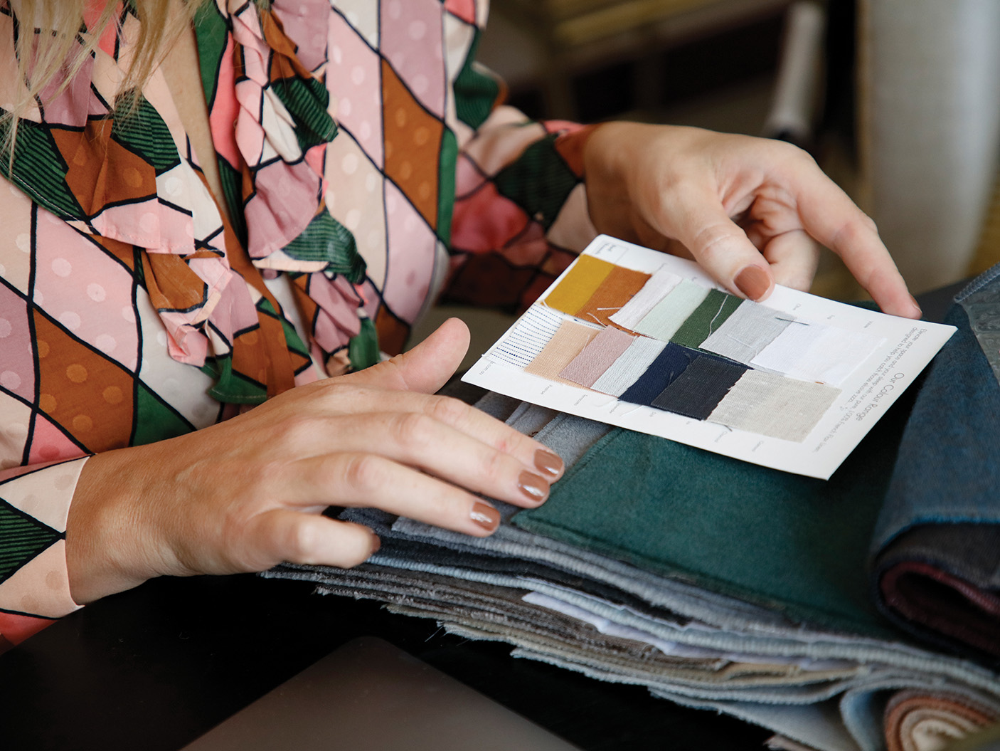
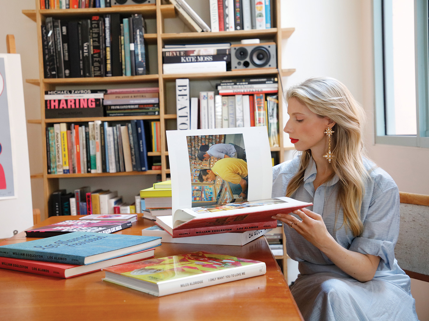
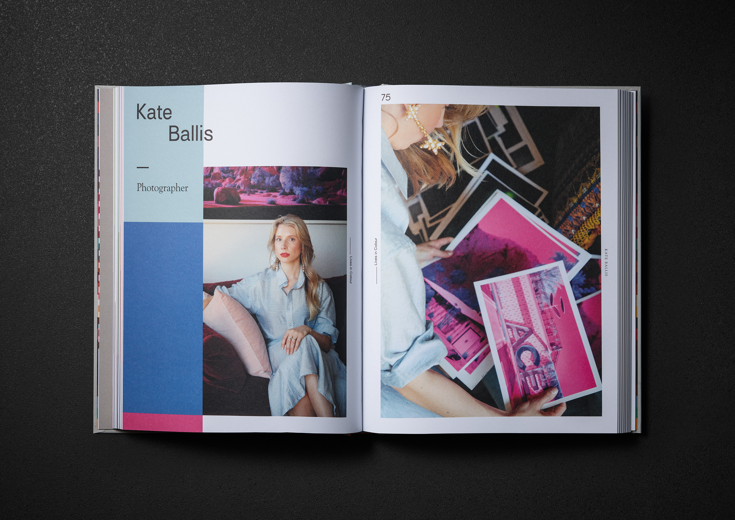
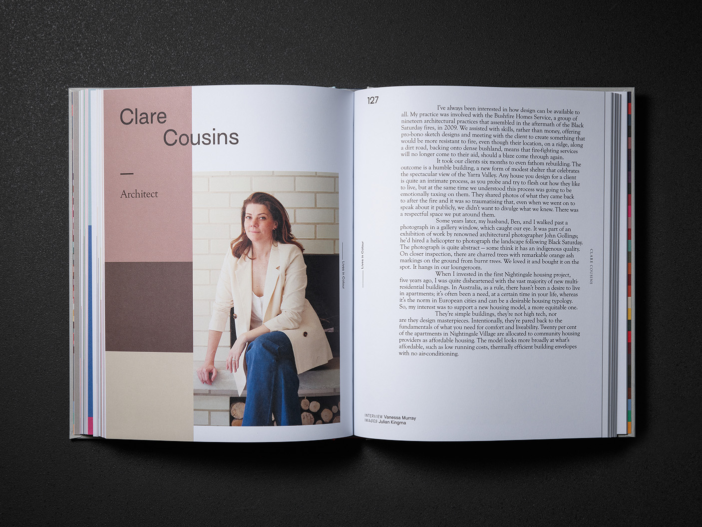
Working collaboratively with the publisher, these colour stories were captured through a series of first-person style narratives and candid portraits which were to be shot by 16 different photographers. Therefore we needed to establish a clear photographic art direction to ensure consistency of style across the portraits.
To ensure that the colour of the stories and photographs were the creative centrepeice, our approach to colour design was minimalistic, using white space to draw the reader’s attention to the subject matter.
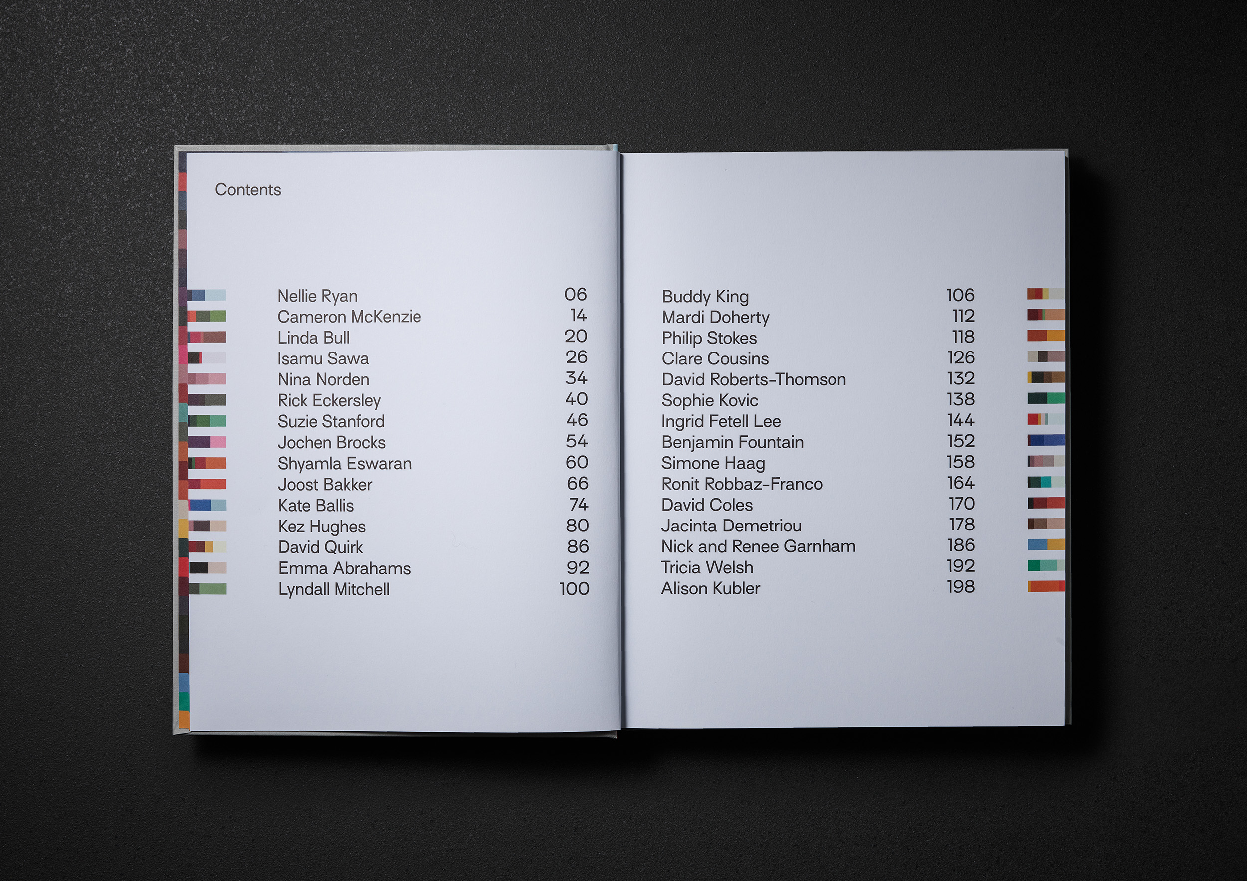
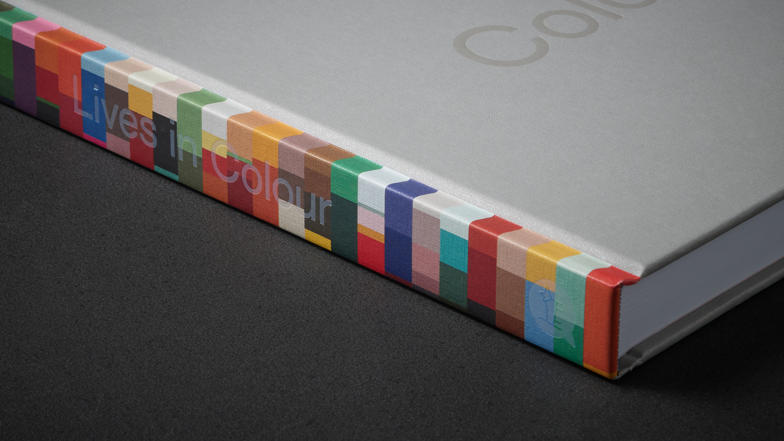
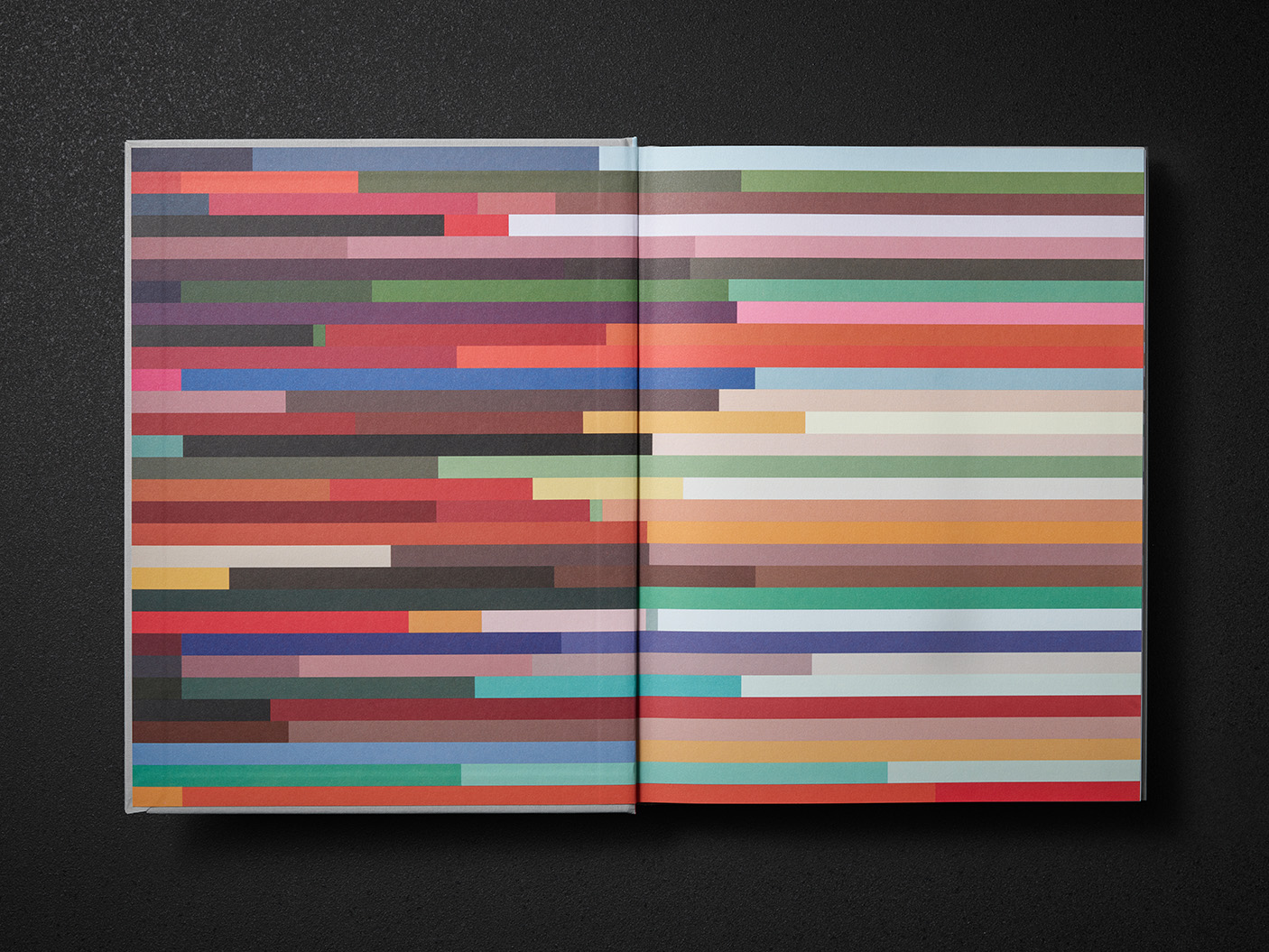
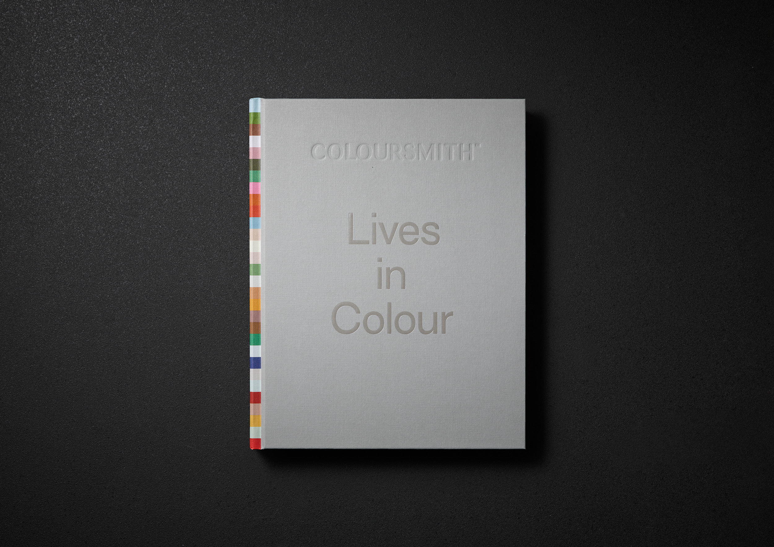
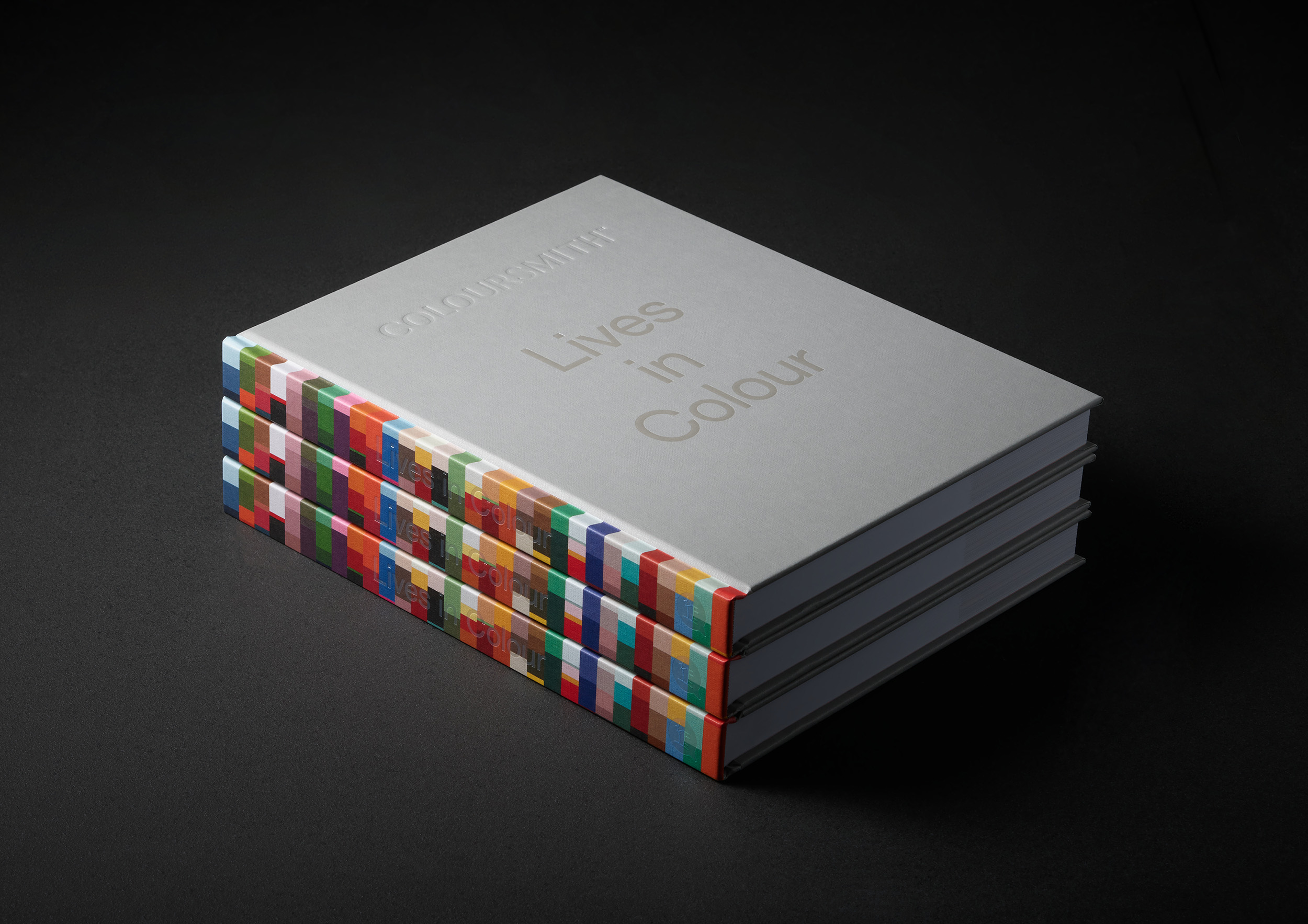
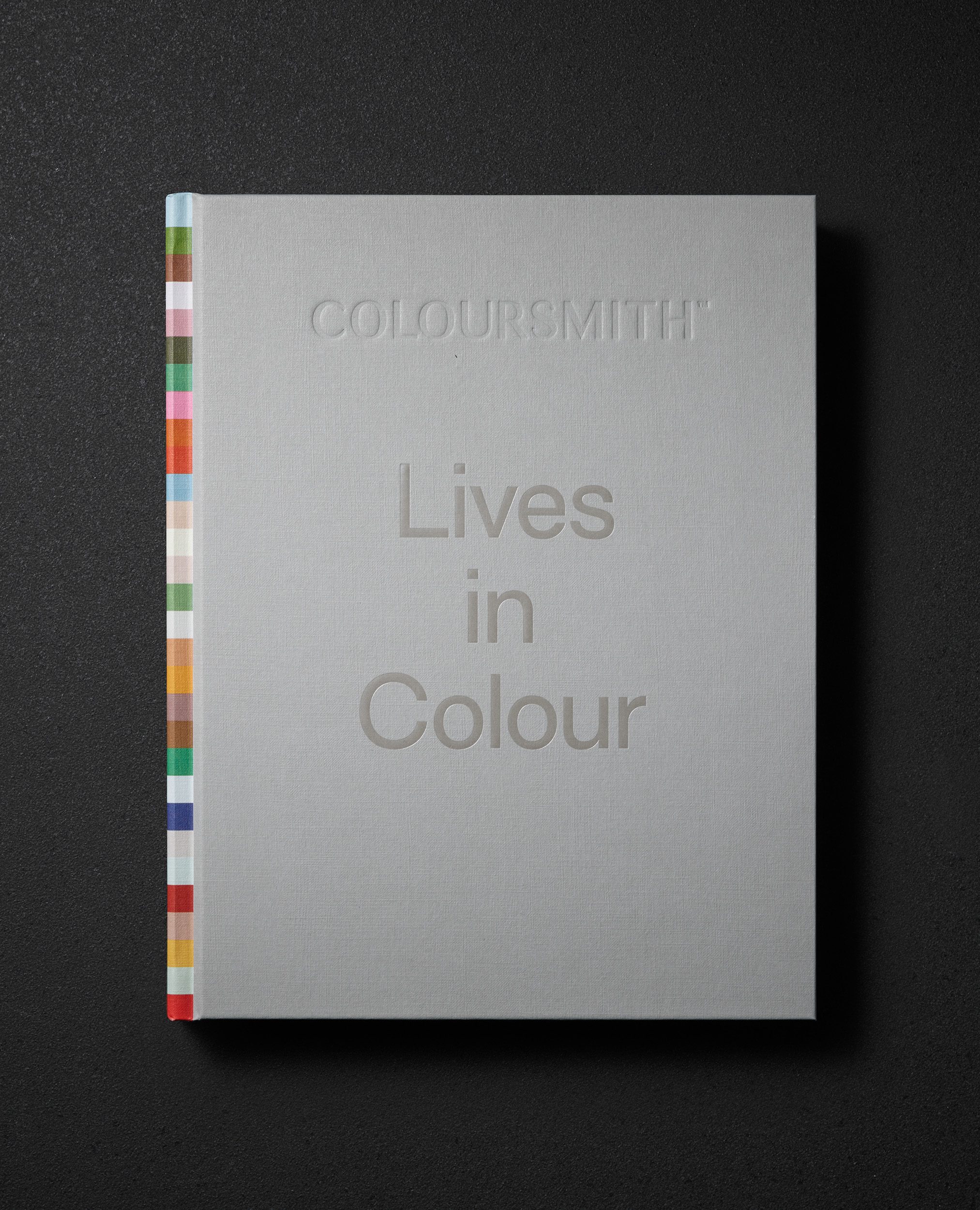
Each individual’s story was then distilled down to a simple palette of colours —some simple… comprising of two complimentary colours, and others more complex… reflecting the theme of their story. These distinctive palettes were used throughout the book as a unique 'colour signature', adding a burst of design personalisation into the pages of each interview.
When combined these dozens of unique palettes became a rich colour tapestry that were then applied to the inside covers and book spine to provide an emotional chromatic spectrum that reflects the myriad, diverse, and colourful stories found within.
The ultimate purpose of the Lives in Colour book was to explore the intimate relationship between people and colour—irrespective of background, age, ethnicity, occupation and so on. This book both investigated and challenged individual, personal experiences of colour through the lens of shared stories. The book was distributed and recognised amongst each of the people featured and their broader community of followers, influencers and industry leaders in paint and design.
Scope:
- Creative Direction
- Photography & Art Direction
- Publication Design
- Naming
- Comms Strategy
- Photography
- Styling
- Management & Production
From our formative early childhood memories… to professional pursuits… to pivotal moments… colour can be a means with which to reveal the most poignant personal tales. Lives in Colour is a curated compilation of such stories, shared by individuals whose relationships with colour are as varied as the colour spectrum itself.
The book features a diverse range of people from different backgrounds and industries all revealing their personal relationship with the colour in their world. Some work with colour, others live what we call ‘colourful lives’— and for some, colour is a more subtle, incidental but ever-present element.
Each individual’s story was then distilled down to a simple palette of colours —some simple… comprising of two complimentary colours, and others more complex… reflecting the theme of their story. These distinctive palettes were used throughout the book as a unique 'colour signature', adding a burst of design personalisation into the pages of each interview.
When combined these dozens of unique palettes became a rich colour tapestry that were then applied to the inside covers and book spine to provide an emotional chromatic spectrum that reflects the myriad, diverse, and colourful stories found within.