Detour Beer Co
The Napoleone family are Yarra Valley legends, having put down roots (literally and figuratively) over 70 years ago. A family-owned business since 1948, they began their journey as growers first and makers second. Growing apples led to them making cider. Growing grapes, led to them making wine. Today, making is taking the front seat, with a new generation of Napoleones’ charting another new course. A thirst for beer taking the family on a detour.
A beer created for winemakers
Every detour starts with a thirst. In this case, it was a thirst for something a little different—what originally started as a group of winemakers searching for the perfect post-harvest brew, became a beer really worth sharing. This unquenchable curiousness could only come from the culmination of three generations of orchardists and winemakers in the Yarra Valley—passionate growers and small batch makers to their very core.
However, getting this beer off the ground and onto shelves would be a process of complete reinvention for the beer brand. The brand—previously operating under the ‘Napoleone’ name—was at odds with the increasingly progressive local craft beer category.
The brand needed a fresh creative approach that would appeal to both beer lovers and beer geeks alike. And so ‘Detour’ was born—representing both the family’s shift from fruit growers to beer brewers, and also the detour they encourage every beer lover to take—to the Yarra Valley, via beer.
This is a beer that needed to reside at the emotional intersection somewhere between the magnetic energy of Melbourne’s laneways and the swooning elegance of Yarra Valley wine country—we needed to show this was a detour worth taking. A little bit of city hustle and a lot of wine country chill.
All signs point to beer
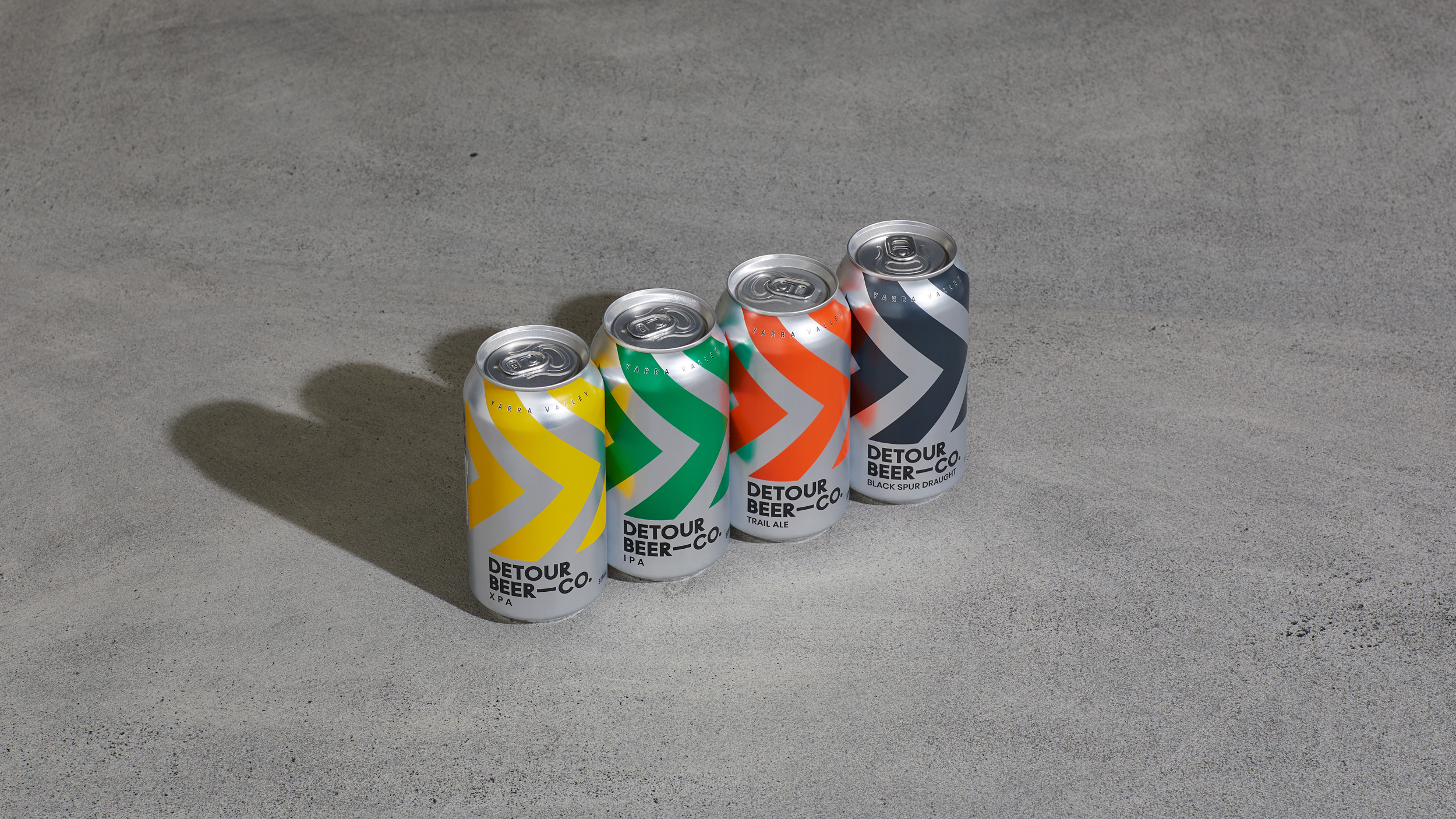
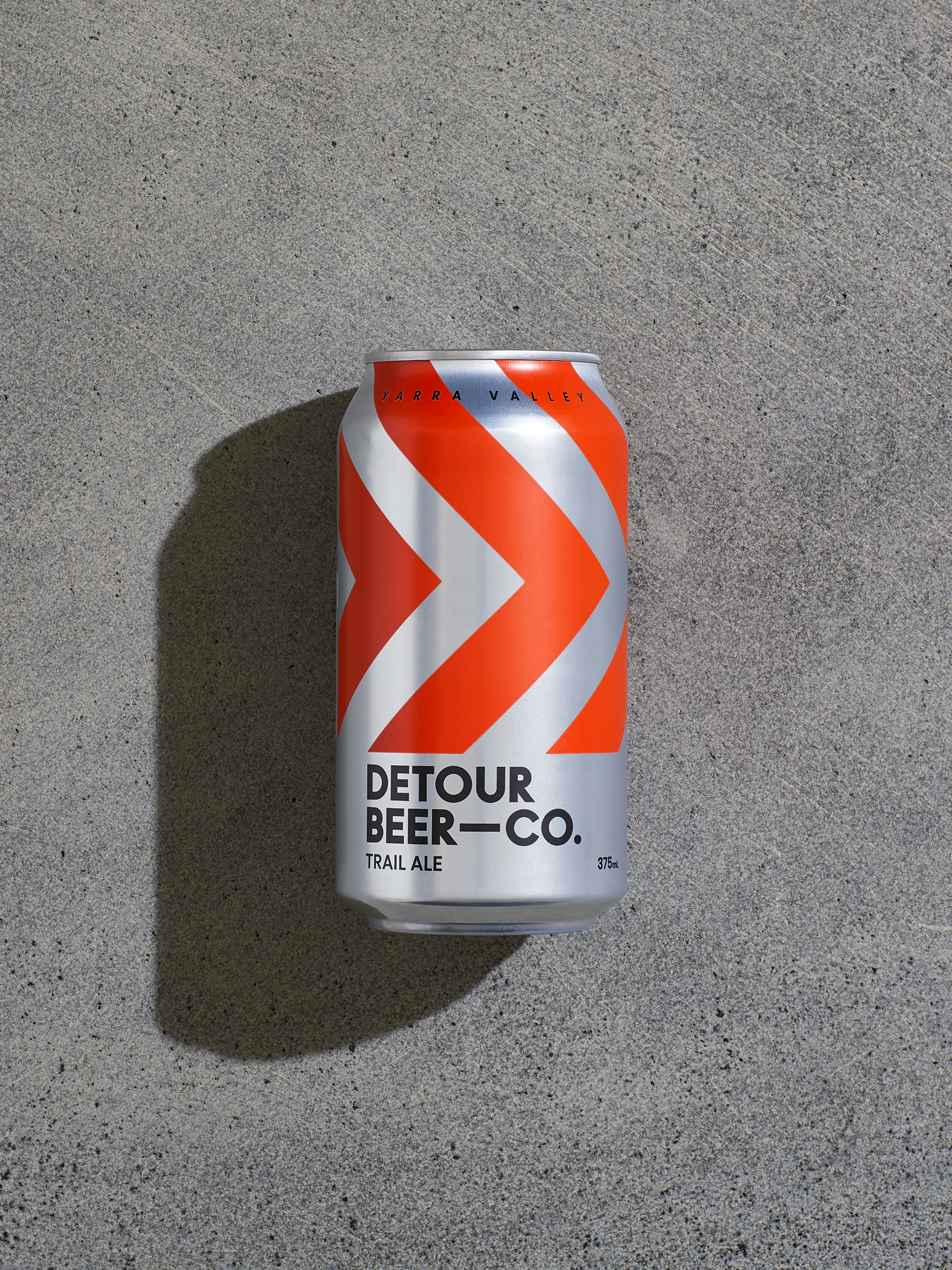
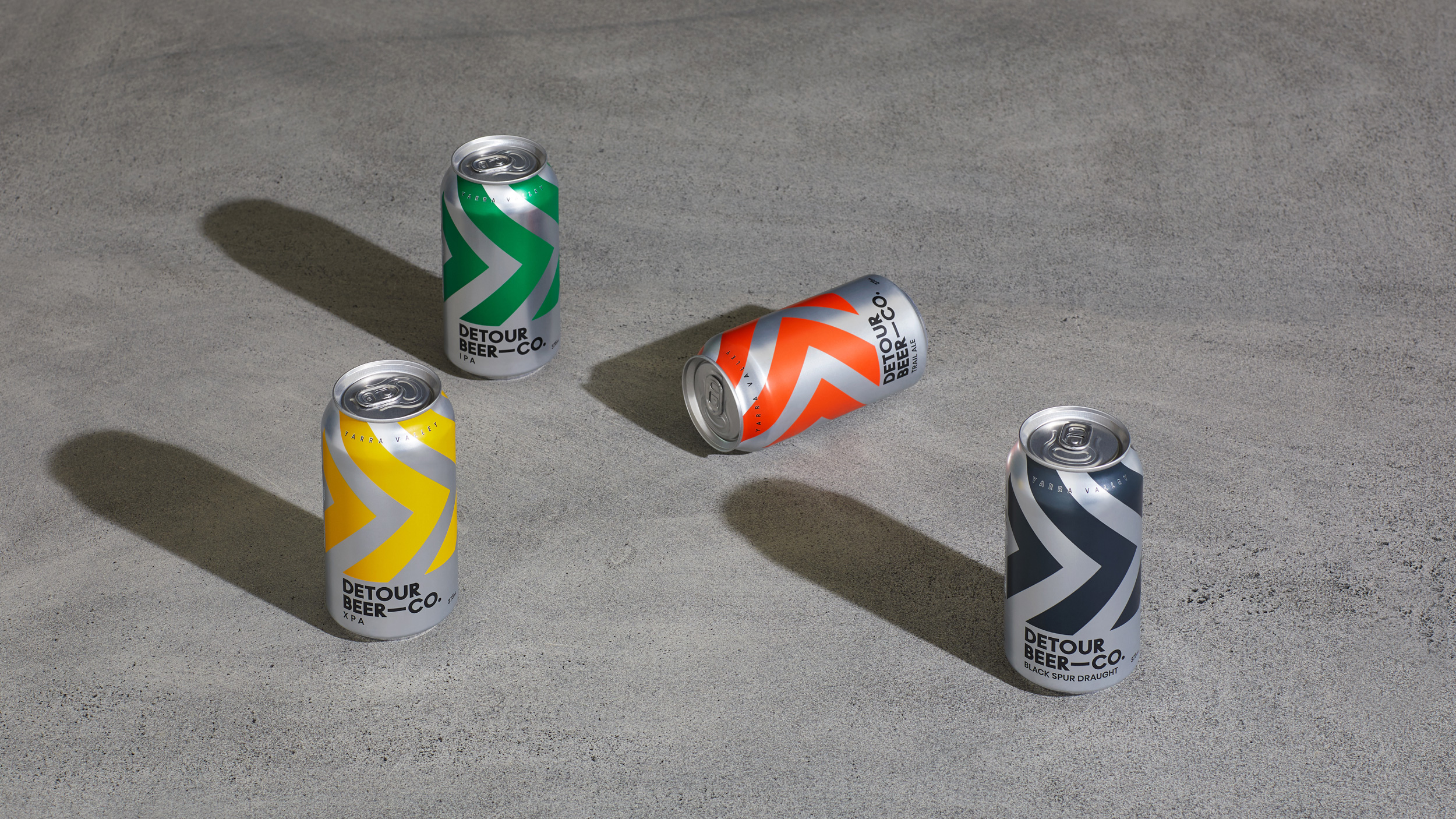
From a design perspective, the Detour creative needed to perform a number of important roles. Firstly, it needed to feel at home both in a craft beer fridge, but equally, stand out from the frantic array of craft beer packaging design flooding the market. Secondly, it needed to feel distinctive enough to appeal to the ‘hipster’ market, while remaining true to the culture of the family business and region— hard working farmers from Yarra Valley.
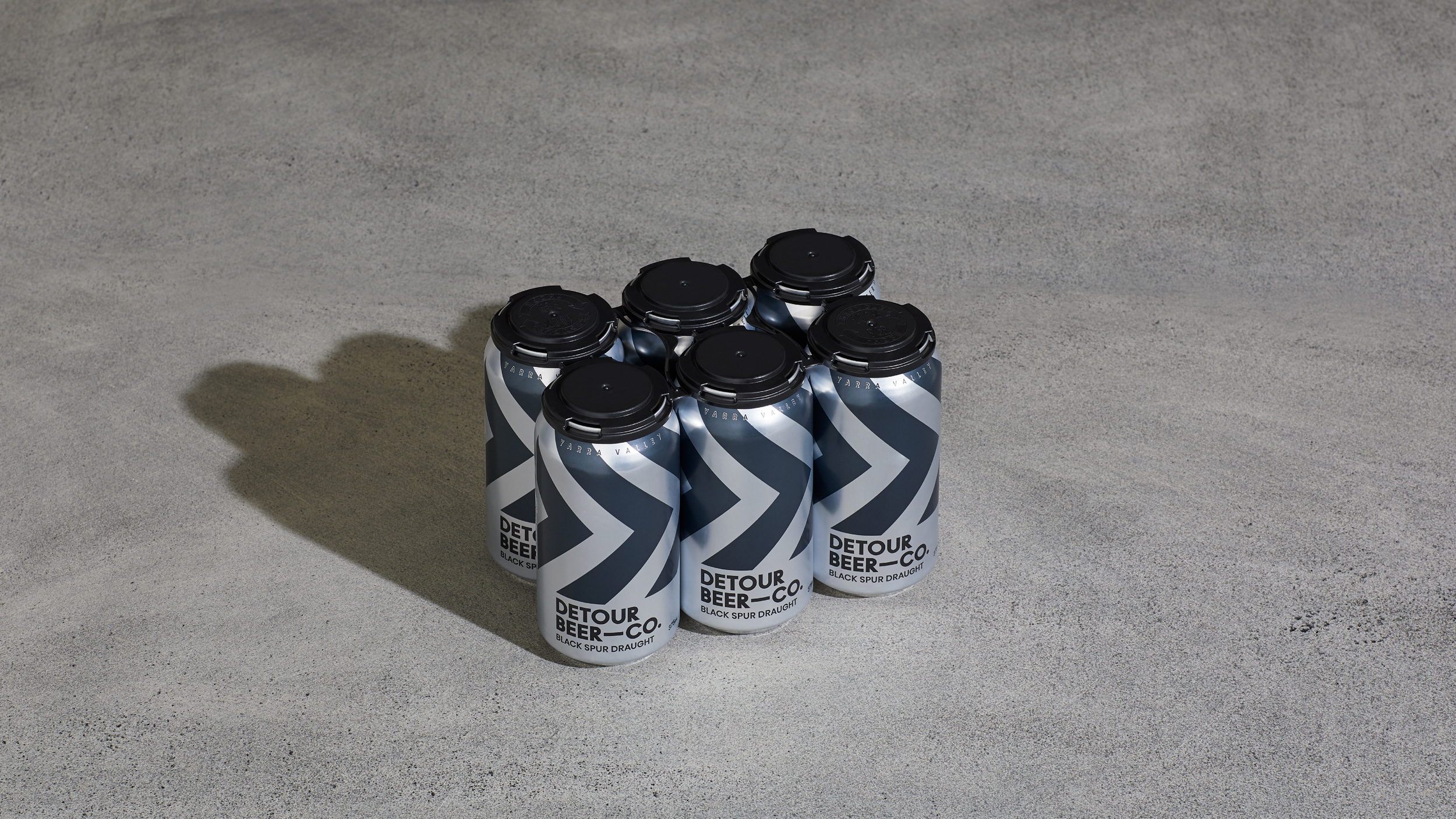
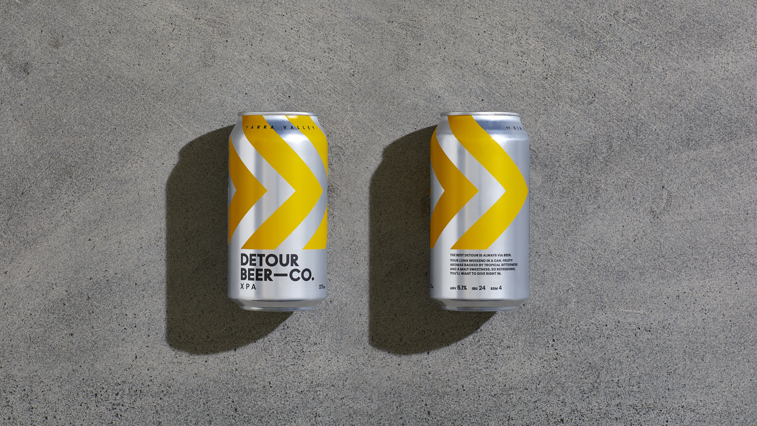
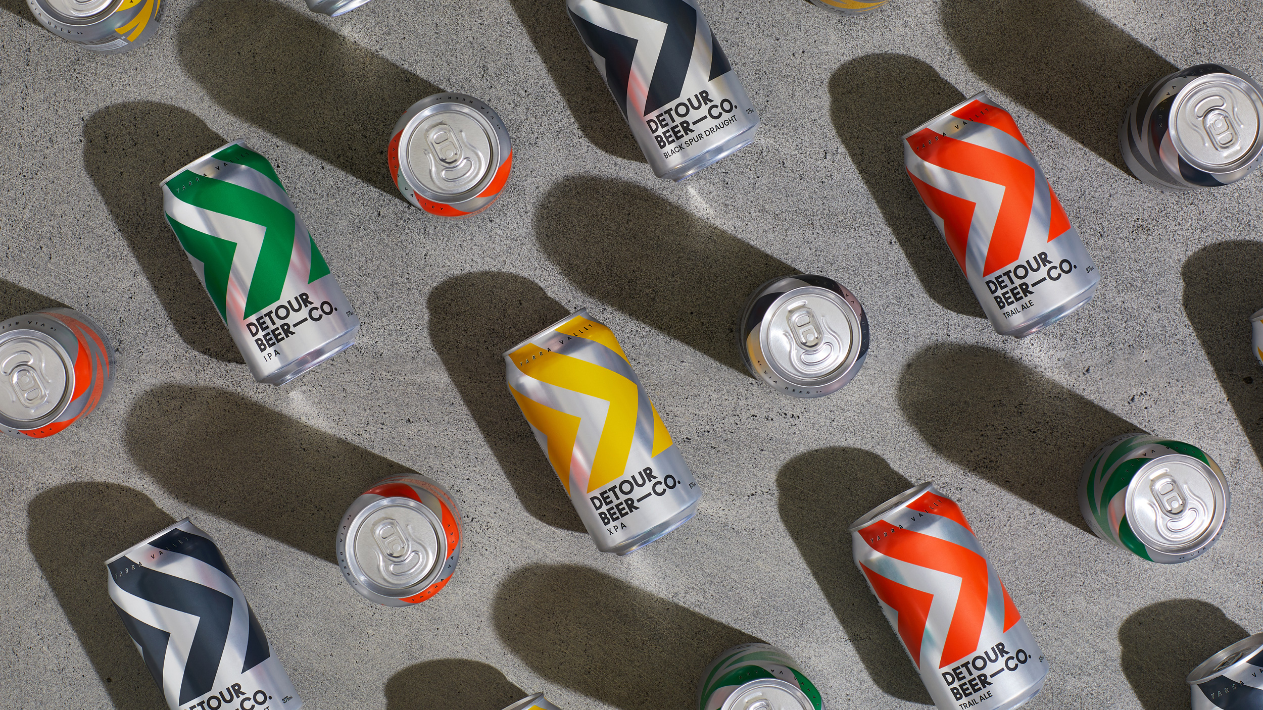
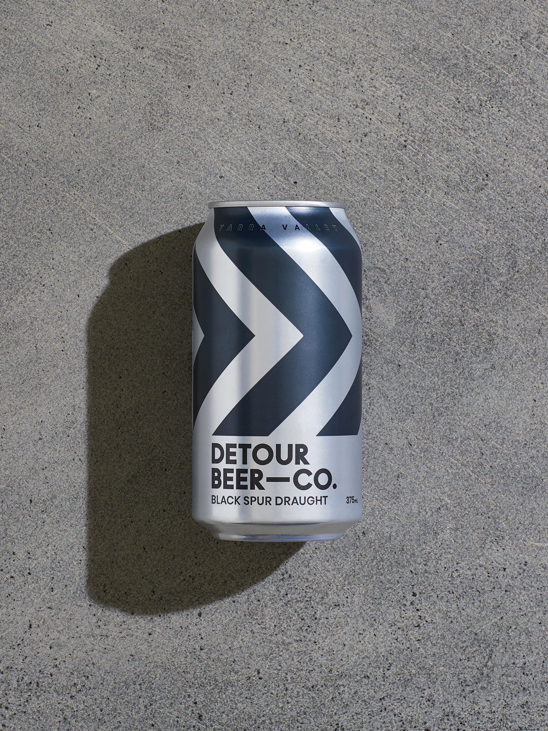
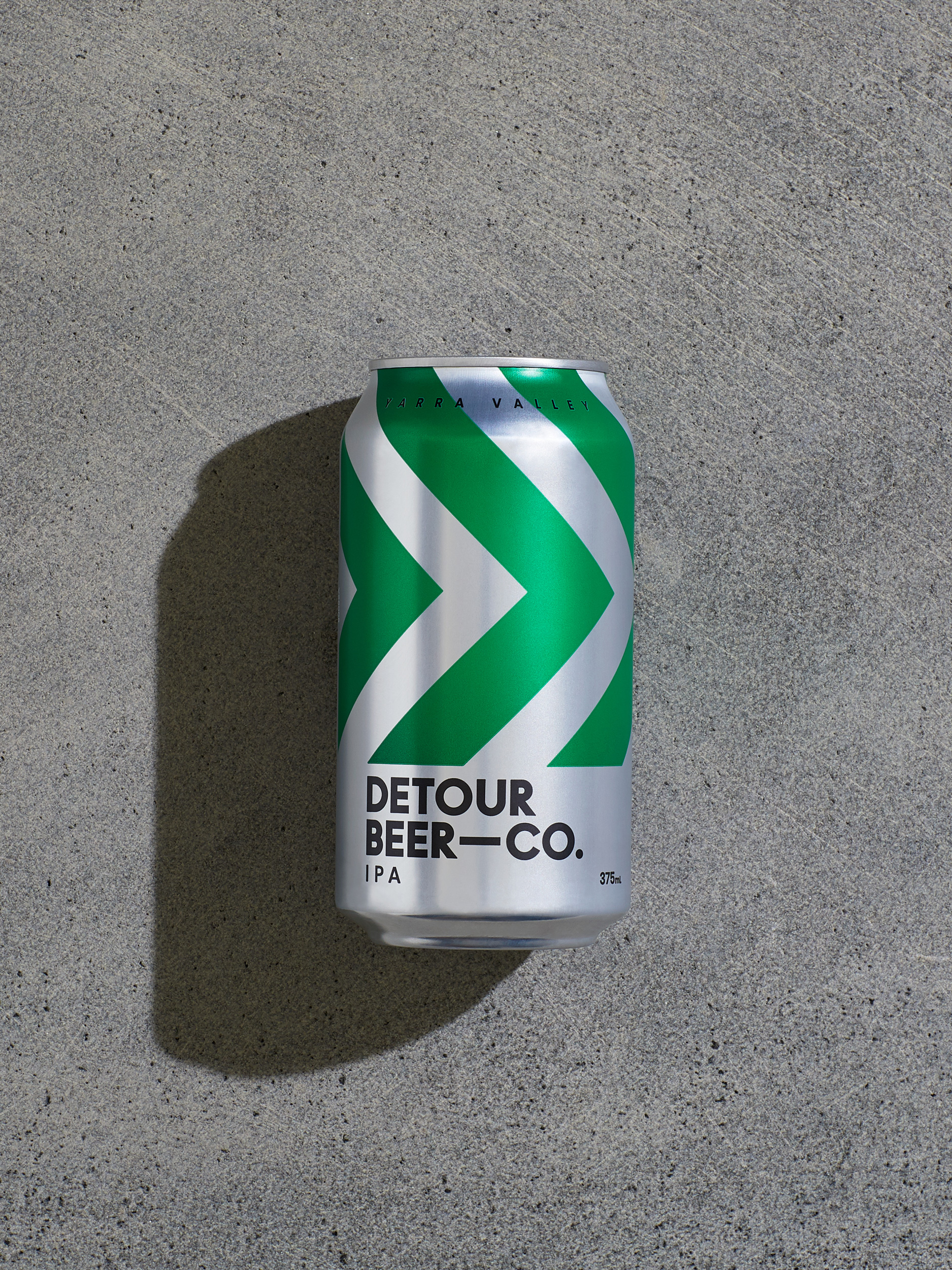
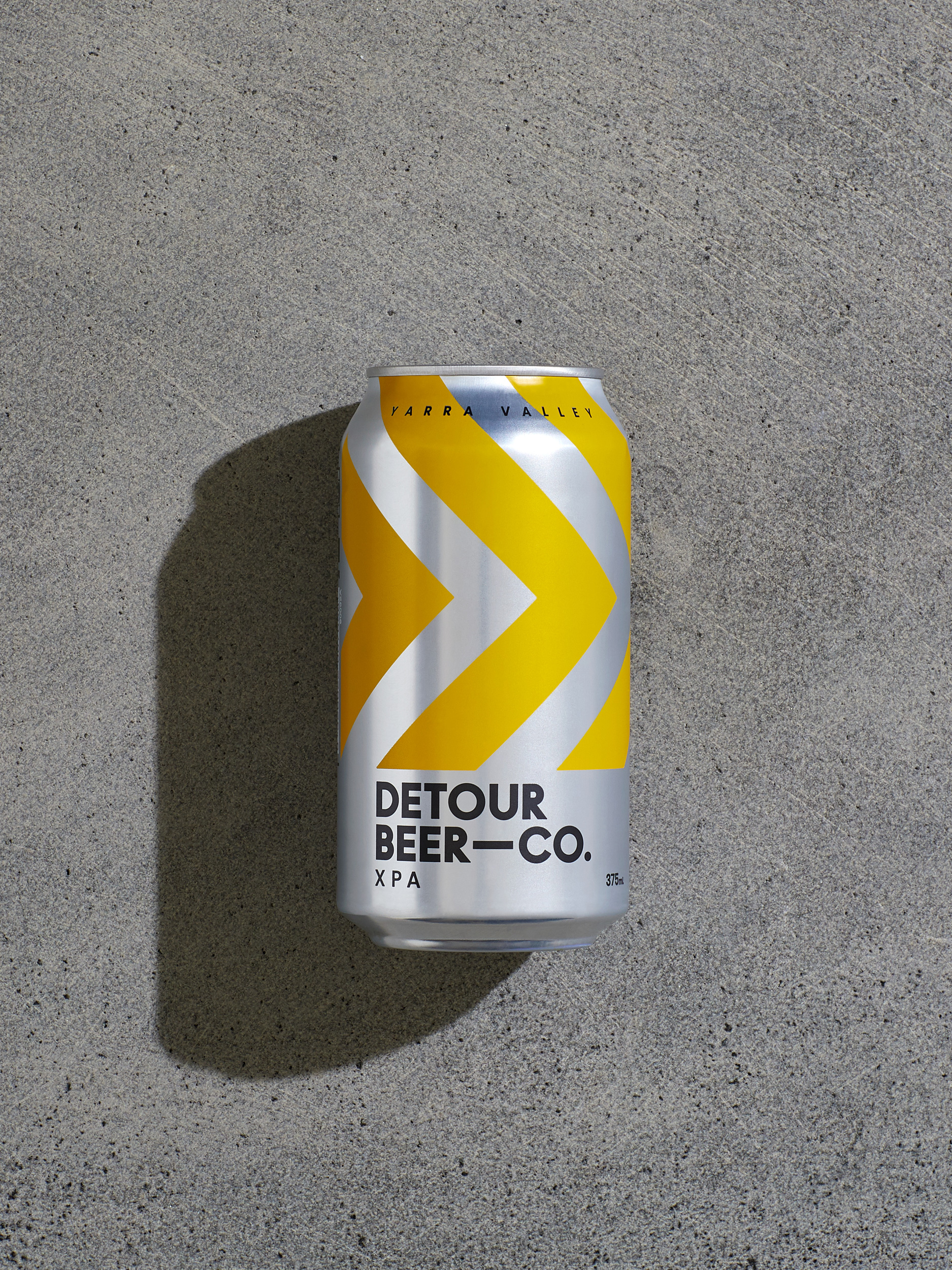
The resulting design was inspired by the brand’s navigational namesake; the creative language taking cues from classic road sign iconography while celebrating the materiality of the can itself. An unconventional layout hero’s the chevron pattern, creating the impression of the tread of the tractor—a nod to their agrarian heritage—while also reinforcing the brand’s craft credentials through outlining detailed brewing information—detail only a true beer geek would appreciate.
The resulting packaging serves as a perfect reflection of the Yarra Valley place and people—dynamic and directional while remaining down-to-earth and pragmatic. The bold design has enormous shelf presence that is winning fans both in Yarra Valley and well beyond and was also awarded Gold for best label design at the recent Australian International Beer Awards.
So, whether it’s a reward for a job well done… or hard done… this is a beer that will quench that thirst. A thirst for beer. A thirst for discovery. This is a beer for the path less travelled.
Scope:
- Brand Identity
- Packaging Design
- Naming
- Brand Strategy
- Tone of Voice
- Creative Direction
- Photography & Art Direction
- Creative Copywriting
- Finished Art
- Management & Production
The brand needed a fresh creative approach that would appeal to both beer lovers and beer geeks alike. And so ‘Detour’ was born—representing both the family’s shift from fruit growers to beer brewers, and also the detour they encourage every beer lover to take—to the Yarra Valley, via beer.
