Devil's Corner
Devil’s Corner is synonymous with the exquisite struggle of creating premium wine on Tasmania’s wild-yet-beautiful east coast. Conditions here are challenging, but the winemakers don’t fight against them… they work with them to create something that couldn’t be created anywhere else. This unique juxtaposition of rugged and rewarding, contemporary and historic, was the foundation for building new meaning into the brand and redeveloping its packaging—while preserving the quintessential essence that had made Devils Corner so successful.
Nature v nurture
Known by sophisticated consumers of all ages for its premium-quality pinot noir, Devil’s Corner is a prominent cool-climate Tasmanian wine brand. But it is the winery’s location on a small stretch of stunning, yet, unforgiving coastline that makes the brand so unique.
Leaning into the harsh conditions, winemakers here craft wines that are polished, nuanced, and rare. It is this extraordinary nexus of peril and potential that fuels their determination and makes their story so compelling. The juxtaposition between nature and nurture became the focal point for conveying the brand’s essence and the qualities that make it exceptional.
The Devil’s Corner contradictions run deep: a contemporary architectural cellar door stands sentinel at the winery’s entrance overlooking the softness of the Freycinet Peninsula’s undulating granite mountains; wild grasses flow towards hardened, weathered grapevines thriving beside an irregular corridor of resilient eucalypts; the brand’s wines have a young, sophisticated consumer audience, yet its labels were anchored in heritage. These paradoxes offered an opportunity to develop a more connected brand message.
Creating a modern icon
Refreshing the label in a way that brought it in closer alignment with the modern cellar door experience, without losing the relationship to the wine’s past, called for a recognisable icon anchored in authenticity and history.
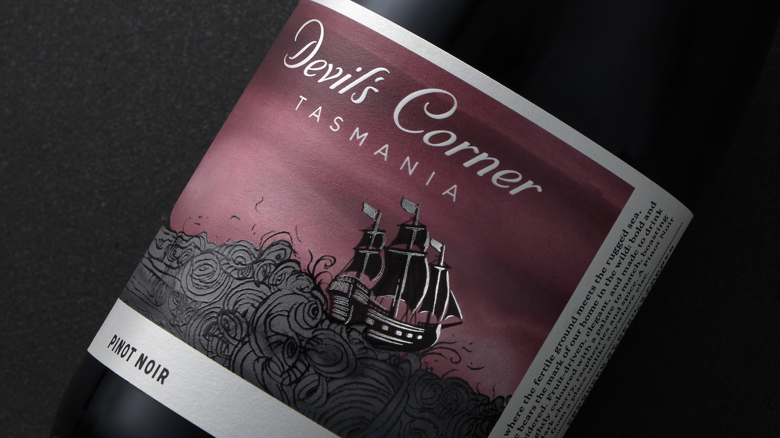
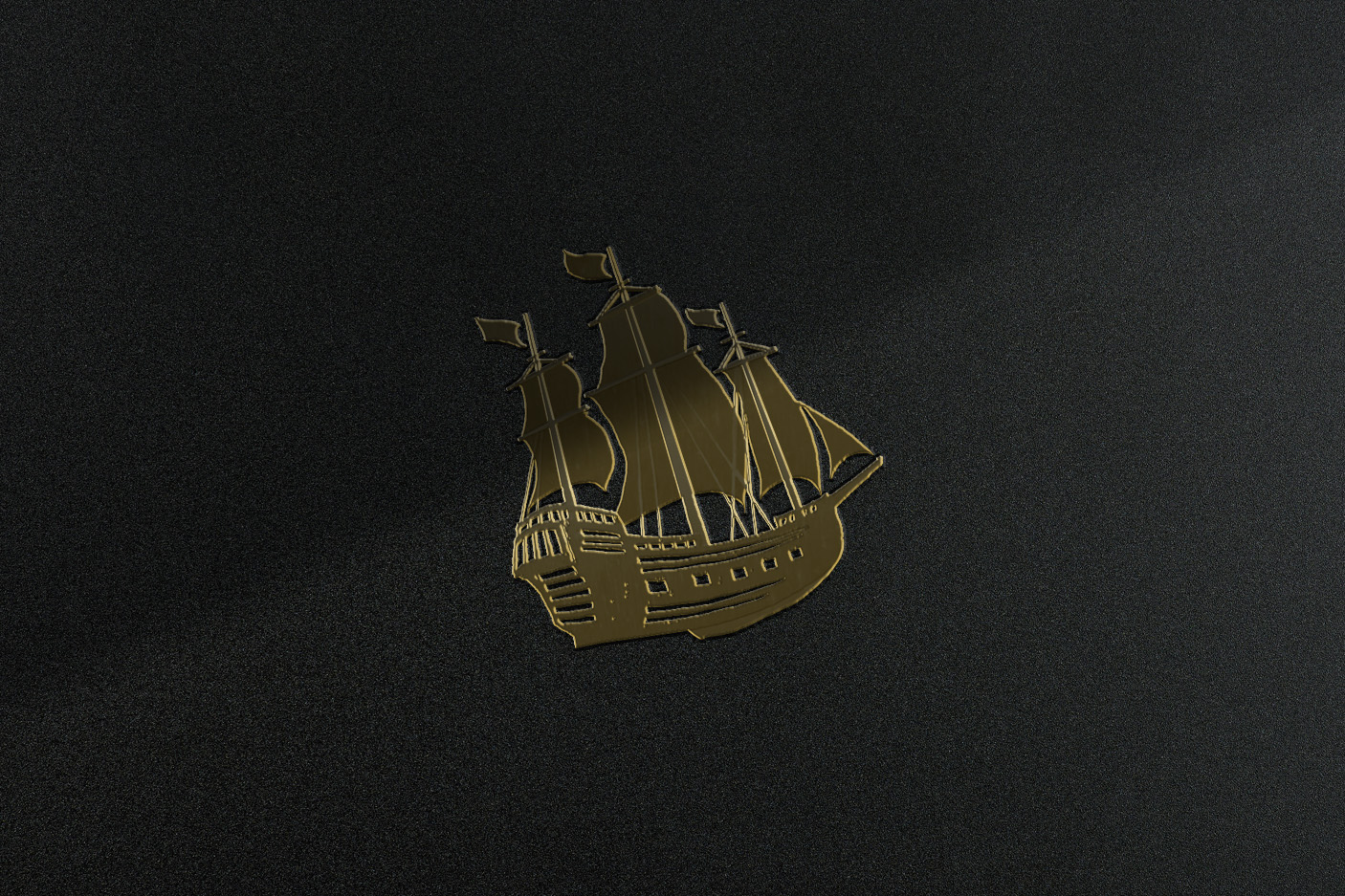
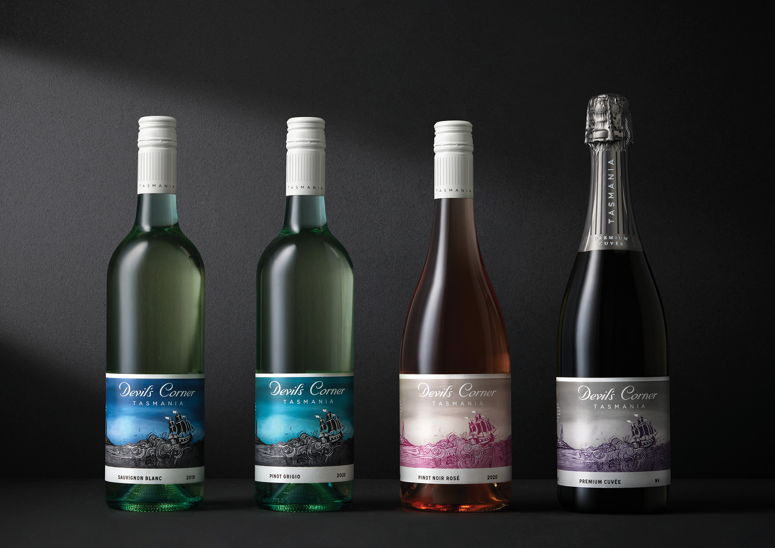
The core wine range featured colonial-style ships being tossed on a violent sea, but the disconnected collection of vessels bore no real meaning; there was no definitive ship that truly represented all facets of the inimitable brand. The premium wine collection, however, featured the HMS Resolution, a ship from a bygone era which, according to folklore, had weathered a ferocious storm at the infamous Devil’s Corner site—this was a story from which we could build a brand icon.
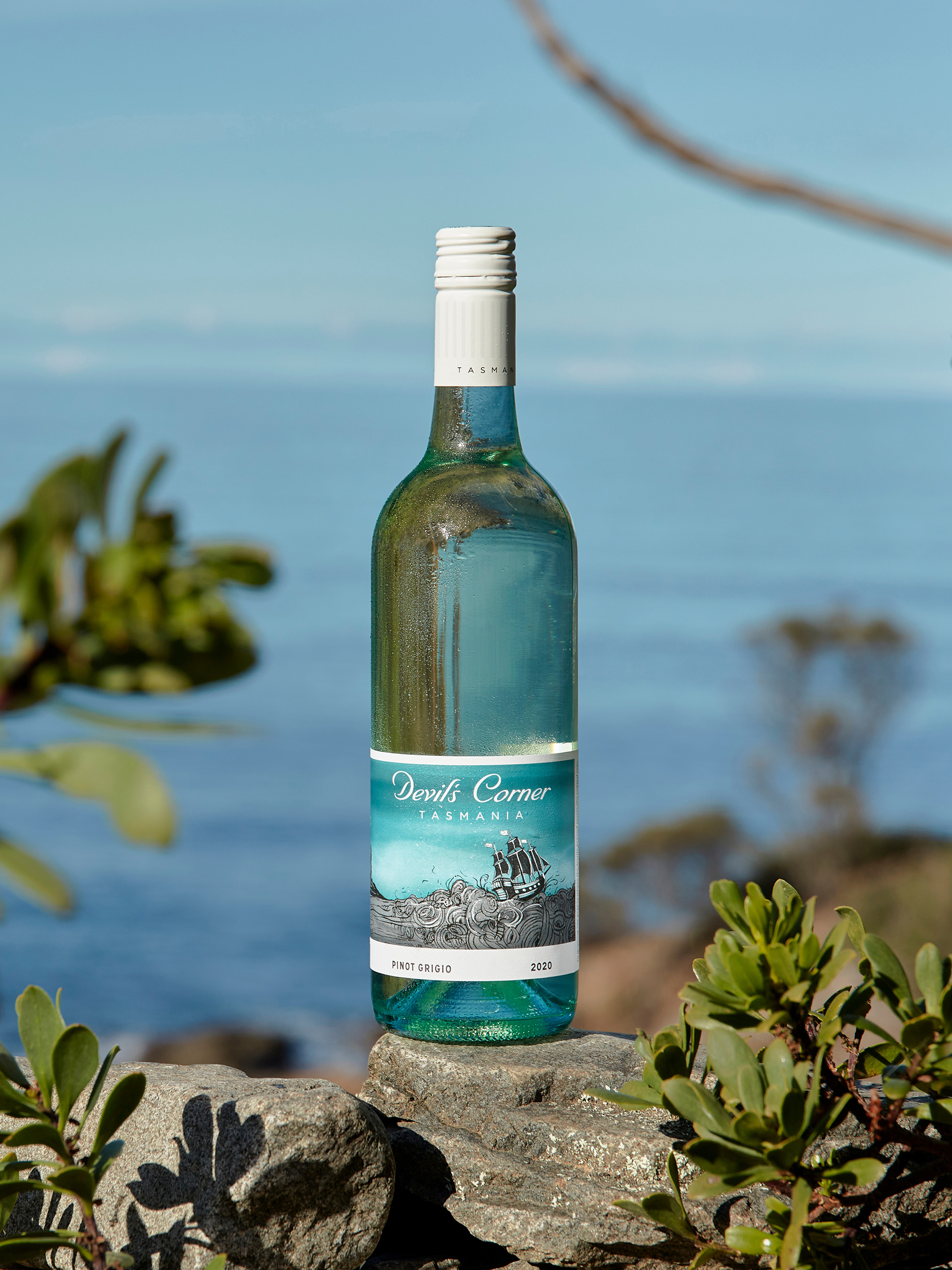
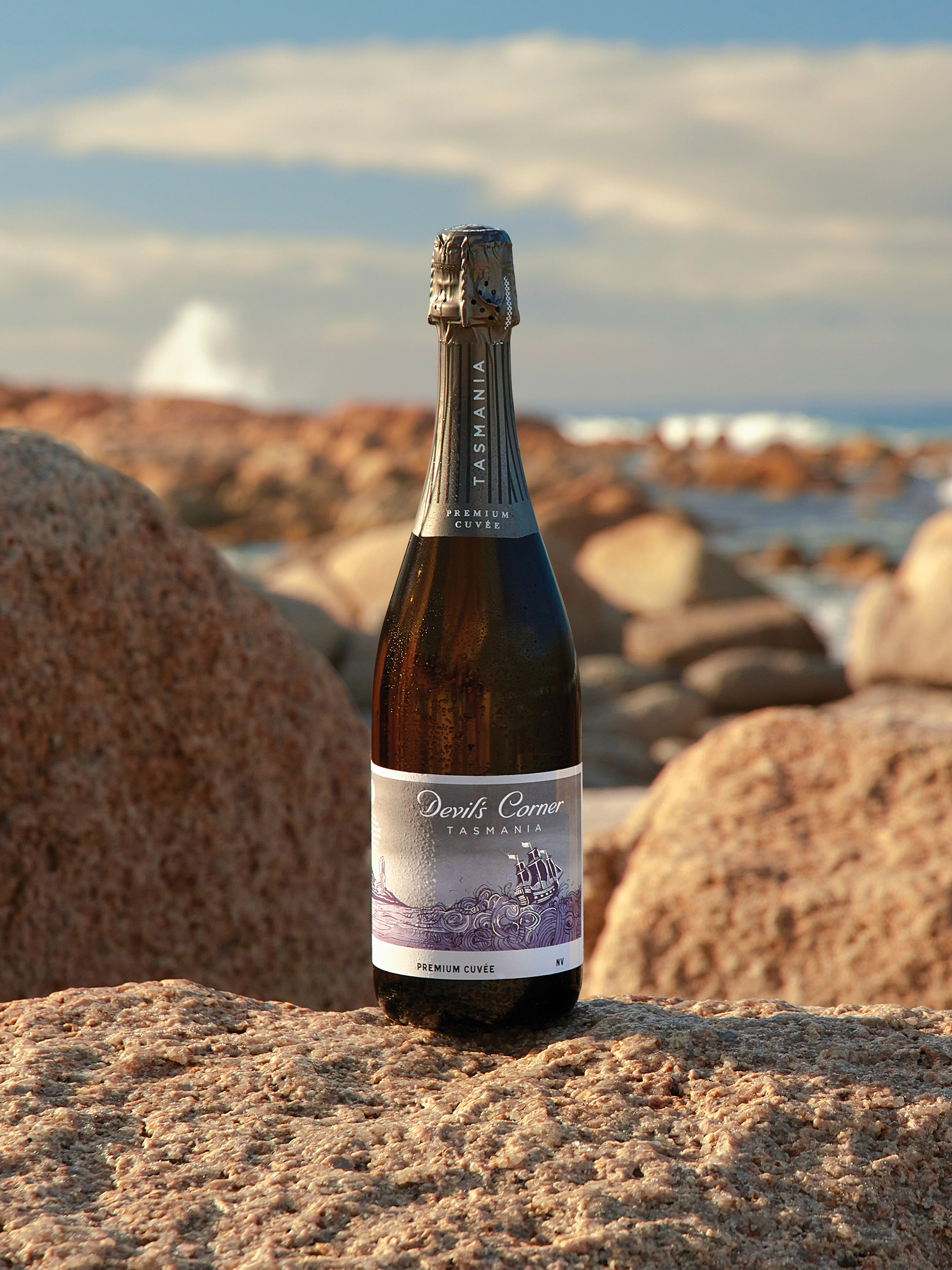
Using this existing asset as a starting point, we evolved its form incrementally leveraging historical detail from the real HMS Resolution. This included increasing the number of gun ports, adding additional sail masts, and altering the shape of the hull and stern to create a more elegant and iconic ship silhouette.
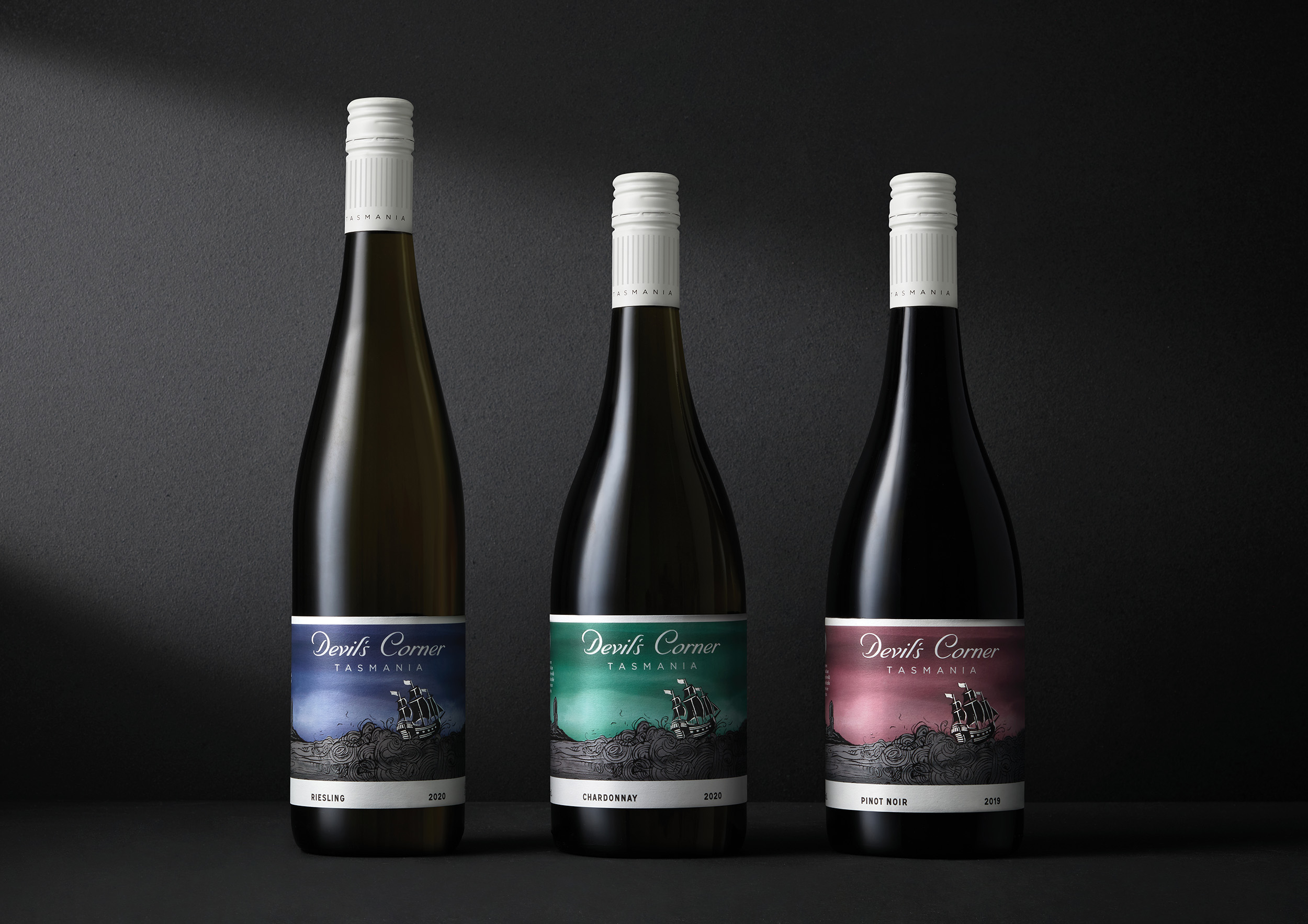
This new brand asset was then given additional weight through the addition of silver foil embellishments to increase its importance and prominence on pack. Used across the entire Devil’s Corner range, the HMS Resolution has become a timeless and recognisable asset for the brand.
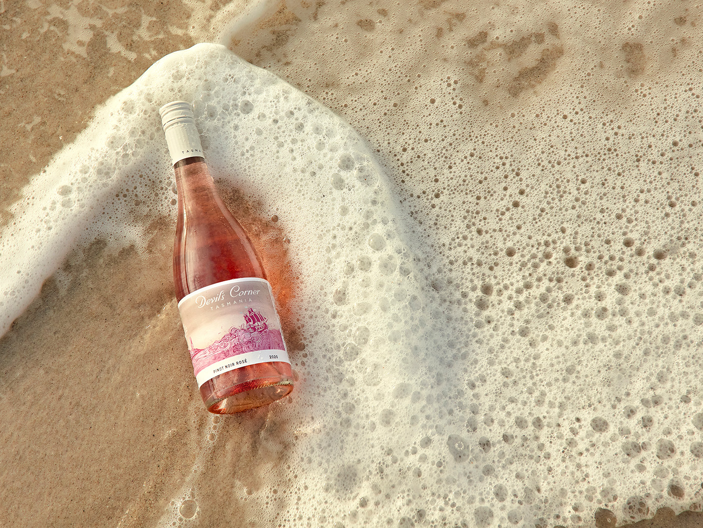
The hues of the original wines were maintained to create a seamless brand transition, but a colour shift from water to sky allowed for a greater clarity and optimism. A graphic white border frames and enriches the image, while also housing important vintage and varietal information. Enhanced foil embellishments create a presence on shelves and draw the buyer’s eye.
Devil’s Corner is famous for its juxtapositions—cultured and wild, timeless and modern, raw and sophisticated—this new concept echoes the brand’s unique allure, and the refreshed messaging eloquently shares its distinctive story.
Scope:
- Packaging Design
- Brand Identity
- Creative Direction
- Photography Art Direction
- Illustration
- Brand Strategy
- Copy Writing
- Photography
- Styling
- Finished Art
- Brand Guidelines
- Management & Production
The core wine range featured colonial-style ships being tossed on a violent sea, but the disconnected collection of vessels bore no real meaning. Research drew our attention to the HMS Resolution, a ship from a bygone era which, according to folklore, had weathered a ferocious storm at the infamous Devil’s Corner site.
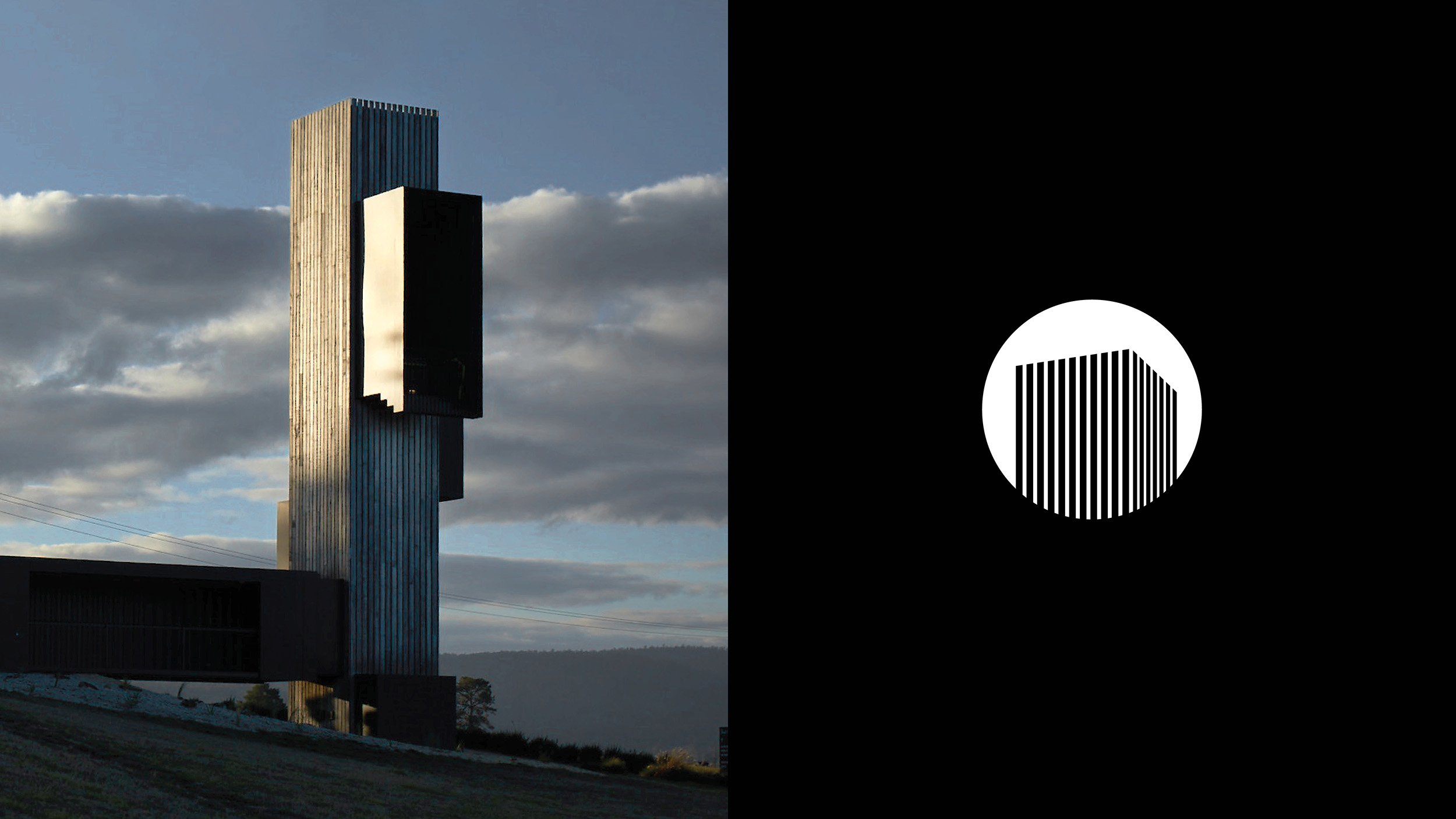
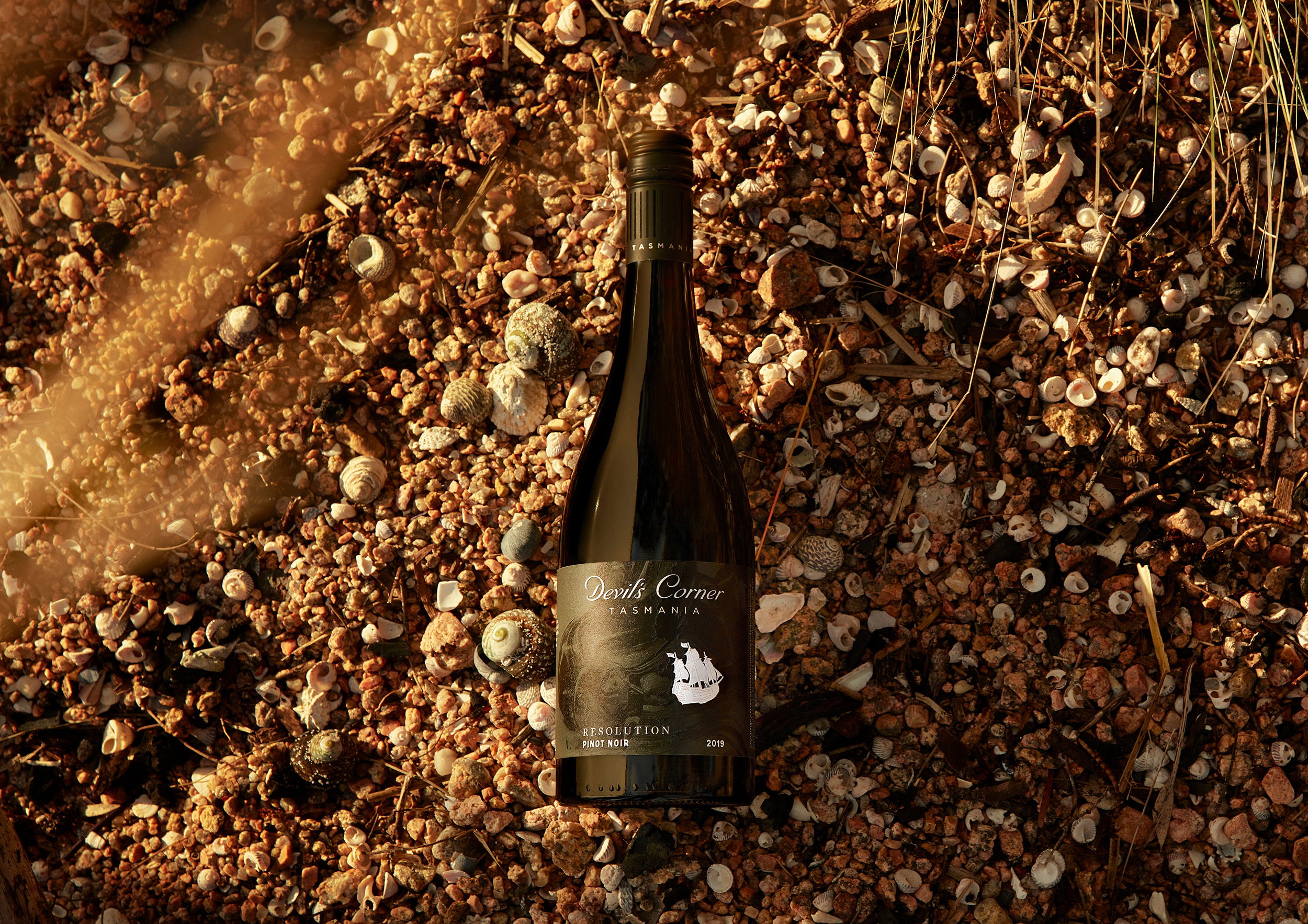
To create a more meaningful link between the brand, the packaging, and the physical site of the Devil’s Corner home, a new secondary brandmark was crafted. This mark reflects the unflinching architecture linework of the winery’s famous landmark lookout tower and features prominently, side of pack, supporting Cellar Door storytelling, bringing a contemporary lens to an otherwise historic label story.
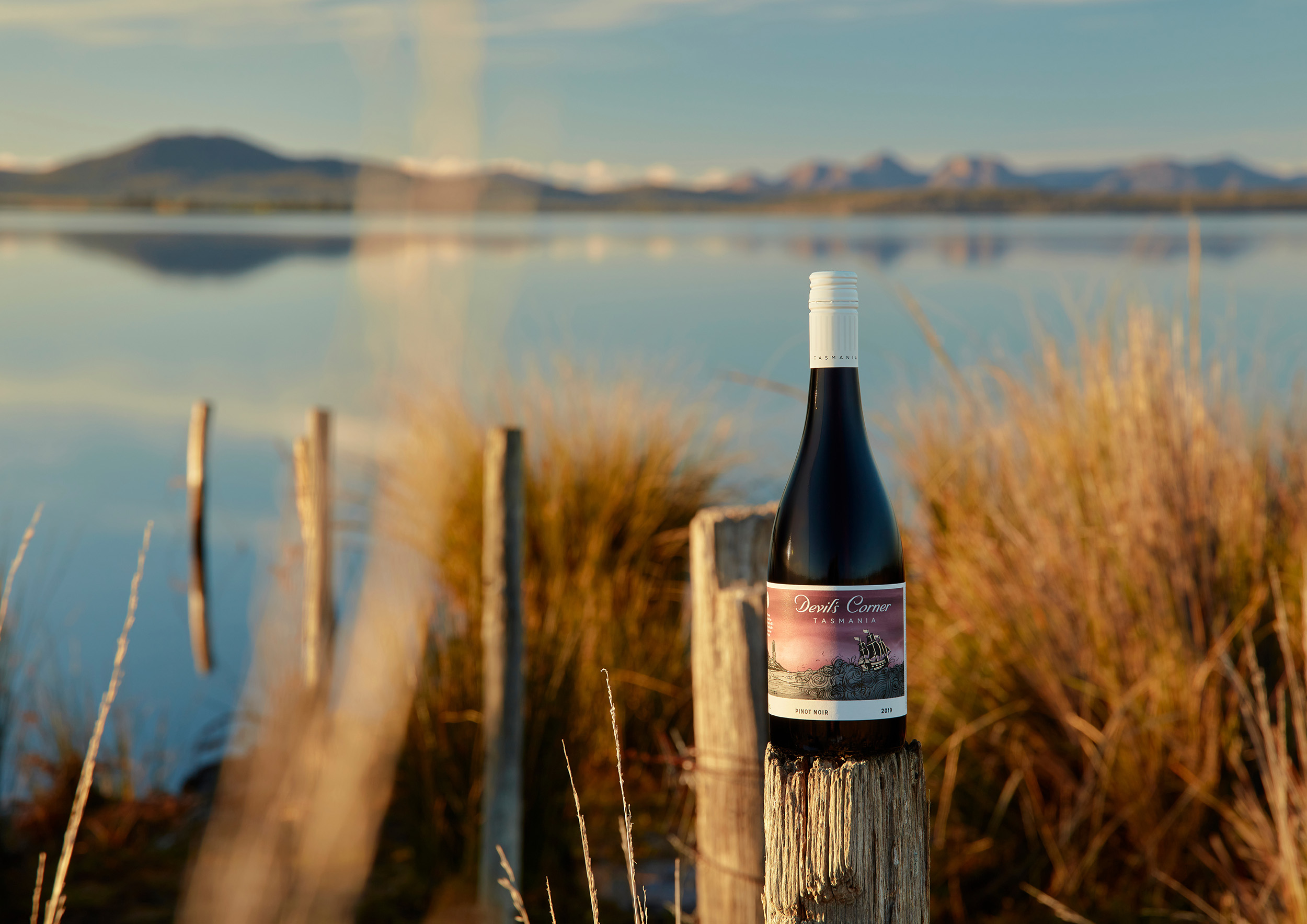
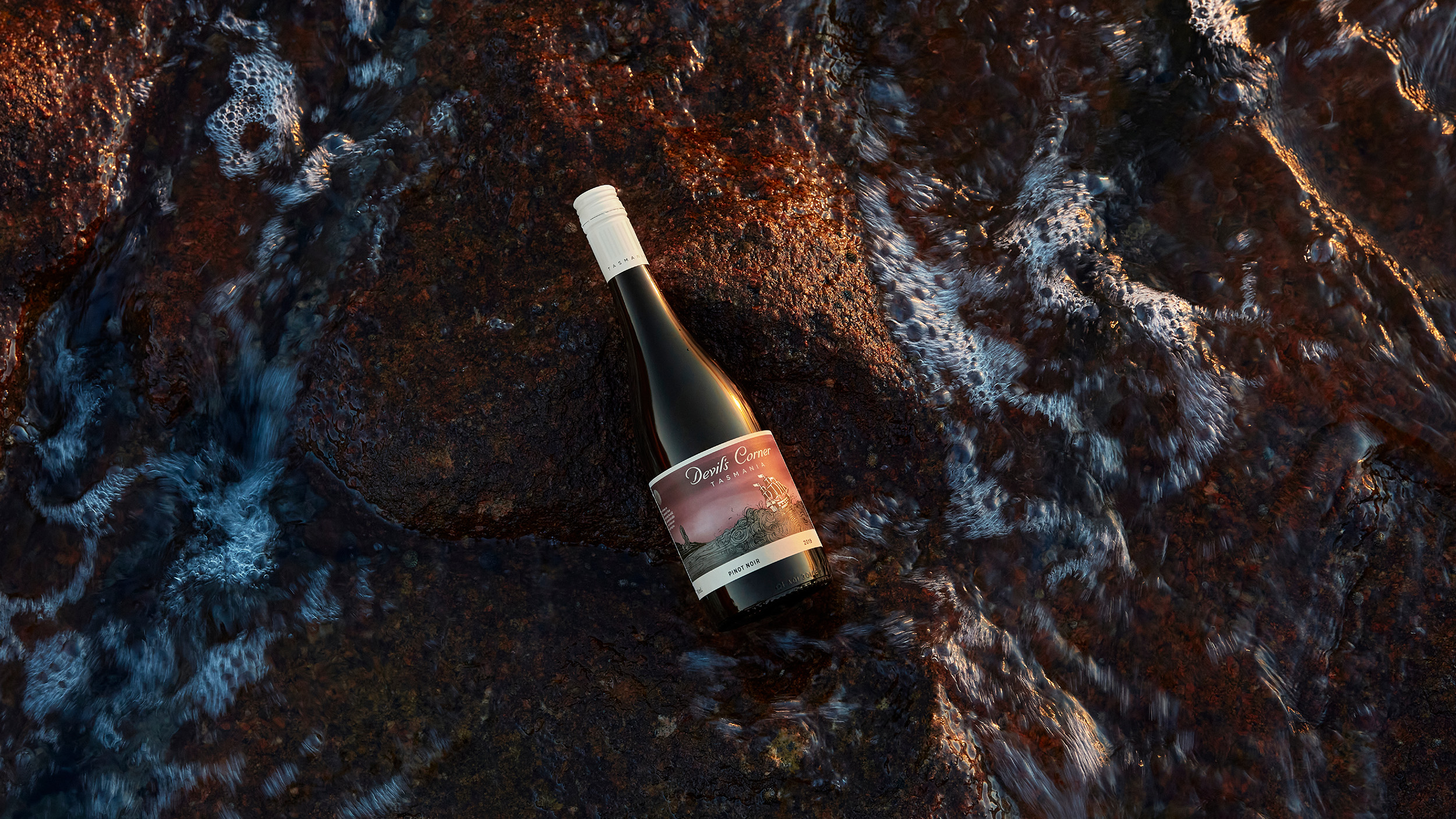
To further express the tension at the heart of Devils Corner brand, their range of wines were photographed out in the wild, set against the rugged and authentic backdrop of Tasmania’s Freycinet Peninsula. To reflect each of the wine’s unique characters and occasionality, different locations were chosen to create a deeper and distinct sense of place.