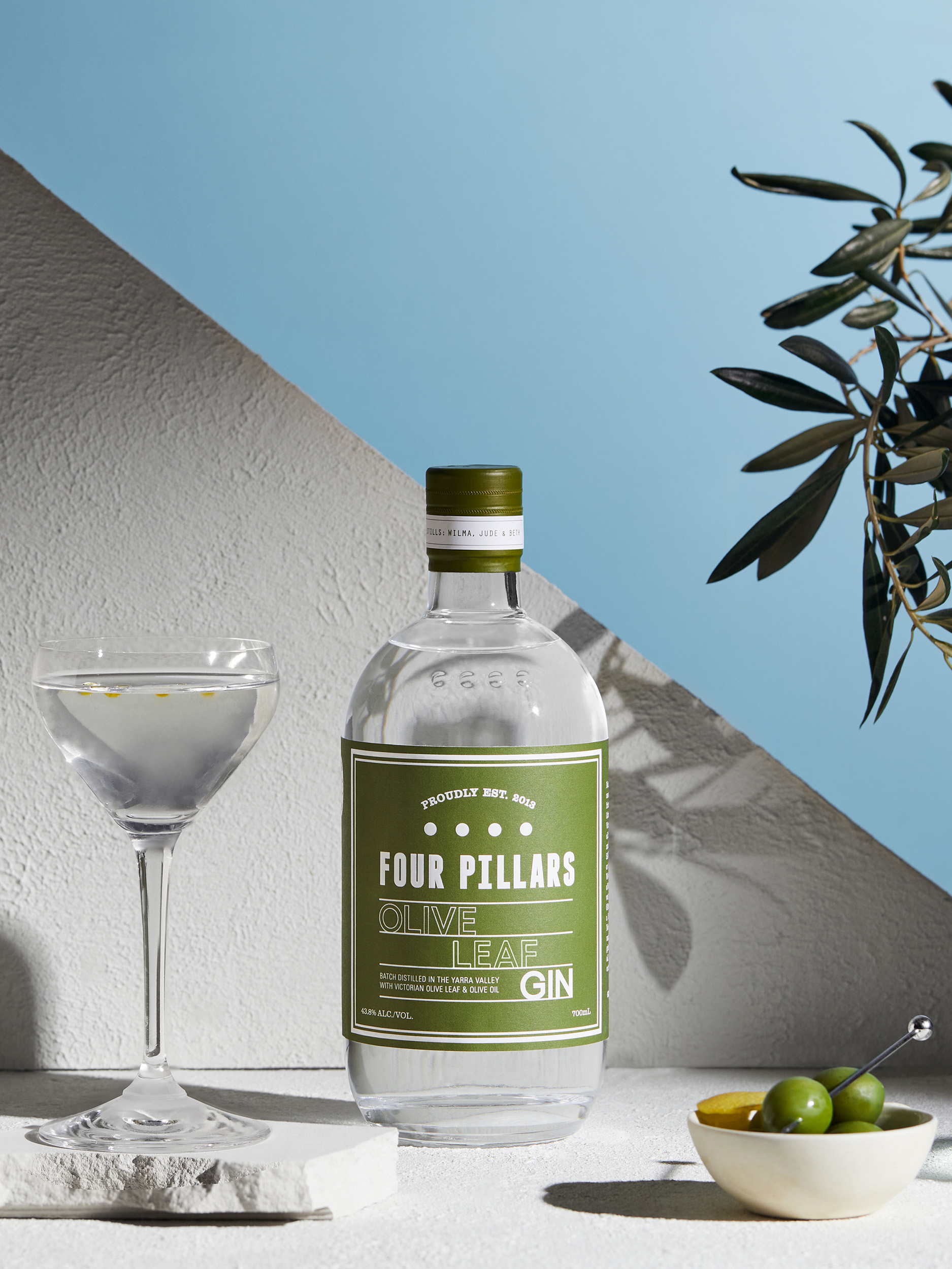
Olive Leaf Gin
The gin geniuses at Four Pillars knew they had crafted a masterpiece destined for their core range when they released their first complex, sophisticated savoury gin. But extending an olive branch to gin lovers familiar with sweeter cocktails called for a broad-brush creative approach.
Into the fold
While martini aficionados were an apt and willing audience for the mellow-yet-robust Olive Leaf gin, its niche appeal and unusual provenance was likely to challenge mainstream consumers.
Four Pillars understood there was an opportunity to take uncertain gin lovers on a journey to understand the delights a savoury gin could offer. Its messaging needed to be comforting and familiar, yet showcase the new product’s possibilities, and its elegant points of difference.
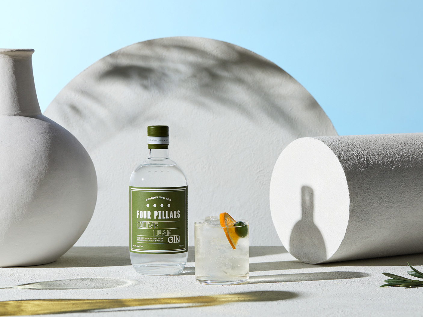
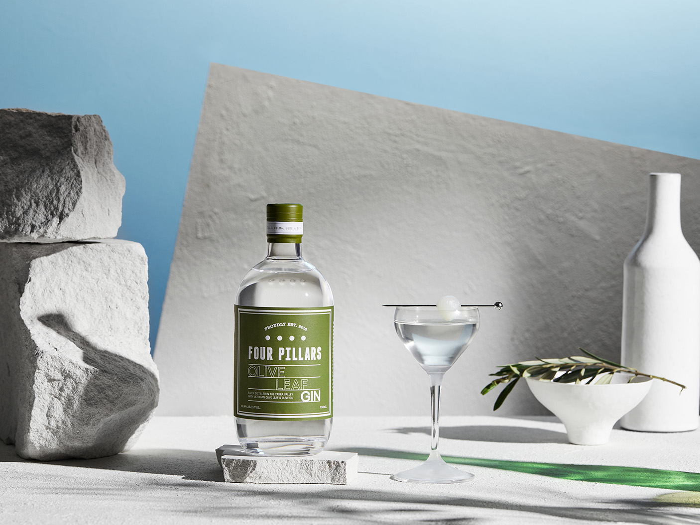
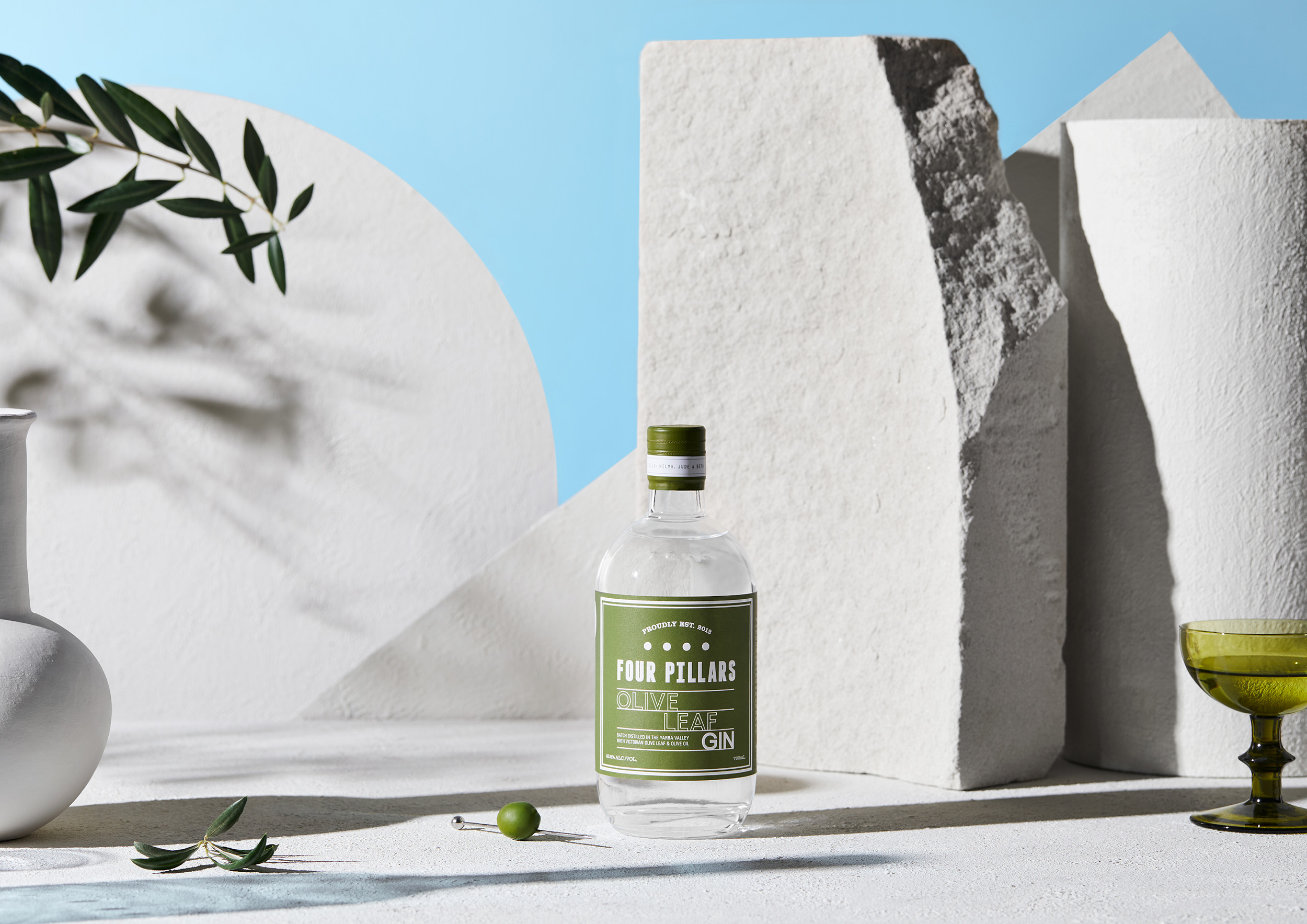
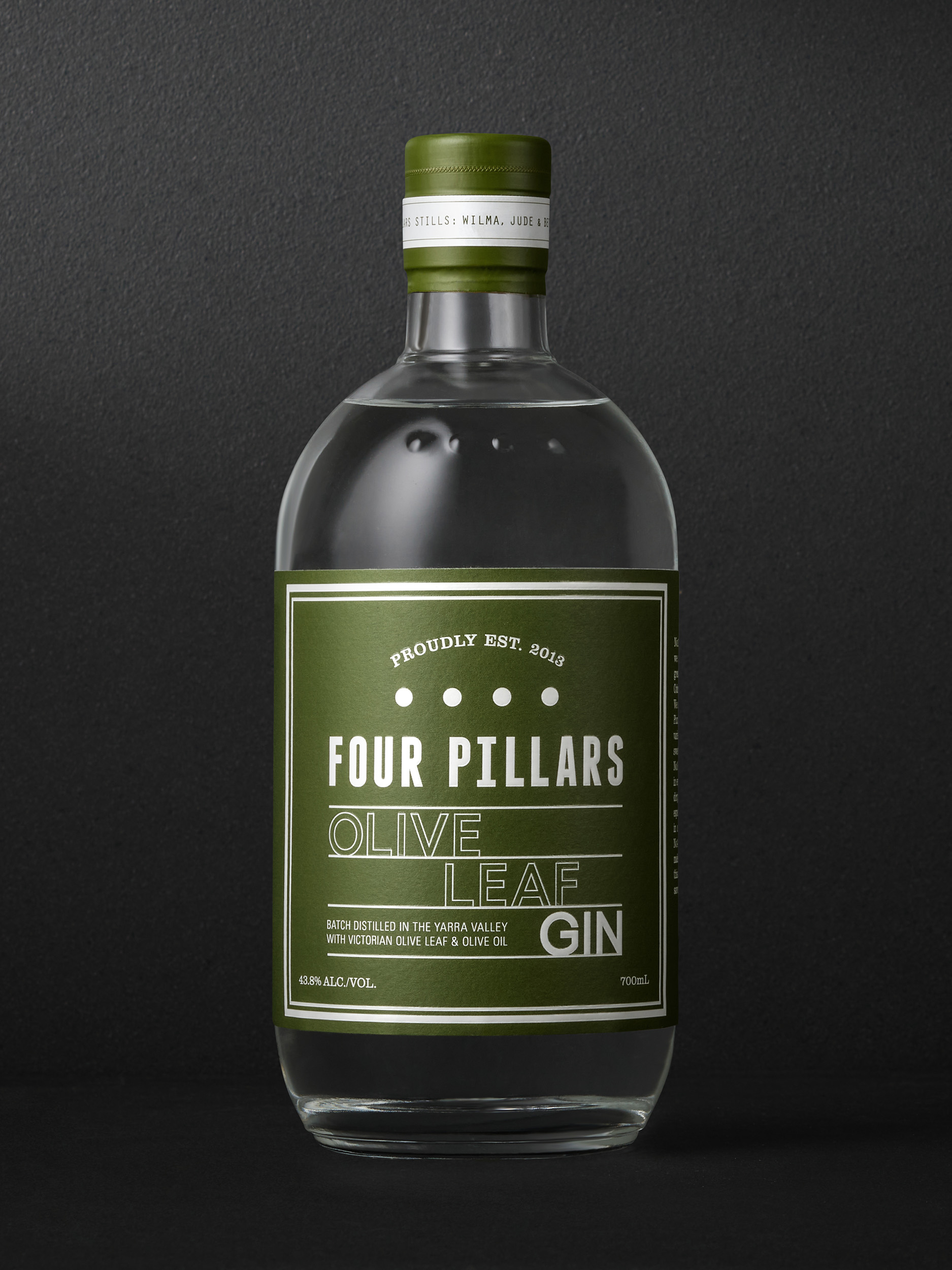
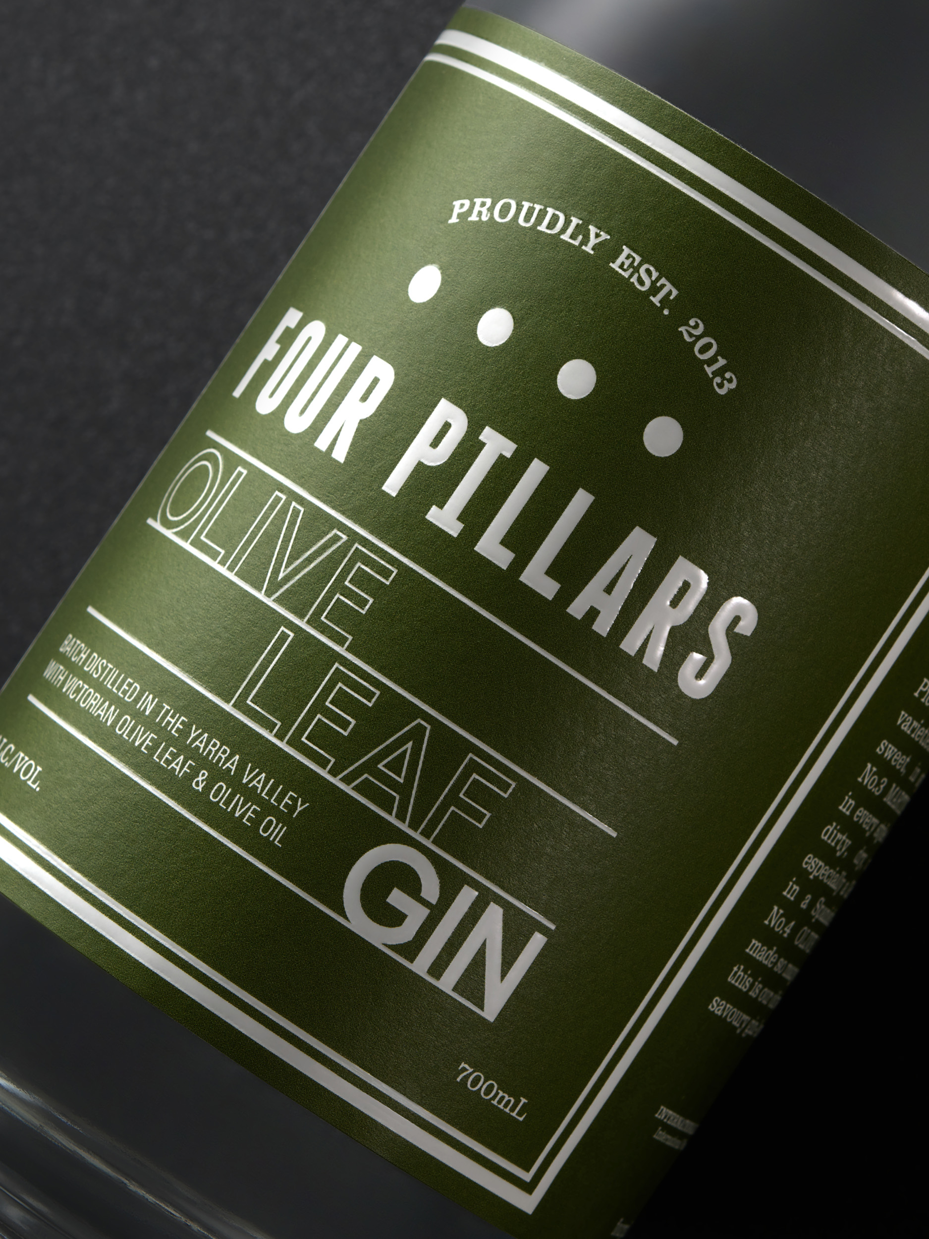
Establishing the new savoury gin within Four Pillar’s core range was a fundamental element of the strategy – and began with a unifying packaging design. The Olive Leaf label, leveraged from success stories such as Rare Dry Gin and Bloody Shiraz Gin, made it clear to consumers this was another beloved family member, and a serious drop of its own. Its curated dusty olive-green colourways helped signal the gin’s savoury flavour profile yet gave it a distinct personality within the growing premium gin portfolio.
The creation of a wordmark featuring contemporary type perched on a horizontal grid, represented regimented rows of lush olive groves, and further expressed the Olive Leaf gin’s unique qualities. Additionally, this type treatment helped us establish a consistent look and feel for the Olive Leaf gin launch content and communications, then extending further into Olive Leaf Gin merch such as socks, pins and even a martini trolly!
From the groves
Olive Leaf gin was lovingly crafted by distilling cold-pressed olive oils and olive leaf tea from the groves of award-winning Victorian producer Cobram Estate; native macadamia nuts and lemon myrtle were added for an authentic Australian touch.
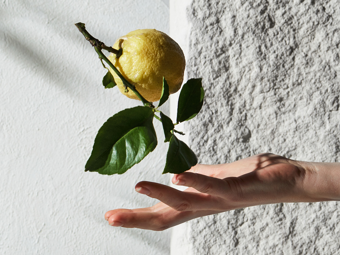
But it was the romanticism of the added Mediterranean-inspired botanicals of rosemary and bay leaf that offered the opportunity for broadest acceptance.
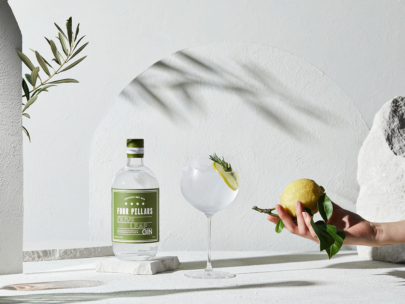
Our photographic art direction and film content tapped into the aspirational qualities of the Mediterranean and, by focusing on a part of the world often associated with olives, turned the attention away from the olives themselves.
A leaf of faith
Light sandstone, bright sunlight and the rustling of a gentle breeze were introduced to transport customers to a vibrant garden in Spain, where they could imagine sipping a cosmopolitan ‘gintonic’ on a warm afternoon.
A simple slice of lemon, paired with a sprig of rosemary created the hero image – everyone knows lemon and rosemary are harmonious partners for a gin and tonic – and mitigated any sense of unfamiliarity with the savory elements of the gin.
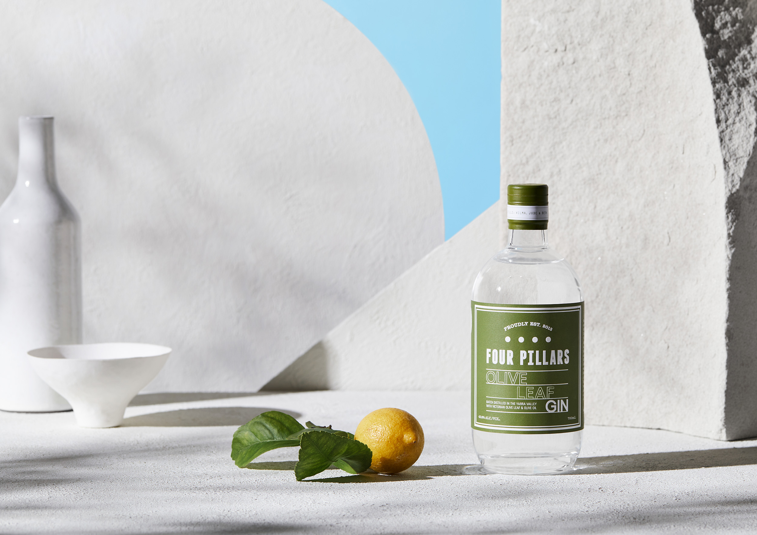
By subtly shifting the scenery to focus on olives, olive leaves and olive oil, we dared consumers to trust Four Pillar’s craftsmanship and take a ‘leaf’ of faith into an unknown garden of pleasure.
Olive Leaf gin sold out in its initial pre-launch in August 2020 as more than 1.5 million Australian gin buyers were targeted by the campaign. In just one month media coverage leveraged the attention of more than 4 million people and Olive Leaf Gin established its place in hearts of Four Pillars fans.
Scope:
- Creative Direction
- Photography & Art Direction
- Packaging Design
- Finished Art
- Campaign Strategy
- Photography
- Graphic Design
- Film Production
- Motion Design
- Styling
- Management & Production
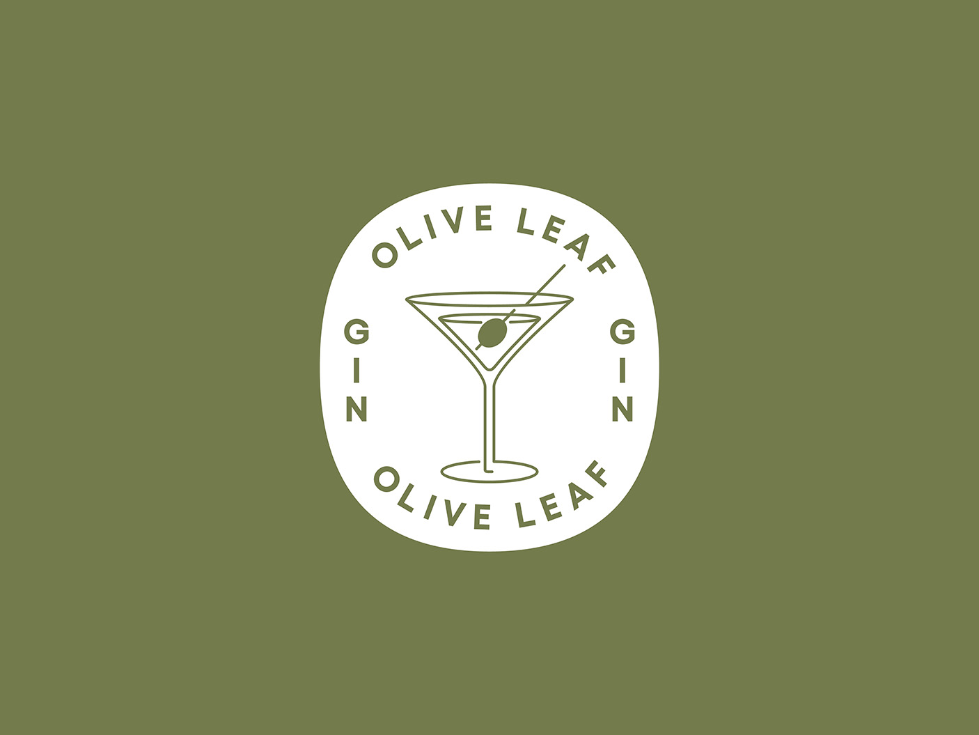
Every Four Pillars core range gin features a graphic icon on the left label wing that highlights the cocktail to which the gin is particularly suited. For Olive Leaf, it is the classic Martini. This playful mark is one of many that Weave have created, building out a suite of cocktail marks that have use beyond the label, across martini merch, such as socks, pins and even a martini trolly.
To build anticipation around the soon to be released Olive Leaf Gin, our launch campaign kicked off with a short percussive film that teased Four Pillars fans, offering only a brief glimpse of the bottle and subtly hinting at its savoury taste profile.
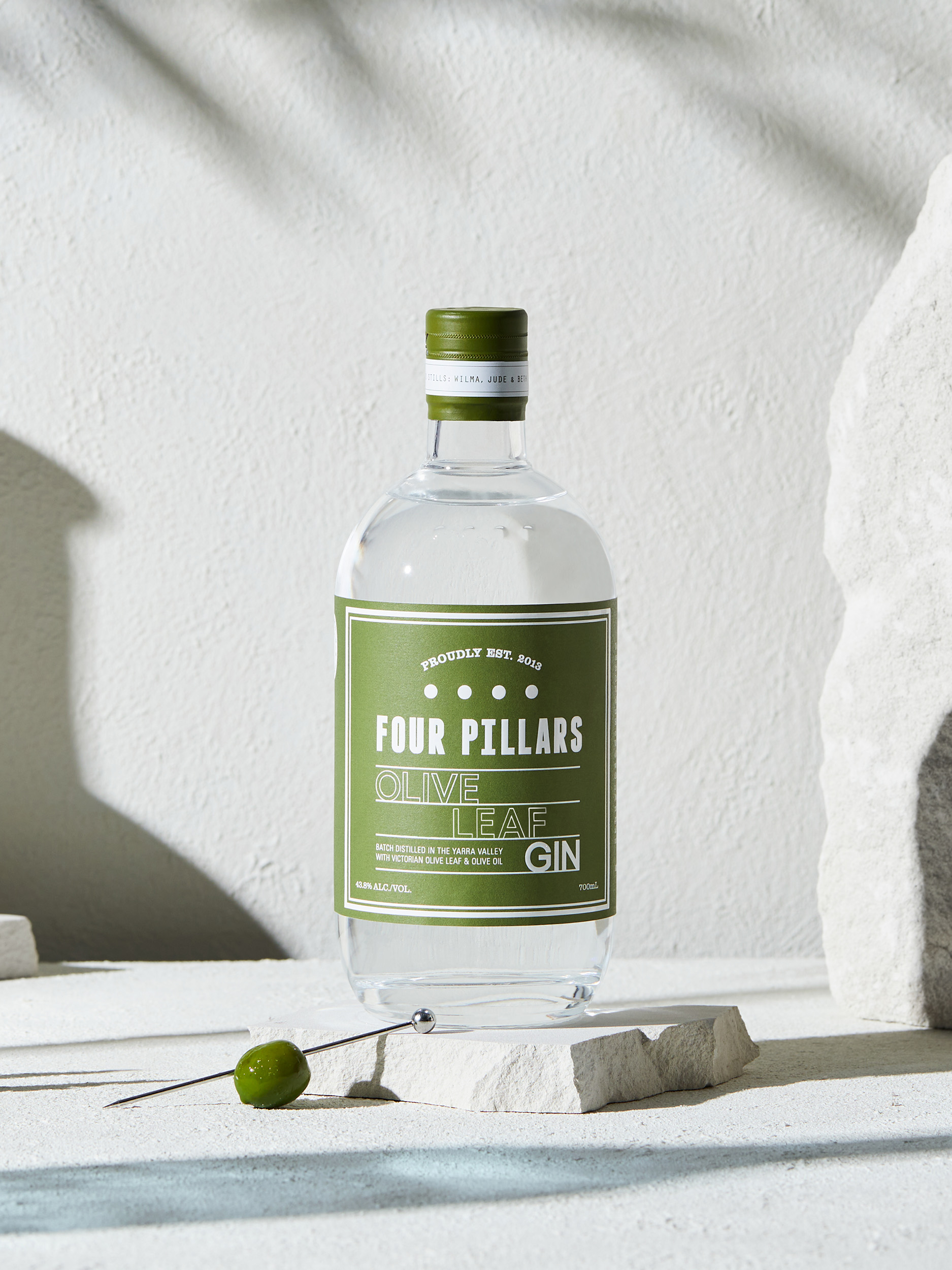
Our photographic art direction and film content tapped into the famously idyllic characteristics of the Mediterranean—light sandstone, bright sunlight, the rustling of a gentle breeze—transporting customers to a vibrant Spanish garden, where they could imagine sipping a refreshing ‘gintonic’ on a warm afternoon.