Devil's Corner Wine
Navigating the wine aisle is as much a challenge for consumers as it is for wine brands. With hundreds of labels competing for attention, even the best wines can be overlooked… wines like Devil’s Corner. This Tassie fan favourite was looking to premiumise its core range to command a higher price tag, by evolving the packaging to elevate perception, sharpening shelf presence, and deepening brand affinity and clarity—all while retaining the unmistakable Devil’s Corner feel—wild, raw, and as breathtaking as the place that inspired it.
Scope:
- Packaging Design
- Brand Identity
- Brand Strategy
- Creative Copywriting
- Creative Direction
- Graphic Design
- Photography & Art Direction
- Management & Production
Let’s set the scene…
Devil’s Corner is one of Tasmania’s most recognised wine brands, loved by cool-climate wine enthusiasts and casual drinkers alike. But with an increased price point for the core range, the existing packaging was starting to fall short of expectations. The labels—featuring a wrap-around format, heritage ship motif, and the now-dated ‘curly wave’ illustrations—felt busy, tired, and inconsistent on shelf. If the price was going up, the perception needed to come along for the ride.
What was really going on
The wine sector is relentlessly competitive, with brands fighting for space both in-store and in the minds of consumers. While the Devil’s corner brand had valuable, recognisable assets, together they weren’t showing up with the confidence or clarity of a premium wine. The label system was doing too much, the visual language was fractured, and key brand assets were being lost in the noise. We needed to amplify what was working the hardest and eliminate the elements that no longer served the story.
Sophisticated simplicity
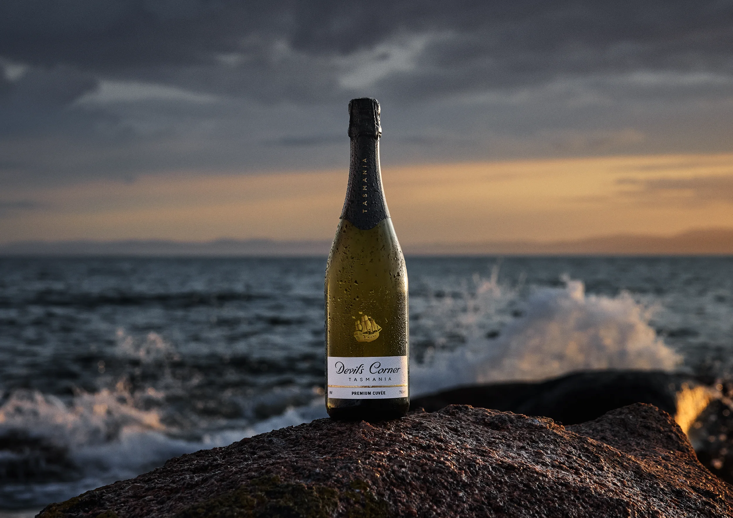
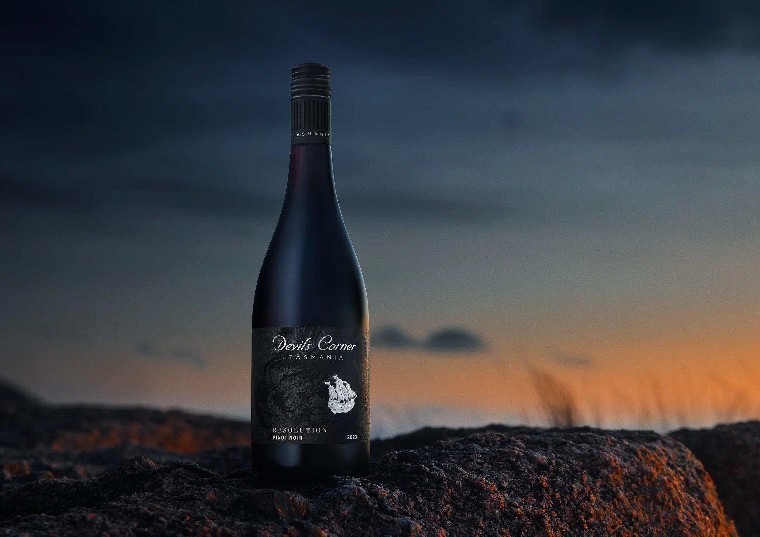
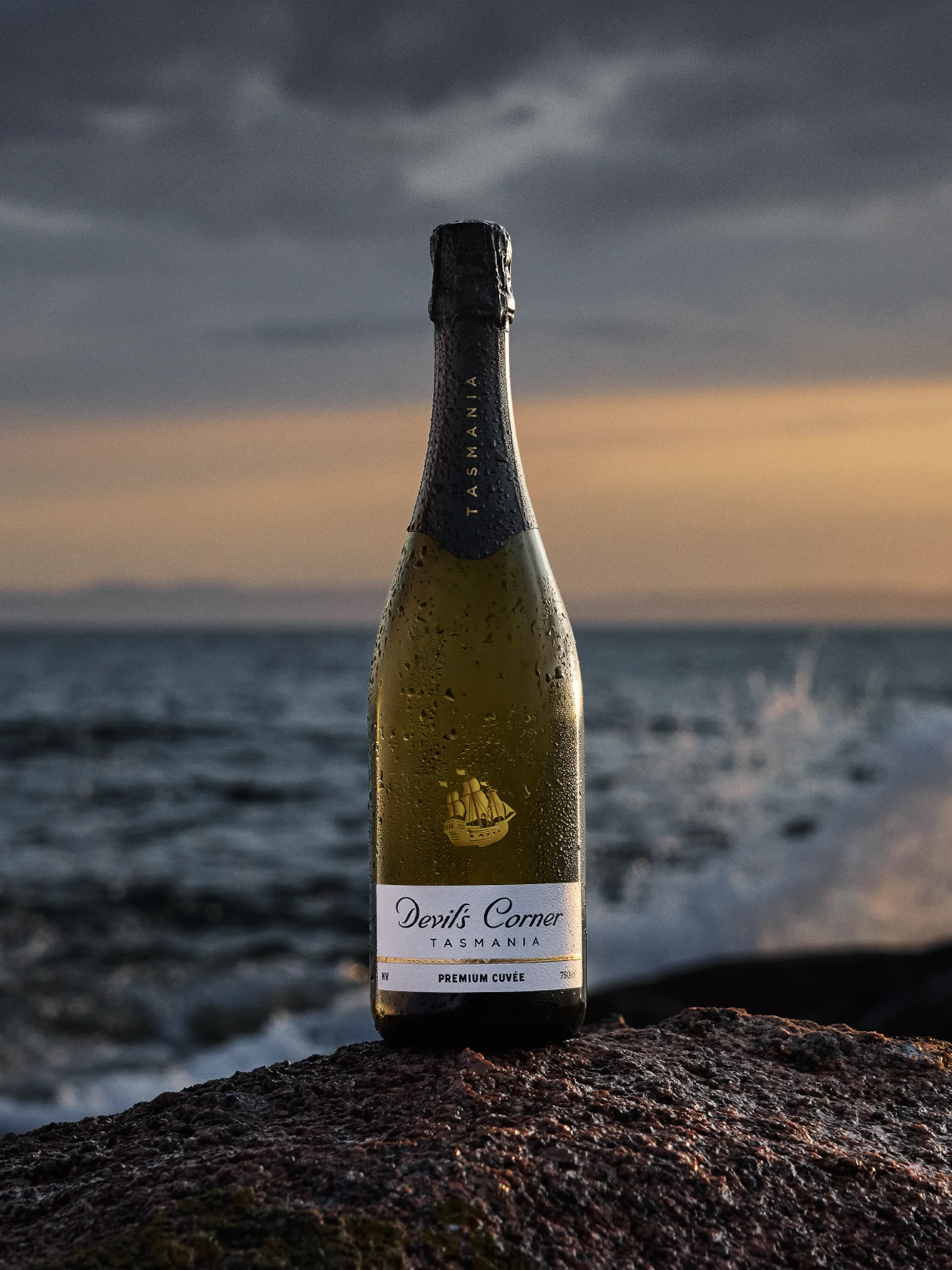
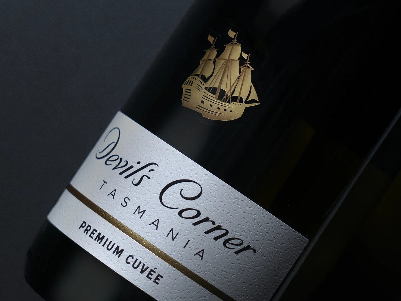
We anchored the redesign in the elements that had strong brand equity—most notably, the HMS Resolution ship icon, which had become the brand’s most effective distinctive asset (DBA) on shelf.
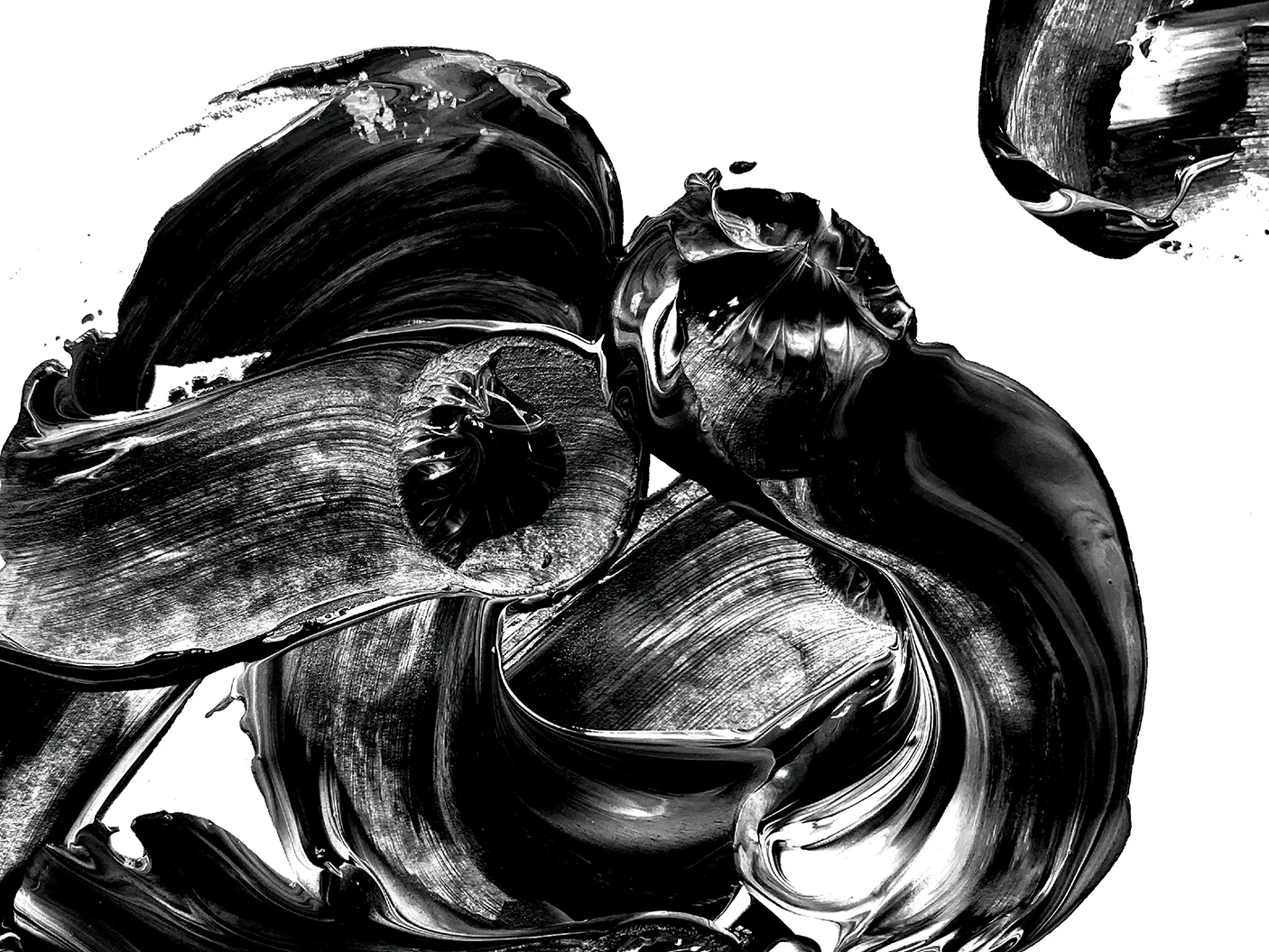
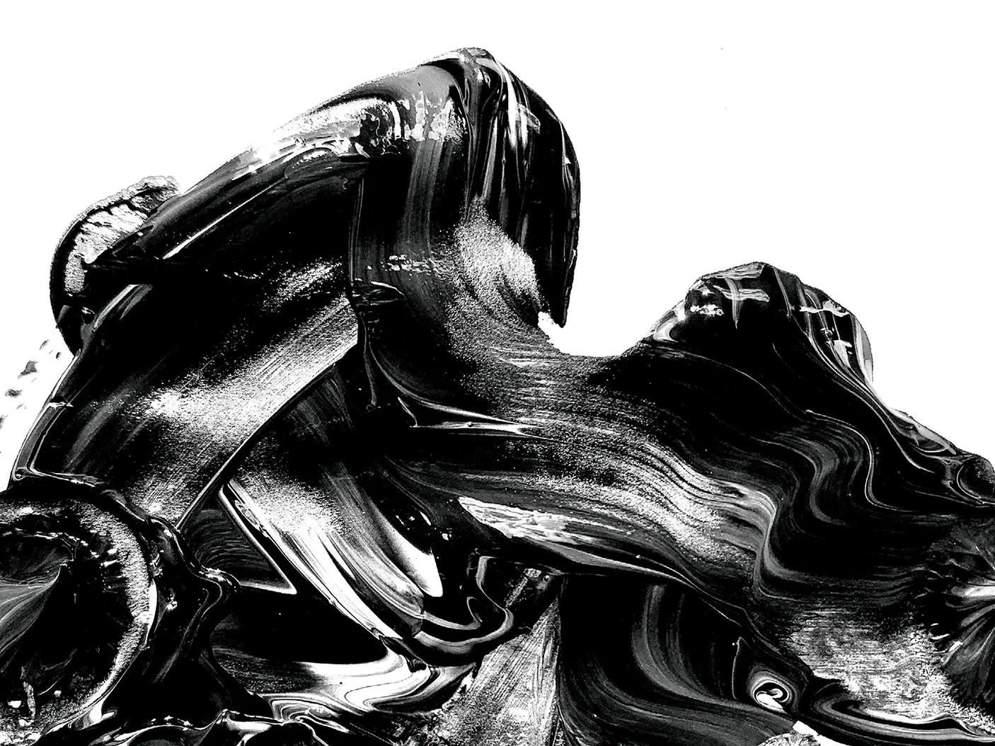
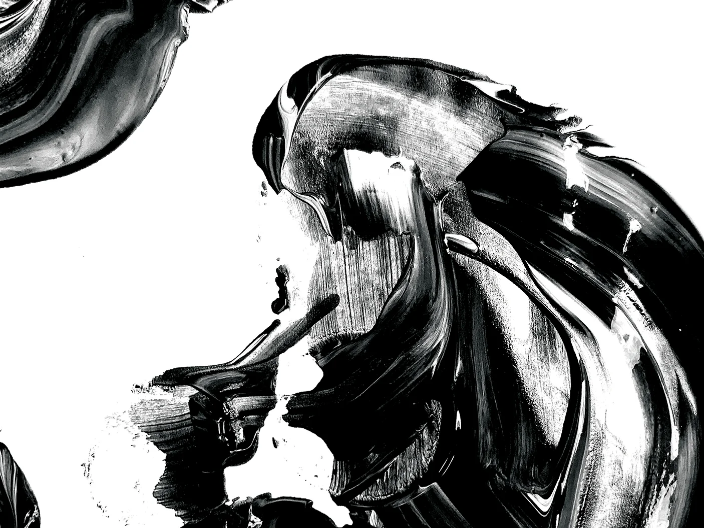
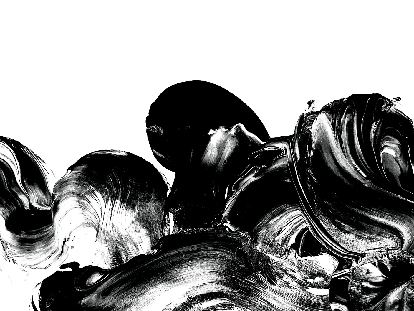
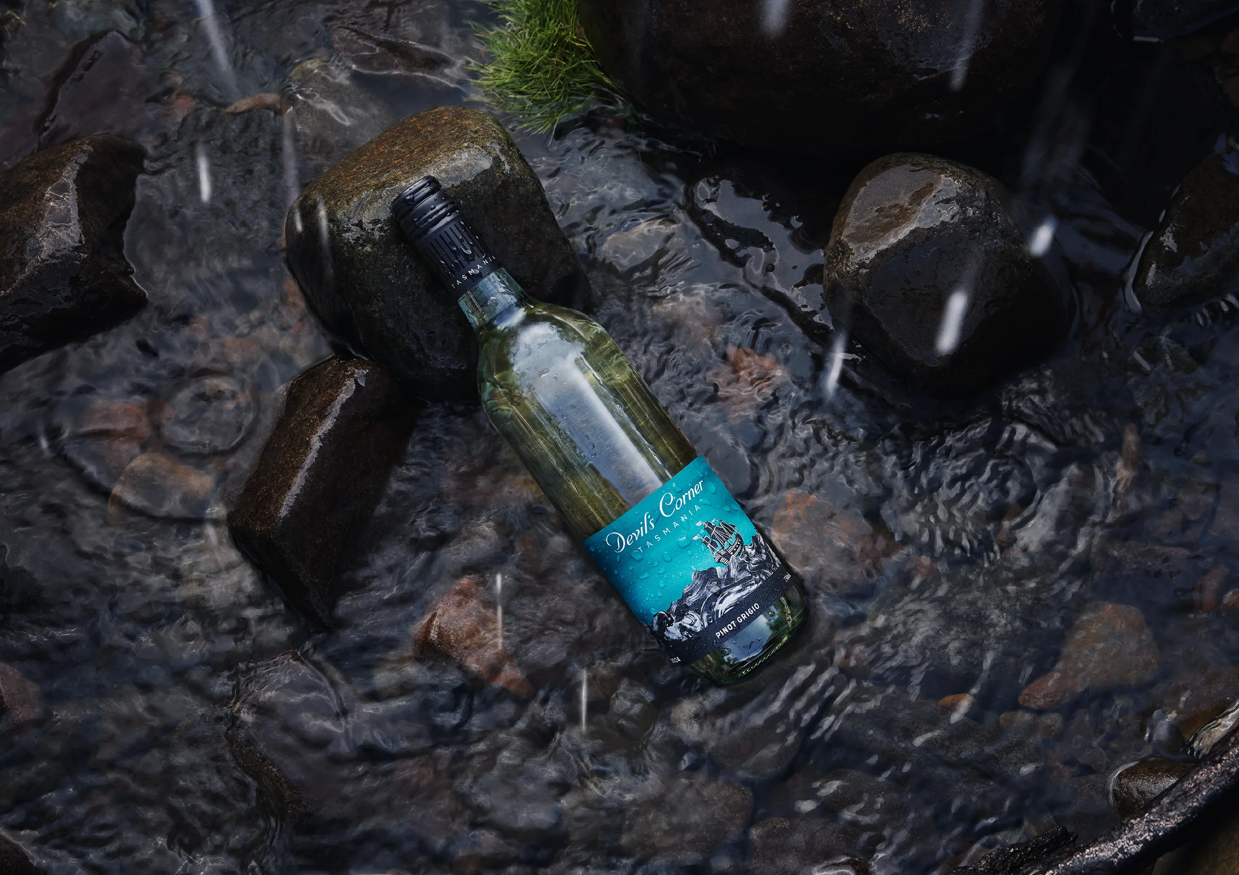
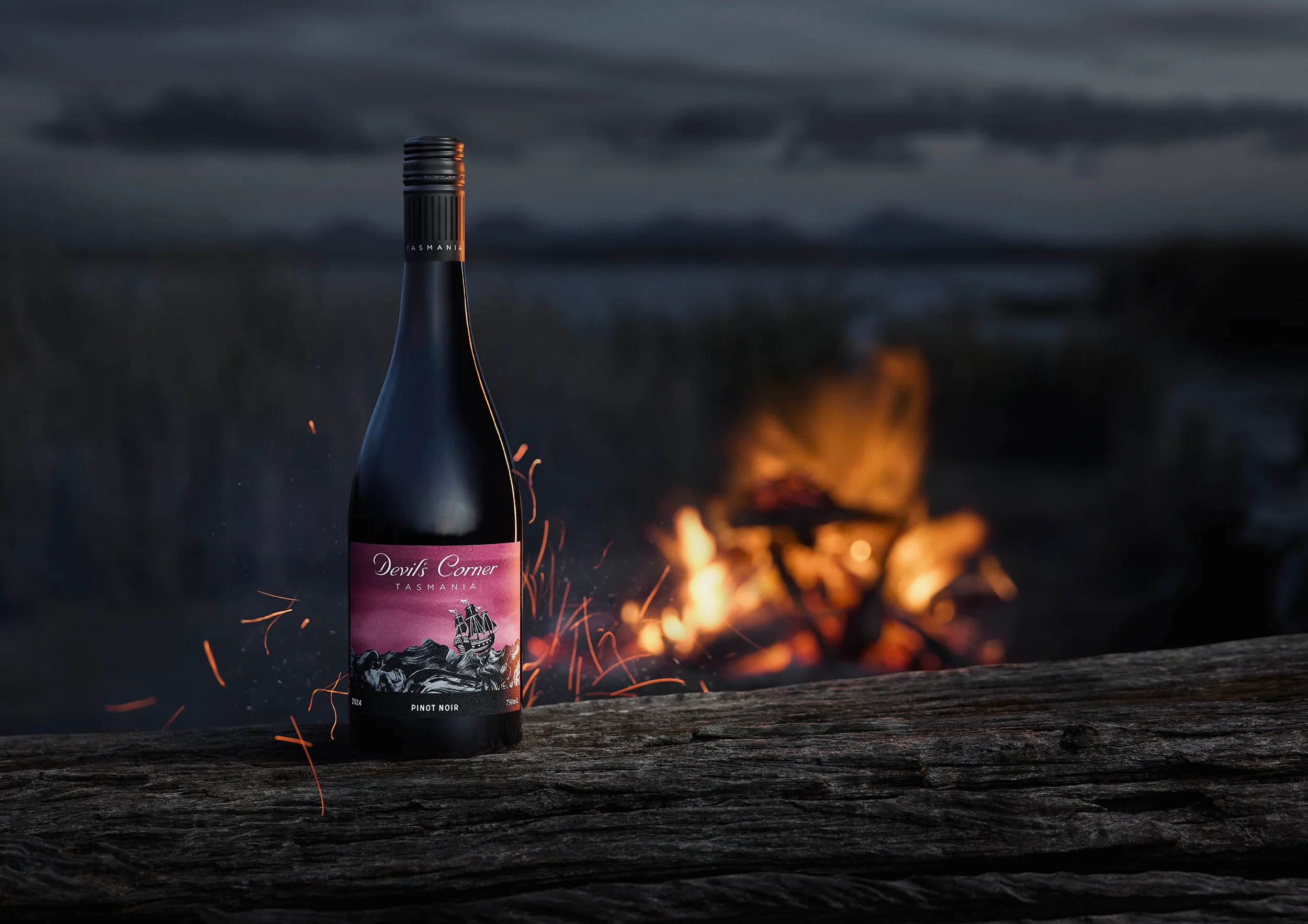
The legacy ‘curly wave’ illustrations—originally carried forward from past packaging to aid consumer recognition—were identified as a barrier to premiumisation. We replaced these with a series of contemporary, abstracted wave textures inspired by the brush-stroke texture of the premium Resolution tier, delivering visual depth and sophistication.
Additional enhancements included a refreshed Devil’s Corner lock-up, a more deliberate colour system to maintain varietal differentiation while enhancing premium feel, and the consistent use of a black capsule across both reds and whites—borrowing visual cues from the premium Resolution range to reinforce a cohesive brand hierarchy.
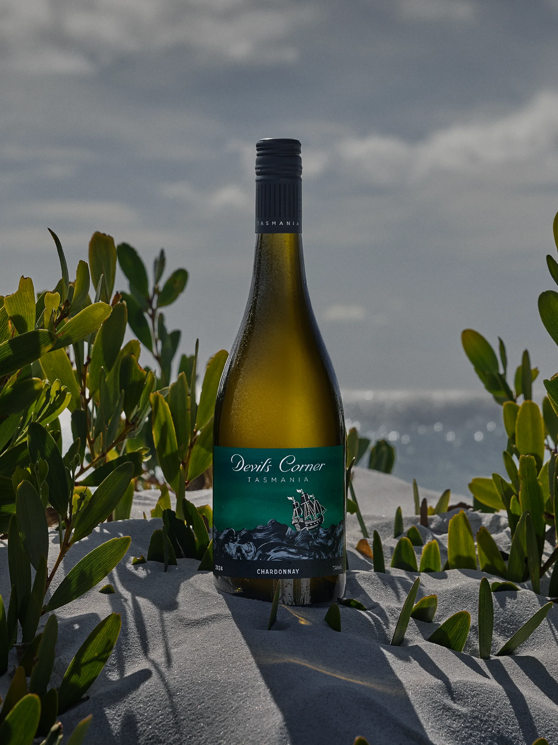
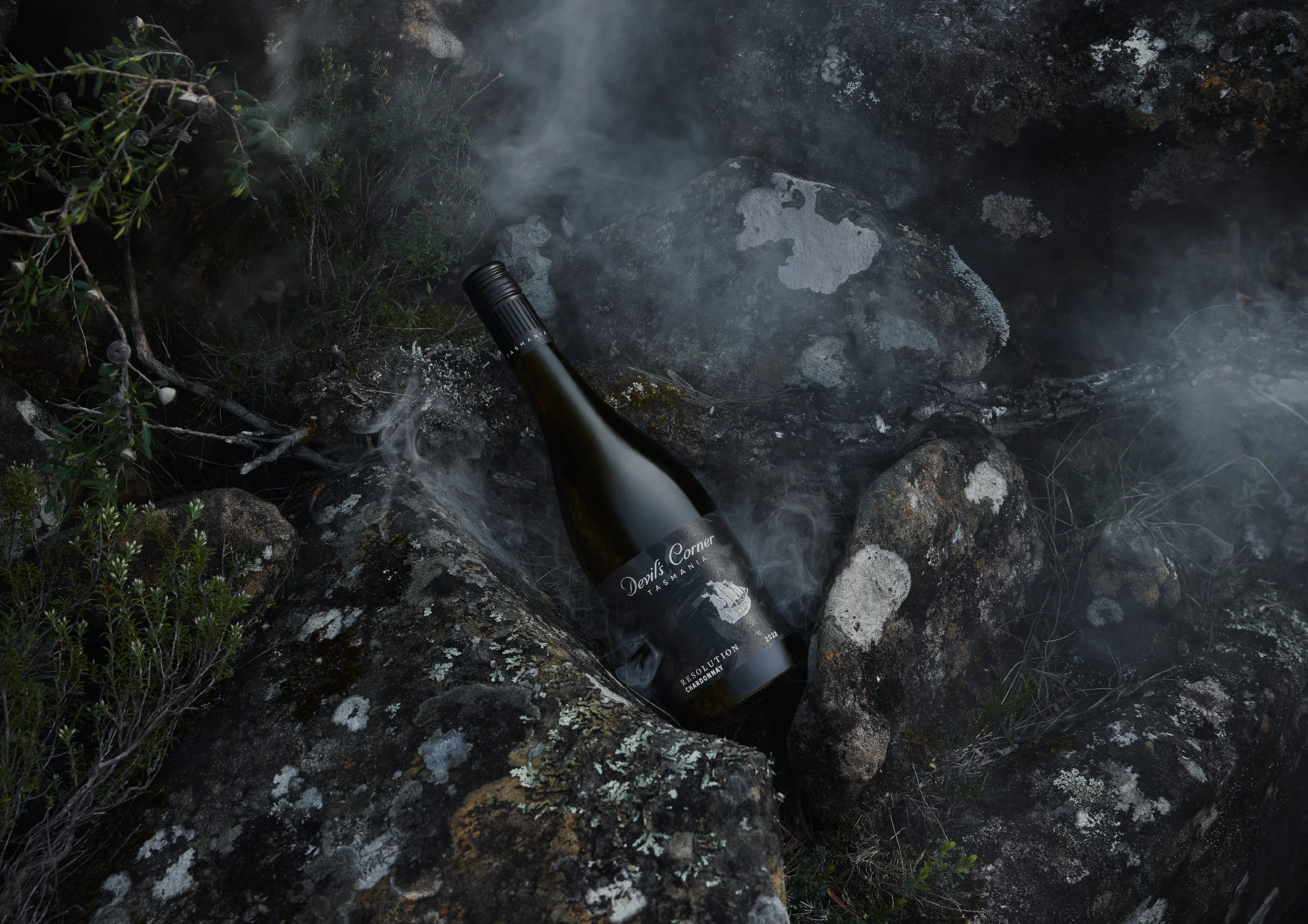
A more cinematic feeling of place
To complement the new packaging, we evolved the Devil’s Corner photographic style. Rather than featuring the glossy, tourist-brochure version of Tasmania, we wanted to capture the rugged, elemental beauty of the east coast: jagged coastlines, smoky undergrowth, wild dunes, and windswept rocks. Every shot felt anchored in the landscape, textured and beautiful—just like the wines, conveying the feeling of the place that shapes them as much as their famous quality.
“UF didn't just refresh our brand; they supercharged it. These creative dynamos cut through the fluff and delivered pure genius. From day one, they nailed our vision with uncanny precision. Their no-nonsense approach, coupled with killer instincts, transformed our identity into something fresh, fun, and unmistakably us. The process? Efficient, inspired, and peppered with just the right amount of laughter. If you're looking for a team that'll push your brand beyond the mundane, UF is your secret weapon. They don't just meet expectations—they smash them.”
Chris Riddell, Founder
3 days
14 interviews
3k visitors
3 exhibitions
Project Collaborators:
Photographer – Sean Fennessey
Behind the scenes