Four Pillars Changing Seasons Gin
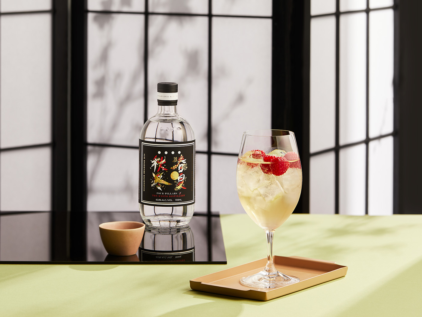
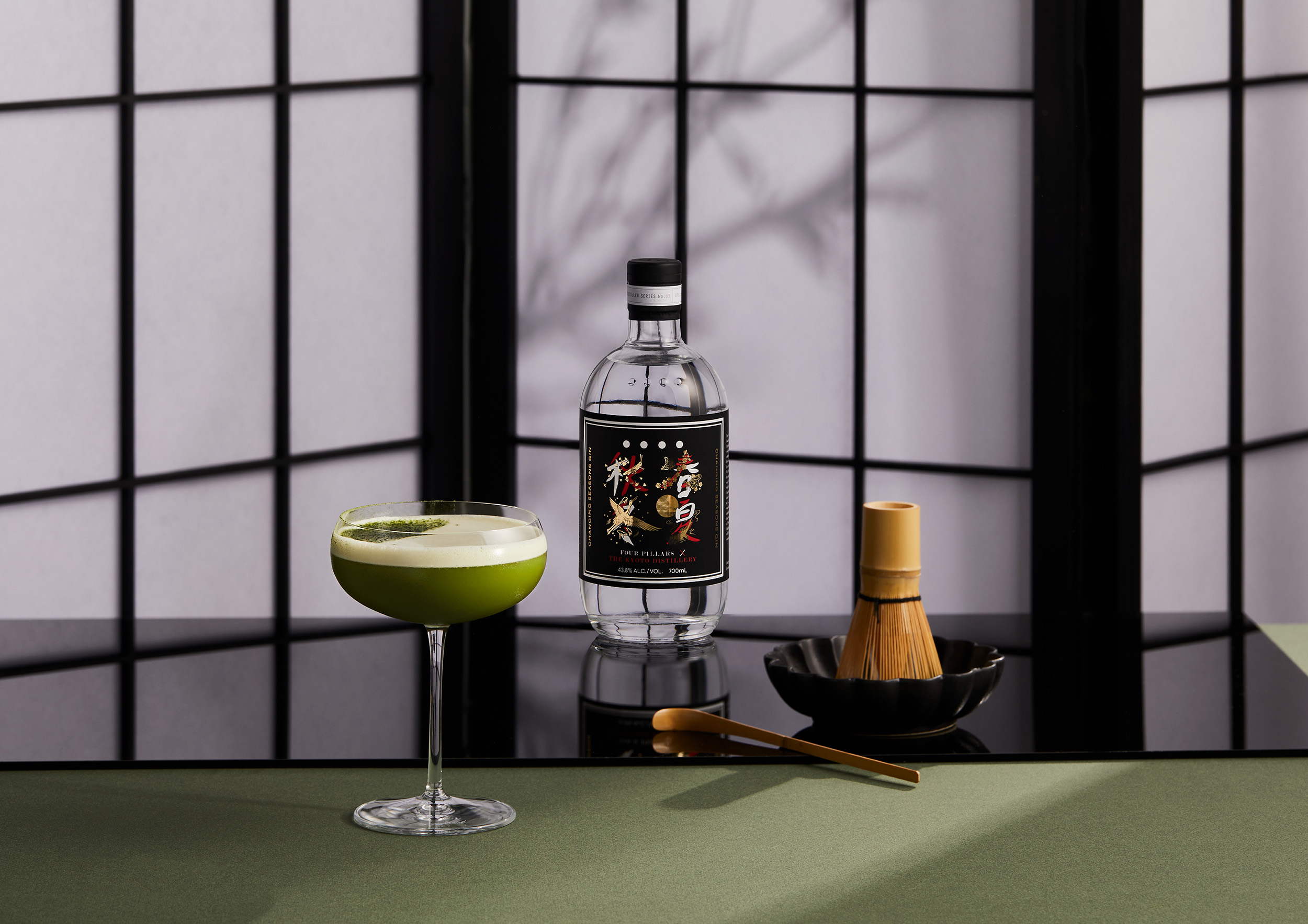
What do you get when you combine the gin making talents of Australia and Japan’s leading distilleries? The answer is Changing Seasons Gin, a cross-seasonal gin that’s equally at home in crafting refreshing cocktails for the hot Australian summer, or a warming tipple in the Japanese winter. Four seasons, two countries, one incredible gin, Changing Seasons needed to capture both hemispheres on a bottle.
Four seasons in one… bottle
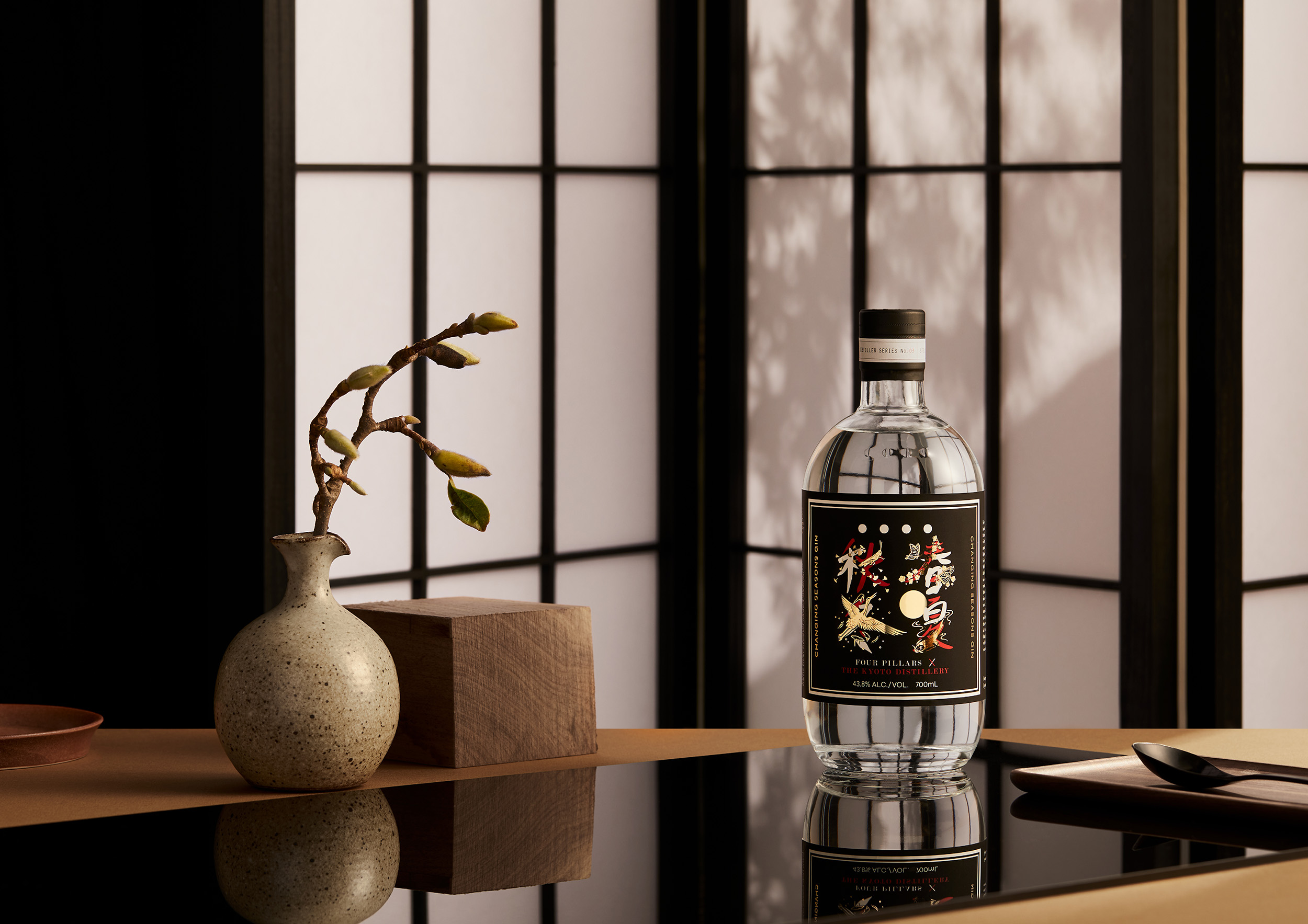
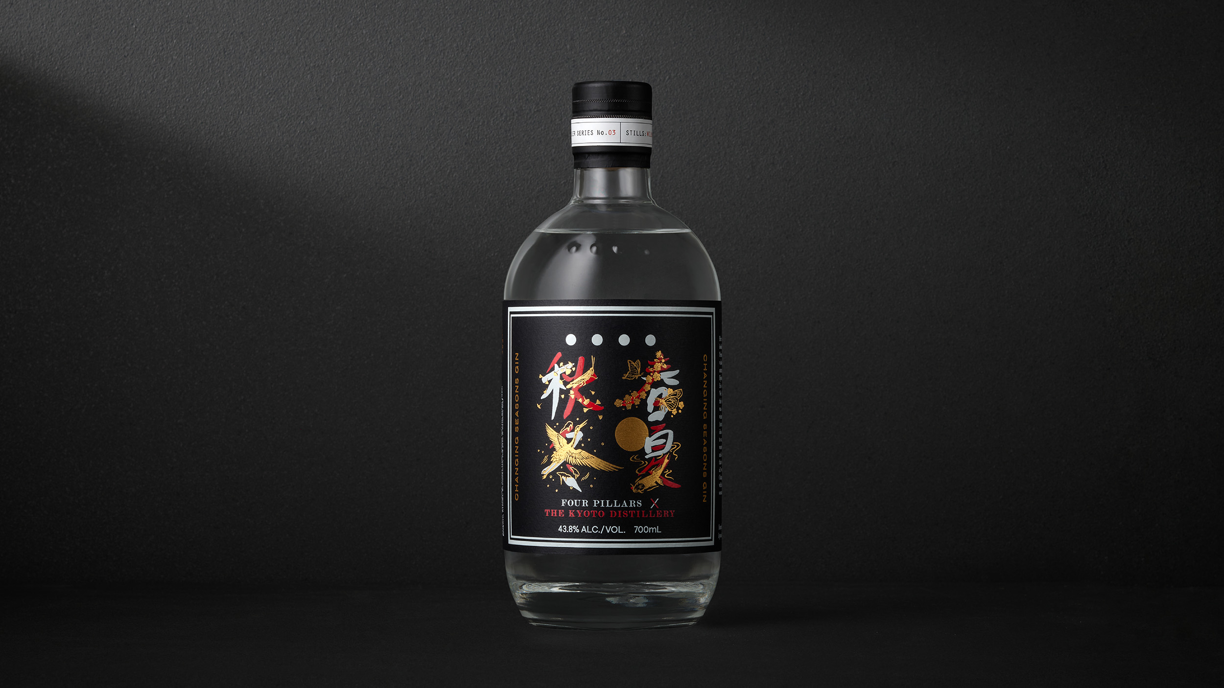
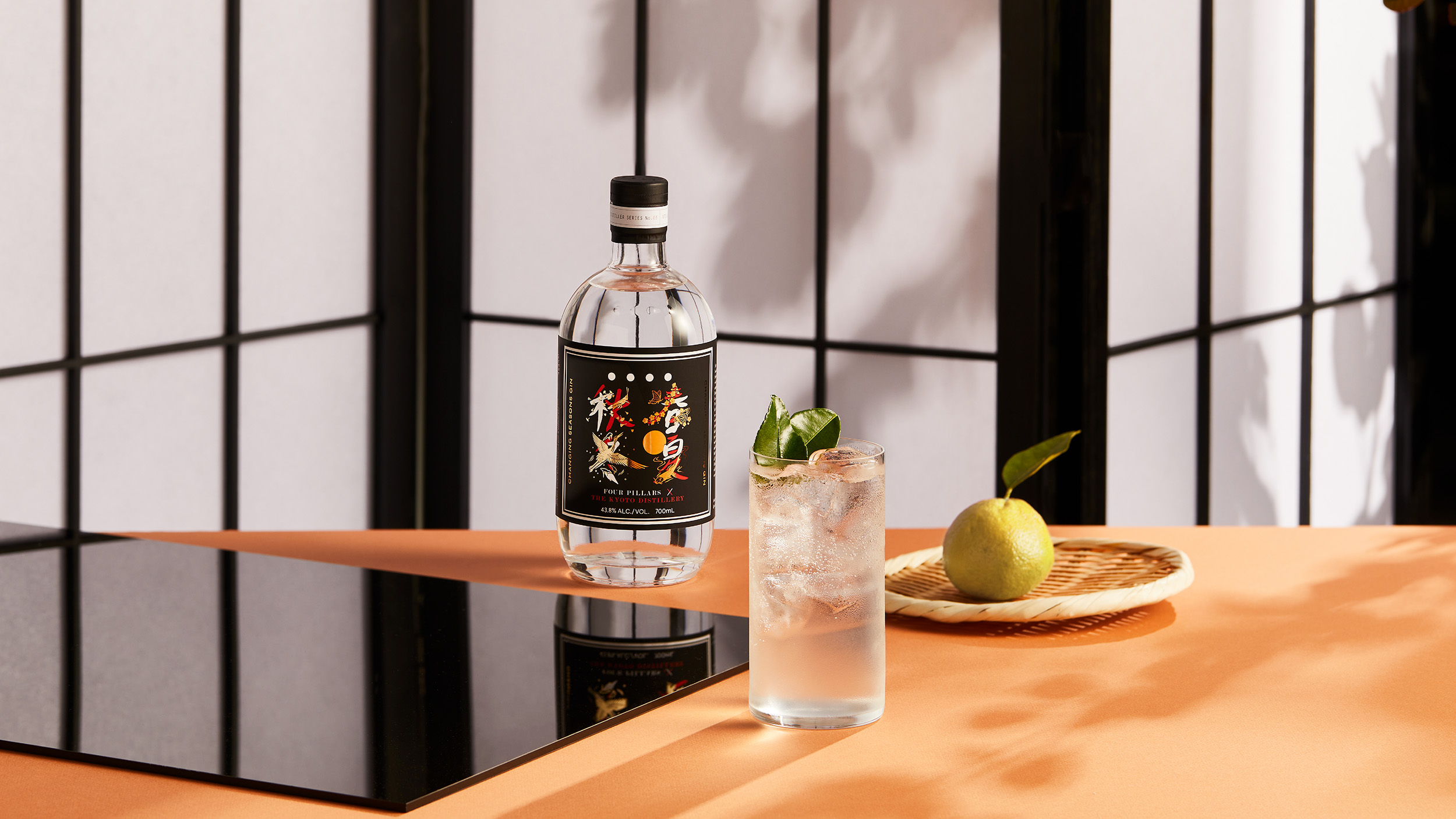
For their third Distiller Series gin, Four Pillars—Australia’s leading craft gin maker—collaborated with Kyoto Distillery, to craft a gin that featured seasonal botanicals from Australia and Japan. The resulting Changing Seasons Gin is perfect for creating refreshing cocktails suited to the hot Australian summer—and equally suited to sophisticated warming drinks in the Japanese winter. This idea of seasonal adaptability, paired with a premium sensibility, needed to be reflected in the creative approach.
Like the Distiller Series Gins that preceded it, Changing Seasons Gin was limited-edition and therefore needed to exude a high level of quality and craft, while also elevating this one-off collaboration with a conceptual label design. A truly trans-seasonal drink created with influences from both hemispheres, the packaging design needed to reflect both the Japanese home from which it was born and its global versatility.
The ultimate collaboration
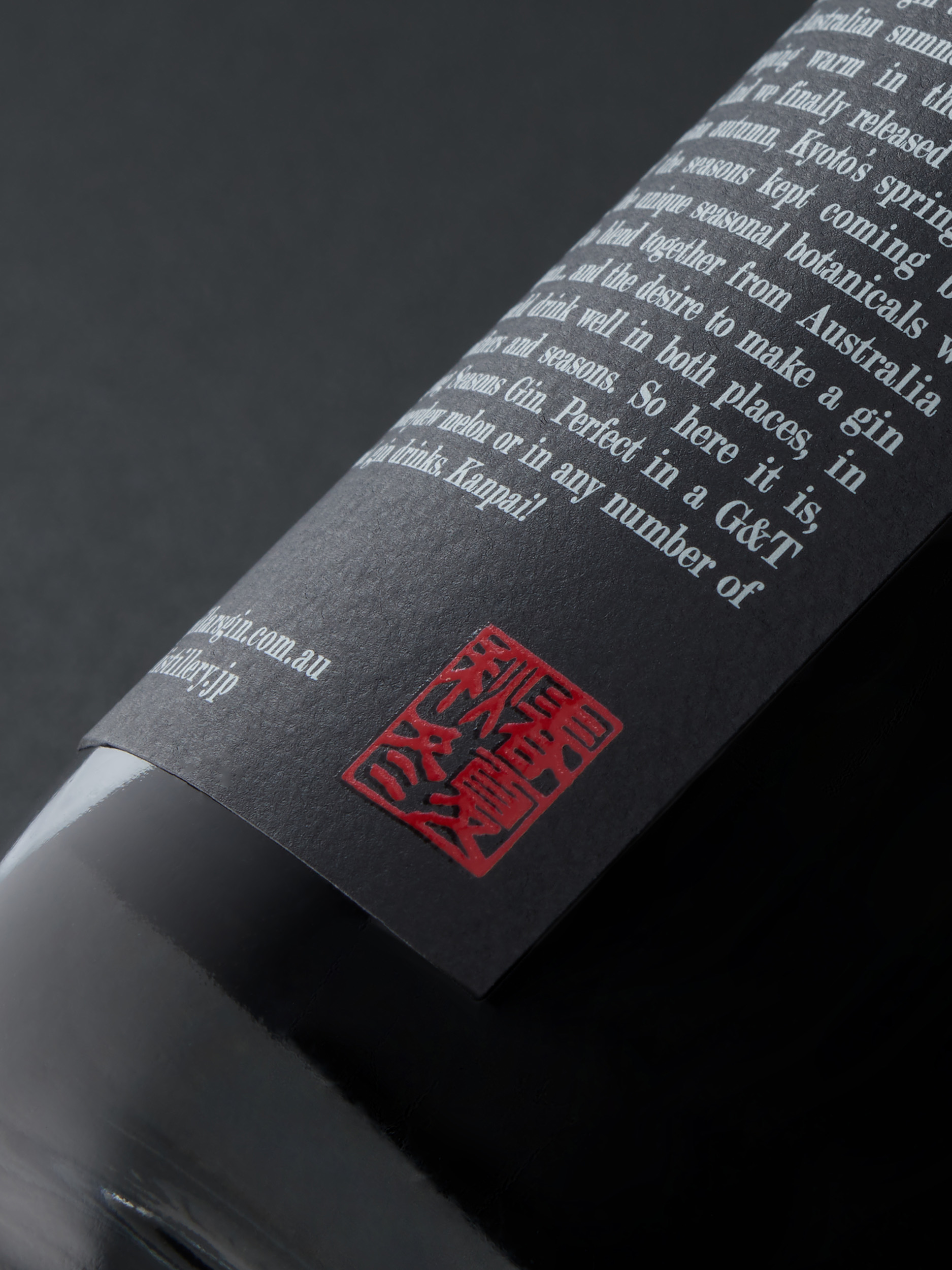
The design of this label needed to reflect the collaboration that went into the liquid itself. This is a gin that was truly a dual-nation, cross-seasonal effort: distilled in the Yarra Valley spring, tested in refreshing cocktails over the hot Australian summer, while Alex (Head Distiller of Kyoto Distillery) was keeping warm in the Japanese winter, and released in the Australian autumn, while the cherry blossoms bloomed in Japan. This year round process lead to the name and narrative for Changing Seasons Gin.
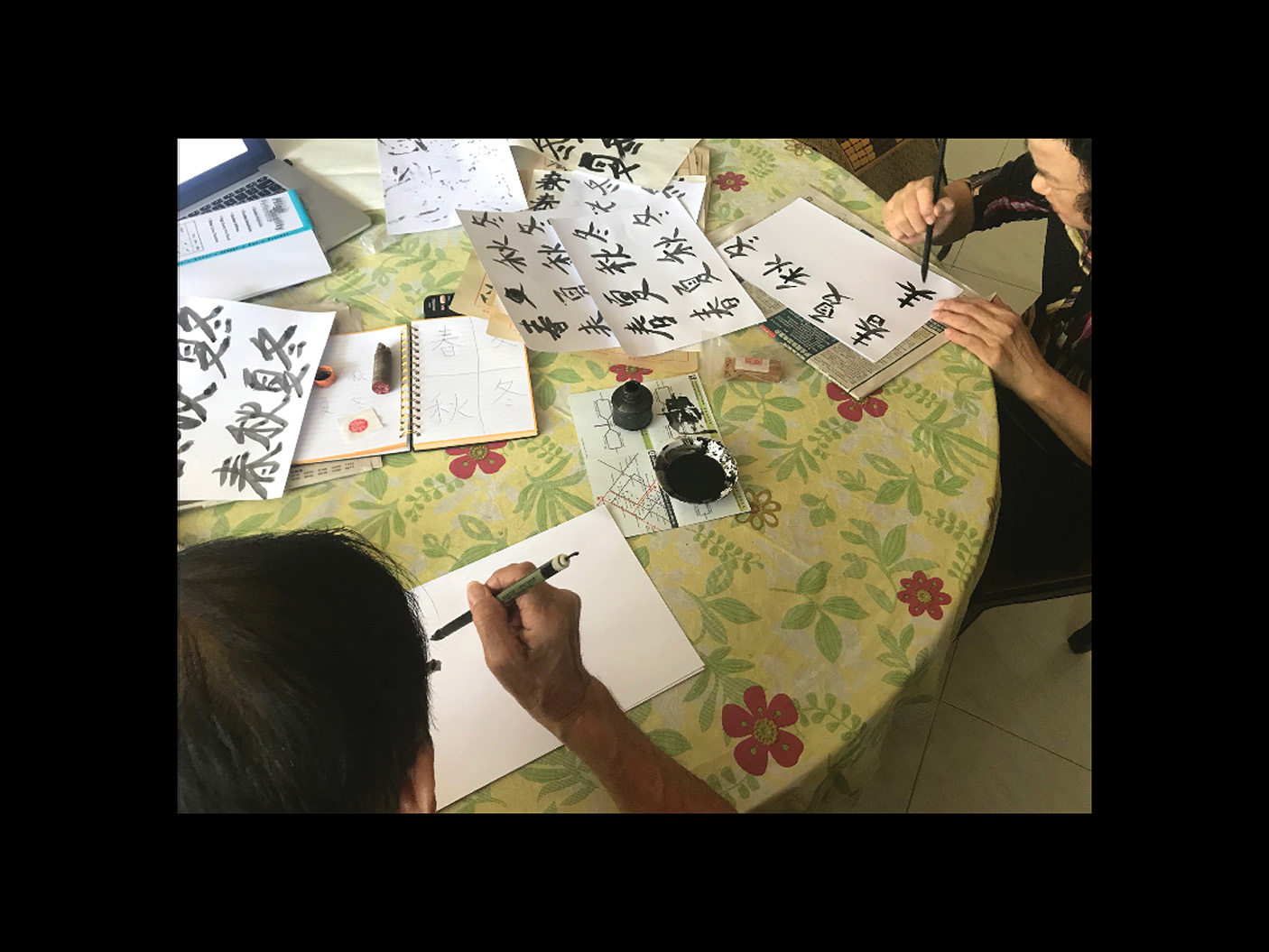
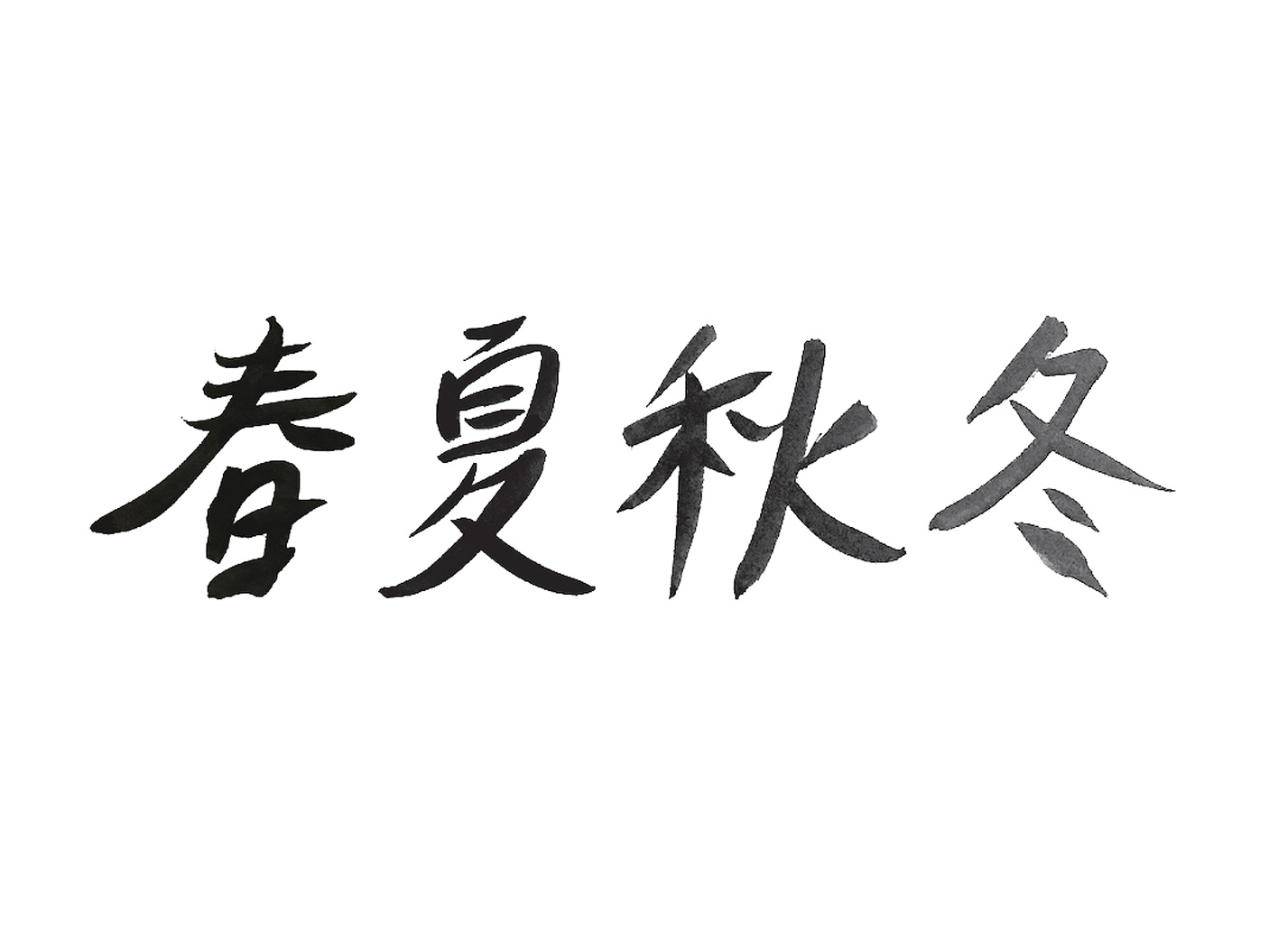
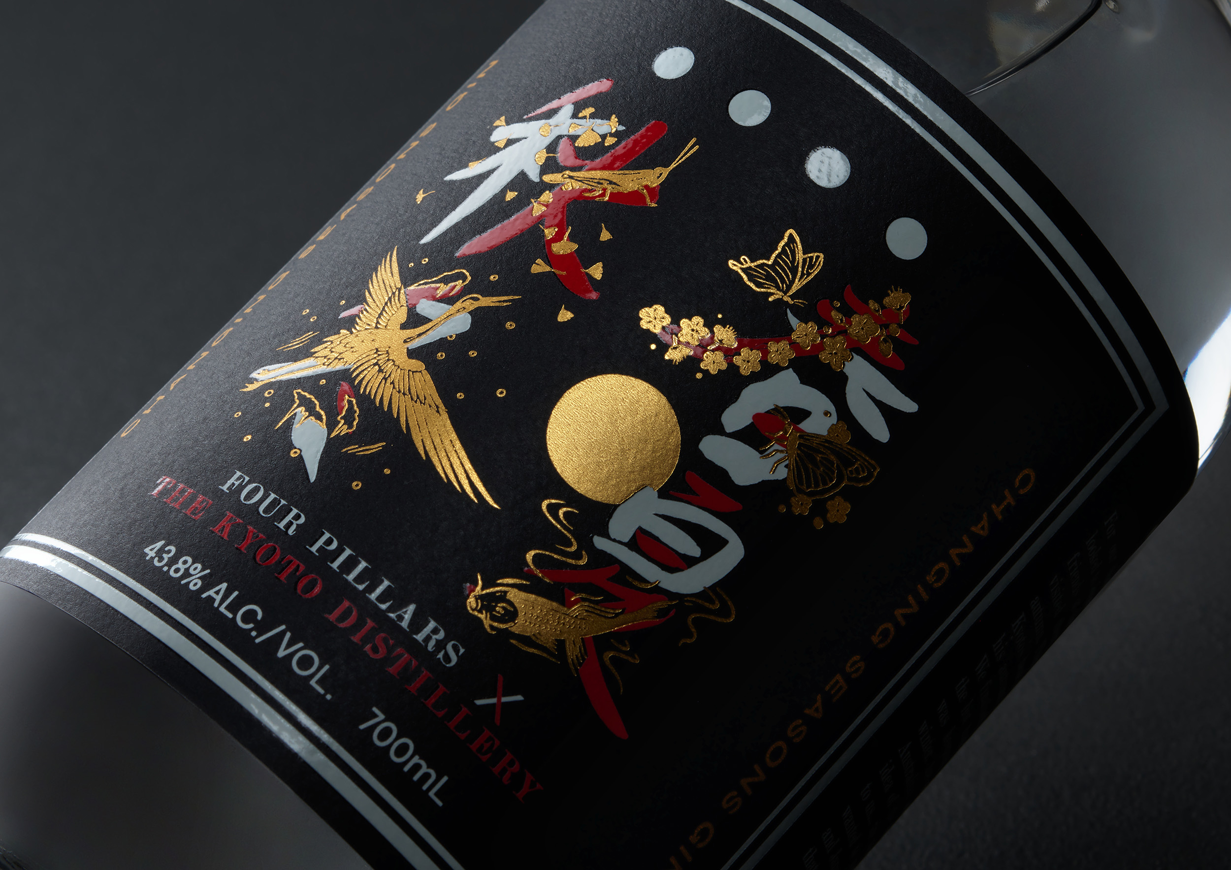
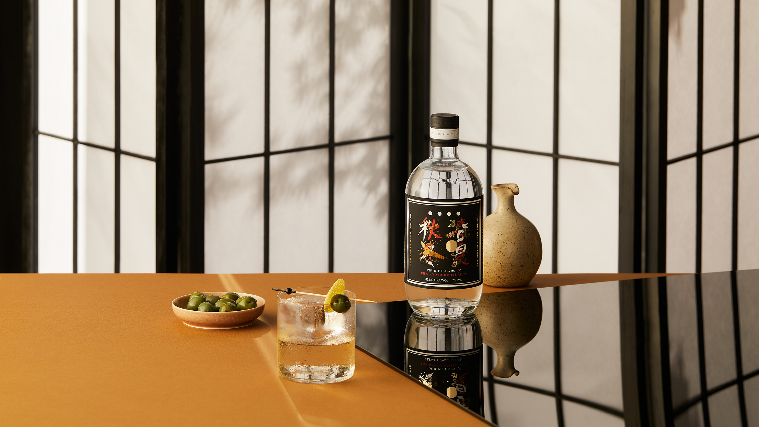
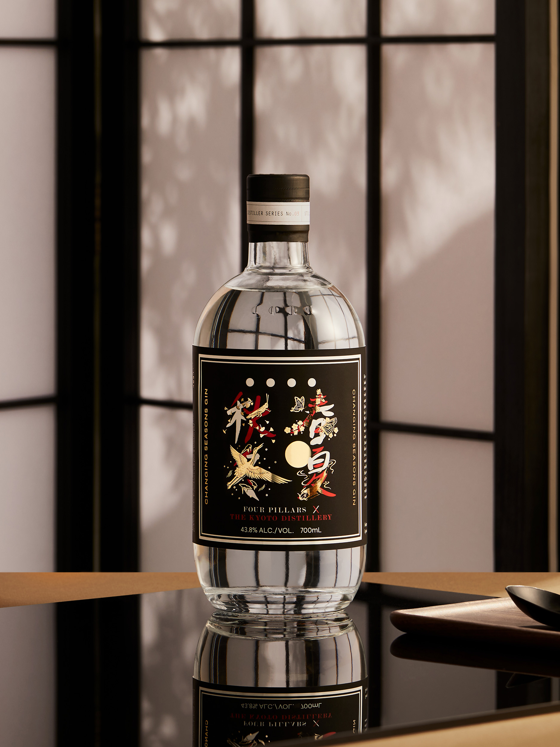
Every element was carefully crafted in-house and then thoughtfully layered to achieve a flawlessly detailed printed product. And like the gin itself, the creative approach was a true collaboration. Family members with an understanding of Japanese letter forms were enlisted to create four Kanji* characters—Summer, Autumn, Winter, Spring—using a calligraphy brush and black sumi ink.
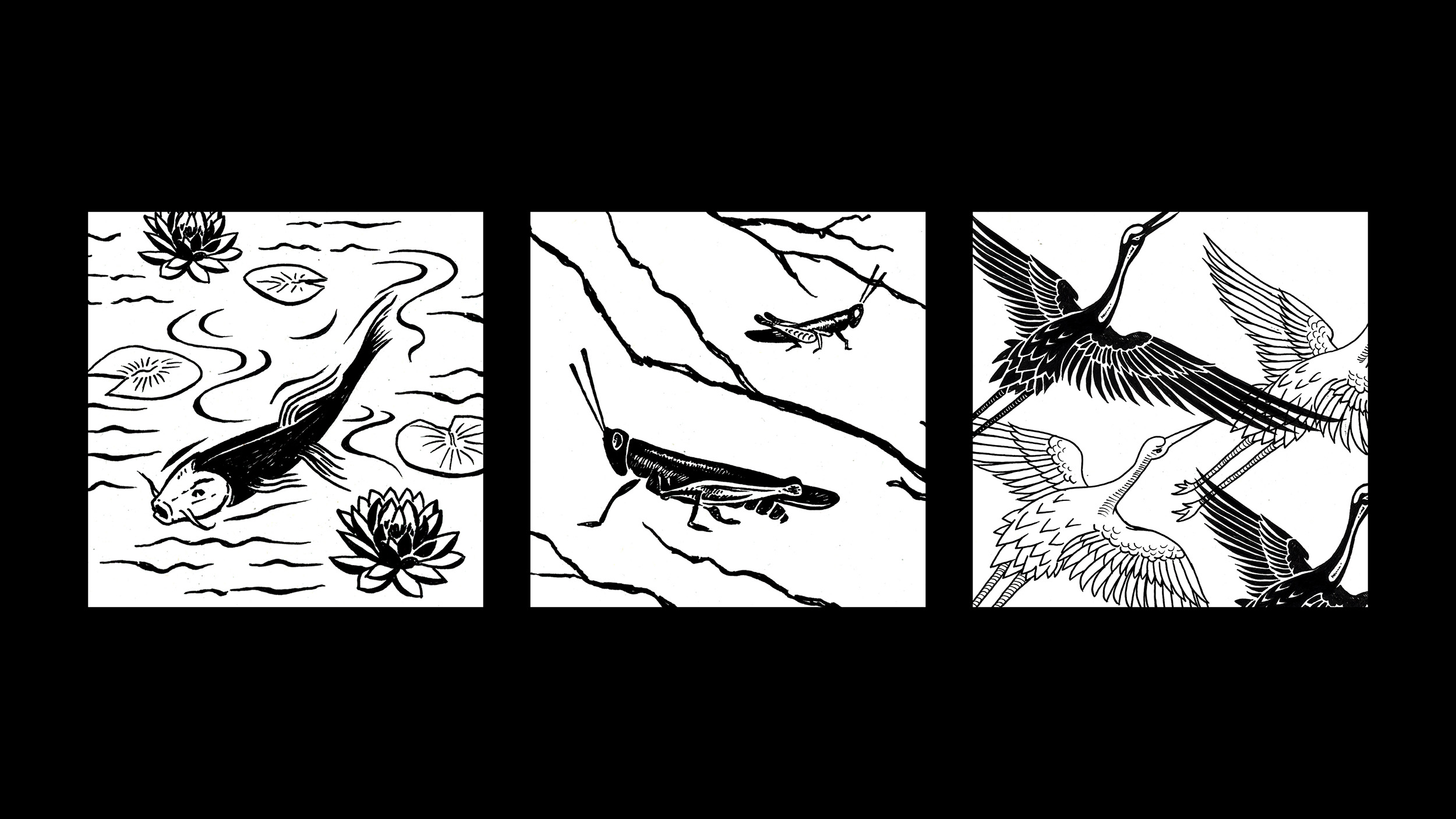
These characters were then overlaid with a series of in-house, hand-painted illustrations, depicting symbolic, seasonal Japanese flora and fauna. Drawn in a style influenced by traditional Japanese Ukiyo-e prints, each illustration is symbolic of the four Japanese seasons.
Spring – Flowering cherry blossoms and fluttering Swallowtail butterflies
Summer – A pond of Koi fish swimming under the heat of the red-hot sun.
Autumn – Grasshoppers amongst the falling of gingko leaves
Winter – A congregation of Japanese cranes flying through a blizzard
To ensure this product had ‘stand out’ appeal in premium on-prem locations, extra care was put into stock testing and selection—including numerous ‘back-light’ tests—to ensure the stock had the correct integrity to act as a backdrop for the intricate and delicate design. Additionally, gold foil and white UV ink was employed to provide greater dimensionality and depth to the illustrations—ensuring that each hand-crafted stroke was clear and recognisable.
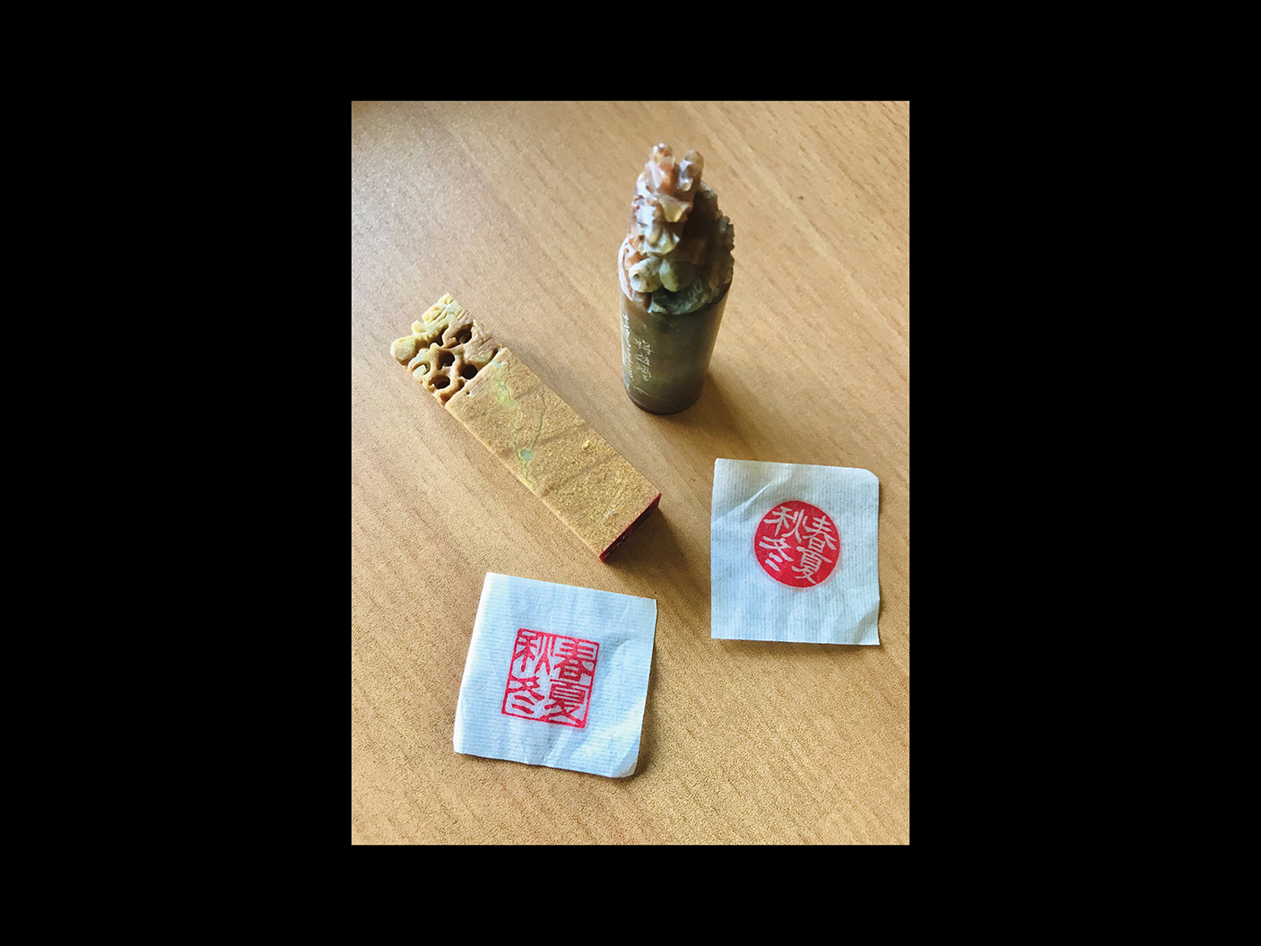
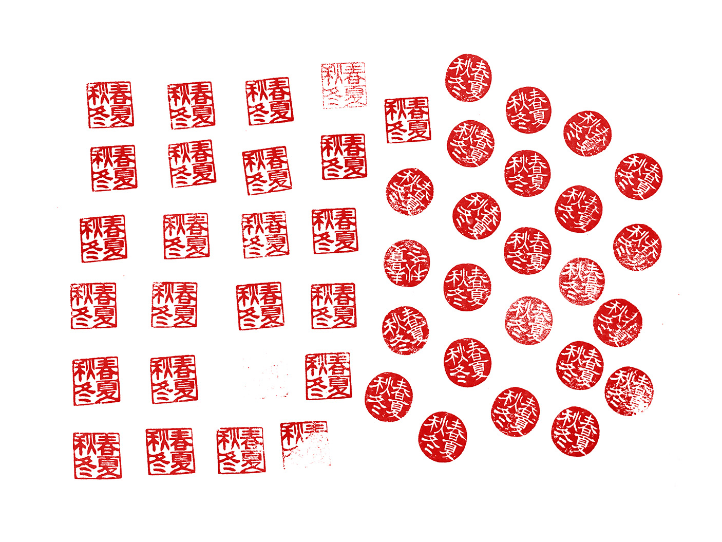
In addition to the label design, a wax stamp featuring the four characters was created to add to both the cultural importance of the product and its premium nature.
The result was a collaboration in more ways than one—a celebration of two cultures, and one unique product. Over 24,000 bottles have been sold to date and 19 media clips reached a potential 905,000 people.
*Kanji—Chinese characters, introduced to Japan in the 5th century—are ideograms. Each character has its own meaning and corresponds to a word. By combining characters, more words can be created.
Scope:
- Packaging Design
- Illustration
- Creative Direction
- Photography & Art Direction
- Photography
- Styling
- Finished Art
- Management & Production
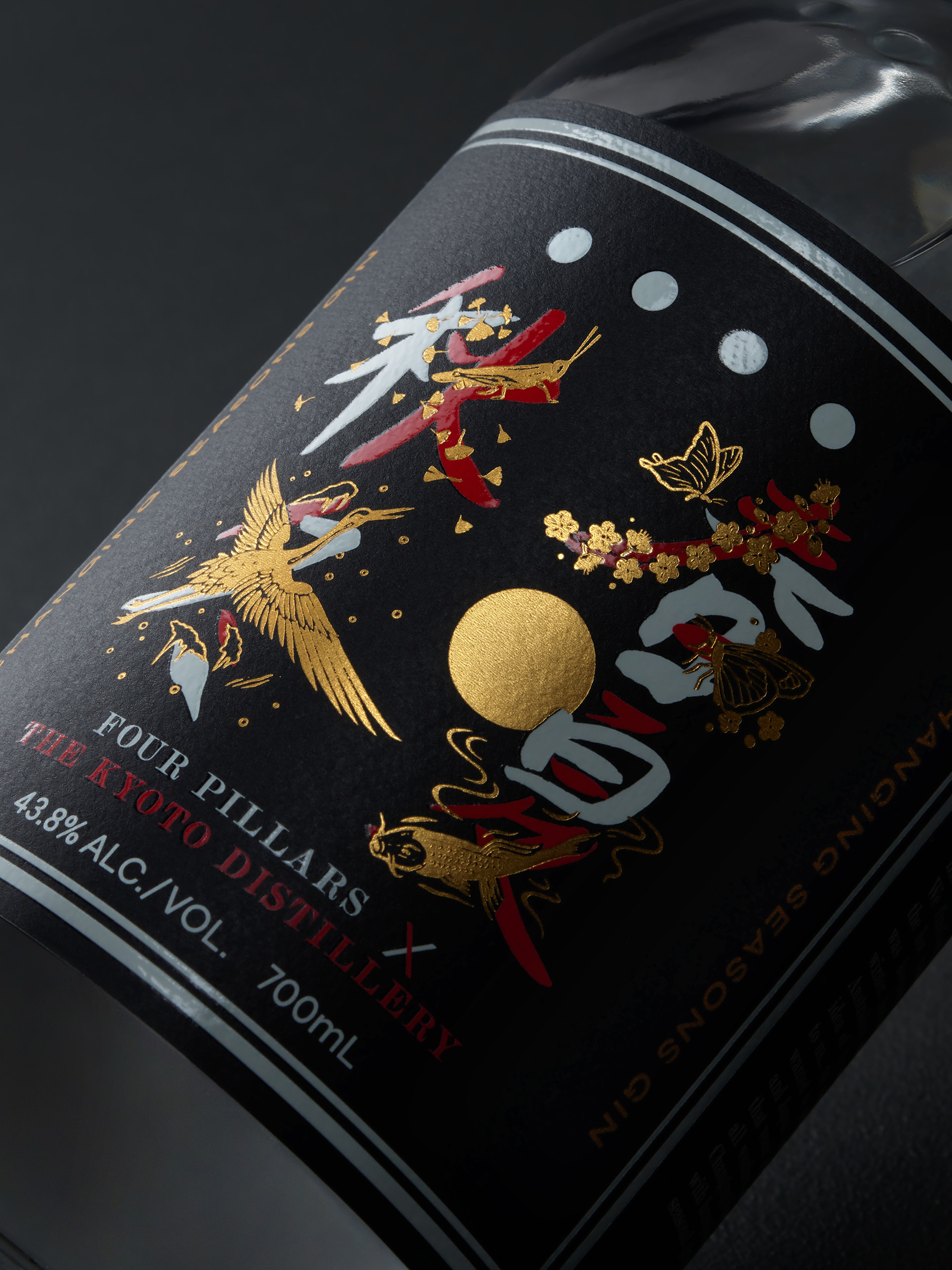
Family members with an understanding of Japanese letter forms were enlisted to create four Kanji characters—representing the four seasons. These characters were then overlaid with a series of in-house, hand-painted illustrations, depicting symbolic, seasonal Japanese flora and fauna.
Project Collaborators:
Photography – Benito Martin
Stylist – Gemma Lush
Kanji CHARACTERS – Daz's MUM & DAD
BEHIND THE SCENES