Four Pillars Summer Campaign 2019
Blistering hot days. Dreamy sunsets and long summer nights. Hot sand, cool ocean, and countless backyard barbies. Australian summer is truly unique. In 2019, we created the Four Pillars summer campaign to celebrate the iconic elements that define this time of year, alongside the refreshing gin drinks that grace bar menus and at-home cocktail repertoires as temperatures rise. The campaign needed to showcase the gin brand’s creative flare and natural home within that aspect of Australian culture. Modern in style and approach, with roots in this iconic seasonal nostalgia.
The Challenge of Four
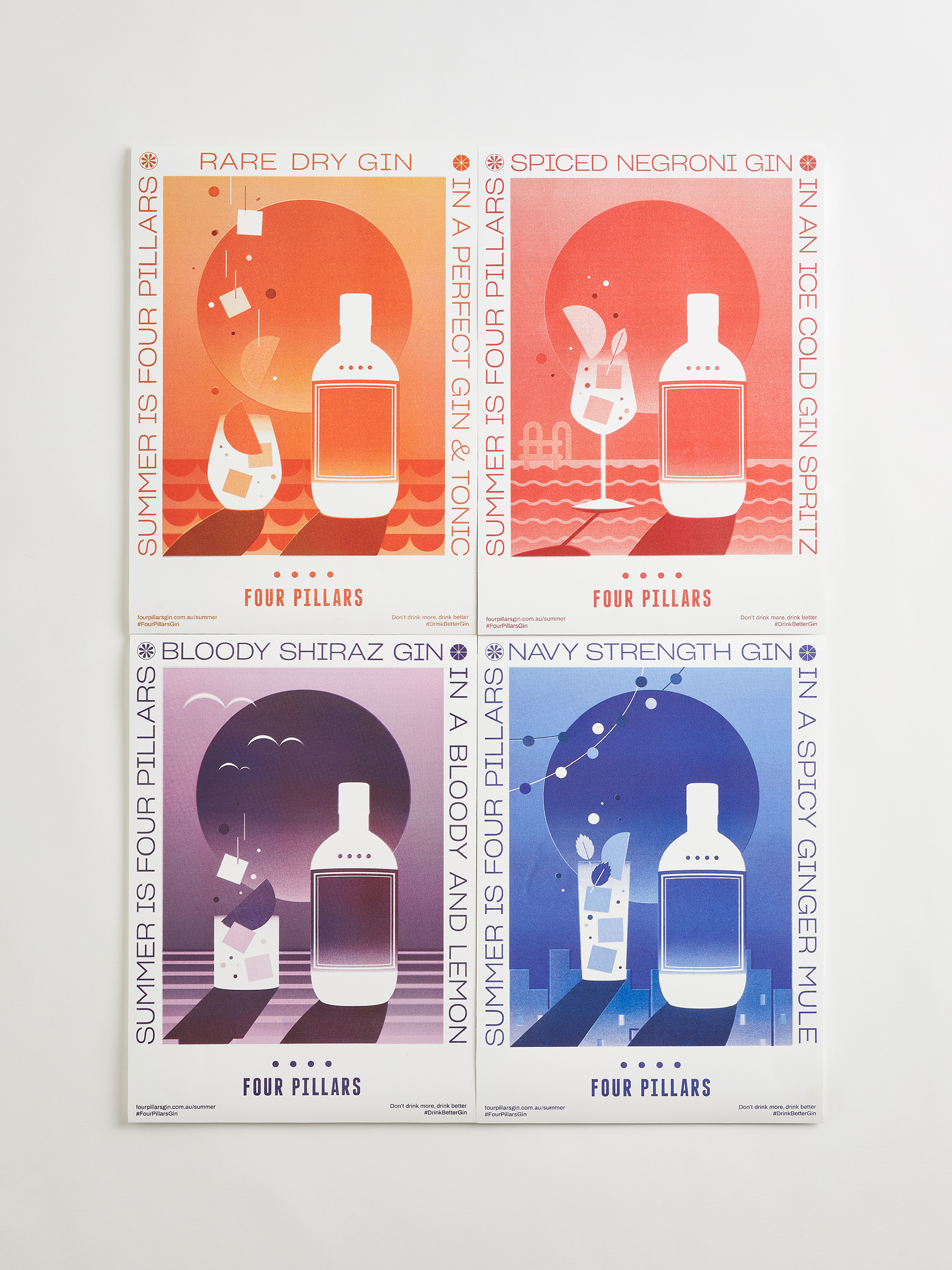
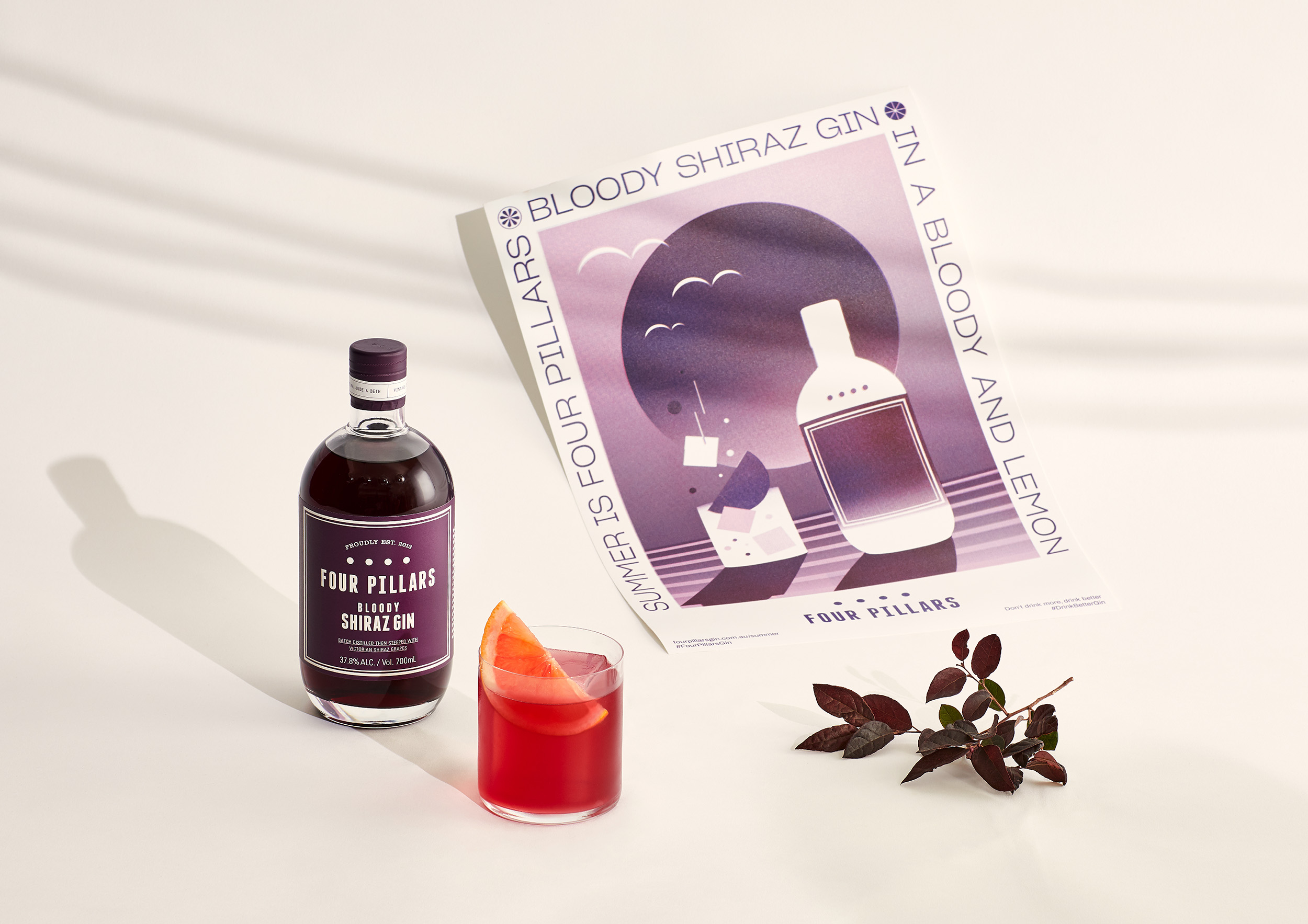
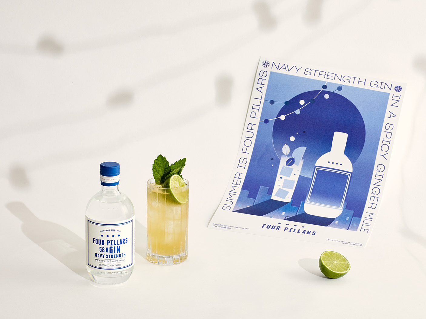
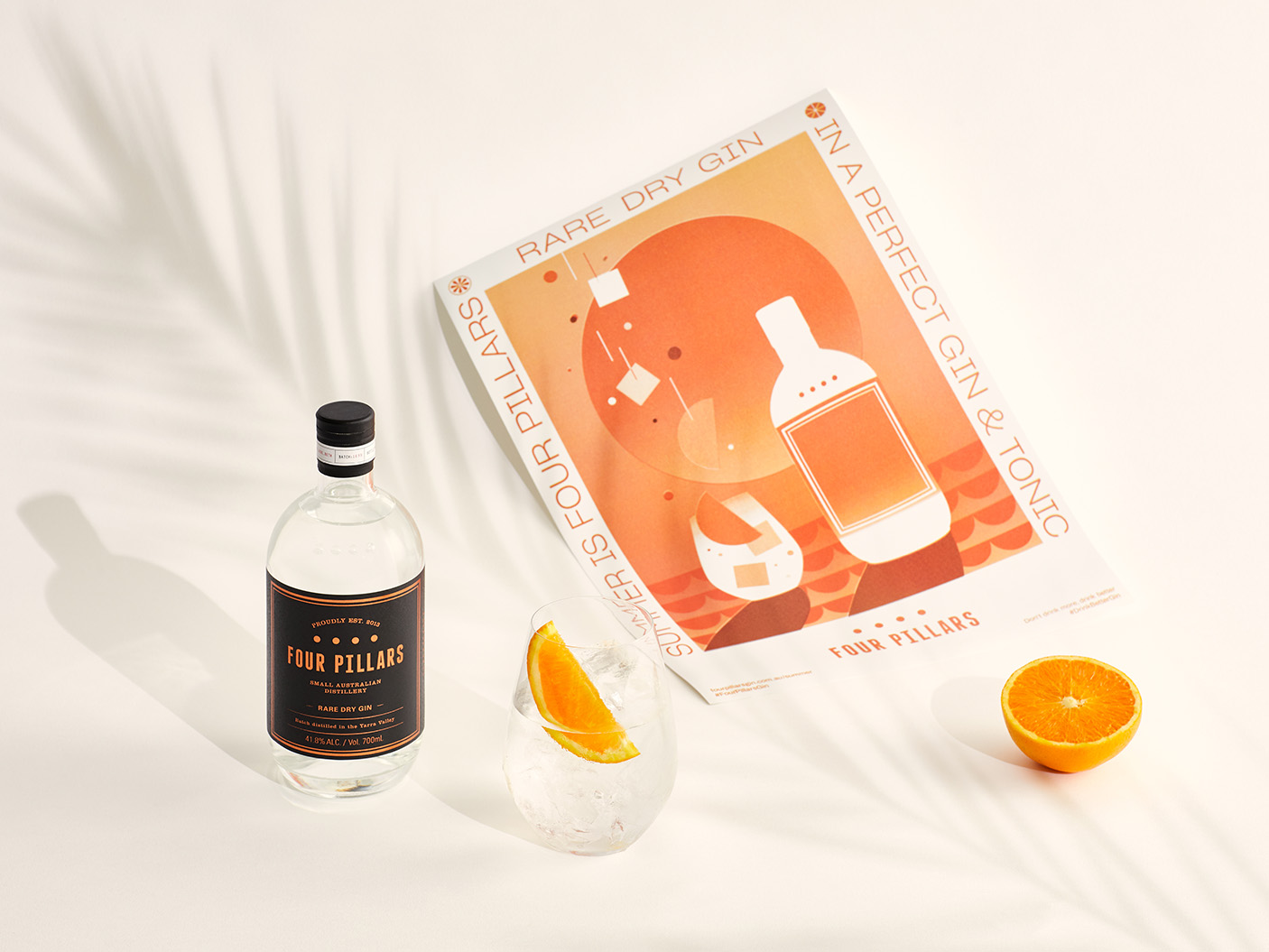
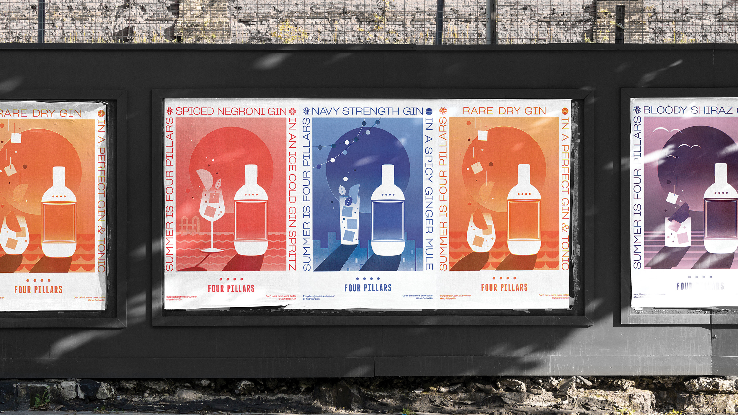
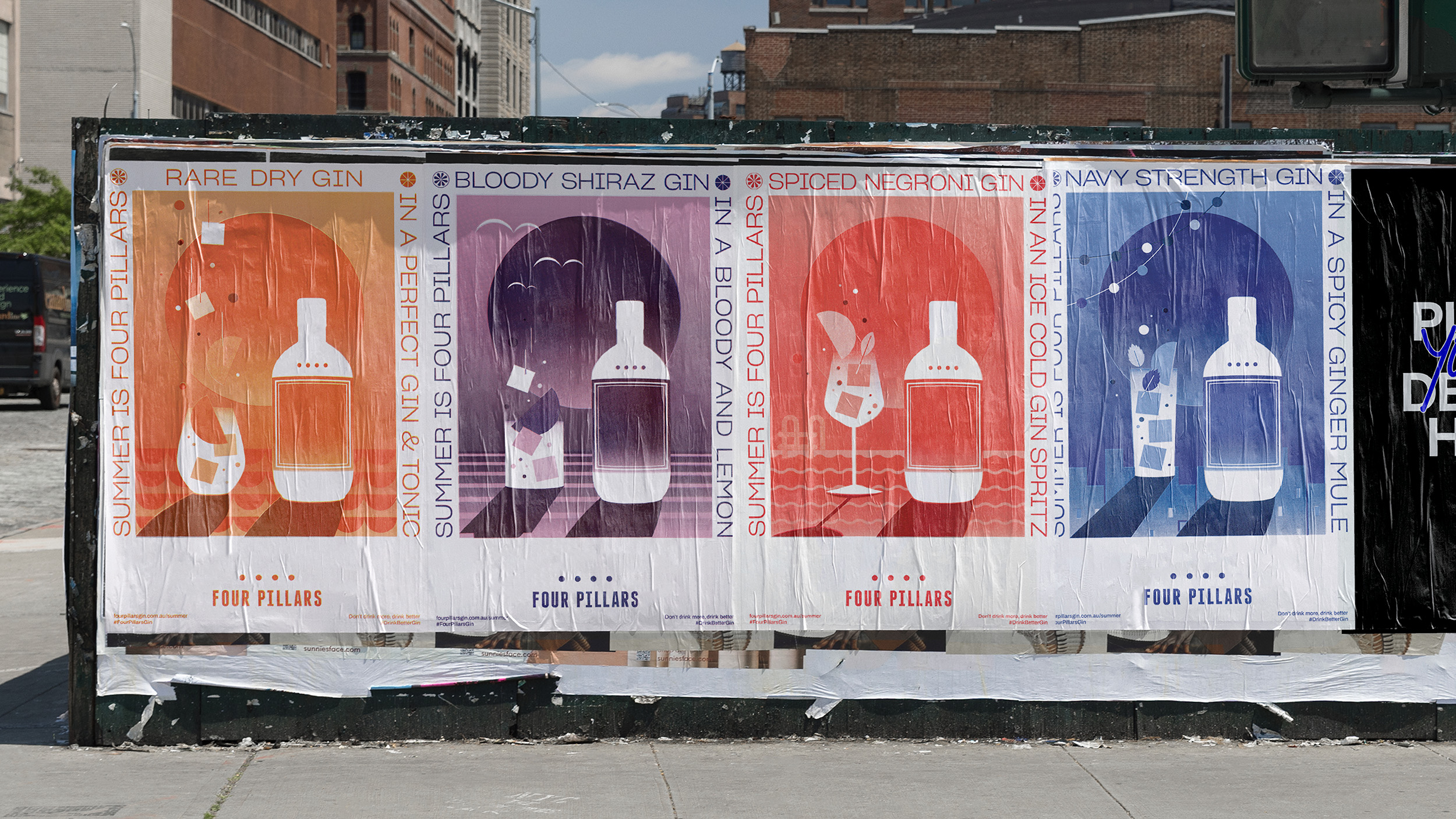
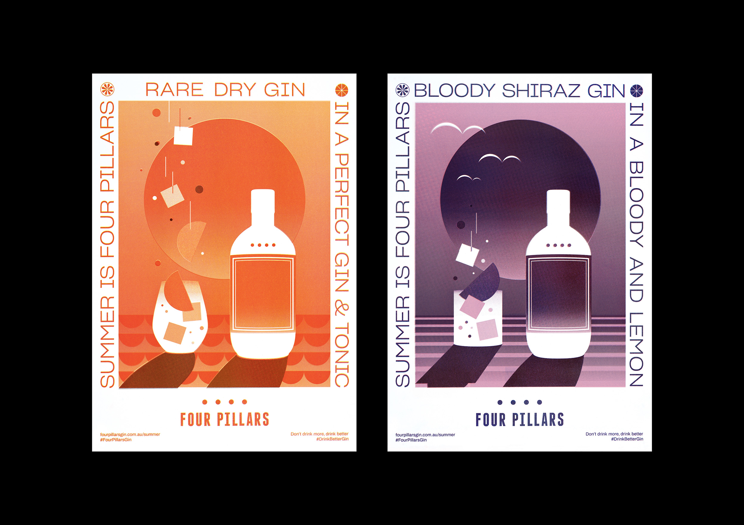
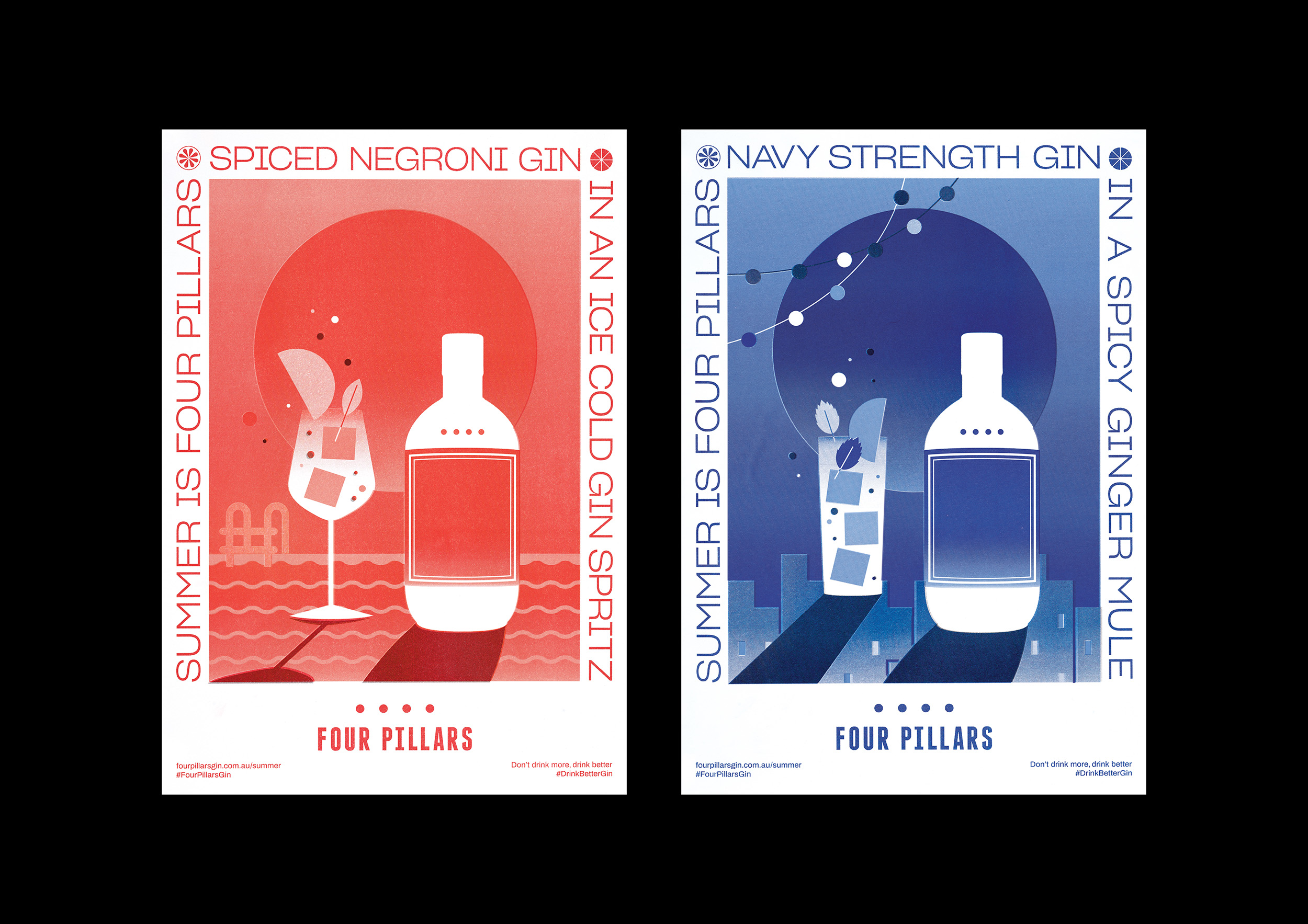
This was the second year of the Four Pillars summer campaign. In 2018, our objective was single minded – to celebrated Rare Dry Gin and the iconic Four Pillars Gin & Tonic, with orange as the hero motif. The 2019 challenge was much broader. We needed to celebrate four very distinctive core range gins; Rare Dry, Bloody Shiraz, Spiced Negroni and Navy Strength; each alongside their own perfect serve cocktail.
These four gins had very distinct and different personalities and to date, had only been presented within their own thematic worlds—Ocean scenes for Navy Strength Gin, Mid-century Italy for Spiced Negroni Gin, and so on. These individual contexts frame how they look, feel and act in execution.
This summer campaign would require the four gins to be placed within a single thematic concept, rolled out as a series of street posters and supporting digital content.
Hero gins and summer moods
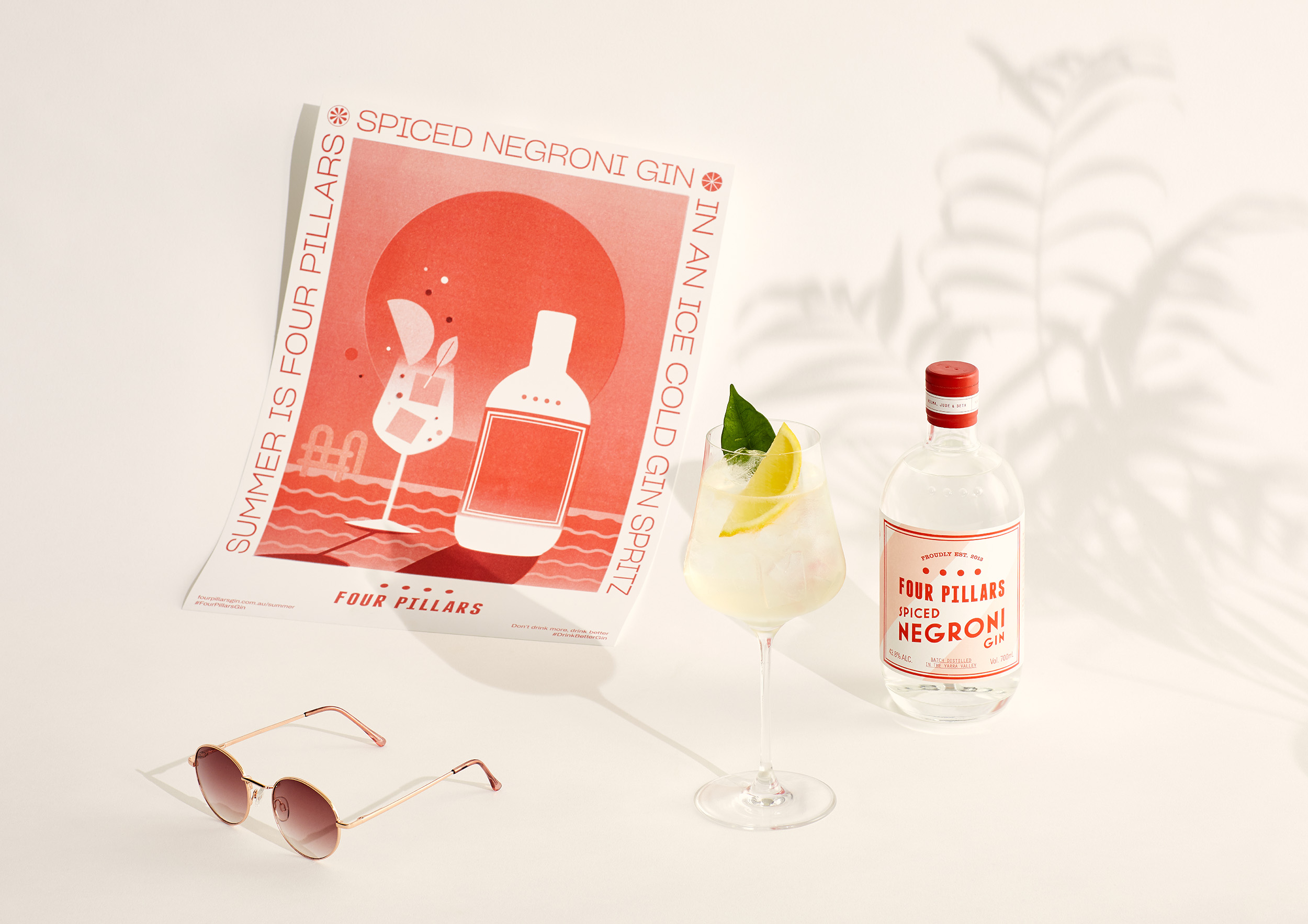
The campaign required four creative expressions - one for each gin. So, we decided to capture the essence of modern Australian summer through a series of four ‘moods’. A blisteringly hot beach day. A balmy summer rooftop night. A picturesque country sunset. A lazy poolside afternoon. These ‘moods' became the settings for the four hero gins and their respective cocktails.
Each ‘mood’ was developed and expressed as a series of 4 street posters. Beautifully minimal, colourful, playful and graphic. Inspired by the classic drink posters of the 1960s; Aperol, Campari, Martini; we opted for a graphic interpretation of the gin products and their Aussie summer scene. In perhaps a daring choice for an above the line campaign, this meant we did away with traditional product photography altogether.
The colour-way of each gin (purple, orange, red, blue) was leveraged for the individual poster designs. This allowed for a wonderfully subtle link to the gin SKU, and further amplified the particular summer occasion.
The posters had to work individually whilst naturally feeling like a set when showcased together. Placed centrally behind each gin scene is a large circular sun. When placed side-by-side, the 4 suns created the iconic four dots of the Four Pillars logomark.
The vintage drink posters we drew inspiration from for this project had an undeniable keepsake quality to them. We wanted our posters to have that same classic feel, to be something that people would want to hang on their wall at home. To that end, each of the four compositional scenes were printed on archival paper using ‘risograph'. This technique gave the artwork an irregular grainy ‘stipple’ effect, emphasising a sense of weight, texture and romantic nostalgia.
Summer scenes in motion.
Our summer scenes were then bought to life as four animated short films to extend the campaign into the digital world. Set within the minimalist graphic environment of the poster designs, we slowly cut between abstracted objects and actions, trivial in nature yet iconic to an Australian summer. A sun shade opening, a cicada chirping, ice melting etc.
Supported with a vivid, almost ASMR-like atmospheric soundscape, each film transports the viewer to a particular time and place, without being explicit. The pace of the films reflects that of the season. The gentle rolling of the hot days, a time of the year that encourages a slow enjoyment of spoils.
The films resolve to the poster design, the typographic boarder creating a dynamic frame for the final composition. These films played out across Instagram and YouTube throughout the campaign season. Because of their filmic quality, they were also featured on the big screen as pre-movie shorts during the Four Pillars sponsored Thornbury Picture House summer film sessions – a regular Melbourne-based brand activation.
Big wins in awareness & preference.
The campaign was a success, managing to generate loads of social commentary on the film content, while shifting the needle positively on overall brand awareness and preference.
The poster element of the campaign around Melbourne received hugely positive responses. So much so in fact that due to popular demand, the series of four were printed (again using risograph) as a limited edition run. These were available for purchasing from the Healesville Distillery, which sold out by the end of summer 2019.
Scope:
- Campaign Creative
- Campaign Strategy
- Photography & Art Direction
- Graphic Design
- Illustration
- Animation
- Motion Design
- Photography
- Sound Design
- Finished Art
- Management & Production
Summer was bought to life as four animated short films set within the minimalist graphic world of the campaign posters. We slowly cut between abstracted objects and actions, trivial in nature yet iconic to an Australian summer. Supported with a vivid, almost ASMR-like atmospheric soundscape, each film transports the viewer to a particular time and place.
The graphic nature of the campaign artwork was Inspired by the classic drink posters of the 1960s; Aperol, Campari, Martini; all of which had an undeniable keepsake quality to them. We wanted our posters to have that same classic feel. To that end, each of the four designs were printed on archival paper using ‘risograph'. This technique gave the artwork a grainy stippled effect, and romantic nostalgic quality. During the campaign the poster received hugely positive responses. So much so that due to popular demand, the series of four were printed as a limited edition run available for purchasing from the Healesville Distillery