Four Pillars Single Vineyard Gin
When you combine two of the best-known Shiraz products from the Yarra Valley—Yarra Yering’s Underhill and Four Pillars Bloody Shiraz Gin—magic is bound to happen. A gin that almost defies description, the Four Pillars Single Vineyard Bloody Shiraz Gin was an extremely rare release and needed to be positioned as a hyper premium product within the Four Pillars portfolio. Taking a luxury approach was obvious, however, with the sustainable-first ethos of a brand like Four Pillars, our real challenge was to bring fresh sustainable thinking to ultra-premium packaging.
Marking the beginning of an enduring tradition, in 2022 Four Pillars launched their inaugural Single Vineyard Bloody Shiraz Gin, the debut release featuring grapes sourced from the esteemed Yarra Yering Underhill Vineyard, an iconic producer renowned for their wines. The result was a gamechanger… a distinctive and site-specific Bloody Shiraz Gin—best savoured straight, on the rocks—that would captivate even the most discerning gin connoisseur.
Our challenge was to design a gin label and outer gift box packaging that captured the essence of this unique gin and convey its luxuriousness. The aim was to blend modern Australian craftsmanship with a touch of tradition, emphasising the exclusivity of each yearly release.
Furthermore, the packaging needed to go beyond aesthetics—balancing visual appeal, display and shipping functionality, and sustainability. To this end, we needed to avoid plastic and disposability to align with Four Pillars’ commitment to environmental responsibility.
When we looked at traditional premium liquor box packaging, it was often loud, filled with intricate details and shiny foils, we wanted to take a completely different approach.
This one-of-a-kind gin, demanded a luxurious touch that whispered elegance and conveyed a sense of modern confidence. So, instead of following obvious premium design codes, our goal was instead to lean into texture, colour, and typography to create both a sense of exclusivity alongside moments of rich discoverability. Drawing inspiration from the unique liquid found within, and the stories of the gin’s creation, the label and gift box design provided a canvas to celebrate the various unique facets of the gin that would unfold during the unboxing process.
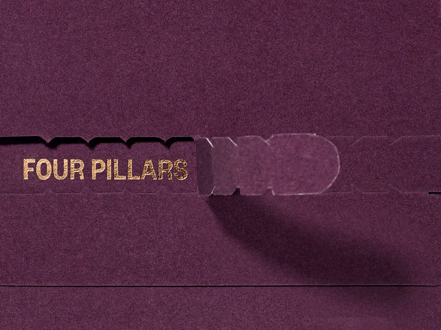
Featuring small, tasteful touches of foil to enhance the premium feel—striking a delicate balance that still allowed for recycling—the unboxing experience also contained card inserts that told the single vineyard story—outlining the grapes, the gin, and the perfect serve. Attention to detail on this feature was paramount; with the sleeve that held the cards featuring a dot matrix die-cut in front to align perfectly with the inserted cards, revealing the famous Four Pillars dots, perfectly aligned.
Through the entire design and production journey, sustainability was front of mind—while always ensuring the result would feel ultra-premium. To align with Four Pillars’ environmental values, we created the box with a bottle mould composed entirely of layers of paper and cardboard, making the entire pack recyclable.
This dedication to environmental responsibility even extended to the pull tab. Made from woven paper ribbon, the pull tab used to unveil the box was created through the braiding of multiple thin paper strands— sourced from sustainable materials—creating a 100% recyclable paper ribbon. This material provided a luxury, yet sustainable, alternative to cotton or polyester, without resorting to cheap-feeling twisted paper handles.
Additionally, FSC certified stock materials were selected and used throughout for both the label and packaging, ensuring that every aspect of the design adhered to strict environmentally responsible practices.
Ultimately, we not only captured the spirit of modern Australian luxury but also created a brand experience that is both memorable and environmentally conscious.
Read more about our drink design process.
Scope:
- Creative Direction
- Packaging Design
- Illustration
- Photography & Art Direction
- Finished Art
- Management & Production


This one-of-a-kind gin, demanded a luxurious touch that whispered elegance and conveyed a sense of modern confidence. Our restrained design approach leveraged texture, colour and typography to create both a sense of exclusivity alongside moments of rich discoverability. Drawing inspiration from the unique liquid found within, and the stories of the gin’s creation, the label and gift box design provided a canvas to celebrate the various unique facets of the gin that would unfold during the unboxing process.