NISCIOO
Every great brand is made up of stories. Stories of people, place, history, culture. Stories of the artefacts we inherit and the traditions we pass on. Individually these stories can tell us about a moment time… together, they tell us who we are. For Niscioo, those stories had been accumulating for generations, shaped by the land, the family and the unique character of San Vittore… and they are every bit as rich and characterful as the wine they produce.
Scope:
- Creative Direction
- Creative Copywriting
- Brand Identity
- Packaging Design
- Illustration & Art Direction
- Finished Art
- Brand Guidelines
- 3D Product Renders
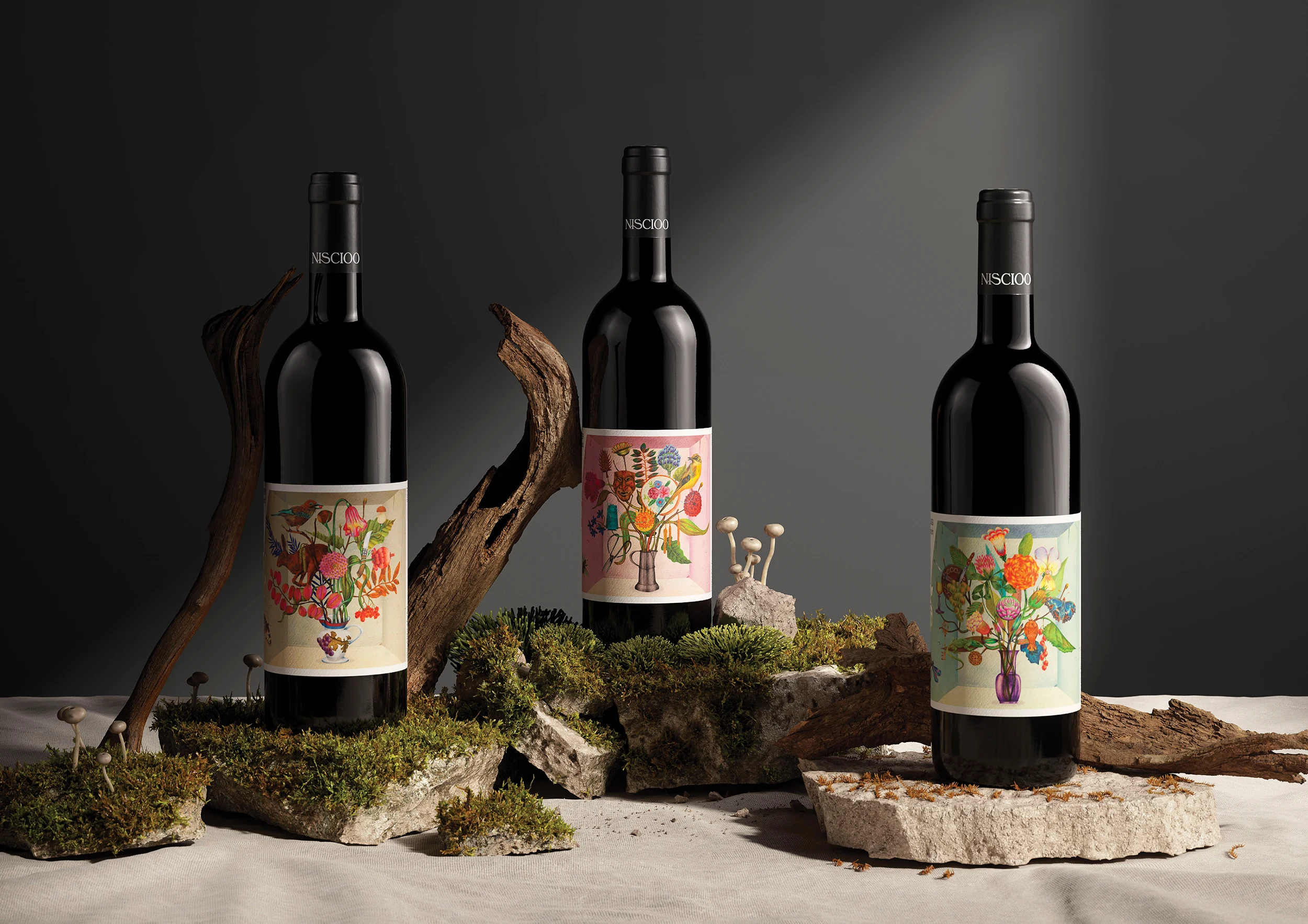
Let’s set the scene.
Niscioo is a family-owned winery in San Vittore, Switzerland. Officially founded in 2015, it’s a business shaped by generations of agrarian tradition. Run by husband-and-wife oenologists, the winery had grown into a serious boutique operation, producing around 35,000 bottles each year. But while the quality of the wine reflected the family’s experience and craftsmanship, there was no unified story bringing it all together.
Our goal was to create a distinctive brand that could celebrate the people, place and traditions behind every bottle.
From little things…
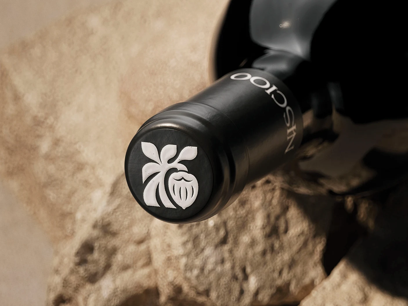
The answer came from the name itself. Niscioo translates to hazelnut in the local San Vittore dialect, referring to the hazelnut trees that surrounded the original Merlot vines planted by Ettore’s grandfather.
This story became the foundation of the brand, and the hazelnut evolved into a symbol of the region, the land and the generations of care that shaped the vineyard. From there, we developed storytelling anchored in agrarian heritage, family storytelling and terroir. An authentic celebration of the distinctive character, and characters, of San Vittore.
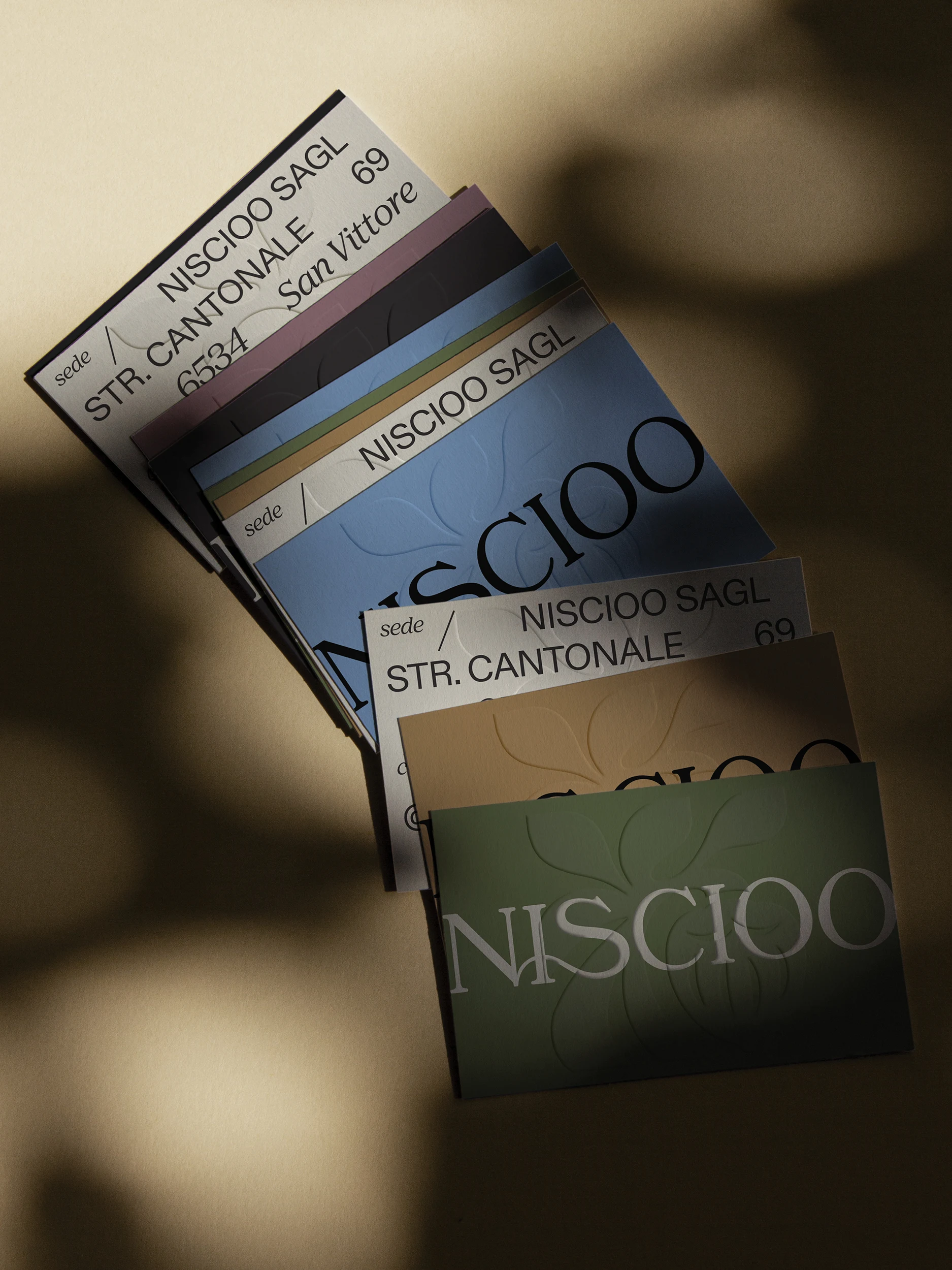
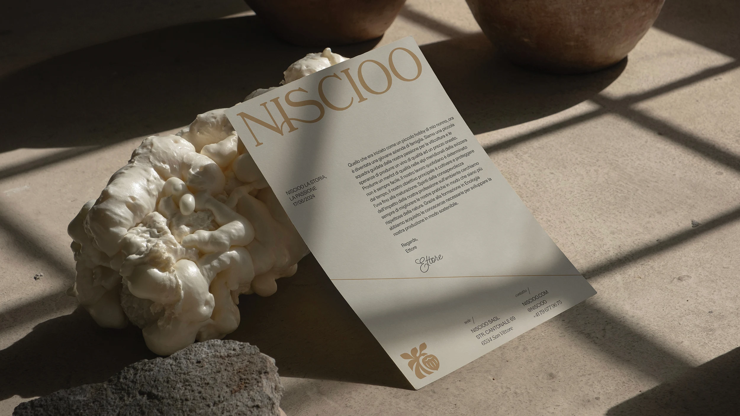
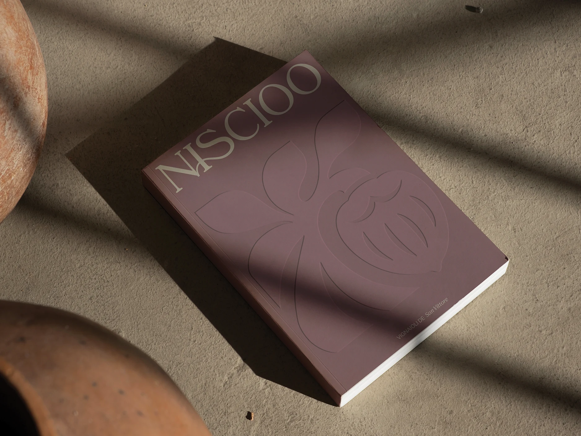
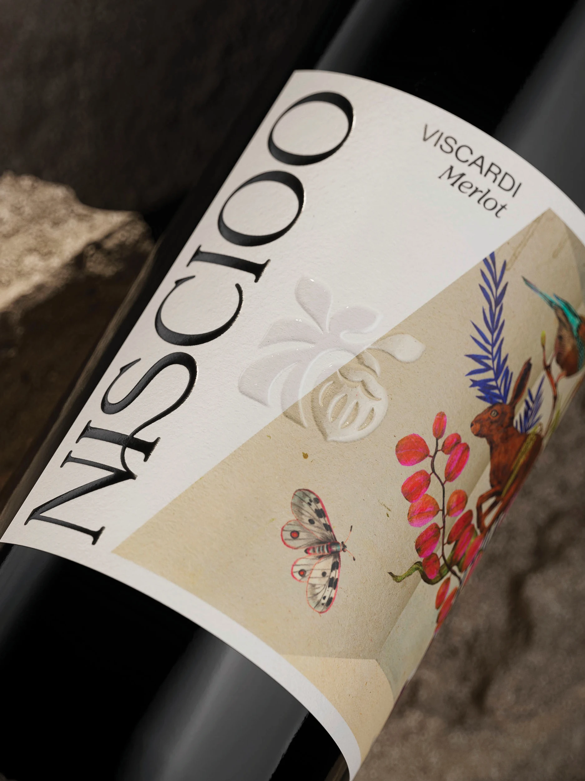
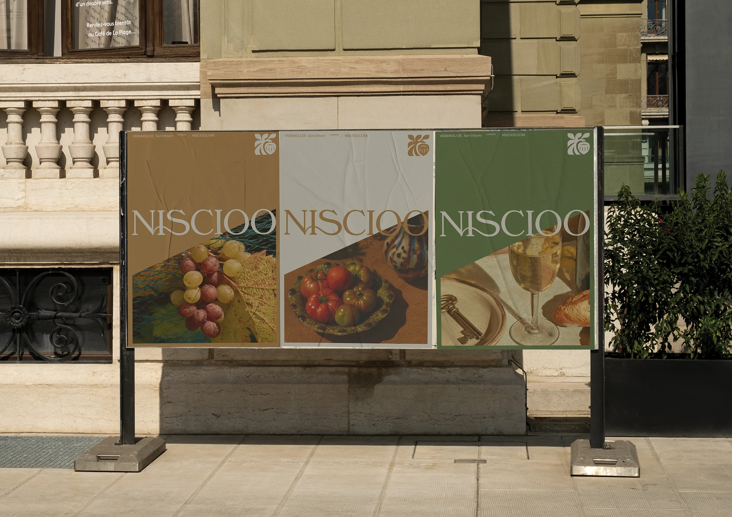
A new brand icon was crafted to resemble a hazelnut hanging from a tree. Simple, symbolic and distinctive, the custom wordmark features a ligature connecting the ‘S’ and the ‘N’, referencing both tree roots and the connections between generations of the family. To complement the wordmark, an earthy, mineral-inspired palette draws directly from the surrounding landscape.
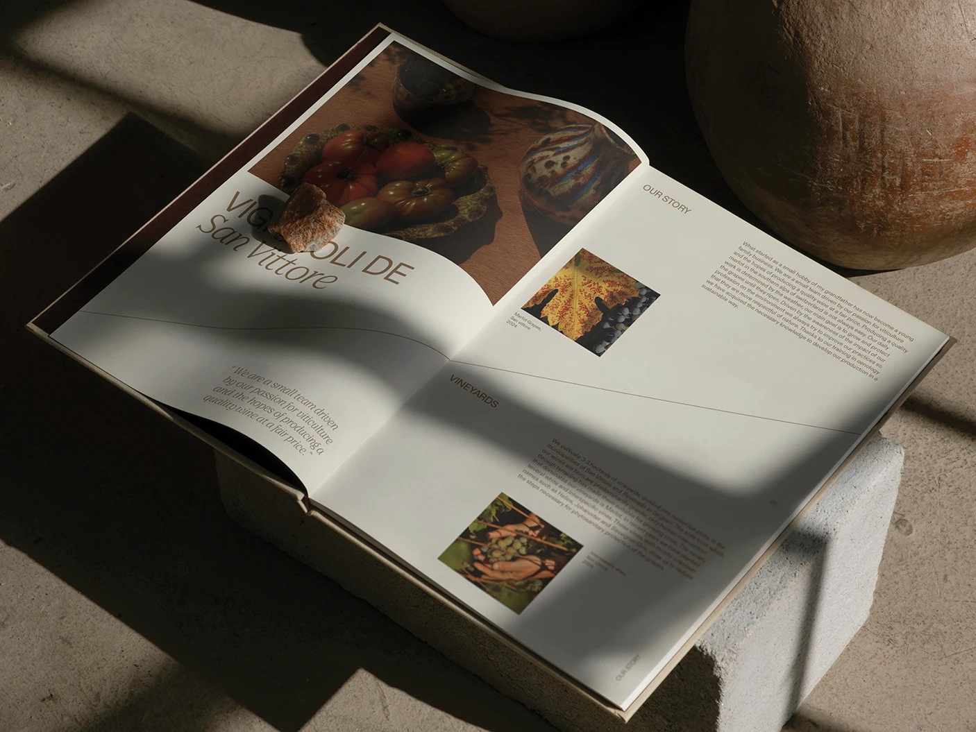
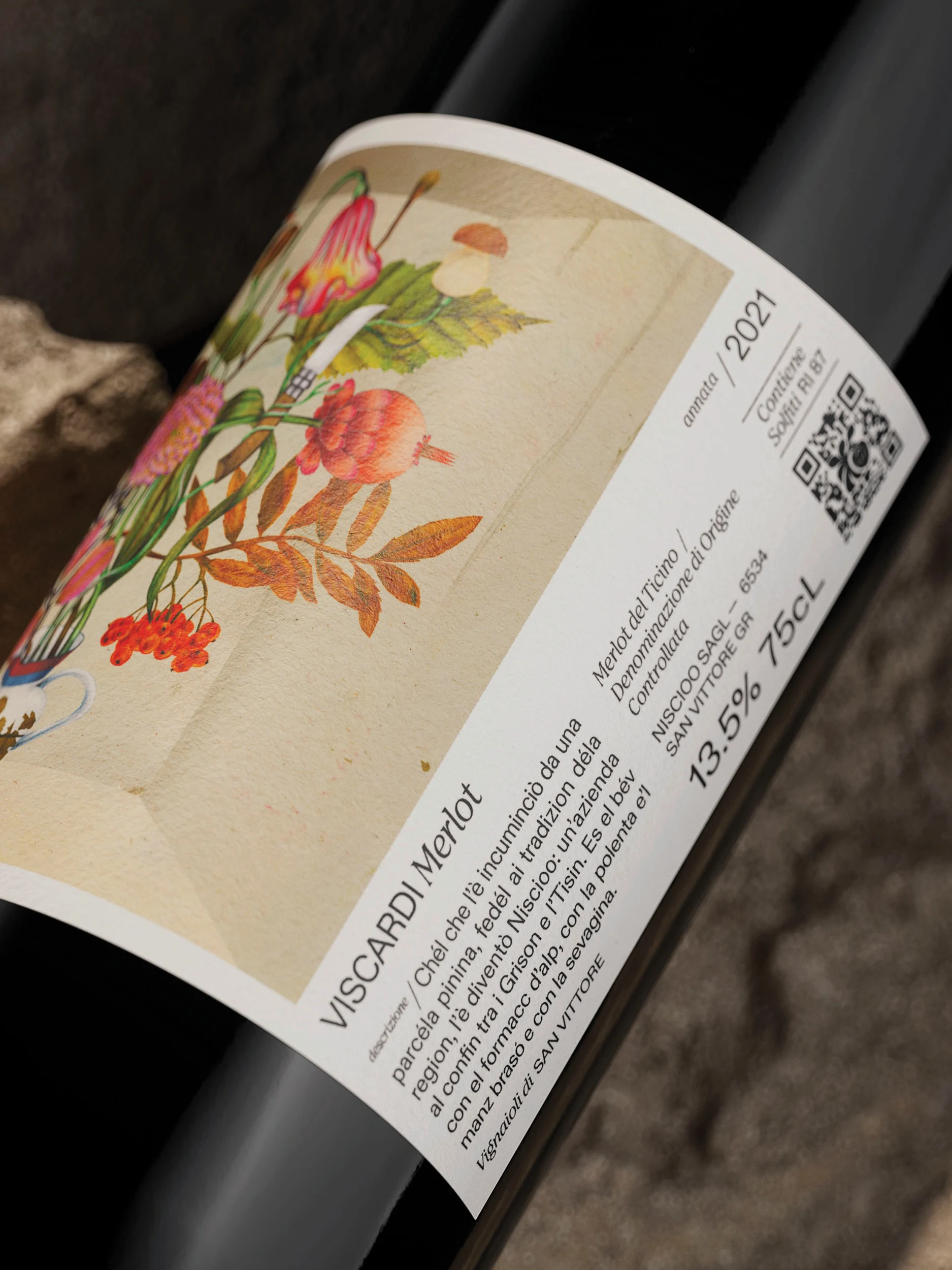
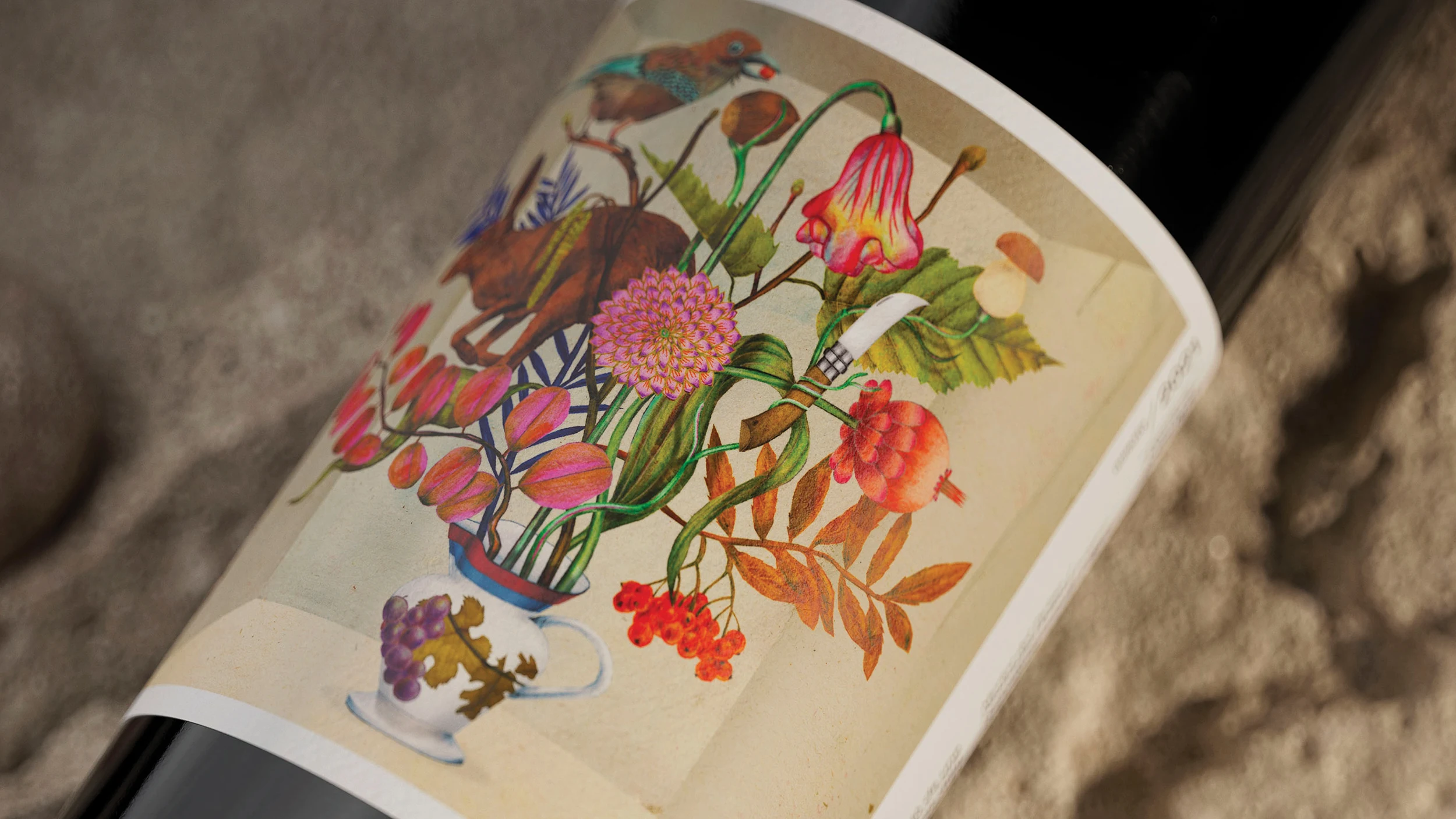
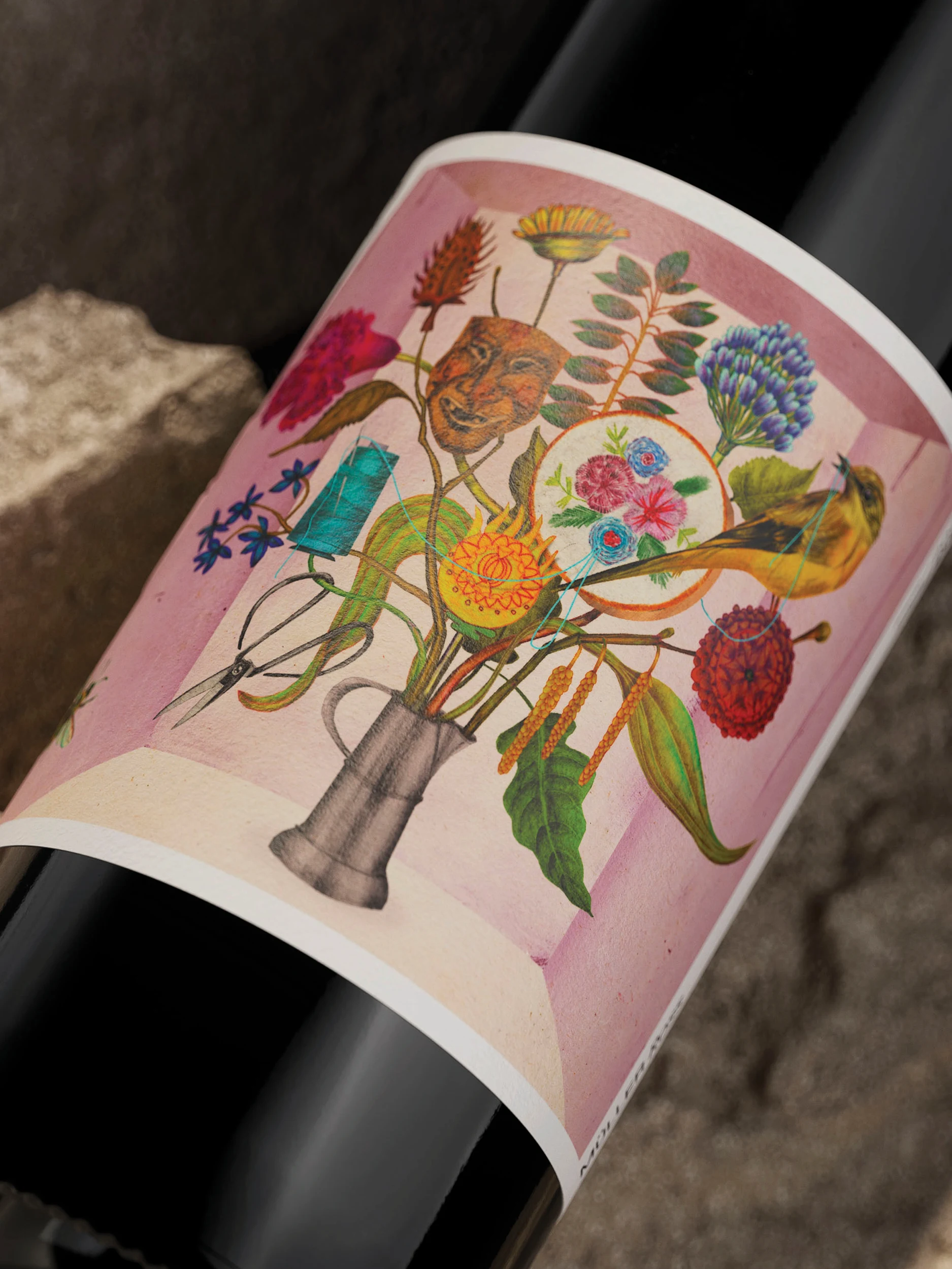
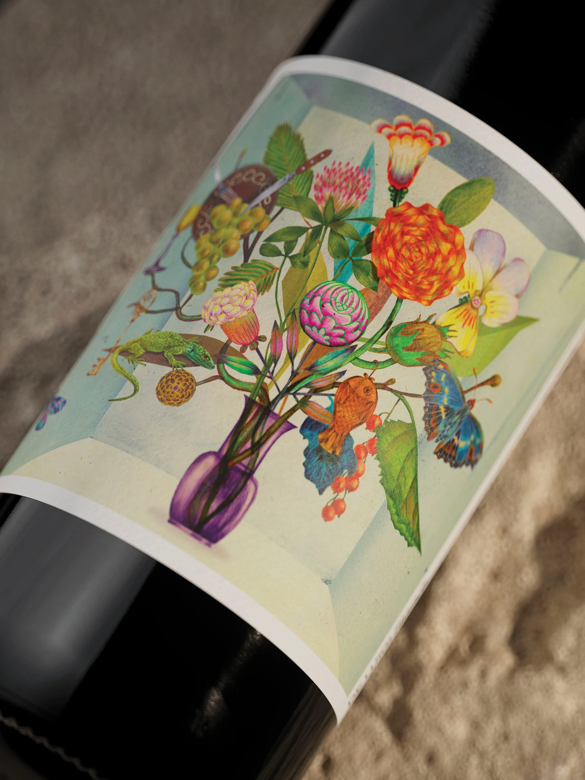
Across the packaging, each wine celebrates a different member of the family through bespoke illustrations created with Marco Wagner. Traditional vessels, heirlooms and native flora are brought together into intricate floral compositions, giving every bottle its own story while creating a cohesive family of labels. A 25° diagonal, inspired by the slope of the vineyard, became a unifying design device across the entire brand system.
And then what happened?
In an increasingly globalised wine industry, where so many brands are starting to look and sound the same, Niscioo chose specificity distinctiveness. Rather than borrowing from familiar wine cues, the brand leans into what makes it unique, the region’s rich local dialect, its family stories and its deep connection to place.
The result is a boutique wine brand with a unique point of view, proving that the most compelling stories are often the ones that have been hiding just below the surface.