Oh! For Ozharvest
What if fighting food waste felt less like something you ‘should do’… and more like something you’d want to do? Oh! is a purpose-driven brand created for OzHarvest Ventures, transforming rescued ingredients into joyful consumer products, and reframing surplus food as something fun, optimistic, genuinely shelf-worthy, and totally share-worthy.
Scope:
- Brand Strategy
- Creative Direction
- Brand Identity
- Naming
- Tone of Voice
- Packaging Design
- Photography & Art Direction
Let’s set the scene
For 20 years, OzHarvest has led the fight against food waste and food insecurity as Australia’s foremost food rescue charity. In a country where 7.6 million tonnes of still-edible-food is wasted each year, while millions of households struggle to put food on the table, OzHarvest Ventures was created to go beyond food relief and build impact-driven brands that could help scale its mission for the future.
Our challenge was to create a consumer-facing brand and design system that could shift perceptions, simultaneously educating and inspiring conscious consumption without guilt, while flexing across multiple product categories.
A little surprise goes a long way
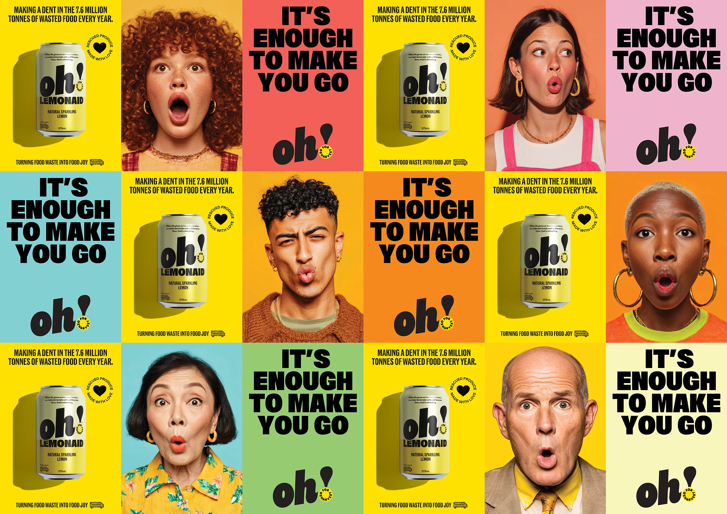
The solution began with a simple human insight… when people discover that rescued ingredients can become something genuinely delicious and desirable, their reaction is often the same… “Oh!” This short, sharp expression of surprise and delight became the brand name, while also drawing on OzHarvest’s initials.
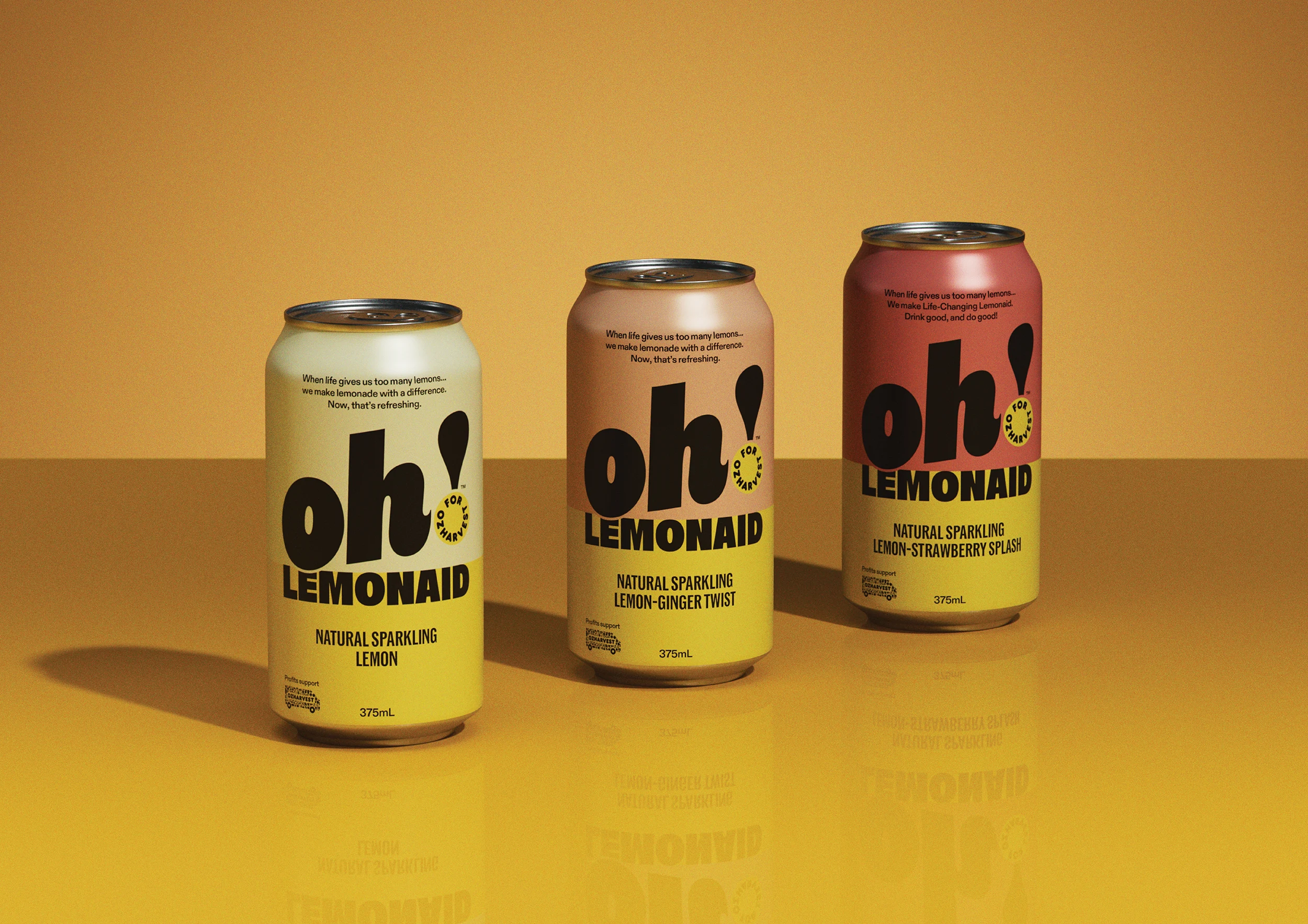
The identity system builds on this idea. The upward-angled wordmark creates a sense of optimism, while a playful exclamation mark introduces a subtle connection back to OzHarvest through its signature yellow. Beyond acting as a visual bridge between the two brands, the exclamation mark reinforces exactly how the brand should be read… with energy and positivity.
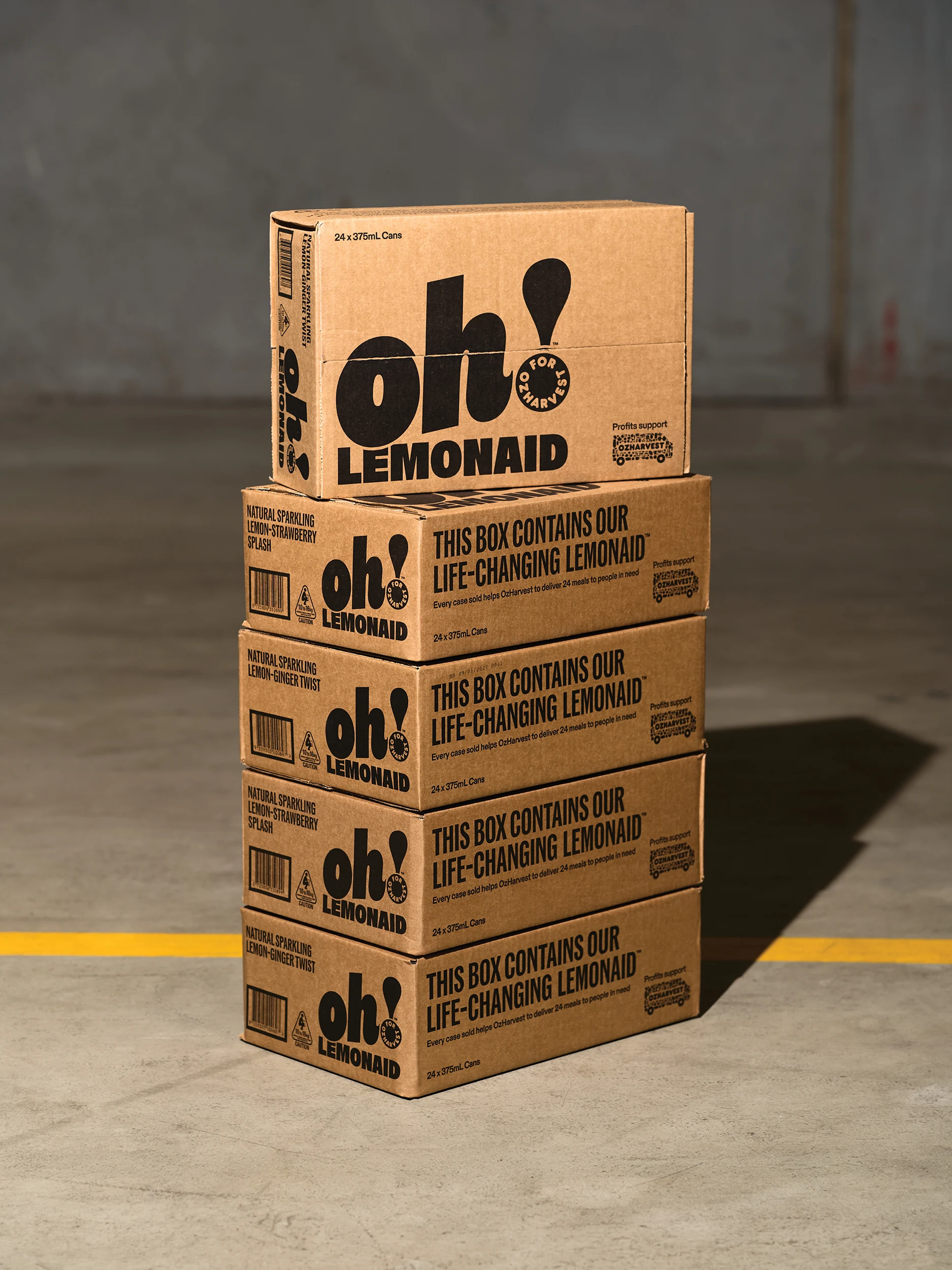
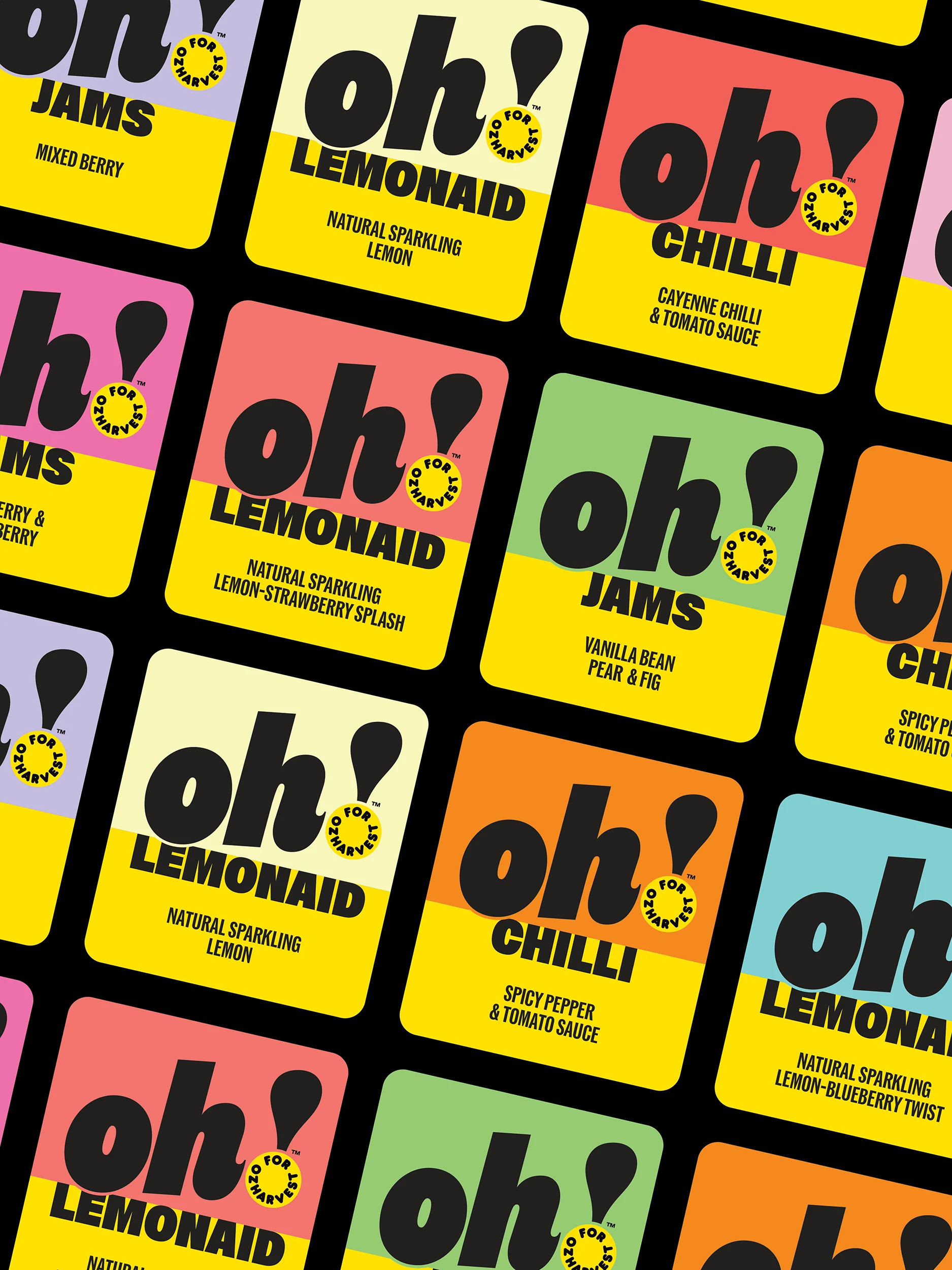
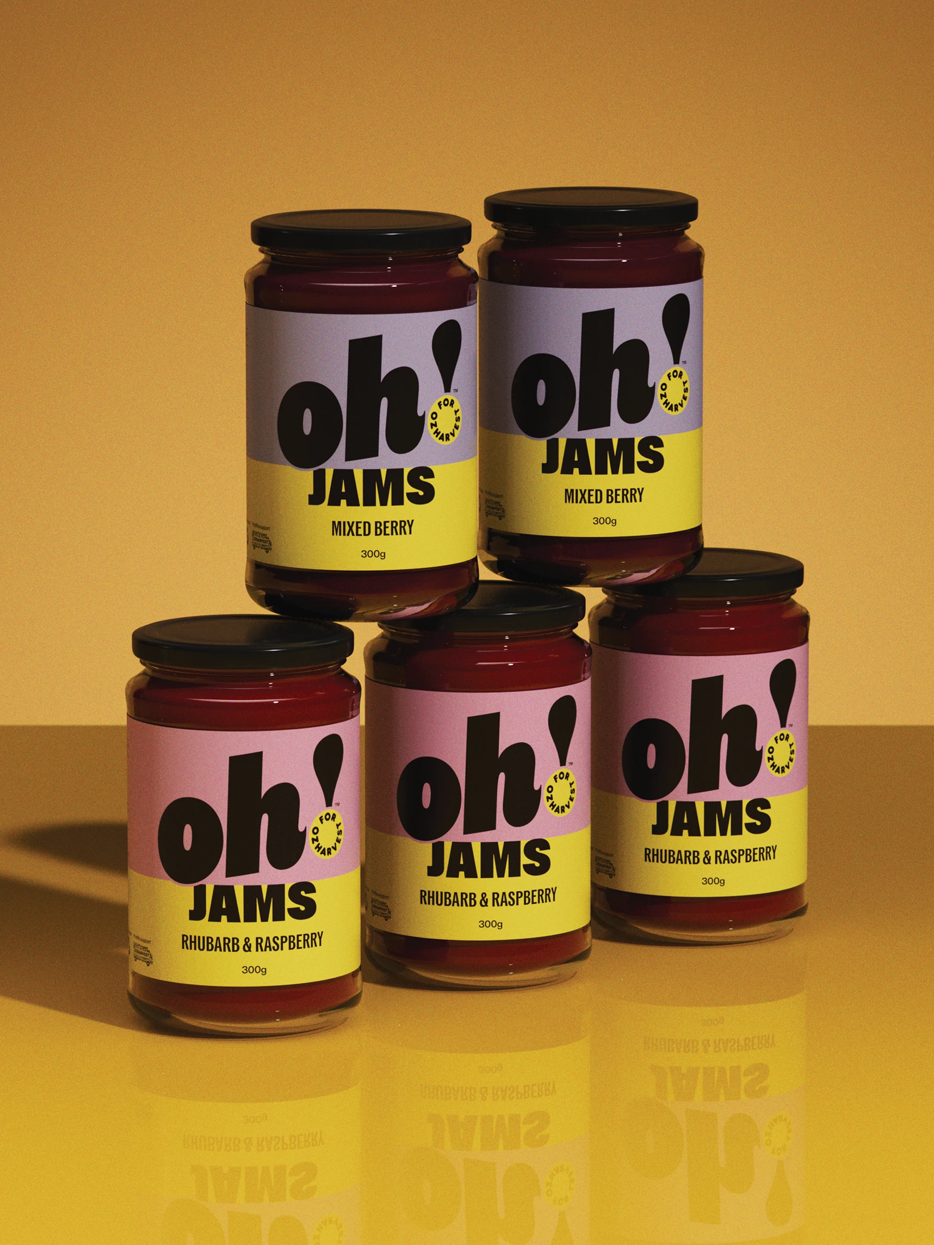
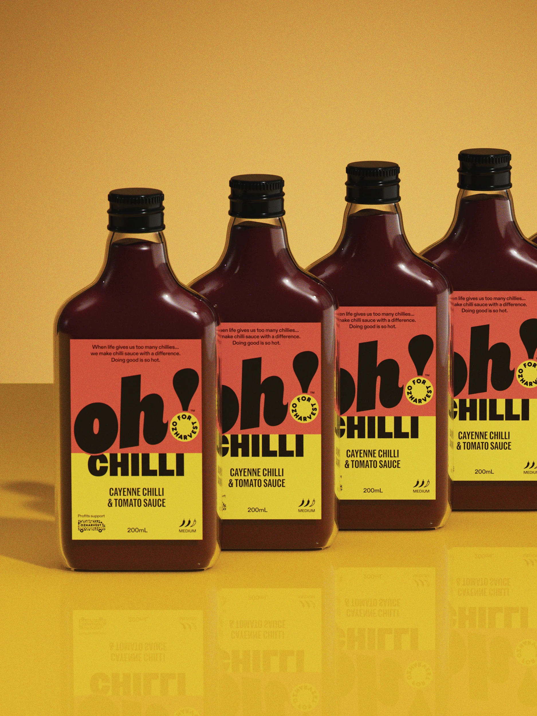
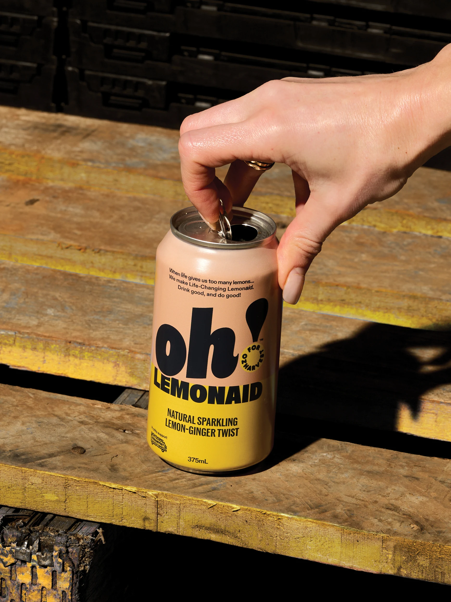
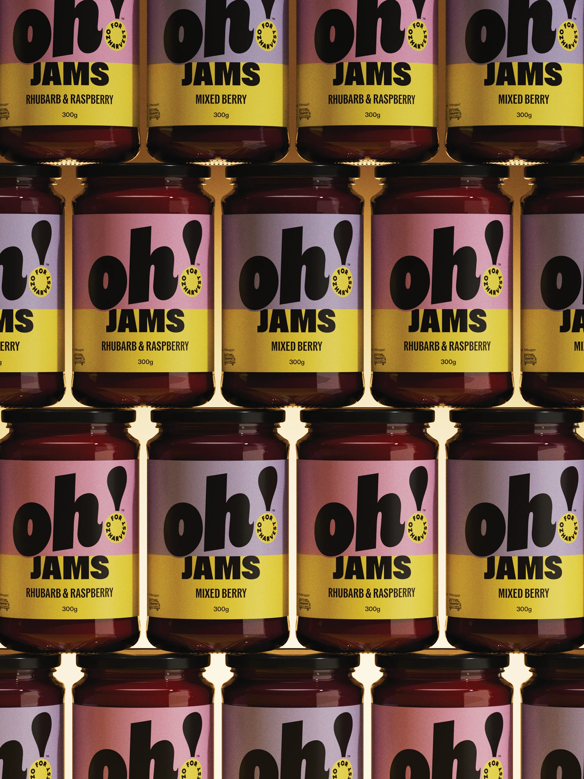
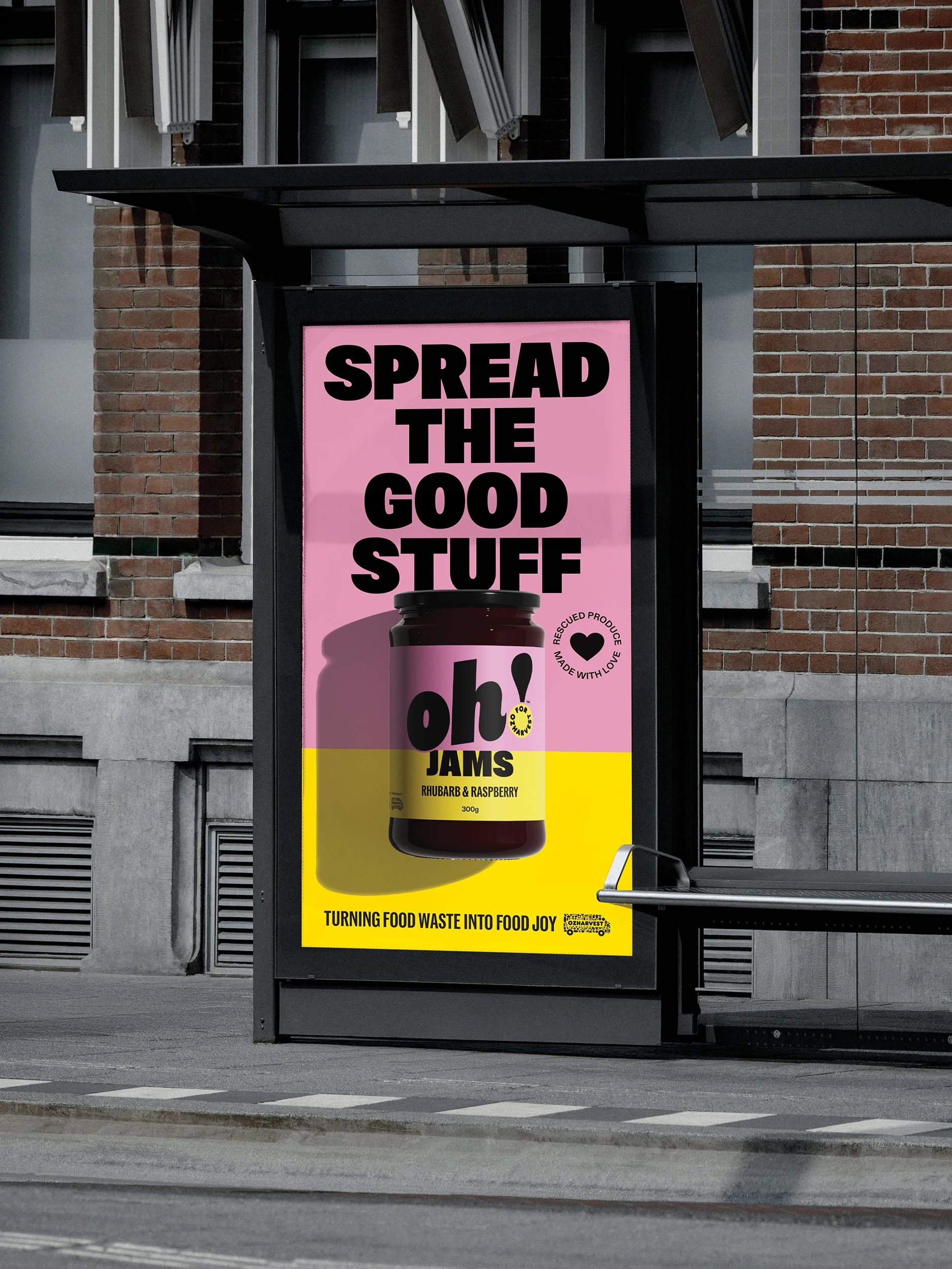
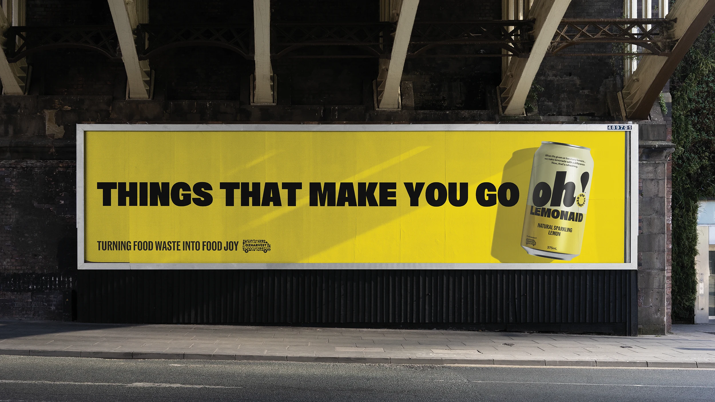
While the name provided the emotional hook, the packaging system needed to solve a much larger challenge. Oh! needed to feel equally at home whether it appeared on a cereal box, a jar of preserves, or a cleaning product.
Our response was a highly structured packaging architecture designed for consistency and scale. Bold typography, strong visual hierarchy, and oversized brand assets create immediate recognition, while a flexible colour system allows individual products and flavours to express their own personality.
Colour became particularly important. While OzHarvest’s iconic yellow and black remained central to the brand world, additional colours were introduced to help consumers quickly navigate flavours and product variants. Every product could feel distinct while still remaining unmistakably Oh!
And then what happened?
Oh! is more than a brand and packaging system, it’s created a scalable platform capable of turning rescued ingredients into desirable consumer products.
By reframing food waste through surprise and discovery, the brand helps consumers participate in positive change through everyday purchasing decisions. Every product supports OzHarvest’s broader mission while demonstrating that purpose-led brands can compete confidently, and competitively, in mainstream retail environments.
The most significant impact, however, lies in its societal contribution. By transforming rescued ingredients into desirable products, Oh! addresses one of the country’s most pressing waste problems while simultaneously raising awareness about food waste and encouraging more conscious consumption behaviours. Each purchase also creates direct social value: supporting Australian farmers with a fair price for produce that may otherwise be discarded, while donating a meal back to someone in need via OzHarvest.
And, perhaps less importantly, it proves that doing good doesn’t have to feel like hard work… sometimes it can simply make you say… Oh!