Pizzini
From Italy to Australia. From tobacco to vineyards. From wine… to wine experiences. The Pizzini story is one of evolving journeys, the latest of which is possibly the most exciting yet, with a new generation of Pizzinis ready to share their stories, their approach, and their wines with a new audience who are thirsty for a taste of the authentic Italian lifestyle, right here in Australia.
A story of several journeys and two significant destinations…
The ‘Little Italy’ of winemaking, Victoria’s King Valley is home to generations of Italian families who have played an integral role in establishing the region’s flourishing wine industry, many of whom have been literally sowing the seeds since the early 1900’s, harnessing the region’s Italian-esque climate and terrain.
The Pizzinis—one of these founding families—are a third-generation wine business, having emigrated from Trentino in Northern Italy to Australia in 1956. Now, with Fred and Katrina Pizzini stepping back, and their children Joel, Natalie, Nicole and Carlo taking the reins, the time had come to look at the brand holistically, evolving it to reflect both the vibrant future of Pizzini, while also reflecting the family’s rich Italian heritage.
The key opportunity was to evolve Pizzini from solely a ‘wine brand’ into an aspirational Italian lifestyle brand—one deeply rooted in culture and family—by refreshing the brand’s visual and verbal identity to deliver greater consistency and greater appeal to new audiences.
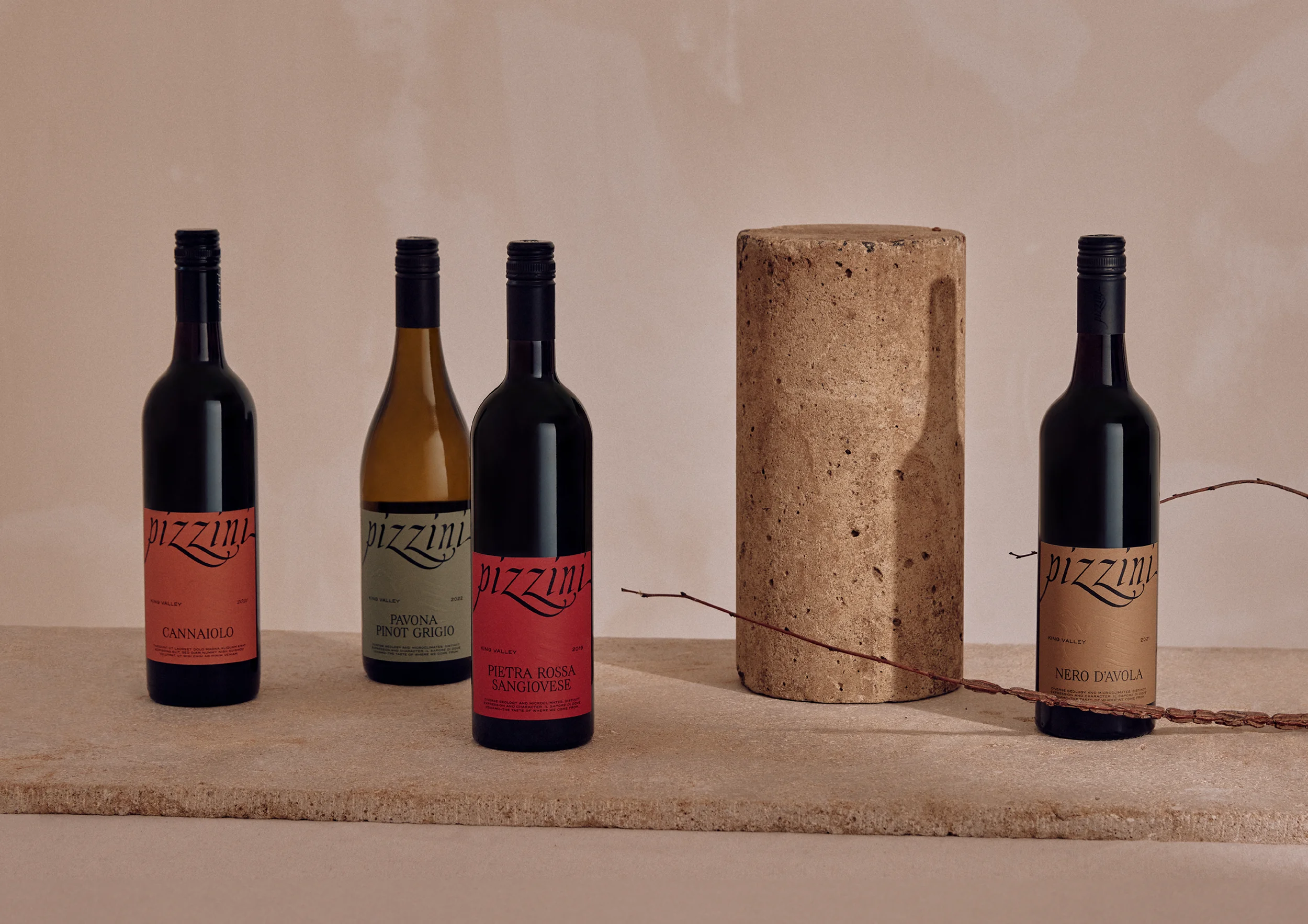
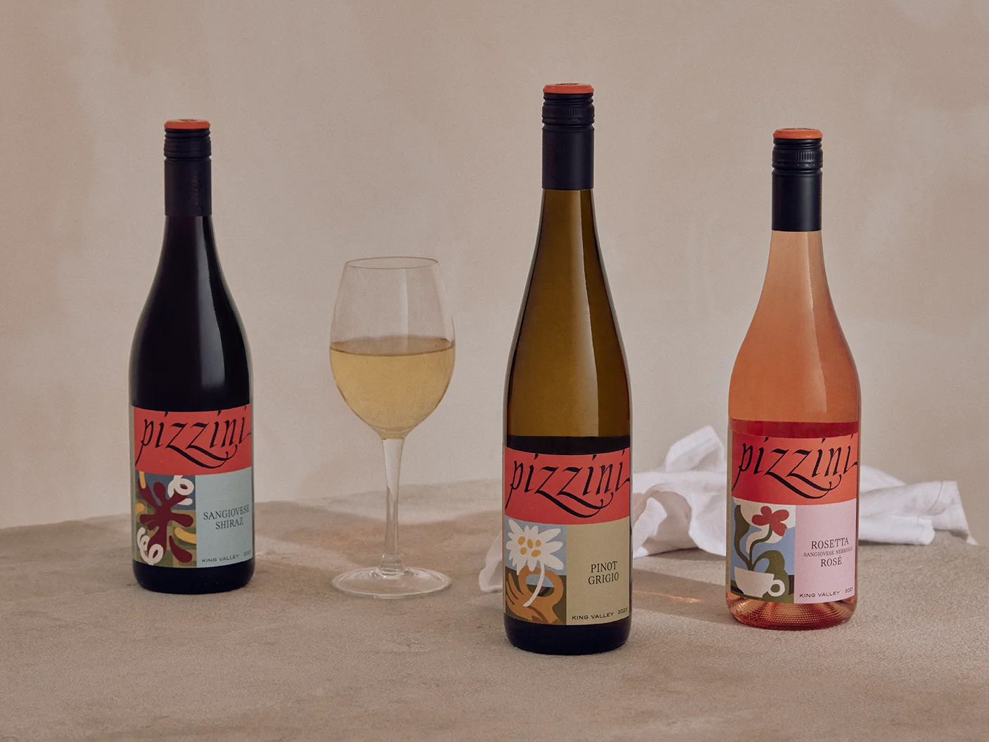
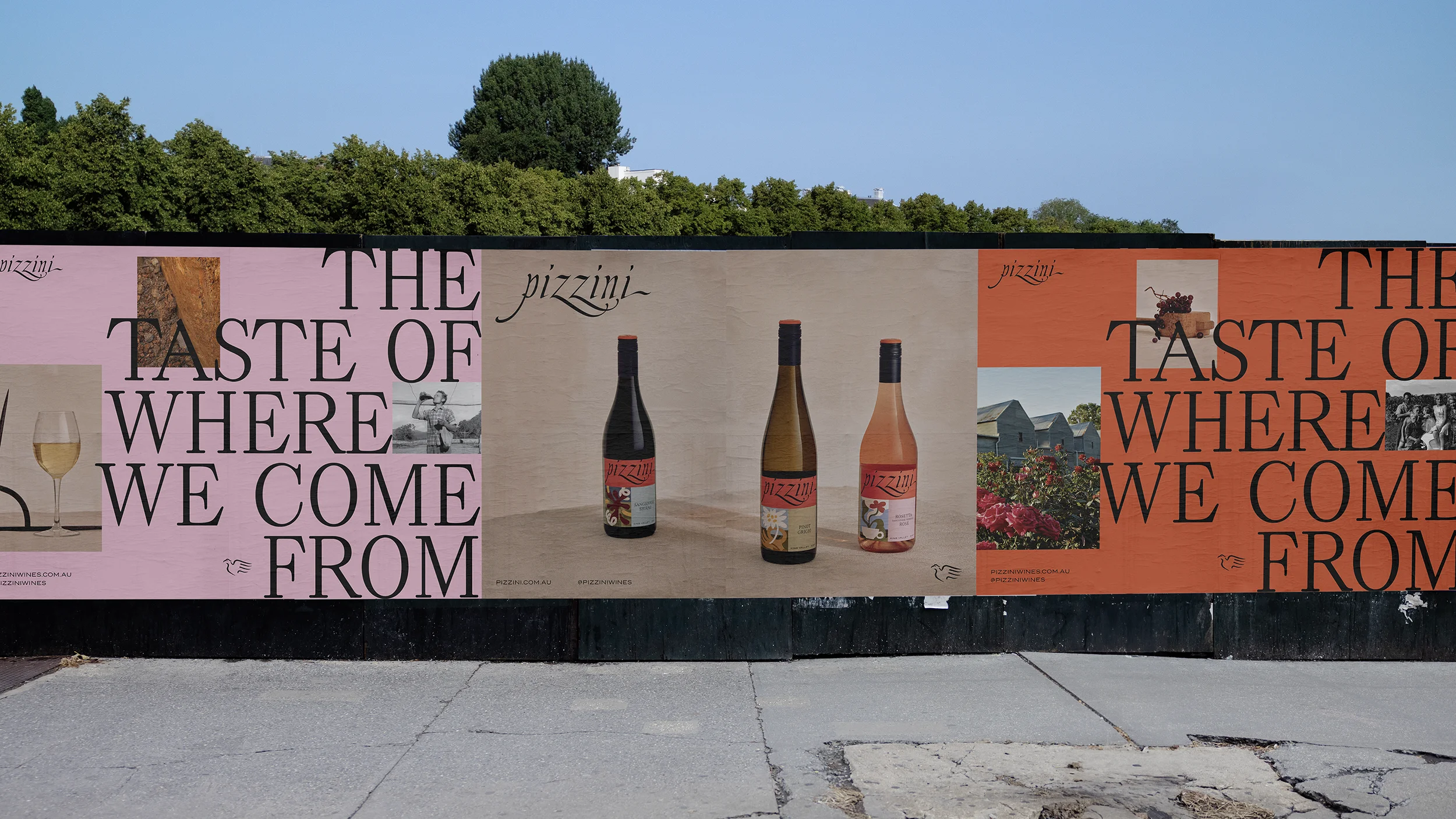
The most substantial component of the refresh, however, was the restructuring and transformation of Pizzini’s wine portfolio. Comprising of over 40 wines, this was a range in need of a robust architecture and redesign. Our creative approach was to use this packaging as a storytelling tool, capturing the essence of the family’s heritage, their Italian roots, and their King Valley home.
Italian varieties, King Valley character.
We soon discovered that there was a lot more to the Pizzini story than just wine. At the heart of the brand and business was a story of two significant places, both of which influenced the Pizzini approach, experiences, and character.
While their ancestral story was anchored in Trentino, Italy—the home of hand-making, slowcooking, and wine-sharing—their love of food, wine, and craft manifested itself in the undulating hills of the King Valley, Australia. So, while Pizzini had positioned themselves as the ‘Italy experts’ it was equally important to capture the distinct, inimitable character of the King Valley region to authentically reflect the true experience of the brand.
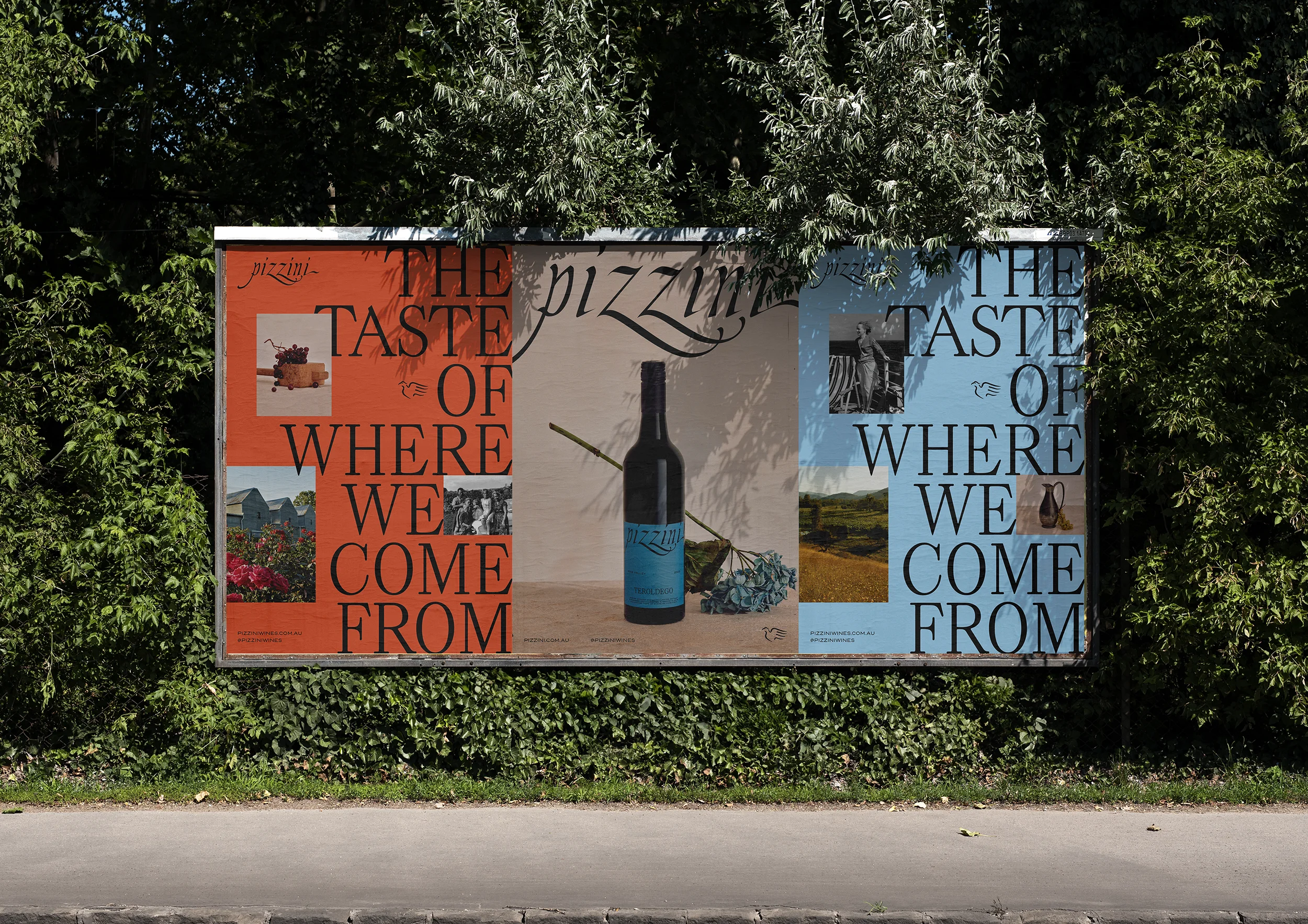
To better reflect the heart and soul of these two homes, the phrase ‘Il sapore di dove veniamo’ was established as a creative anchor for storytelling and design, which translates to ‘the taste of where we come from’.
A story in—and on—every bottle.
Storytelling is at the heart of the Pizzini brand. From the stories that have travelled thousands of miles across the sea from Italy, to the stories revealed in the land they tend, to the stories they share with their customers about their wine, our food, and history. Each and every Pizzini story creates a unique connection between family and place, and it was these stories we aimed to capture through the various tiers and varieties of Pizzini wine labels.
The taste of where we come from
Ultimately, it is the merging of two worlds—Trentino, Italy and King Valley, Australia—that make the wine created at Pizzini so unique… and so enjoyable, so it stands to reason that the brand needed to reflect this unique relationship. Everything the brand touches, from the online presence, to the cellar door experience, helps to reinforce the Pizzini story, where they’ve come from, where they are, and where they’re going next.
Scope:
- Brand Identity
- Brand Strategy
- Portfolio Architecture
- Creative Direction
- Graphic Design
- Typography
- Illustration
- Photography
- Creative Copywriting
- Finished Art
- Brand Guidelines
- Management & Production
The existing Pizzini word-mark had equity in the market—while also having a distinctive artful charm. We wanted to renovate it carefully and respectfully in a way that simplified its usability and amplified its beauty, while ensuring we retained its recognisable essence.
The logo was therefore carefully re-drawn letter by letter, preserving its distinctive quirks while enhancing legibility and symmetry, making it easier to use within a broader design system.
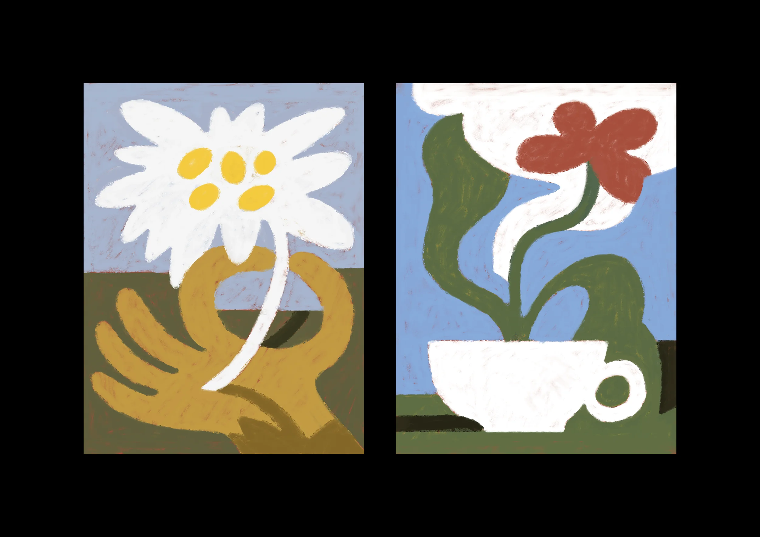
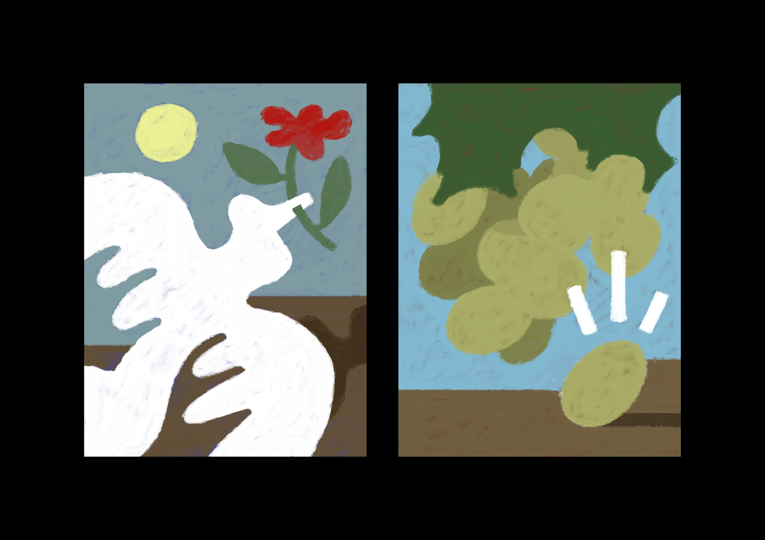
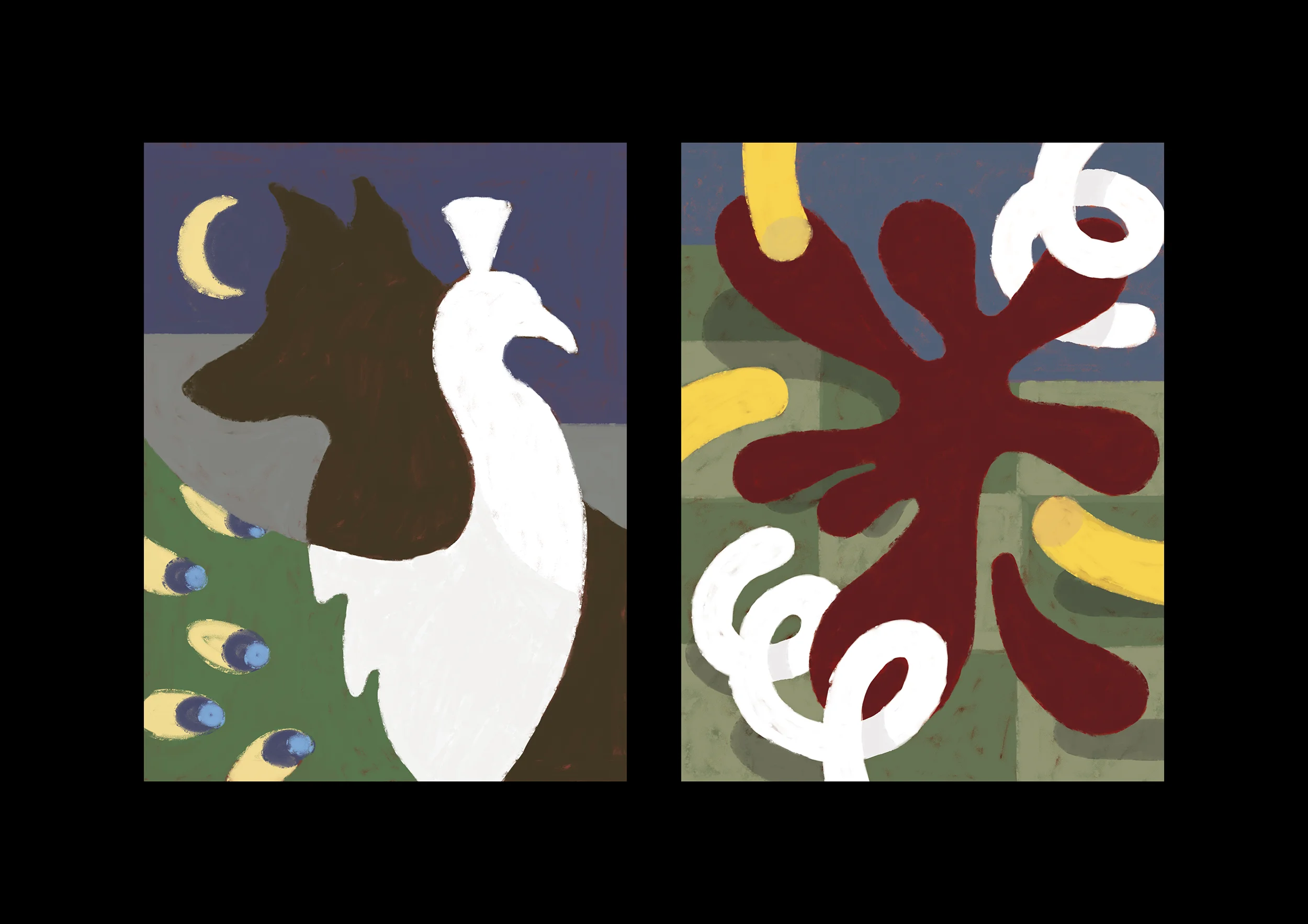
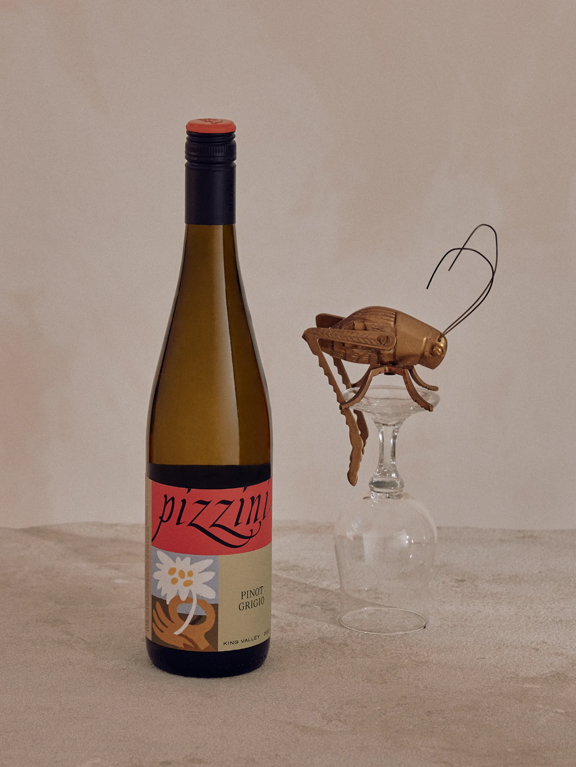
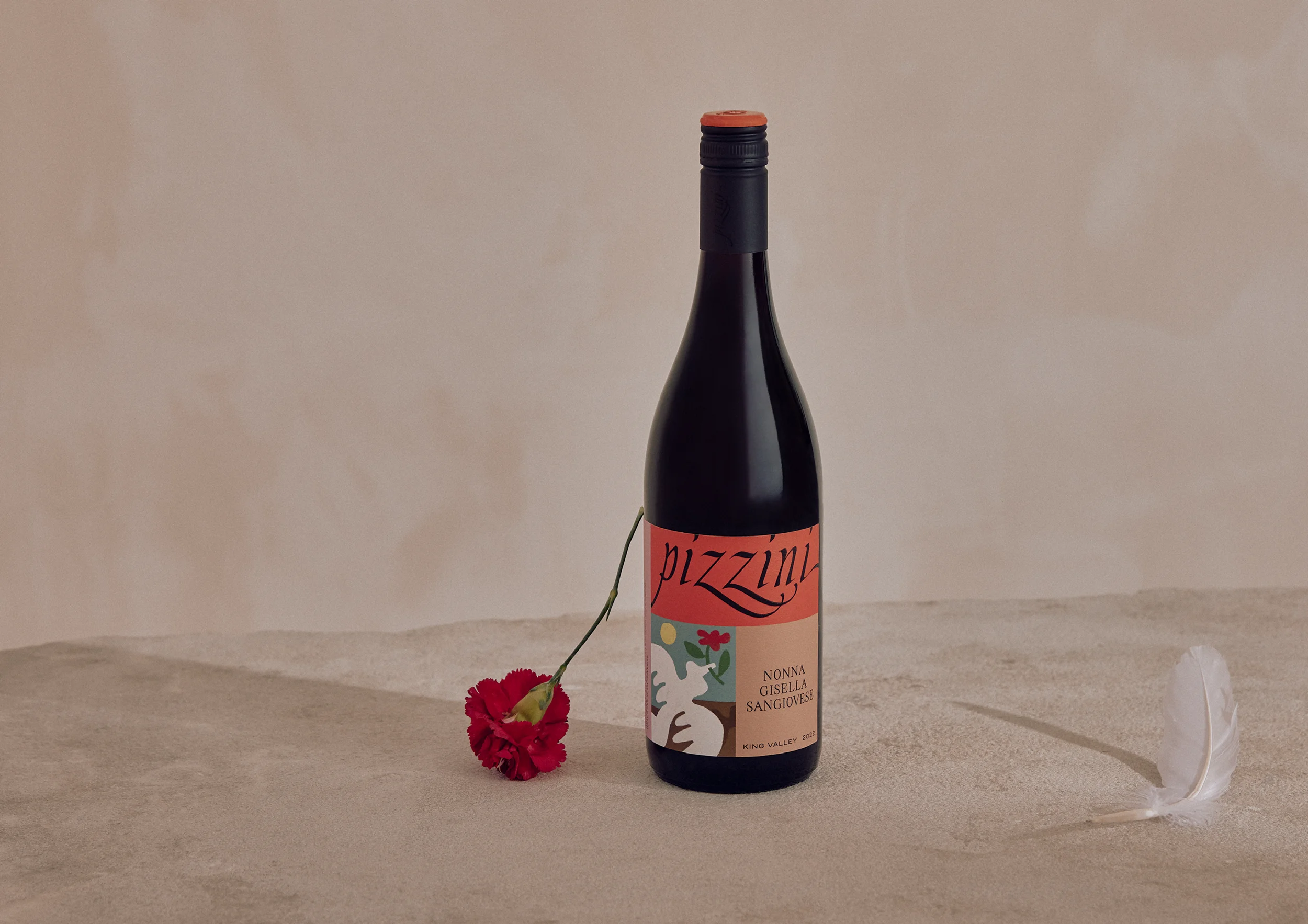
Each wine from the La Famiglia range pays tribute to a significant family members spanning the 3 generations of Pizzini. From Alfred Pizzini, the 'little rascal', depicted as the mischievous lone grape. Or the tale of Rosetta Pizzini, smuggling her beloved's parting gift (an Edelweiss flower) across the sea to Australia. These character and their incredible stories were captured and distilled into an illustration featured proudly on the front label.
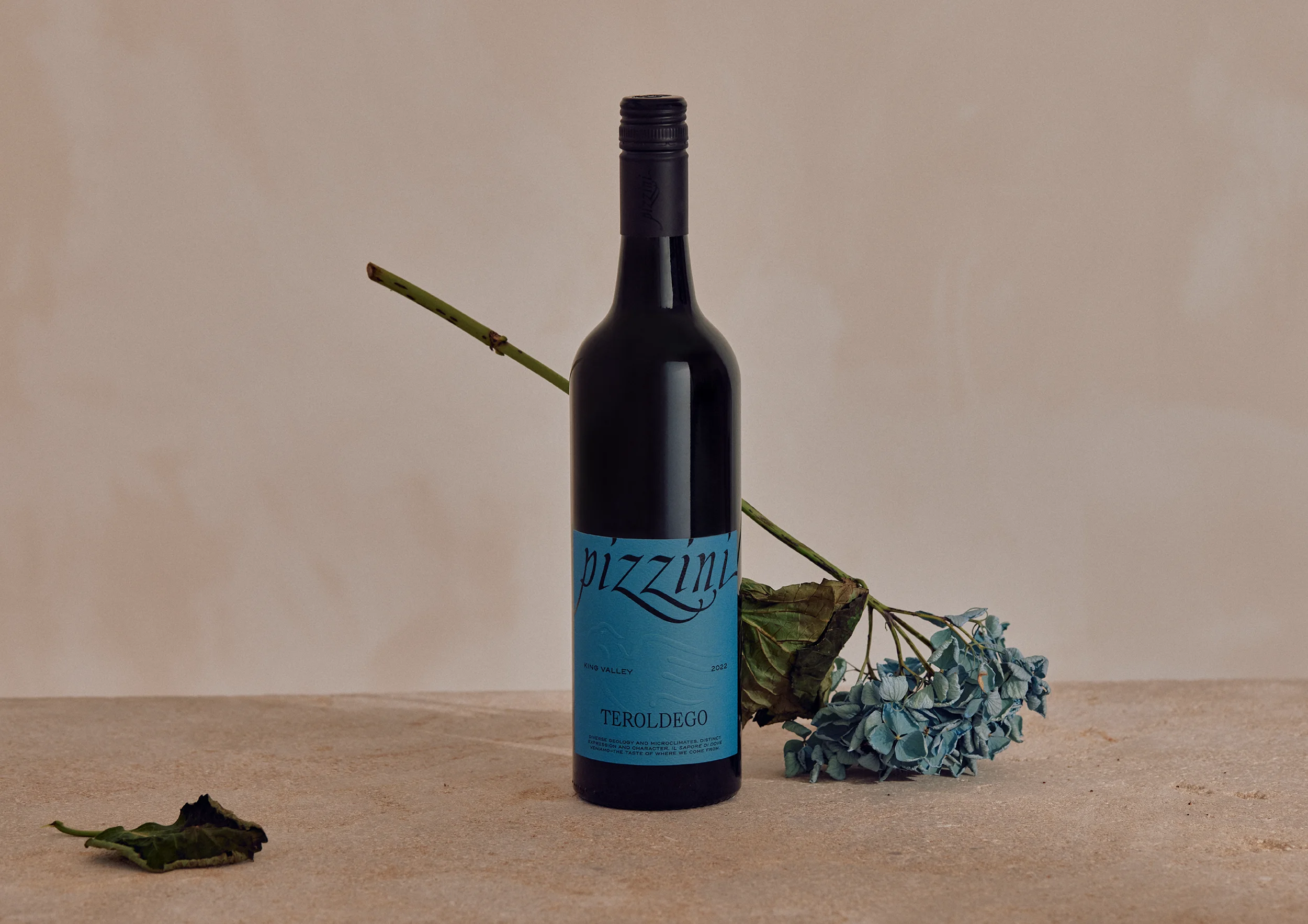
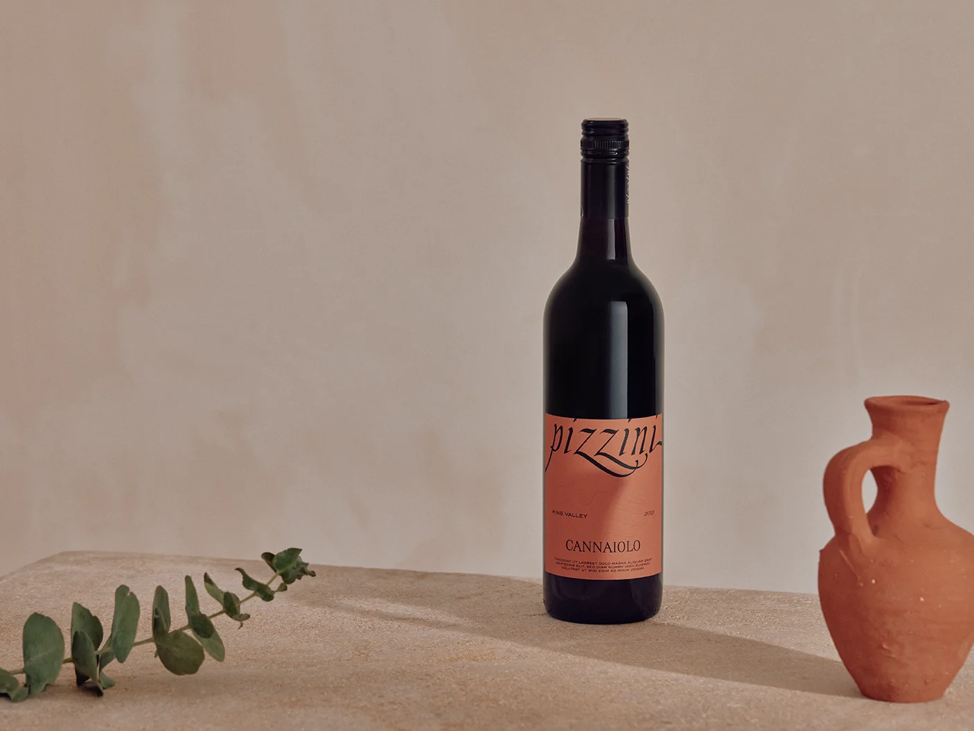
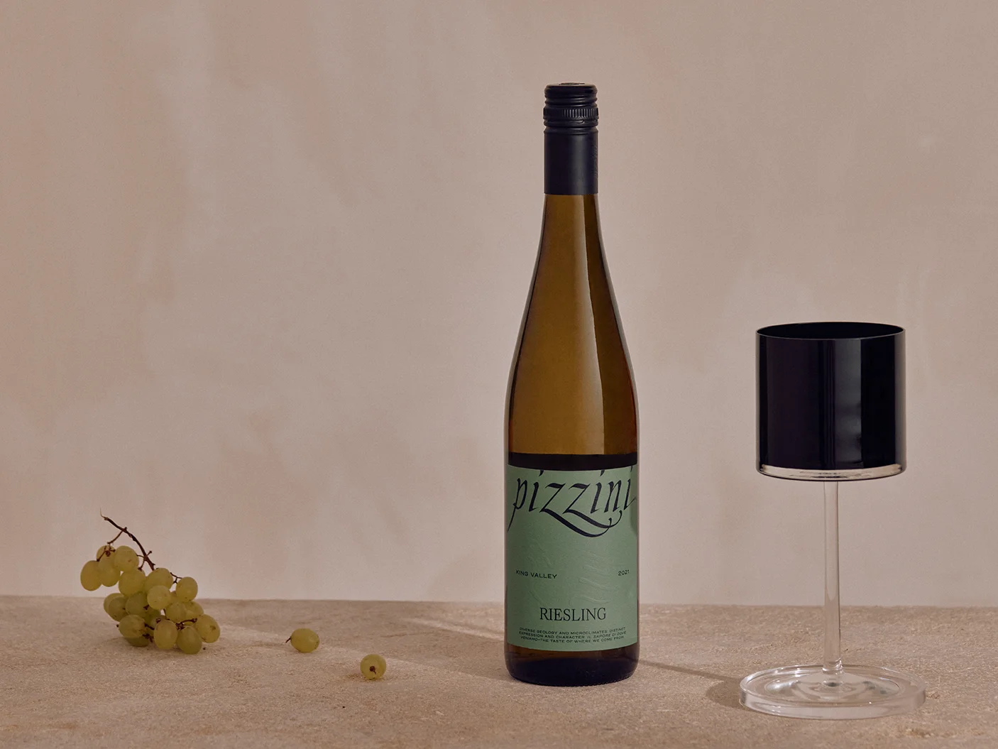
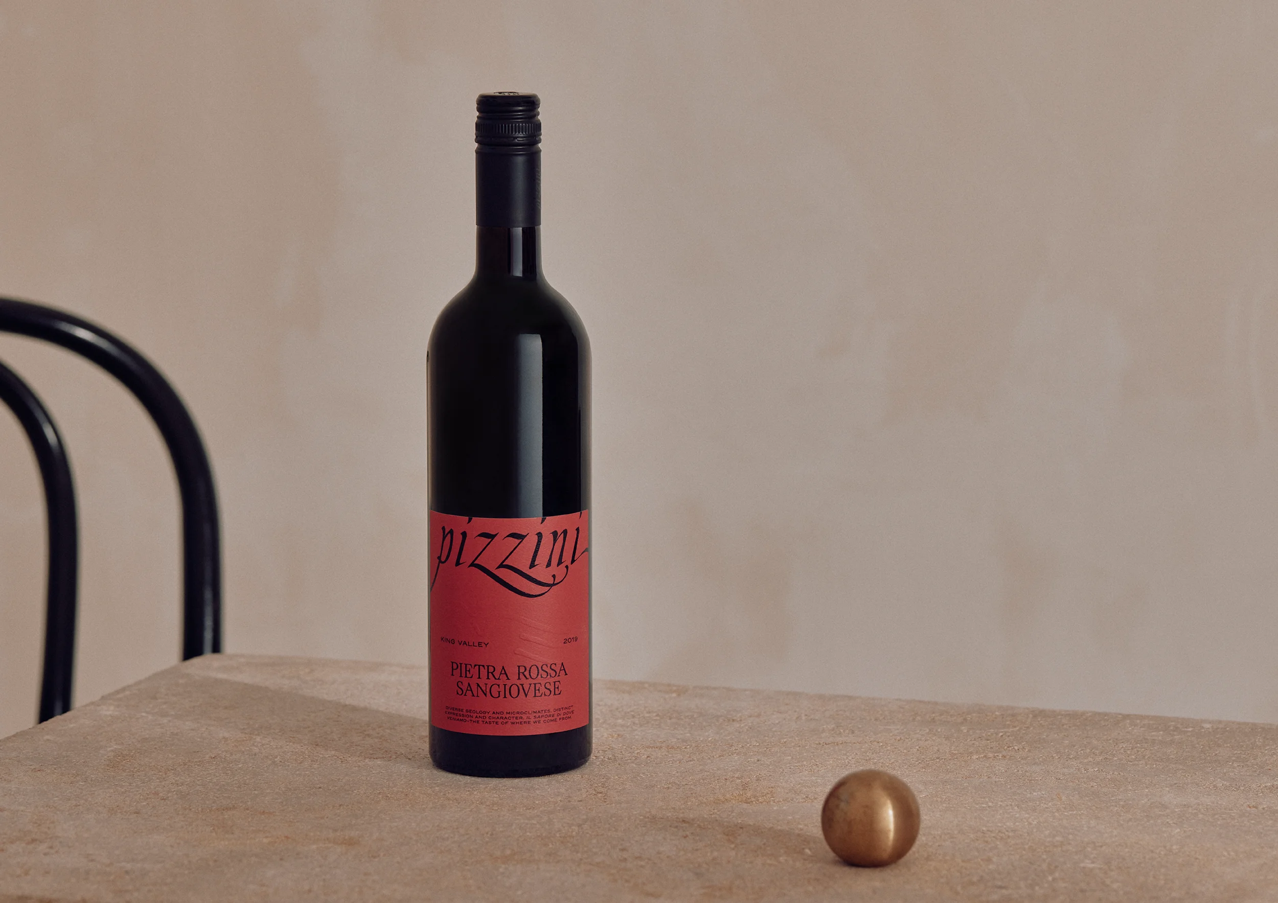
The King Valley Craft range aims to reflect Pizzini’s two homes—Victoria’s King Valley and Trentino in the far northern reaches of Italy. The design celebrates these connections through colour, drawing from the landscapes, architecture, and natural palettes that define each region.
Taking inspiration from the earthy yellows and eucalypt greens of Victoria’s King Valley—tones found in its rolling hills, vineyards, and native flora—alongside the burnt terracotta roofs of Trentino’s sun-drenched buildings, this range embodies a meeting of two distant, yet related worlds.
The eagle icon—originally reinterpreted from the Pizzini family crest, and designed so that its stretched wing resembled a toiling hand—was also redrawn to create a stronger relationship to the wordmark, providing additional flexibility to be used differently in execution.
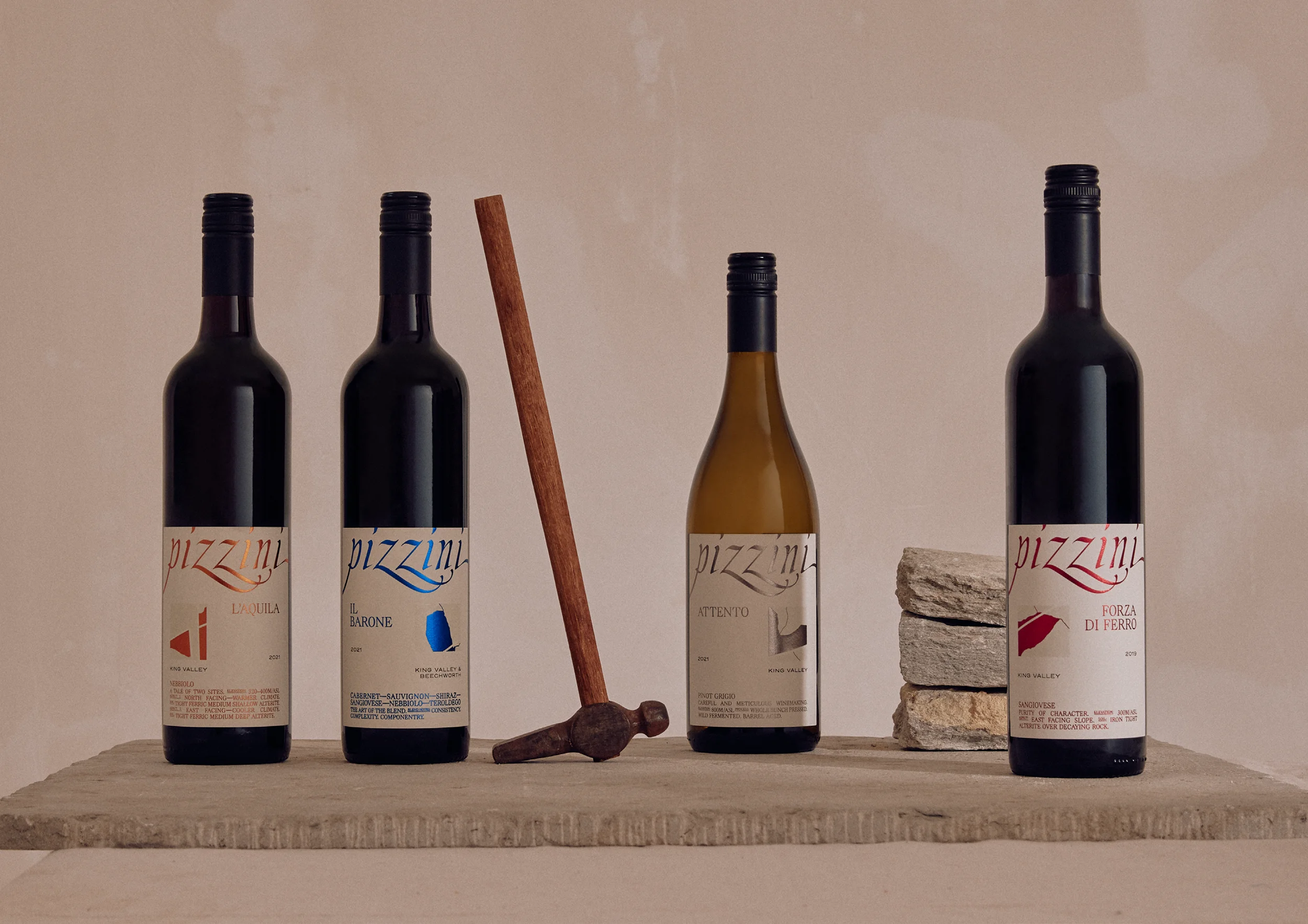
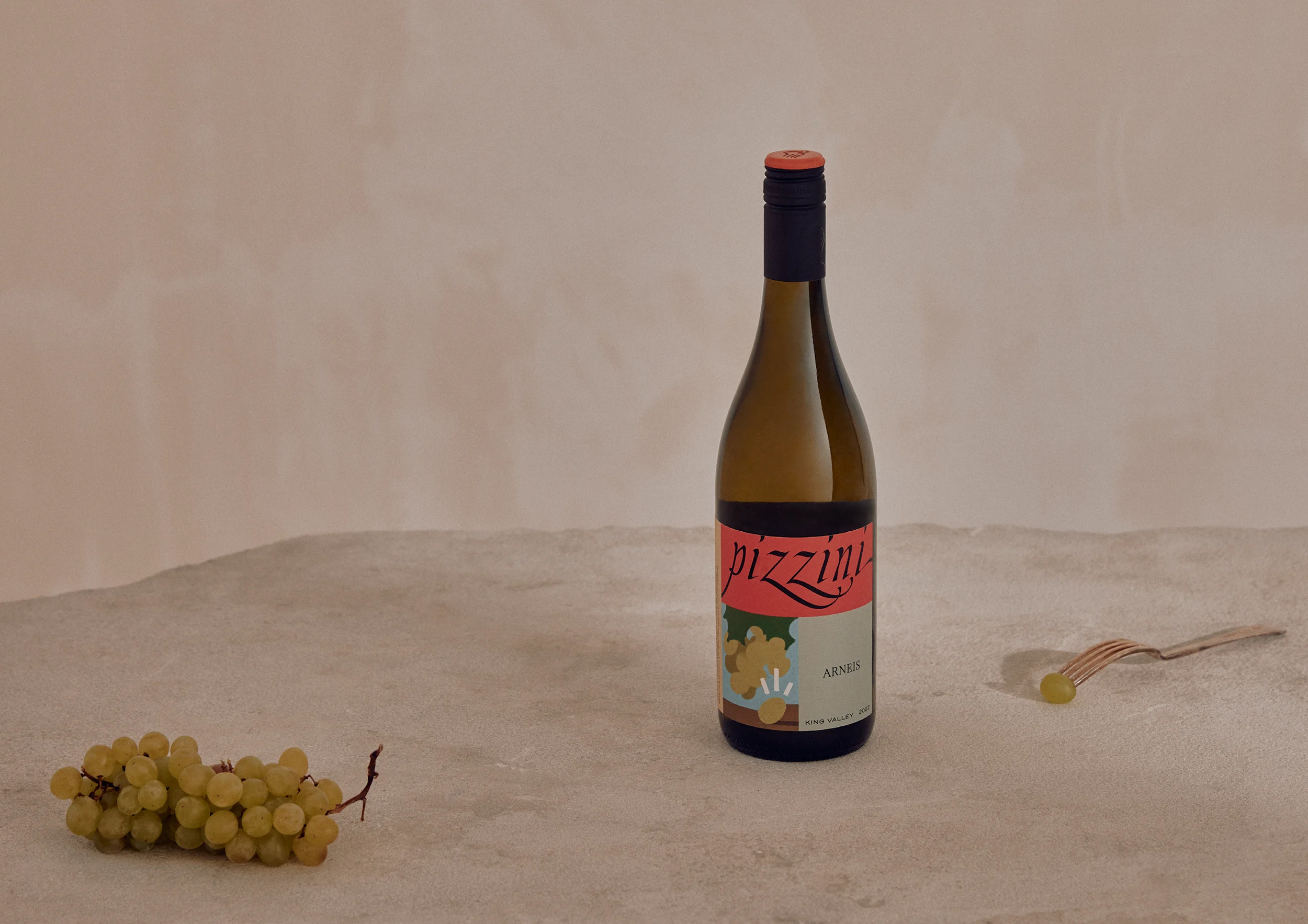
The Strength of Site range aims to capture Pizzini’s deep knowledge and understanding of each of their wine-growing sites—and the incredible wines born from them. Each label is designed to honour place, reflecting the unique characteristics of the vineyards through both design and detail.
By featuring a cropped sub-section of the vineyard site map, each label pinpoints the exact area where the grapes were grown, reinforcing the connection between terroir and taste. Elegant metallic foils highlight these graphic maps, creating a distinctive label identifier that is both striking and sophisticated.
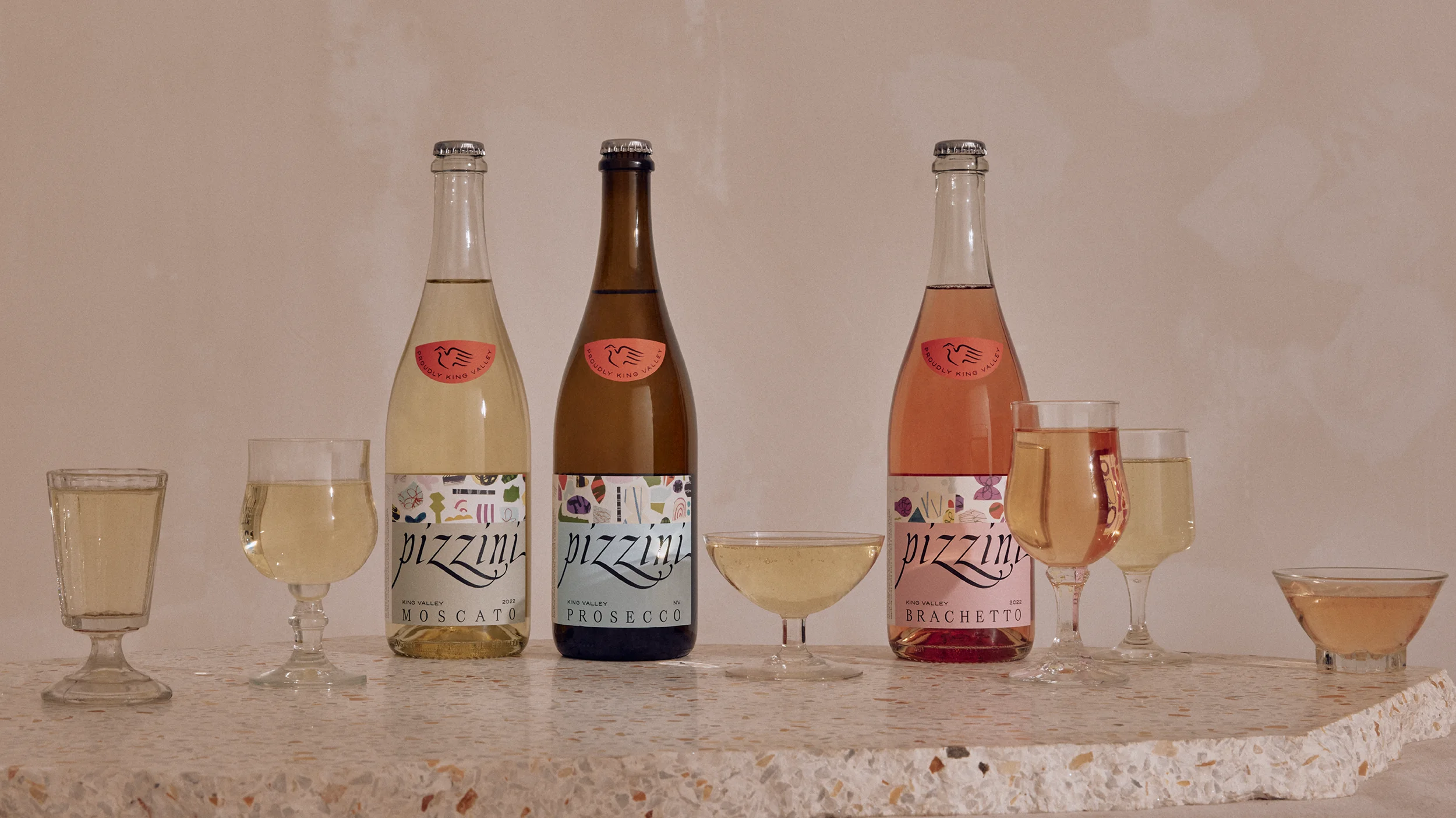
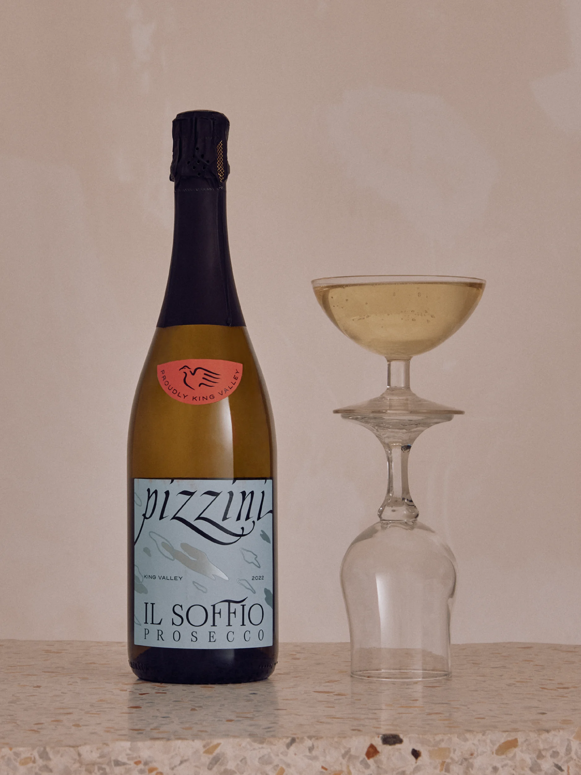
Pizzini may be best known for its Prosecco, and for good reason. Less formal than French Champagne, but no less distinguished, Pizzini’s Prosecco demanded an element of playfulness and celebration to be reflected on the label. Using a collage effect of cut paper and whimsical shapes, the labels capture the spontaneity and joy of the wine itself—like thrown confetti, the fizz in the glass, and the pop of a freshly opened bottle—we created a design that was as effervescent as the wine inside.
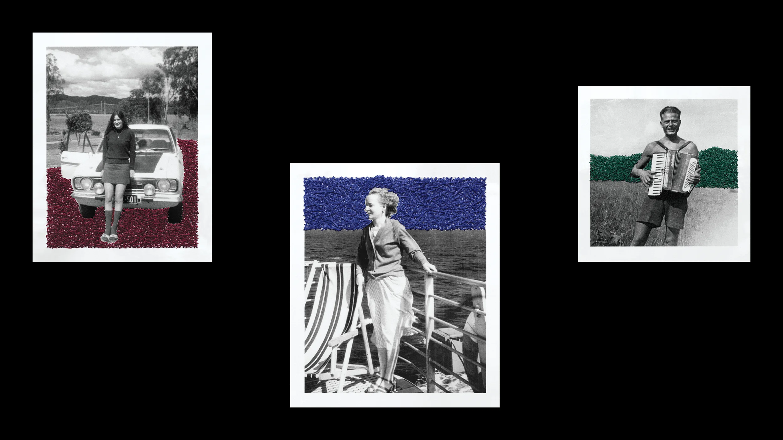
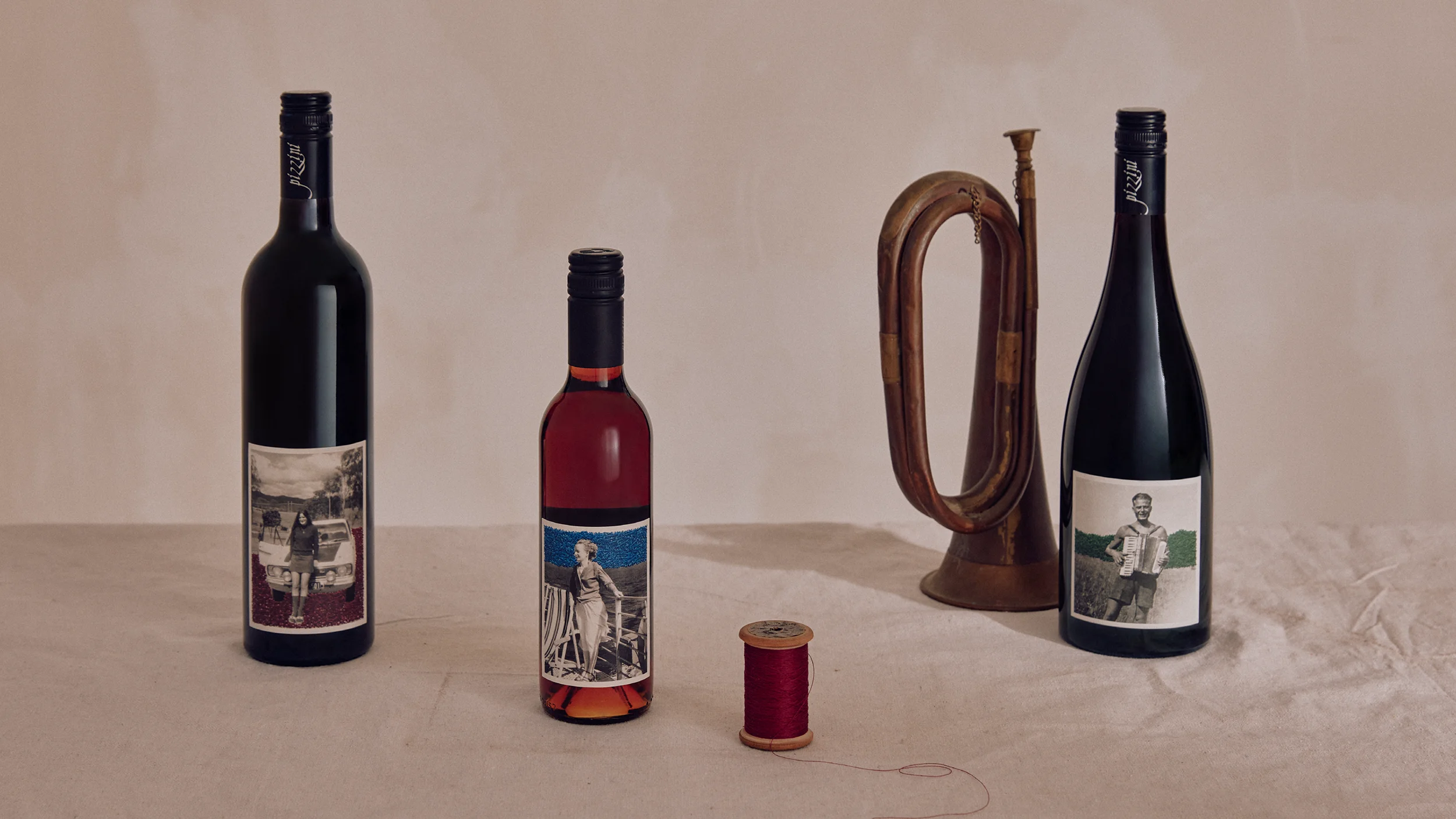
Sitting at the intersection of rarity, character and distinction; the Excellence range tells three formative stories from Pizzini history. Each story is captured through the combination of archival photographs, and overlaid hand-stitched embroidery—speaking to the rich textural nuance of both the wine and the family.